Optical Sizes
SF font was designed to provide two separate versions depending on the current size set, for fonts smaller than 20 points it used
SF Textwhile fonts at 20 points or higher usedSF DisplayThe difference between these two fonts lies in different aspects, spacing and vertical proportion for example
Variable Fonts
Introduced in 2016, variable fonts lets you use one font that adapts to different text point sizes dynamically
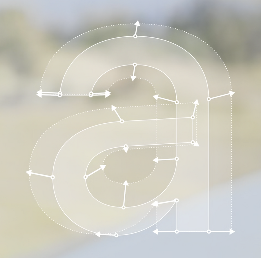
This year, Apple has moved away from multiple fonts versions to a single
SFPro.ttffont which can change how it looks in many different aspects according to its font sizeThe following APIs handle optical sizes automatically for system fonts (as well as custom fonts with optical size access):
preferredFont(forTextStyle:)
systemFont(ofSize:)
systemFont(ofSize:weight:)
CTFontCreateUIFontForLanguage()
Tracking and Leading
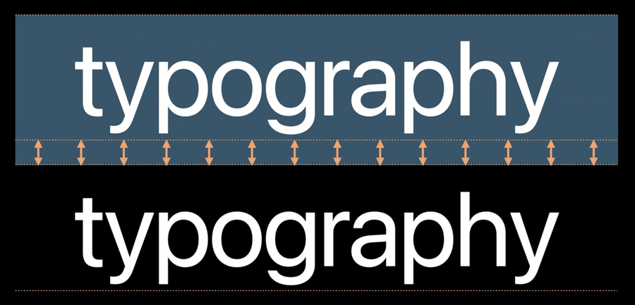
Tracking is the action of adding spaces between glyphs in text layout (equally across the whole word). It’s different than Kerning which is a micro-correction in spacing that’s only applied to certain pairs
 |  |
|---|---|
| Tracking | Kerning |
Previously,
SFTextandSFDisplayhad different tracking values, because smaller fonts usually requires more tracking to make it easier to read text
 |  |
|---|---|
| SF Text | SF Display |
Now, SF font doesn’t have a hard breakpoint at 20pts for tracking, instead it varies smoothly between 17 and 28 points
System fonts have a pre defined tracking table that map each font size to the correct tracking
Also, fonts provide multiple tracking tables (for tightening for ex.) that is used when the available space is too tight by assigning:
label.allowsDefaultTighteningForTruncation = true

// AppKit: NSTextField
textField.allowsDefaultTighteningForTruncation = true

// SwiftUI
Text("hamburgefonstiv").allowsTightening(true)
Platforms now recognizes different tracking for custom fonts containing both
trackandSTATtablesBy applying
kCTFontOpticalSizeAttributeyou can enable this behavior for old OSs as wellLeading is the added space between lines vertically
The system adds extra leading space for some languages that requires it (for example Arabic fonts)
Text Styles and Dynamic Type
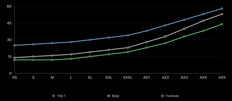
Text styles are a set of predefined combinations of weight, size and leading values
Here is how you can get a font of a certain style with emphasized weight:
// Getting emphasized text styles

// AppKit
let descriptor = NSFontDescriptor
	.preferredFontDescriptor(forTextStyle: .title1)
	.withSymbolicTraits(.bold)
// 13 pt Semibold on macOS
let emphasizedBodyFont = NSFont(descriptor: descriptor, size: 0)

// UIKit/Catalyst
if let descriptor = UIFontDescriptor
	.preferredFontDescriptor(withTextStyle: .body)
	.withSymbolicTraits(.traitBold) {
	// 17 pt Semibold on iOS
	let emphasizedBodyFont = UIFont(descriptor: descriptor, size: 0)
}

// SwiftUI
let emphasizedFootnoteFont = Font.footnote.bold() // 13 pt Semibold on iOS
You can also use tight and loose leading setting to allow more information to be displayed on screen when you have a dense screen, or allow for more room to make easier to read a large content
Tight and loose leading setting applied on platforms are as follows:
| Platform | Standard Leading | Tight Leading | Loose Leading |
|---|---|---|---|
| iOS | 0 | - 2 pt | + 2 pt |
| macOS | 0 | - 2 pt | + 2 pt |
| watchOS | 0 | - 1 pt | + 1 pt |
Here is an example of how you can use tight/loose leading APIs:
// Getting tight/loose leading variant

// AppKit
let descriptor = NSFontDescriptor.preferredFontDescriptor(forTextStyle: .headline)
	.withSymbolicTraits(.tightLeading) // Use .looseLeading for loose leading font
let tightLeadingFont = NSFont(descriptor: descriptor, size: 0) // 14 pt line height

// UIKit/Catalyst
if let descriptor = UIFontDescriptor.preferredFontDescriptor(withTextStyle: .title1)
	.withSymbolicTraits(.traitTightLeading) { // Use .traitLooseLeading for loose leading
	let tightLeadingFont = UIFont(descriptor: descriptor, size: 0) // 36 pt line height
}

// SwiftUI
// Use .loose for loose leading font
let tightLeadingFootnoteFont = Font.footnote.leading(.tight) // 16 pt line height on iOS
You can also mimic the design of rounded fonts in the Reminders app:
// Access system font designs

// Use .serif for New York, .monospaced for SF Mono

// AppKit
let descriptor = NSFontDescriptor.preferredFontDescriptor(forTextStyle: .body)
	.withDesign(.rounded)
let roundedBodyFont = NSFont(descriptor: descriptor, size: 0) // SF Pro Rounded

// UIKit/Catalyst
if let descriptor = UIFontDescriptor.preferredFontDescriptor(withTextStyle: .body)
	.withDesign(.rounded) {
	let roundedBodyFont = UIFont(descriptor: descriptor, size: 0) // SF Pro Rounded
}

// SwiftUI
let roundedBodyFont = Font.system(.body, design: .rounded) // SF Pro Rounded
Access to system fonts through CSS has changed a little bit with some additions, WebKit now supports following generic font families:
font-family: system-ui;  /* SF Pro */
font-family: ui-rounded;  /* SF Pro Rounded */
font-family: ui-serif;  /* New York */
font-family: ui-monospace;  /* SF Mono */
Text styles API now support macOS
AppKit API defines full range of text styles as in iOS
Font sizes are optimized to match recommended app text size (for this choose
Optimize Interface for Macin Xcode project editor instead ofScale Interface to Match iPad)No Dynamic Type support
Dynamic Type allows the font to scale its size according to the user’s preferred text sizes set in settings
Different text styles scales differently to Dynamic Size, so you need to adopt such behavior in your custom font (if you’re using one)
In UIKit, you can do that by using
UIFontMetricclass:
// Support Dynamic Type with custom font in UIKit

if let customFont = UIFont(name: "Charter-Roman", size: 17) {
	let bodyMetrics = UIFontMetrics(forTextStyle: .body)

	// Charter-Roman scaled relative to body text style
	// in different content size categories.
	let customFontScaledLikeBody = bodyMetrics.scaledFont(for: customFont)
	label.font = customFontScaledLikeBody
	label.adjustsFontForContentSizeCategory = true

	// Scaling constant 10 relative to body text style.
	let scaledValue = bodyMetrics.scaledValue(for: 10)
}
New in SwiftUI, you can set your custom font to be relative to a system text style for it to scale correctly with dynamic type (this is not needed in iOS 14 as all fonts are relative to
.bodytext style as a default behavior)You can also use the new
@ScaledMetricproperty wrapper to make any value scales with Dynamic Types relative to a certain text style:
struct ContentView: View {
	let prose = "Apple provides two type families you can use in your iOS apps. San Francisco (SF). San Francisco is a sans serif type family that includes SF Pro, SF Pro Rounded, SF Mono, SF Compact, and SF Compact Rounded."
	@ScaledMetric(relativeTo: .body) var padding: CGFloat = 20

	var body: some View {
    	VStack {
        	Text("Typography")
            	.font(.custom("Avenir-Medium", size: 34, relativeTo: .title))
        	Text(prose)
            	.font(.custom("Charter-Roman", size: 17)) // relative is not needed in iOS 14 because it's implied
            	.padding(padding)
    	}
	}
}
You can opt-out of default relative font behavior in iOS 14 by using the parameter fixedSize:
// Text with font Courier, always use fixed size, do not scale according to user setting.
Text("Fixed").font(.custom("Courier", fixedSize: 17))
Takeaways
Try using system fonts such as
SF Pro,SF Pro Rounded,SF Mono, andNew YorkUsing text styles helps create typographic hierarchy
Consider supporting Dynamic Type with custom fonts
Only override system behavior in exceptional cases
Custom tracking should be size specific
