Design principles
watch apps should be lightweight
limit interactions/features
make actions discoverable
Design process goals
Interactions should be both discoverable and predictable.
Relevant actions should always be visible.
Eliminate gesture-based contextual menus without removing functionality.
Secondary Actions
Secondary actions add or increase functionality, provide a secondary but still important action and/or provide new ways to interact with the primary actions already in the view.
Sort and filter actions
Sort and filter menus are a lightweight and actionable way to narrow down any long list and make it easier to navigate and more relevant to you in the moment.
Use a Picker inside a List to show such action:
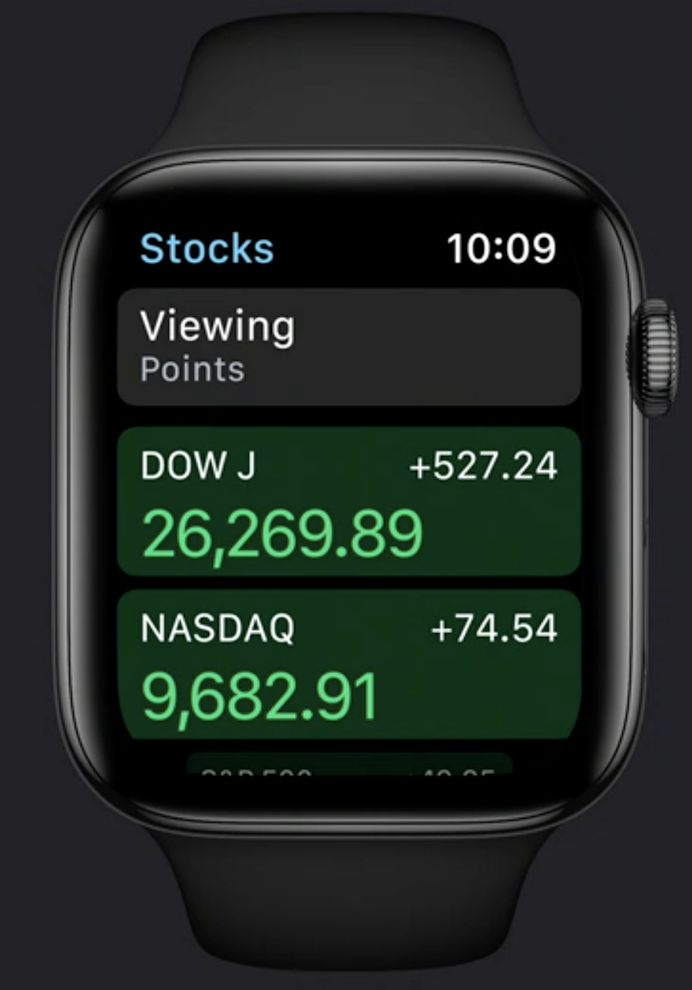
List {
    Picker(selection: $viewing
           title: Text("Viewing")) {
       // Viewing options
    }
    // Rest of the list
}
Swipe actions
Swipe actions are being used more and more in watchOS for displaying actions in a list.
Use the .onDelete modifier on a List to remove rows via a swipe:
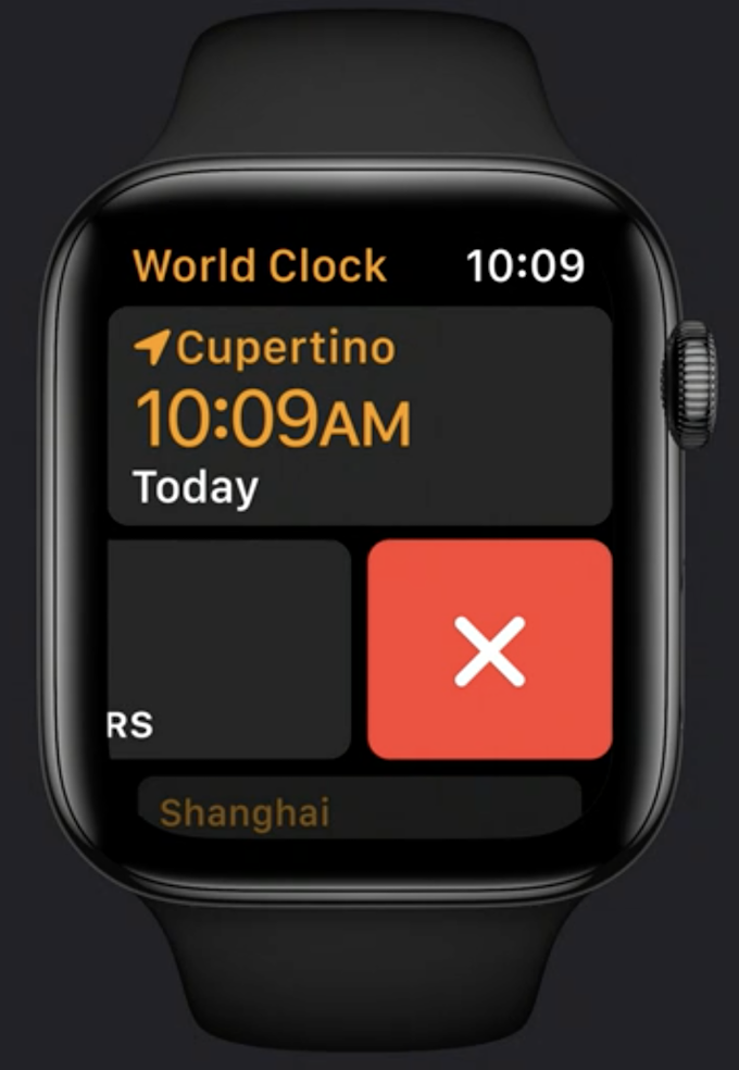
List {
    ForEach(model.locations) {
        ClockCell(location: $0)
    }
    .onDelete { deleteClock(index: $0) }
}
More options
It’s especially important to separate primary from secondary actions when you think about using a More button
Never put primary actions inside a More menu
Be very choosy about which secondary actions you offer
Use a simple circular container element with the SF Symbol ellipsis centered inside. Refer to Apple’s Human interface Guidelines for the recommended hit regions for each watch screen size and add transparent padding around your button, if needed, to ensure that your button is comfortably tappable.
If you’d like to show only one more extra action, you can do so by showing an ad-hoc glyph.
Bottom of a scroll view actions
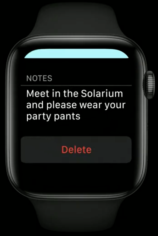
Action buttons at the bottom of a detail view may be the most discoverable and intuitive way to show actions in your app
The actions at the bottom of a detail view should always apply to the content of the view above it
To avoid confusion, information in the detail view that is not actionable sits directly on the black background
Only the action button at the bottom sits in a container and looks tappable
Use a red text label on the button to indicate a destructive action
Add a confirmation alert if the information being deleted is not easily retrievable
Toolbar buttons
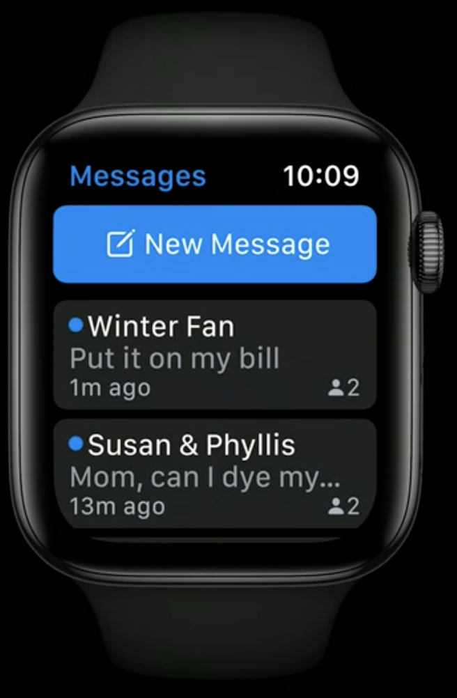
These buttons are hidden by default, and show up only after the user swipe down
Use tool bar buttons only for actions that are essential to the functioning of your app but may not be the primary action for the view
Use toolbar buttons only on scrollable views
.toolbar {
    Button(action: newMessage) {
        Label("New Message",
              systemImage: "square.and.pencil")
    }
}
Hierarchycal Navigation
 |  |
|---|
In a hierarchical navigation model, the app should remember the destination the user chose the next time they open the app.
