Sample Code
Download the sample code to learn more about Modern Collection Views.
Lists
UITableViewlike appearance.Based on Compositional Layout.
Highly customizable.
Improved self-sizing support. (No longer need to worry about manually calculating the height of cells)
Components of a list
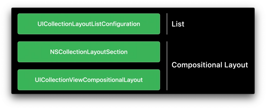
UICollectionLayoutListConfigurationis the only new type required to build alist.UICollectionLayoutListConfigurationis built on top ofNSCollectionLayoutSectionas well asUICollectionViewCompositionalLayout.For more refer to the Advances in Collection View Layout session.
List Configuration
Gives the styles form table view such as
.plain,.groupedand.insetGrouped.Two new styles exclusive to lists in
UICollectionView:.sidebarand.sidebarPlain.
Build a list
Simple setup
let configuration = UICollectionLayoutListConfiguration(appearance: .insetGrouped)
let layout = UICollectionViewCompositionalLayout.list(using: configuration)
Create an
UICollectionLayoutListConfiguration, give it an appearance.Create an
UICollectionViewCompositionalLayoutusing this configuration.
Per section setup
let configuration = UICollectionLayoutListConfiguration(appearance: .insetGrouped)
let section = NSCollectionLayoutSection.list(using: configuration, layoutEnvironment: layoutEnvironment)
Create an
UICollectionLayoutListConfiguration, give it an appearance.Create an
NSCollectionLayoutSectionusing this configuration.
This code can then be used inside the existing section provider initializer on compositional layout.
let layout = UICollectionViewCompositionalLayout() {
    [weak self] sectionIndex, layoutEnvironment in
    guard let self = self else { return nil }

    // @todo: add custom layout sections for various sections

    let configuration = UICollectionLayoutListConfiguration(appearance: .insetGrouped)
    let section = NSCollectionLayoutSection.list(using: configuration, layoutEnvironment: layoutEnvironment)
    return section
}
Headers and Footers
Headers and footers in UICollectionView have to be explicitly enabled.
One approach
Works for both Headers and Footers.
First
Register headers and footers as supplementary views.
var configuration = UICollectionLayoutListConfiguration(appearance: .insetGrouped)
configuration.headerMode = .supplementary
let layout = UICollectionViewCompositionalLayout.list(using: configuration)
Second
Provide this view through a
supplementaryViewProvideron your diffable data source.Can also implement the equivalent method on UICollectionView delegate.
Check the
elementKindfor eitherelementKindSectionHeaderorelementKindSectionFooterand configure and return the appropriate view.
var configuration = UICollectionLayoutListConfiguration(appearance: .insetGrouped)
configuration.headerMode = .supplementary
let layout = UICollectionViewCompositionalLayout.list(using: configuration)

dataSource.supplementaryViewProvider = { (collectionView, elementKind, indexPath) in
    if elementKind == UICollectionView.elementKindSectionHeader {
        return collectionView.dequeueConfiguredReusableSupplementary(using: header, for: indexPath)
    }
    else {
        return nil
    }
}
Set the mode to either
.supplementaryor.nonedepending on whether this particular section should show a header or not.Don’t return nil in the
supplementaryViewProvider.
let configuration = UICollectionLayoutListConfiguration(appearance: .insetGrouped)
configuration.headerMode = sectionHasHeader ? .supplementary : .none
let section = NSCollectionLayoutSection.list(using: configuration, layoutEnvironment: layoutEnvironment)
Another Approach
Only available for headers.
var configuration = UICollectionLayoutListConfiguration(appearance: .insetGrouped)
configuration.headerMode = .firstItemInSection
let layout = UICollectionViewCompositionalLayout.list(using: configuration)
Sets the
headerModeto.firstItemInSection.Collection view will configure the first cell to look like a header.
Data source needs to be aware of this.
The first item in data source no longer represents the actual content of section but rather the header.
List Cell
Can use either UICollectionViewListCell or UICollectionViewCell in lists sections.
Support to configure the insets of separators
Support to configure the indentation of cell’s content.
Swipe Actions are now also a feature of the cell.
Improved accessories API.
Access to the default system content and background configurations.
For more refer to the Modern cell configuration session.
Separators
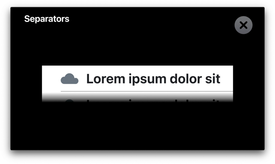
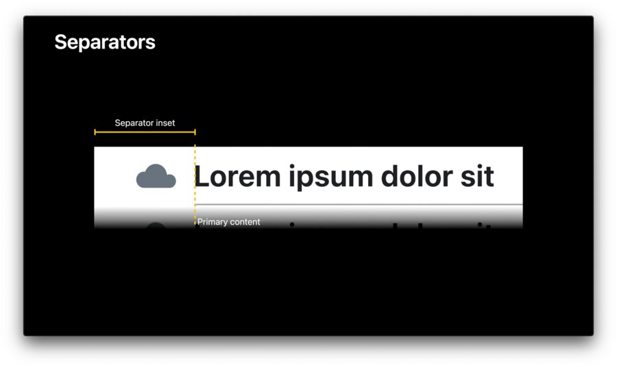
Separator is supposed to line up with the primary content of cell.
Use Separator Layout Guide to easily align the separator.
Separator Layout Guide works opposite of other layout guides.
Constrain this layout guide to content.
Configure cell’s layout first, then constrain the separator layout guides leading anchor to primary content.
Swipe Actions
Swipe actions are now a feature of list cell.
Configure like cell content.
Swipe Actions are only supported using a list configuration.
let markFavorite = UIContextualAction(style: .normal, title: "Mark as Favorite") {
	[weak self] (_, _, completion) in
	guard let self = self else { return }
	// trigger the action with a reference to the model
	self.markItemAsFavorite(with: item.identifier)
	completion(true)
}
cell.leadingSwipeActionsConfiguration = UISwipeActionsConfiguration(actions: [markFavorite])🚨Caution:
Make sure to never capture the index path of the cell.
The index path is not a stable identifier.
The index path of this cell changes whenever we’re inserting or deleting content above it which doesn’t necessarily reload this particular cell.
Capture the data model directly or a stable identifier instead.
Accessories
List cell offers many new accessory types.
Allows to configure accessories for both, the trailing and the leading side of the cell.
Can configure multiple accessories on the same side.
cell.accessories = [
    .checkmark(),
    .disclosureIndicator(options: .init(tintColor: .systemGray)),
    .delete(),
    .reorder()
]