New API
Templates
With watchOS 7 there are new complication templates that take in just a SwiftUI view, letting us be in total control of what to display in the complication:
CLKComplicationTemplateGraphicCornerCircularViewCLKComplicationTemplateGraphicCircularViewCLKComplicationTemplateGraphicRectangularLargeViewCLKComplicationTemplateGraphicRectangularFullViewCLKComplicationTemplateGraphicExtraLargeCircularVie
Text
By default
Textsize adapts based on the complication family it will appear on. The default font is SF Rounded.Use the new
Textdate formatters to make the view update live:
/// A style displaying a date as relative to now.
/// e.g. 2 hours, 23 minutes
static let relative: Text.DateStyle

/// A style displaying a date as offset from now.
/// e.g. +2 hours
static let offset: Text.DateStyle

/// A style displaying a date as timer counting from now.
/// e.g. 36:59:01
static let timer: Text.DateStyle
Examples:
import SwiftUI
import ClockKit

struct RelativeText: View {
  var body: some View {
    VStack(alignment: .leading) {
      Text("Count Down")
        .font(.headline)
        .foregroundColor(.accentColor)
      Label("Nap Time", systemImage: "moon.fill")
      Text(Date() + 100, style: .relative)
    }
    .frame(maxWidth: .infinity, alignment: .leading)
  }
}

struct RelativeText_Previews: PreviewProvider {
  static var previews: some View {
    CLKComplicationTemplateGraphicRectangularFullView(RelativeText())
      .previewContext()
  }
}
import SwiftUI
import ClockKit
struct TimerText: View {
var body: some View {
VStack(alignment: .leading) {
Label("Sourdough Timer", systemImage: "timer")
.foregroundColor(.orange)
Text("Time remaining: \(Date() + 100, style: .timer)")
}
.frame(maxWidth: .infinity, alignment: .leading)
}
}
struct TimerText_Previews: PreviewProvider {
static var previews: some View {
CLKComplicationTemplateGraphicRectangularFullView(TimerText())
.previewContext()
}
}ProgressView & Gauge
New ProgressView and [Gauge][] SwiftUI views:
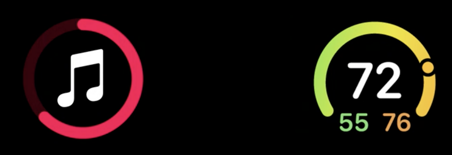
ProgressView comes with two styles:
import SwiftUI
import ClockKit

struct ProgressSample: View {
  var body: some View {
    ProgressView(value: 0.7) {
      Image(systemName: "music.note")
    }
    .progressViewStyle(CircularProgressViewStyle(tint: .red))
  }
}

struct ProgressSample_Previews: PreviewProvider {
  static var previews: some View {
    CLKComplicationTemplateGraphicCircularView(ProgressSample())
      .previewContext()
  }
}
Gauge comes with a style:
CircularGaugeStyleLinearGaugeStyle
Both styles come with many optional personalization such as:
label
currentValueLabel
minimumValueLabel
maximumValueLabel
import SwiftUI
import ClockKit

struct GaugeSample: View {
  @State var acidity = 5.8

  var body: some View {
    Gauge(value: acidity, in: 3...10) {
      Image(systemName: "drop.fill")
        .foregroundColor(.green)
    } currentValueLabel: {
      Text("\(acidity, specifier: "%.1f")")
    } minimumValueLabel: {
      Text("3")
    } maximumValueLabel: {
      Text("10")
    }
    .gaugeStyle(CircularGaugeStyle())
  }
}

struct GaugeSample_Previews: PreviewProvider {
  static var previews: some View {
    CLKComplicationTemplateGraphicCircularView(GaugeSample())
      .previewContext()
  }
}
Complication Template Preview
When previewing templates, we now have a new
.previewContext()modifier that will let us preview our complication on a face that is best suited for our complication family (examples above).We can also set a tinting to our preview as well:
.previewContext(faceColor: .blue)We can use the new
CLKComplicationTemplate.PreviewFaceColor.allColorsto preview our complication with all the colors:
struct HistoryView_Previews: PreviewProvider {
  static var previews: some View {
    ForEach(CLKComplicationTemplate.PreviewFaceColor.allColors) { color in
      CLKComplicationTemplateGraphicRectangularFullView(ComplicationHistoryView())
      .previewContext(faceColor: color)
    }
  }
}
Watch face tinting
Some faces alter the tint color, and the color on each complication.
There are two kinds of tinting:
desaturated tint (default)
color opacity tint
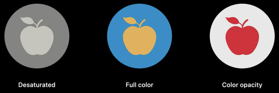
Desaturated tint
Depending on the face, our complication can get completely desaturated, or get one color applied for the whole complication
If our complication elements have similar brightness, they will be indistinguishable when the view is desaturated.
Color opacity tint
Alternative to Desaturated tint that we can opt-in to
This works by splitting our view in two layers, background and foreground:
what matters for each layer is the opacity
each watch face will determine what color to give to each layer (they will be two different colors)
By default all elements are in the background layer, to move elements into the foreground layer, apply the new .complicationForeground() modifier.
Custom tint
For more custom tinting, we can get the current ComplicationRenderingMode via the \.complicationRenderingMode environment variable: what we can do here is read the current rendering mode and change our layers opacity based on that.
Best practices
Tapping anywhere in a complication will always open the watch app (no buttons or else support)
Use
Text,Image. and drawing primitives such asShapes,Paths, andPaints, other SwiftUI elements are not supportedSwiftUI animations are not supported
Limit expensive drawing such as blurs and formatted text
Use the default font size as a guide for your complication layout
Circular and Rectangular complication families will mask your view
Rectangular full view complication features a safe area for layout to help prevent your content from being clipped on the watch face.
