Xcode 12 brings new APIs to configure the content and styling of cells.
Getting started with configurations
With iOS 14, standard cells should use the new content configurations:
var content = cell.defaultContentConfiguration()

content.image = UIImage(systemName: "star")
content.text = "Hello WWDC!"

cell.contentConfiguration = content
The cell’s defaultContentConfiguration():
always return a clean configuration (with nothing set on it)
has a default styling, based on the cell and table view style
The same approach is used for any cell that supports configurations (UITableViewCells, UICollactionViewcells, ..), this is possible because these standard cell layouts and appearances are now available as independent pieces that can plug right into any cell or view that supports them.
Using configurations will let the system take care of the multiple states a cell can be in, for example:
normal
highlighted
highlighted and selected
disabled
and more.
What are configurations?
Configurations describe the cell appearance for a specific state
applied to a view to render
composable
lightweight (inexpensive to create)
built for performance
Configuration types
Two types:
Background Configuration
List Content Configuration
Background configurations let you set things such as:
background color
visual effect (blur)
stroke
insets and corner radius
custom view
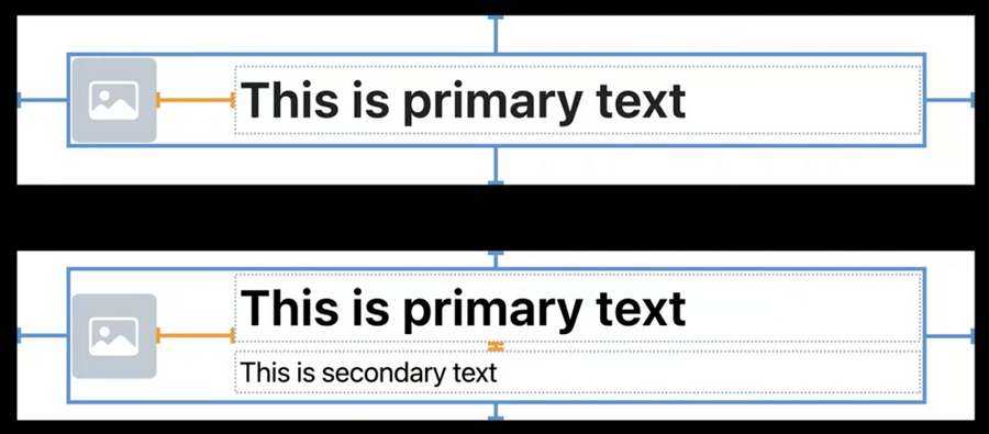
List Content configurations give you the standard layout for cells, headers, and footers:
image
text
secondary text
layout metrics and behaviors
You can change configurations at will, for example within an animation
Configuration state
Configuration state represents the various inputs that you use to configure your cells and views: it’s a collection of all the different traits, states, and your own custom states wrapped together in one place.
Each cell, header and footer has its own configuration state
Two Types:
View configuration state
Cell configuration state
View configuration state
This state has:
a trait collection
four different (boolean) states: highlighted, selected, disabled, focused
and a custom state: this is key value storage for you to add any extra states or data that you want to use when configuring your view
Cell configuration state
Cell configuration state has everything from the View configuration state plus the following extra states:
(boolean) editing, swiped, expanded
Drag and drop states
We can ask a new configuration by passing a new state:
let updatedConfiguration = configuration.updated(for: state)By default these configurations update by themselves when we set a new configuration, thanks to the cell automaticallyUpdatesContentConfiguration and automaticallyUpdatesBackgroundConfiguration properties:
in other words, when you set a background or content configuration on the cell, any time the cell’s configuration state changes it will automatically ask the configuration to return an updated version of itself and then reapply that new configuration back to the cell.
If you’d like to do this manually instead, you can override the cell’s new function updateConfiguration(using:):
this method is always called before your cell first displays and will be called again anytime the configuration state may have changed so you can configure your cell for the new state.
Here’s an example that customizes the cell colors based on the state:
override func updateConfiguration(using state: UICellConfigurationState) {
    var content = self.defaultContentConfiguration().updated(for: state)

    content.image = self.item.icon
    content.text = self.item.title

    if state.isHighlighted || state.isSelected {
        content.imageProperties.tintColor = .white
        content.textProperties.color = .white
    }

    self.contentConfiguration = content
}
Background and content configurations
Each cell has a default background and content configuration, however we can ask for a specific configuration just as easily:
var background = UIBackgroundConfiguration.listSidebarCell()
var content = UIListContentConfiguration.sidebarCell()
Configurations are designed to be used with self-sizing cells where their height can be flexible depending on the exact configuration and environment
Content configurations give you control over the layout margins (blue), and various padding properties (orange)