Overview
All iOS, iPadOS, macOS, and watchOS icons can be created in Icon Composer and stored in single
.iconfileThis is optional, you can still add images to Xcode, they’ll “specular highlight” edge rounding and glass effect
If your artwork is somewhat translatable to the new design language, use Icon Composer for Liquid Glass effects
Use app to test how your icon reacts to different lighting conditions, light/dark mode, clear, tinted light/dark
Exporting flat images for marketing needs possible
Design
It’s best to design app icons with vectors so you can scale the exported SVGs
Use app icon design template with the grid system to size your vectors right
The grid and rounded rectangles of the templates have changed
Layers supported like on tvOS/visionOS icons, most apps fine with background/foreground, but more layers possible
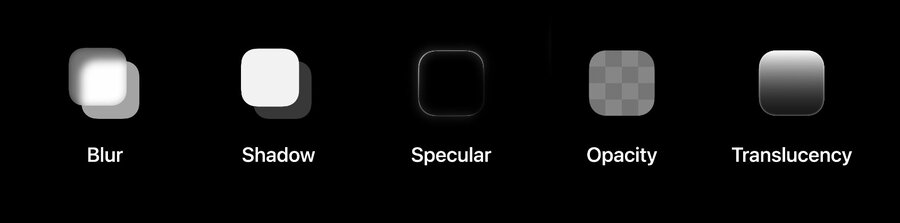
Effects like Blur, Shadow, Specular, Opacity, and Translucency should be added in Icon Composer
So keep things flat and opaque in your design tool, export multiple layers (keep text on extra layers)
The watchOS template uses 1088×1088 to share the same grid as 1024×1024, but adds some padding for the circle.
Export layers
For those using Adobe Illustrator a script is provided by Apple to convert to SVG (Author note: couldn’t find link)
To save time export layers in the canvas size and enumerate layers starting with
0_for the backgroundNo need to export simple color backgrounds or gradients (can be added directly in Icon Composer)
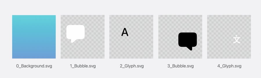
SVG doesn’t preserve fonts, so convert text to outlines before exporting
For other things not supported by SVG like custom gradients or raster images, export layers as PNG
Never include a rounded rectangle or circle mask in your exports, and always use the full canvas.
Icon Composer
Consists of (from left to right): Sidebar, Preview panel, and Inspector
Select layers on the sidebar and adjust their properties (like color) in the inspector
Drag & drop your layers into the sidebar, automatically creates a group
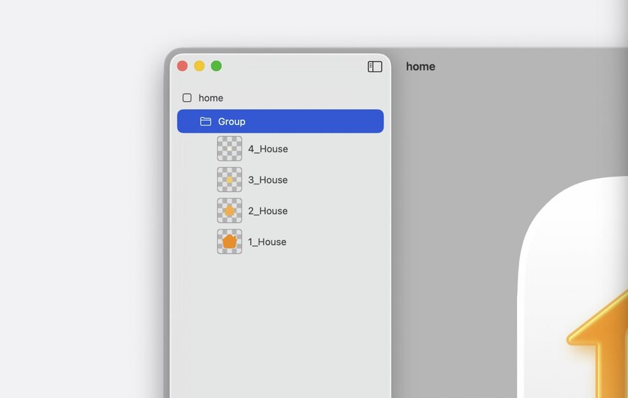
Groups control how elements stack and receive glass properties, up to 4 groups (= depth levels) possible
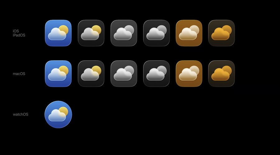
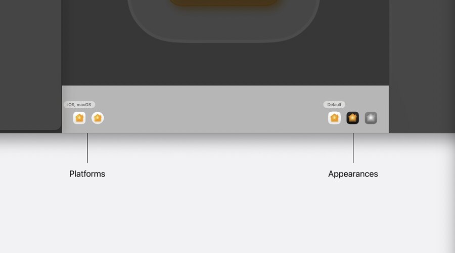
Select a platform shape and the appearance (light/dark/tinted) in the bottom pane of the preview
Monojoins the existingDefaultandDarkappearances, supporting sub-modesClear,Tinted Light/Dark
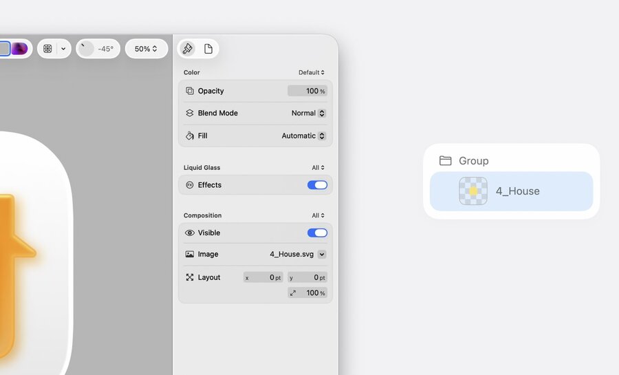
You can turn on/off the Liquid Glass effect per layer, adjust Opacity, Blend Mode, and Fill
Composition section helps hide/show or alter images or sizes per platform (see “All ” pickers)
On group-level, the inspector reveals more options like Mode, Blur, Translucency, and Shadow
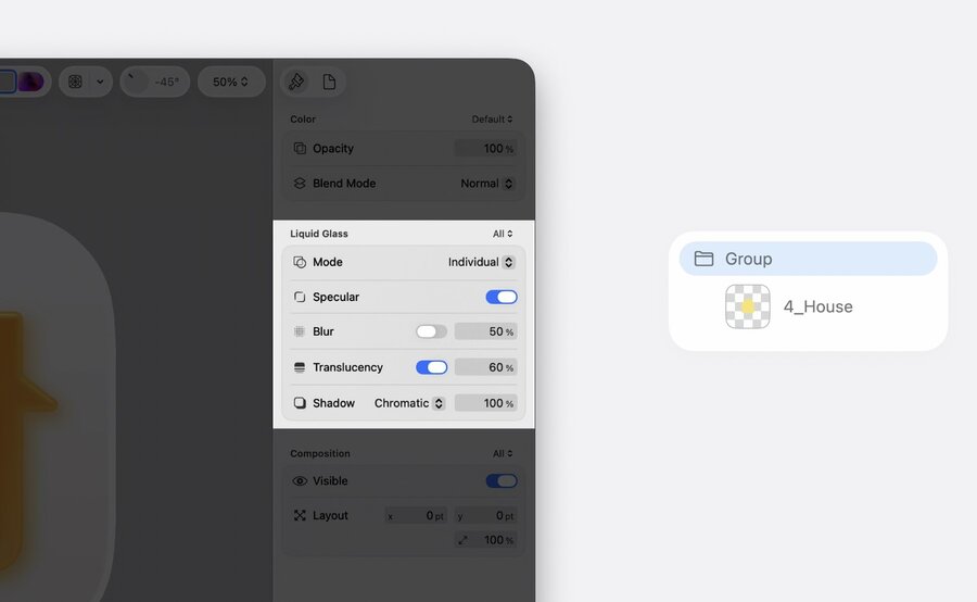
Besides the “All ” / “Default ” pickers, you can also fully customize each property per variant
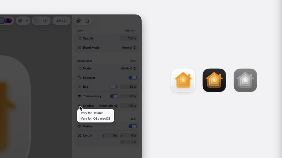
Turn off the “Specular” on group or switch of Liquid Glass on layer if thin shapes (like text) become illegible
Set the shadow type to “Chromatic” when background color is white for the color of the top layer to spill
Keep the shadow “Neutral” for Dark and Mono appearances (by creating a variant)
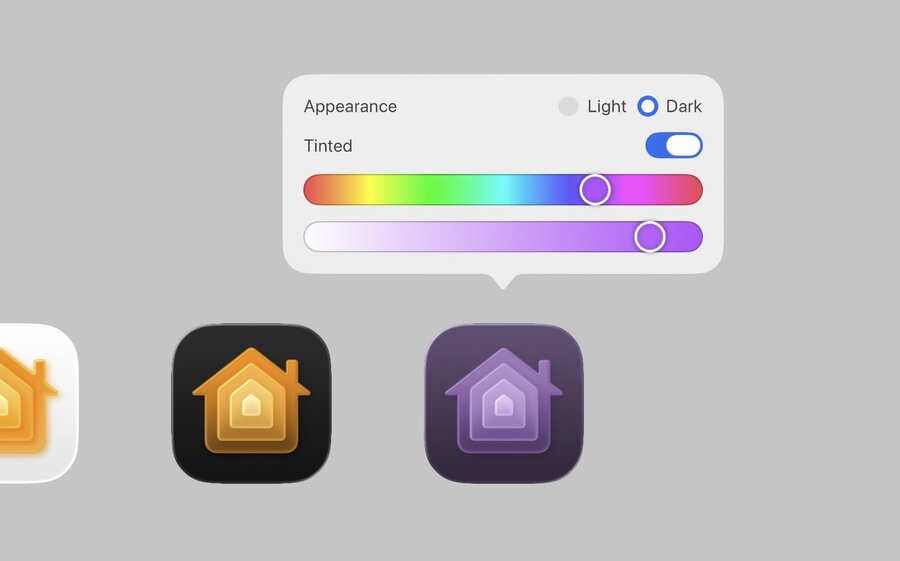
Adjust your colors (like red) for different appearances (like dark mode) to keep them visible
For pre-rendered PNG images, you can export a dark version of the image and override with a variant
For the “Mono” appearance to look good, you should have at least one icon to be close to white
Check the watchOS circular icon and make positional/sizing adjustments where needed
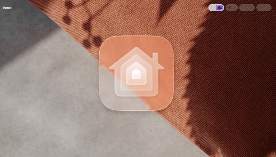
Use different backgrounds (and more) to test look and legibility of your icon in different scenarios
You can also overlay an icon grid with a click, see how light moves (Liquid Glass), and zoom in/out
Deliver
Save your
.iconfile, add to Xcode, and choose icon in project editorIcon Composer alters the workflow and saves time generating assets – no need to recreate the glass effect
Icons now respond to user input and adapt between appearance for a richer and more integrated experience
