App Structure
Refined design for
NavigationSplitView,TabView,NavigationStack, Sheets, Inspectors & moreSidebars float above content now
Extend views behind sidebars with
.backgroundExtensionEffect()modifierMirrors and blurs images/content
Inspector also gets blurry background, but not floating
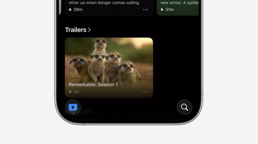
Tab bar floats above content now
Use
.tabBarMinimizeBehavior()to minimize Tab bar on scroll
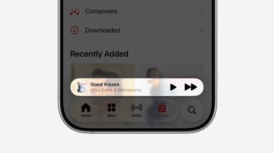
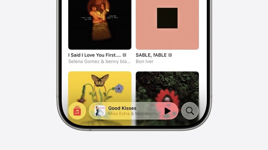
Use
.tabViewBottomAccessory()to add view above Tab barUse environment to customize accessory view when minimized on scroll
TabView { … }
    .tabBarMinimizeBehavior(.onScrollDown)
    .tabViewBottomAccessory {
        MusicPlaybackView()
    }

struct MusicPlaybackView: View {
    @Environment(\.tabViewBottomAccessoryPlacement)
    var placement

    var body: some View {
        if placement == .inline {
            …
        } else {
            …
        }
    }
}
Sheets
Partial height get inset with + Liquid Glass background
Smaller heights get pulled in even more
Full height get full size + opaque background
Swipe gesture smoothly transitions between these states
Consider removing
.presentationBackgroundmodifierMorph sheets out of buttons with
.navigationTransition(zoom) and.matchedTransitionSourceMenus, Alerts, Popovers, and Confirmation Dialogs automatically morph out of buttons
Toolbars
Toolbar items automatically placed in Liquid Glass and grouped
System back button is separate
Split out groups with
ToolbarSpacer(.fixed)Use
ToolbarSpacer(.flexible)to expand space between bottom items
Use
.sharedBackgroundVisibility(.hidden)to hide Glass container of items.badge()modifier can add number badgesLean into new automatic monochrome icon styling!
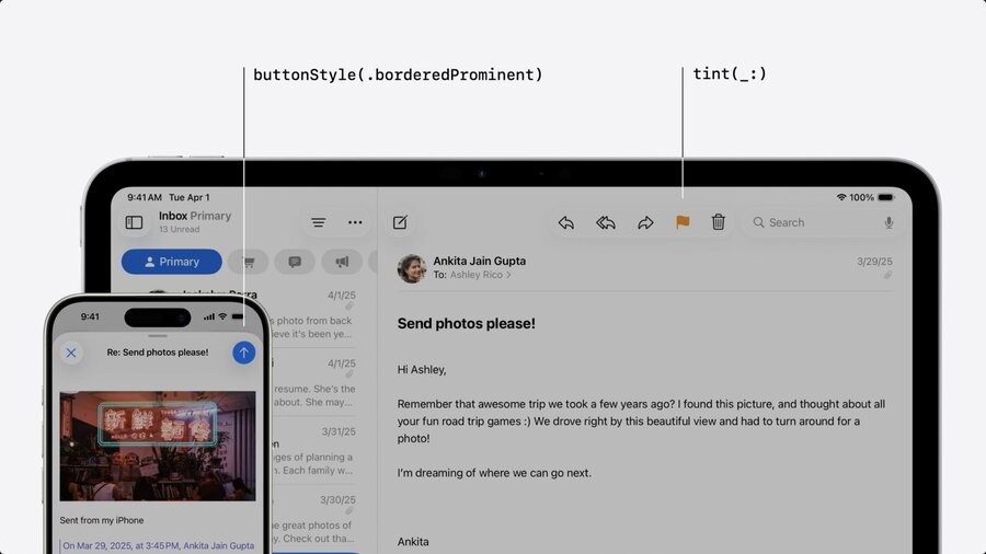
Use
tint()to style the iconUse
buttonStyle(.borderedProminent)for colored backgroundColoring only used to convey meaning, not effect!
Remove backgrounds behind bars to embrace scroll edge effects!
For sharp edge effects use
.scrollEdgeEffectStyle(.hard, for: .top)onScrollView
Search
Search is now placed on bottom on iPhone
Top trailing on iPad and Mac
Treat search as dedicated page!
Page may show browsing suggestions
Apply
.searchable()onNavigationSplitViewto get this behaviorSearch may be minimized automatically or via
.searchToolbarBehavior(.minimize)For Tab bars use
Tab(role: .search)
Controls
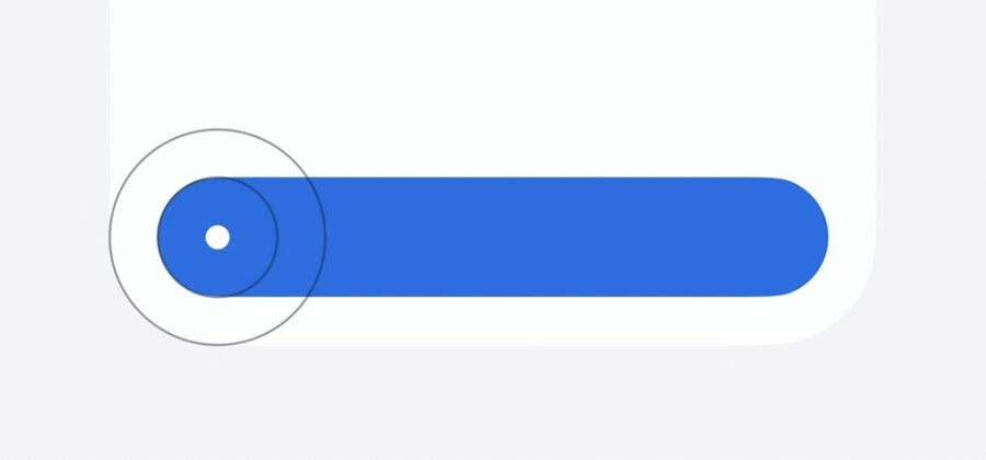
Buttons
Bordered buttons are now capsule shaped
On macOS Mini, Small, and Medium size are still rounded rectangles
Control heights are tweaked
Slightly taller on macOS
Extra large size buttons are now available
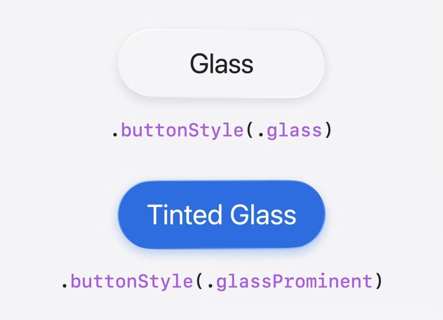
New button styles
.glassand.glassProminent
Sliders
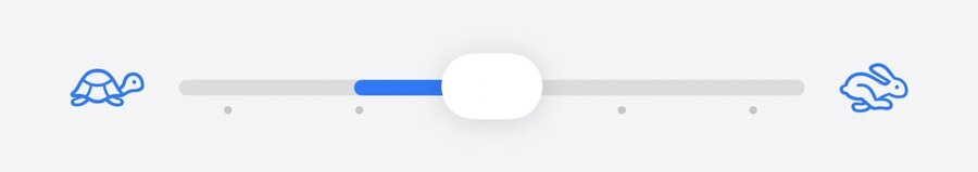
Tick marks now automatically shown when using
stepparameterManually place them in
ticksclosure withSliderTick()Define bar start point with
neutralValueparameter
Menus
Now use leading icons on menu items!
Use same standard label or control API to show icons
More on menu design in Elevate the design of your iPad app
Aligned Corner Radius
Controls should have same corner center as container
Pass
.containerConcentricto corner parameter ofRectangleor.rect
Liquid Glass Effects
Use
.glassEffect()to manually add Liquid Glass to any viewCapsule shape by default
Automatically uses vibrant text color
Also when tinting background
Label("Desert", systemImage: "sun.max.fill")
    .padding()
.glassEffect(in: .rect(cornerRadius: 16))Label("Desert", systemImage: "sun.max.fill")
.padding()
.glassEffect(.regular.tint(.green))Label("Desert", systemImage: "sun.max.fill")
.padding()
.glassEffect(.regular.interactive())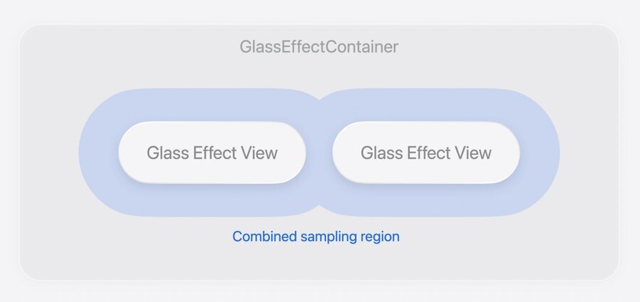
Important to wrap multiple glass elements with
GlassEffectContainerUse
.glassEffectIDmodifier on child views for transitions or morphing of glass viewsCombine with
@Namespace
@Namespace var namespace

GlassEffectContainer {
    VStack {
        if isExpanded {
            VStack(spacing: 16) {
                ForEach(badges) {
                    BadgeLabel(badge: $0)
                        .glassEffect()
                        .glassEffectID(badge.id, in: namespace)
                }
            }
        }

        BadgeToggle()
            .buttonStyle(.glass)
            .glassEffectID("badgeToggle", in: namespace)
}