Key Takeaways
🌅 Snippets are compact views displayed by App Intents
🪜 They are displayed over other content on the device
🏃➡️ Actions can be performed within a Snippet
⌛ Data in a snippet can be updated in real time
Presenters
Ray Pai, Apple Design Team
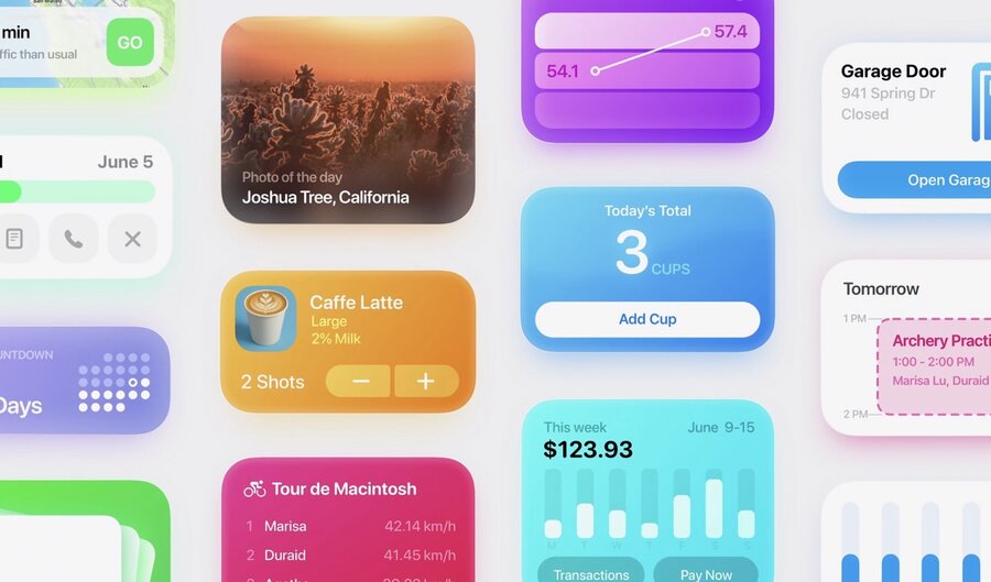
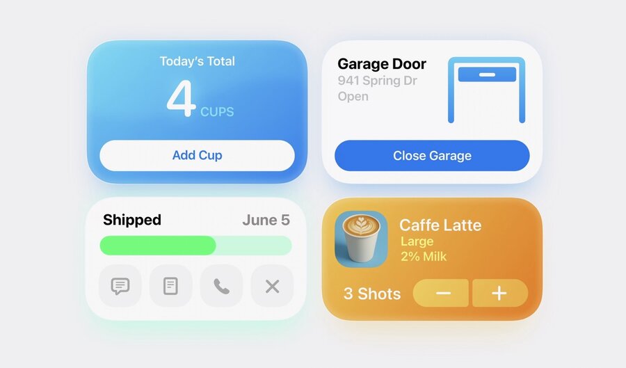
Interactive Snippets
Compact view displayed by App Intents.
Show updated information and offer quick actions
Appear anywhere App Intents are supported
Overlay other content until confirmed, cancelled, or swiped away
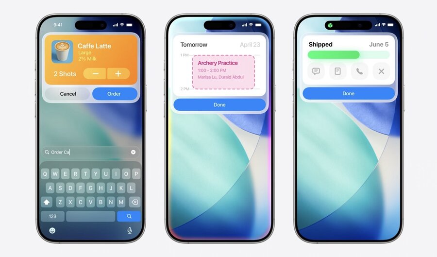
Appearance
Designed for quick, in-the-moment experiences
Text in snippets has larger sizes than system defaults
Avoid including content past 340 points in height
If more information is needed, link to the relevant view in your app
Use a vibrant color background so your snippet stands out from the content beneath
Interaction
Snippets can include buttons to perform simple and relevant actions
Data in the snippet can be updated in real time
Even without interactivity, snippets can animate information changes
Types
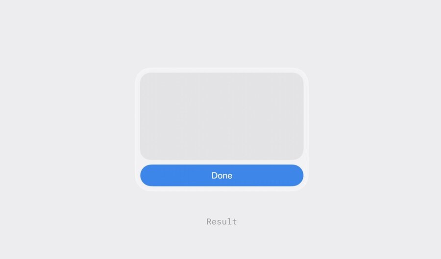
Results
Present information that’s an outcome or doesn’t require further action
Only a “Done” button at the bottom of the snippet
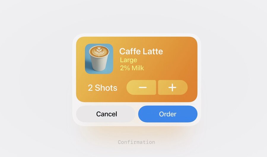
Confirmations
Used when an action is required before a result can be shown
After the required action is taken, show a result snippet to show that the intent has completed
