Intro
For an introduction to Liquid Glass – it’s core principles, behaviors and how to use them effectively check out: Meet Liquid Glass
New harmonized design language across Apple ecosystem.
Maintains flow across devices, screen sizes and input modes.
Editor Note: The speaker explains lots of thoughts and ideas behind the design system. I recommend watching the talk, if you want to get all the reasoning behind the details.
Design Language
All system colors got minor adjustments (for all appearances).
Typography is bolder and left-aligned.
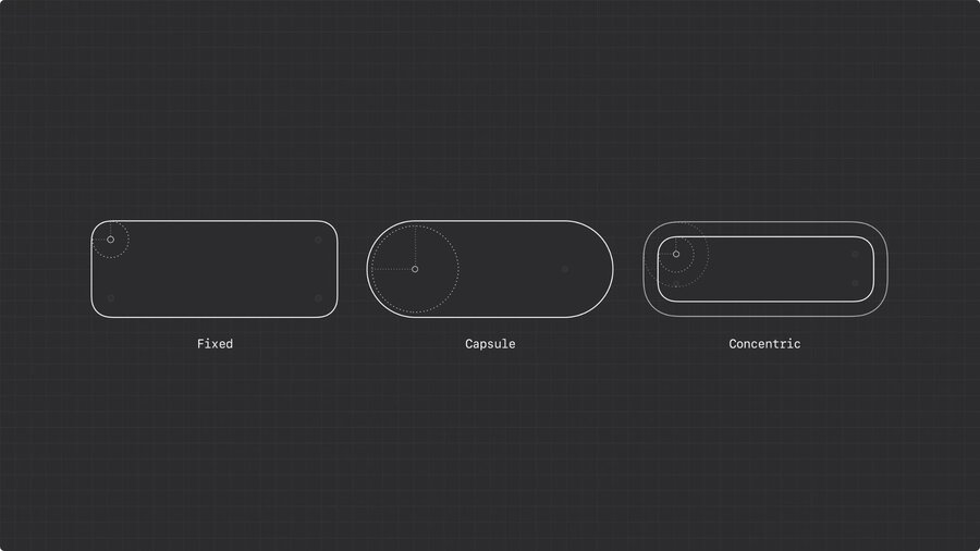
Consistent shapes with curvature, size, and proportions provide unified rhythm to UI → concentricity
Three shape types
| Shape | Corner Radius |
|---|---|
| Fixed | Constant corner radius. |
| Capsule | Radius half the container size. |
| Concentric | Calculated radius by subtracting padding from parent. |
Use shape types to align with system’s rhythm and tone.
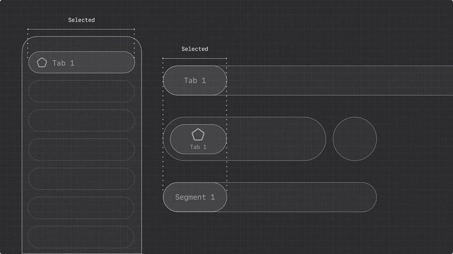
Capsule is used a lot in system, because it supports concentricity.
Capsules bring focus to touch-friendly layouts.
Capsules best used for standout actions on desktop.
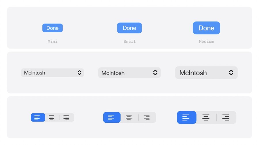
On macOS: mini, small and medium controls still use rounded rectangles.
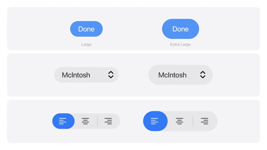
Large and extra large use capsule shapes.
Check corner radii that feel off. Like in nested containers or controls near screen edges.
Concentric shapes let system calculate inner radii for nested containers.
iPhone → Capsules for controls near screen edge.
iPad and Mac → Concentric shape for controls near the edge.
Use concentric shape with fallback radius for components that need to work inside and outside container. → Adapts when nested. Fallback kicks in when it stands alone.
Structure
Depict relationships
Liquid Glass defines new functional layer above content.
Relationships between surfaces depicted by how they appear and stay connected to source.
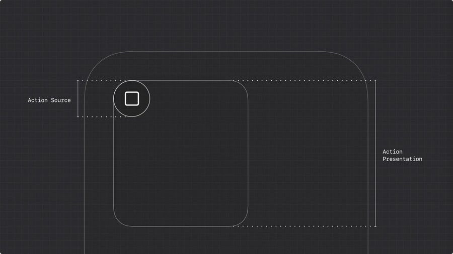
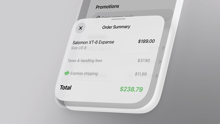
Example: Action Sheets don’t appear at bottom of screen, but spring from action itself.
Use same approach for custom controls.
Make sure to apply material directly to control, not inner views.
Reflect navigation focus
Subtle material variation reinforces intent.
Use dimming layer to signal modality of sheets, if task interrupts main flow.
Liquid glass without dimming layer, if task happens parallel.
Glass subtly recedes and gets more opaque on focus shifts.
Elevate controls
Liquid Glass lifts navigational controls to reinforce interactivity.
Apple discourages to customize bars.
With the new system we all relearn where emphasis comes from.
Don’t rely on (color) decoration, but on grouping and layout.
Organize for legibility
Remove unnecessary bar actions.
Move secondary actions to a more menu.
Group bar items by function and frequency.
Put buttons with related actions together.
Don’t group symbols with text!
Otherwise hard to separate buttons.
Put text-buttons in own container.
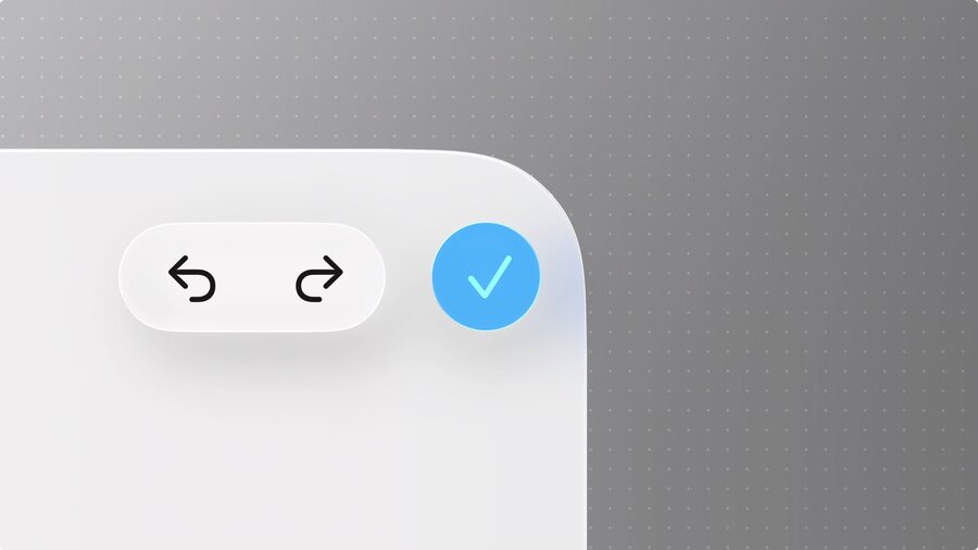
Primary actions (like Done) stays separate and tinted.
Blue checkmark on iOS and iPadOS.
Prominent text button on macOS.
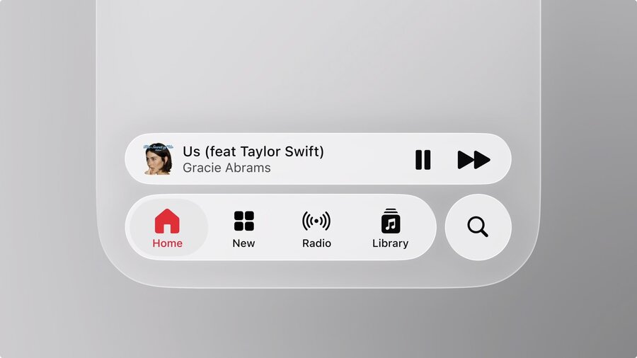
Search is now placed at bottom for quicker access.
Tab bars can support persistent features using accessory views.
Avoid screen-specific actions in the tab bar (like checkout button)!
Prioritize content
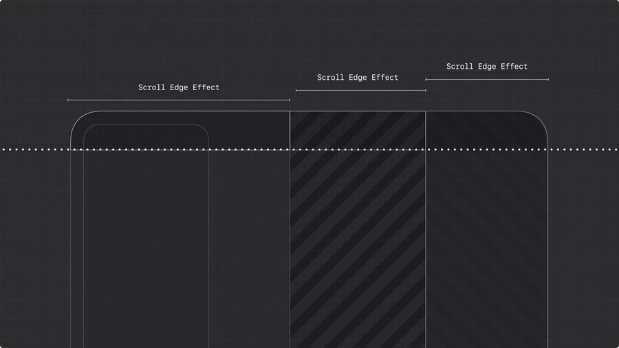
Elements with Liquid Glass require clear separation from content (legibility).
Scroll edge effects reinforce that!
Scroll edge effects are not decorative!
Clarify where UI and content meet.
Don’t use if there no floating elements.
| Style | Use |
|---|---|
| Soft (Default) | Interactive elements. (Subtle blur) |
| Hard | Interactive text, controls without background or pinned table headers. (More opaque and hard edge) |
Apply one edge effect per view.
Don’t mix or stack soft and hard style in one view.
Each split view pane can have its own effect.
Keep height consistent.
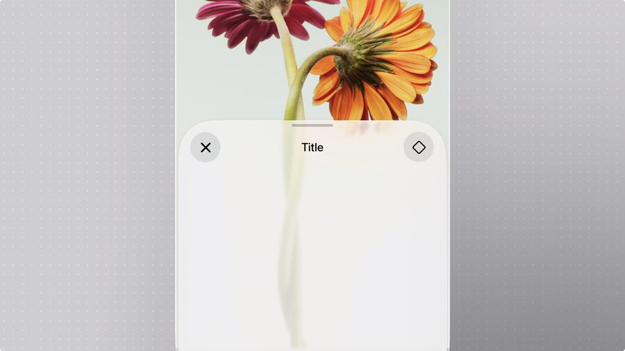
Extend to the edge
Sidebars are now inset and out of glass.
Background extension effects let content extend behind sidebar.
Scroll views extend by default.
Background extension effect can be applied per view.
Continuity
One layout, hierarchy or interaction should carry across every device.
Re-evaluate your app when adopting the new design.
| Device | Layout |
|---|---|
| iPhone | Zoomed in vertical layout. |
| iPad | Middle layer bridging iPhone’s utility and depth of Mac. |
| Mac | Wide, expansive canvas. |
Use shared content
Grouped content should stay together when layout adapts.
Use same symbols across devices.
Only use icons that are clear to user. Generally, a label is always better than an icon.
Populate menus with symbols for better recognition.
Use one icon for related actions.
Don’t repeat or tweak.
Structure components to scale
Define shared anatomy and same core interactions across systems.
Example: Menu on macOS and iOS might not look exactly same, but work the same.
