Key Takeaways
The new design provides refreshed materials and controls throughout macOS.
Windows and controls have new metrics, with escape hatches for compatibility.
The Liquid Glass material can be adopted by custom views as well as system controls.
App structure
Windows
Window shape has been altered.
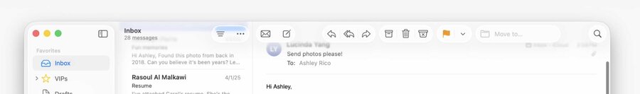
Key structural regions, like sidebar and toolbar, are framed in glass.
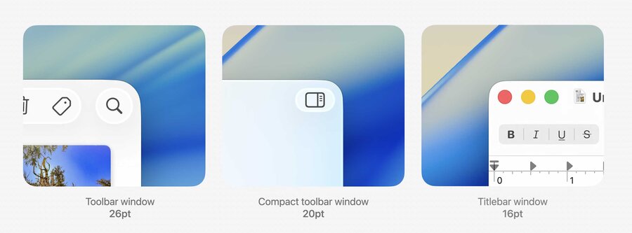
Windows have a larger corner radius.
Avoiding window corners
Use new
NSView.LayoutRegionto obtain a layout guide avoiding a corner.
let safeArea = layoutGuide(for: .safeArea(cornerAdaptation: .horizontal))

NSLayoutConstraint.activate([
    safeArea.leadingAnchor.constraint(equalTo: button.leadingAnchor),
    safeArea.trailingAnchor.constraint(greaterThanOrEqualTo: button.trailingAnchor),
    safeArea.bottomAnchor.constraint(equalTo: button.bottomAnchor),
])
Toolbars
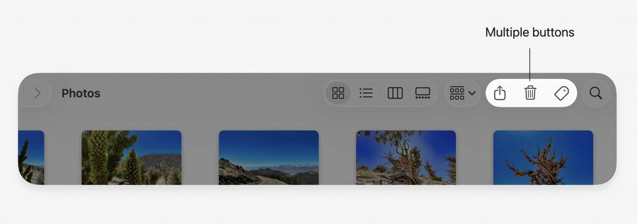
Toolbar items are automatically grouped based on the type of each item’s control view.
Toolbar item groups are rendered on a single piece of glass.
You can override the automatic behavior by either:
Using an explicit
NSToolbarItemGroup;Inserting spacers.
Toolbar material is adaptive and its appearance follows the brightness of the content behind it.
It can switch appearance between light and dark automatically.
Non-interactive items should avoid the glass material.
Remove the glass from an
NSToolbarItemby settingisBorderedproperty tofalse.
Toolbar items can now be tinted.
Use the
styleproperty onNSToolbarItemwith value of.prominent.Use the
backgroundTintColorproperty to customize the tint color (accent color by default).
Call attention to toolbar items using badging (see
NSItemBadge).
Sidebars
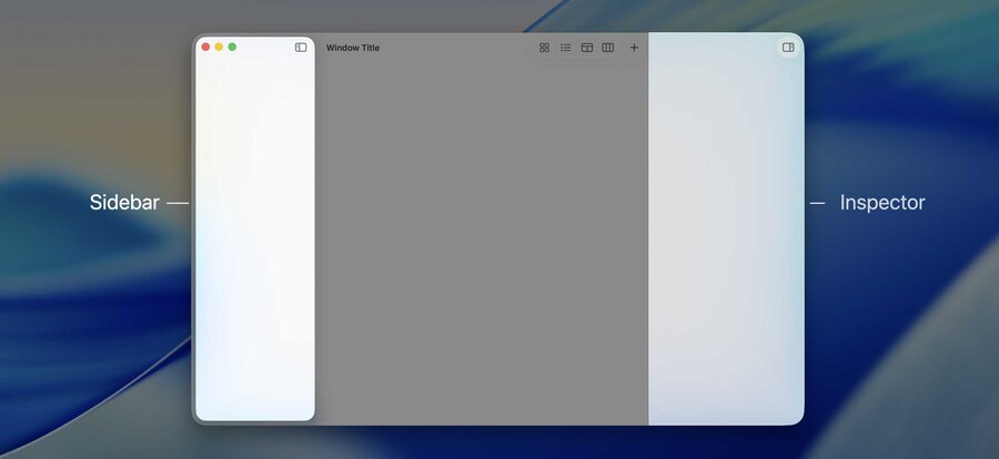
Sidebars appear as a pane of glass that floats above the window’s content.
Legacy
NSVisualEffectViewis no longer necessary in sidebars; you should remove it.
Inspectors use an edge-to-edge glass that sits alongside the content.
Content under the sidebar
Sidebars can appear over content from the adjacent split.
Great for content that can extend into the sidebar region.
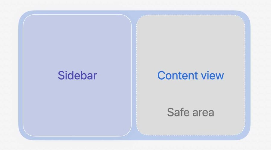
To allow split content to appear under the sidebar, set the
automaticallyAdjustsSafeAreaInsetsproperty totrue.NSSplitViewwill extend that item’s frame beneath the sidebar and then apply a safe area layout guide to help you position your content within the unobscured area.
In some cases, it’s undesirable to cover up any content to get the floating sidebar effect.
In that case, you can use
NSBackgroundExtensionViewto mirror and blur the content.NSBackgroundExtensionViewpositions content in the unobscured portion of the view, while extending its appearance edge-to-edge.
Scroll edge effect
Types
Allows flowing content edge to edge.
Two styles:
Soft-edge style uses a progressive (or variable) blur.
- Hard-edge style uses a more opaque backing.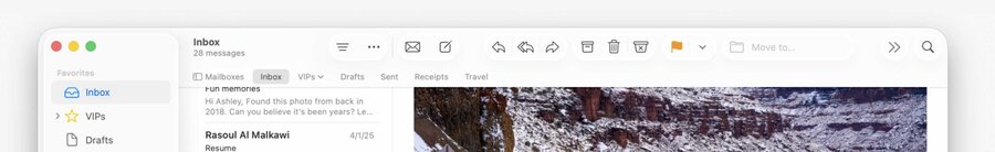
Split item accessories
Similar to titlebar accessories.
Only span one split within the Split View.
Automatically add scroll edge effects underneath floating content.
Use the new
NSSplitViewItemAccessoryViewControllerAPI.
Controls
Sizes
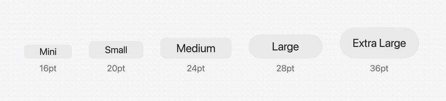
Standard sizes: mini, small, medium, large.
New size: extra large.
Should be used for showcasing the most prominent actions in your app.
Metrics
Controls are larger across the board.
Use Auto Layout to avoid hard coding varying heights.
For compatibility, you can opt out of the new metrics by using the
NSView.prefersCompactControlSizeMetricsAPI.
Shapes and prominence
The mini through medium sizes retain a rounded-rectangle shape.
The large and extra-large sizes round out into a capsule shape.
You can override the shape of a button, popup button, or a segmented control by using the new
borderShapeproperty.You can also override the material using the
bezelStyleproperty.Controls now have configurable levels of prominence, accessible via the
NSTintProminenceenum and thetintProminenceproperty.
Menus
Menu items now use icons to represent key actions.
Glass effect view
Use
NSGlassEffectViewto place yourcontentViewon glass.You can customize the appearance of the glass using the
cornerRadiusandtintColorproperties.If you have multiple glass shapes in close proximity, group them together using
NSGlassEffectContainerView.This avoids visual artifacts and improves performance.
Adaptive appearance is also shared within groups.
