Summary
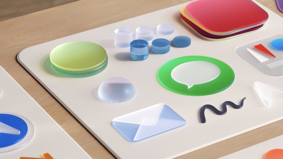
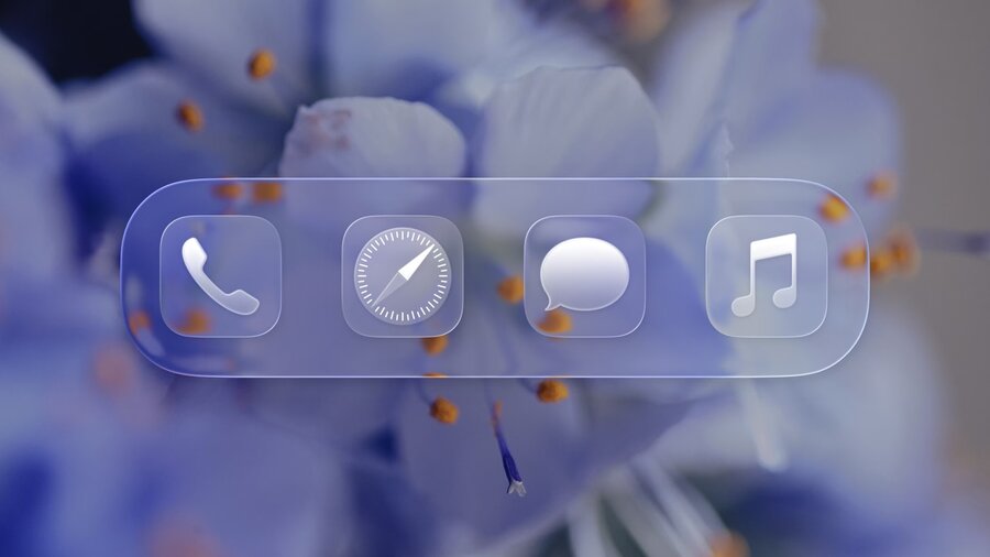
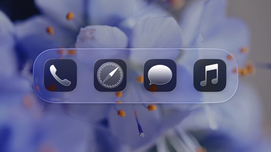
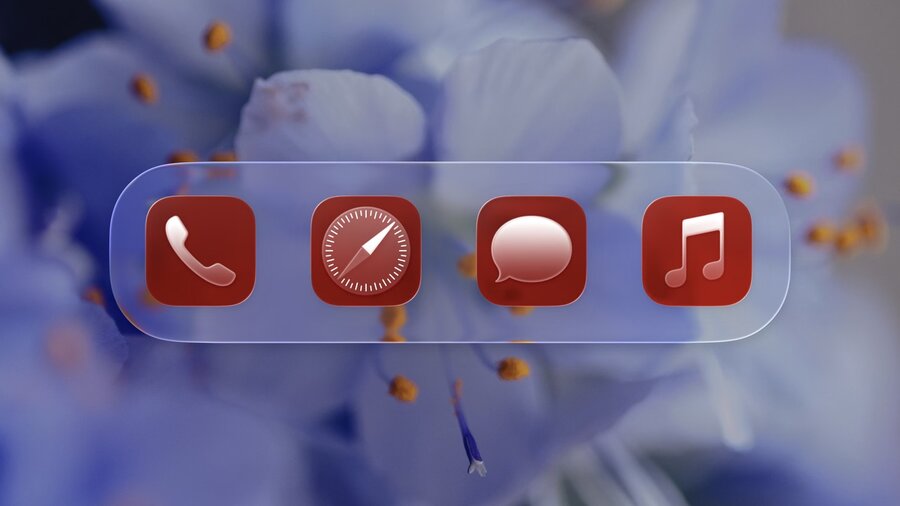
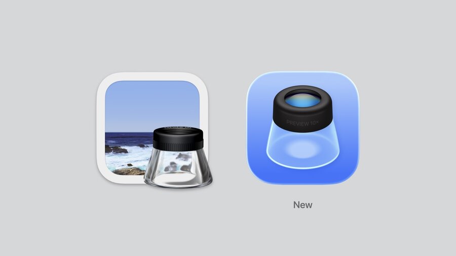
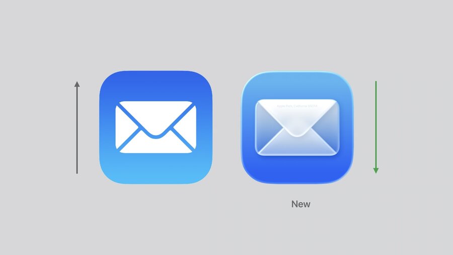
Liquid glass material introduces layered translucency, frostiness, and edge highlights for depth and internal glow.
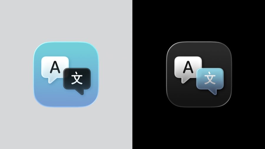
New appearance modes: light/dark monochrome and two tinted glass options enrich color expression.
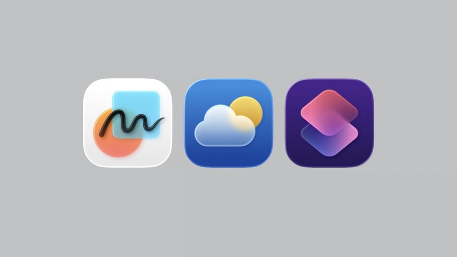
Unified iconography system standardizes grids and corner radii for rounded rectangles and circles across devices.
Layering, translucency, and simplicity are essential to maximize the new material effects.
Avoid sharp edges; prefer rounder corners and bolder lines to preserve detail and enhance lighting.
Presenters
Marie Dommenget, Apple Design Team
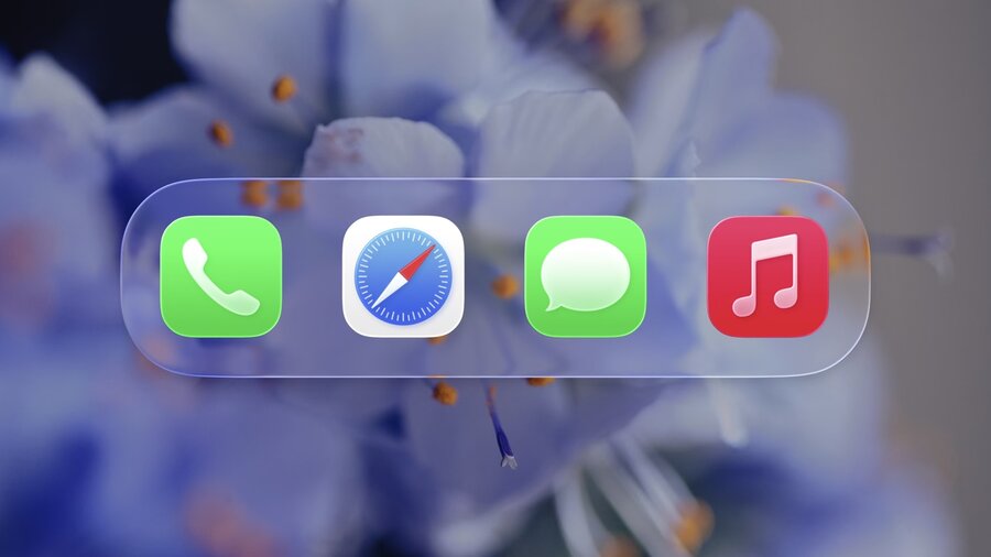
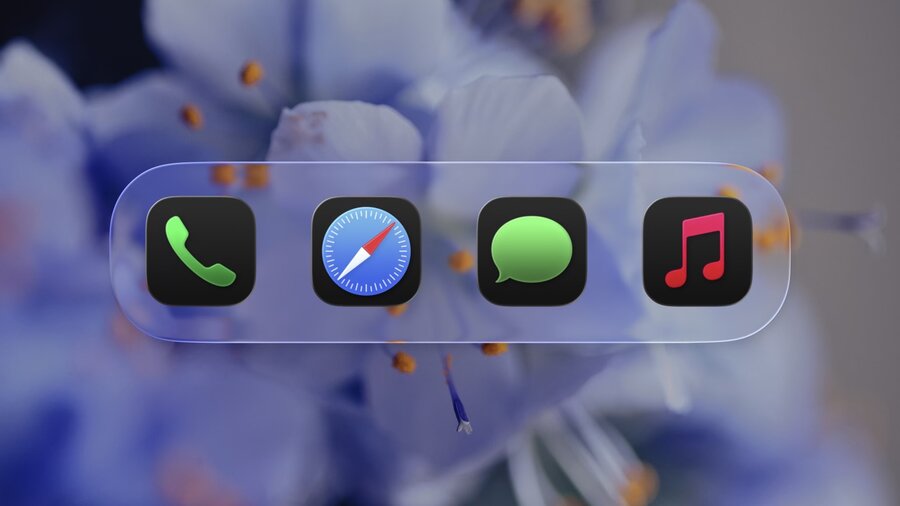
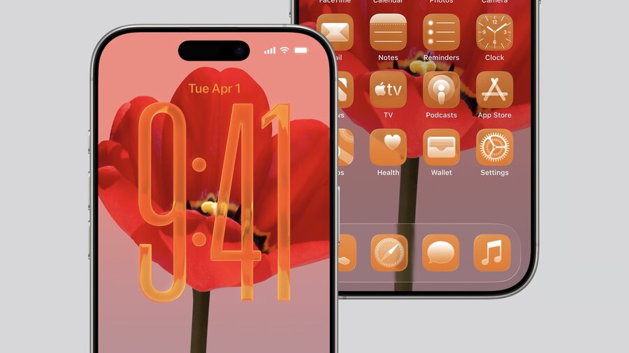
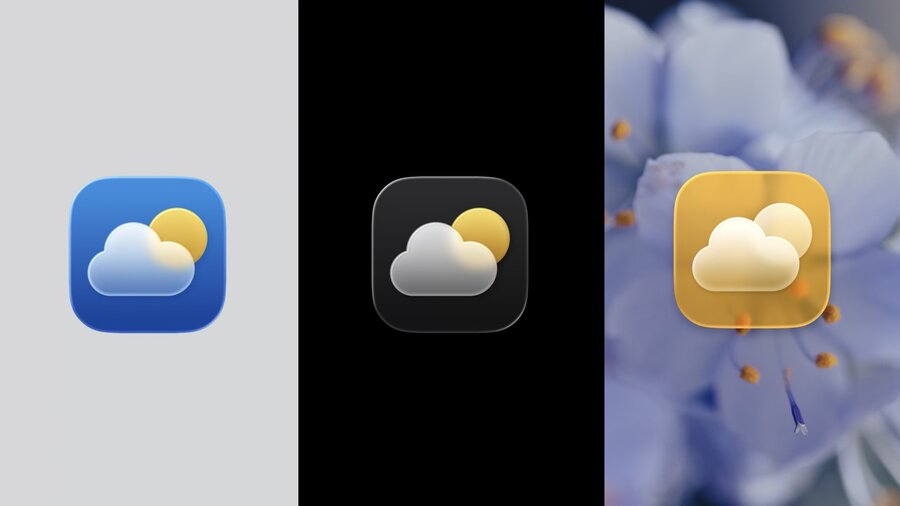
Appearance Modes
Support for light and dark modes with liquid glass effects.
New translucent modes:
Monochrome glass (light and dark variants)
Tinted glass with dark foreground tint or light glass-infused color.
Available on iPhone, iPad, Mac, Apple Watch, and reflected on App Store pages.
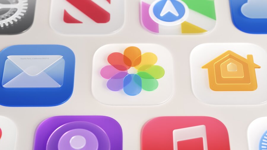
Unified Design System
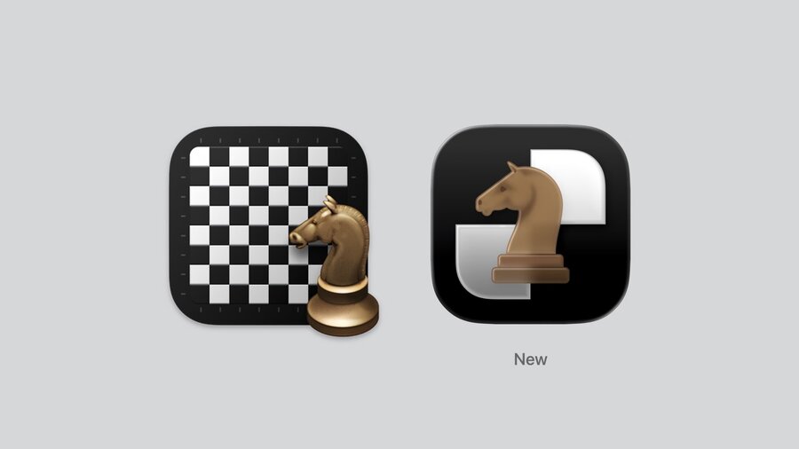
Previous platform-specific icon designs replaced by a single, consistent language.
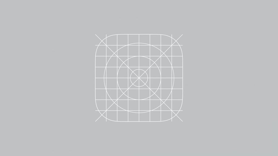
Updated 1024px canvas for rounded rectangles and circles, with simpler, evenly spaced grids and rounder corners.
macOS icons now use the canvas shape as a mask, automatically fitting artwork and removing irregularities.
Recommended to redraw icons to fully utilize the new canvas for best results.
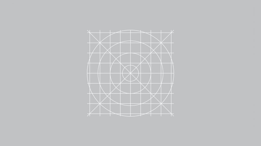
watchOS circular icons use a 1088px canvas aligned with the rounded rectangle grid for visual consistency.
Design Principles
Layering
Icons consist of one background and multiple foreground layers to add dimensionality.
Layer stacking enhances richness and depth (e.g., Podcasts icon).
Illustration Style
Avoid complex 3D perspectives that compete with material effects.
Prefer flatter, frontal views that complement translucency and lighting.
Translucency & Blur
Easy to apply with new materials, adds lightness and multi-layer depth.
Works well in all modes including transparent backgrounds.
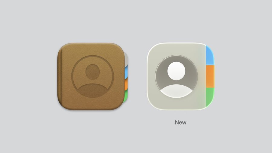
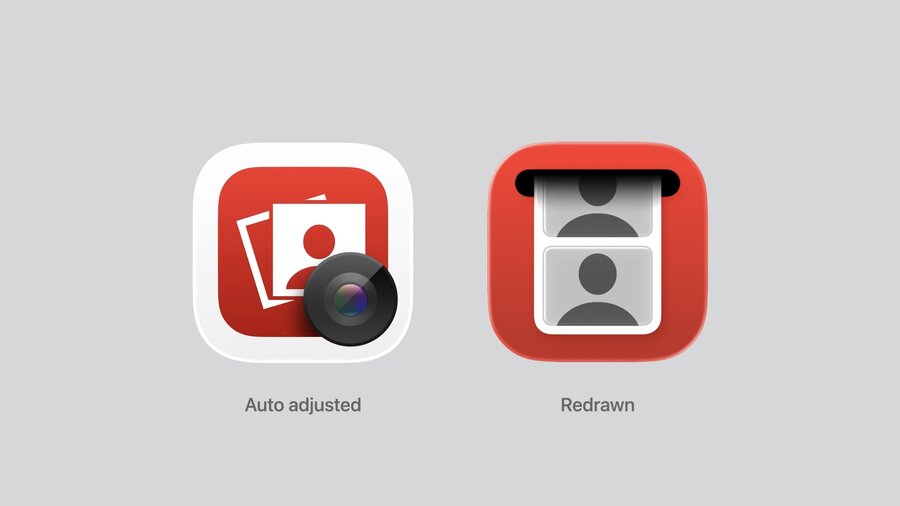
Simplicity
“Less is more”: reduce overlapping layers to let material nuances shine.
Remove baked-in effects like shadows or bevels from source artwork.
Example: Photos and Home icons simplified for better glass effect.
Details
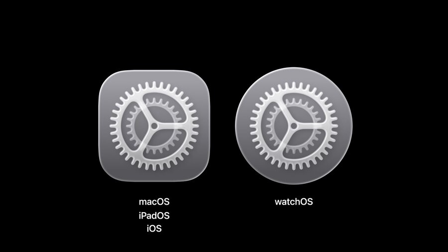
Avoid sharp edges and thin lines.
Use rounder corners and bolder strokes for better light travel and clarity at small sizes (e.g., Settings icon).

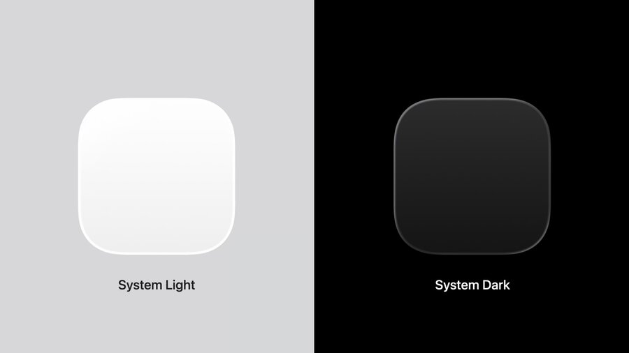
Backgrounds
Use soft light-to-dark gradients (System Light and Dark) instead of pure white or black.
Gradients harmonize with lighting direction and enhance contrast.
Colored backgrounds recommended to improve distinction in dark mode.
Resources
Updated templates for Figma, Sketch, Photoshop, and Illustrator available on Apple Design Resources.
Companion talk “Make app icons with Icon Composer” recommended for building icons with the new material.
