Presenter
Zhiyu (Apollo) Zhu, SwiftUI Engineer
Key takeaways
🌦️ Present weather trends
🎭 Track mood & vitals
📉 Plot Mathematical Functions
📊 Vectorized Plotting APIs
LinePlot and AreaPlot API
LinePlots allow plotting of normal distributions across a graph of data.
Accessible by default meaning Voice Over can describe the chart as well as use of Audio Graph
func normalDistribution(_ x: Double, mean: Double, standardDeciation: Double) -> Double {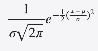
}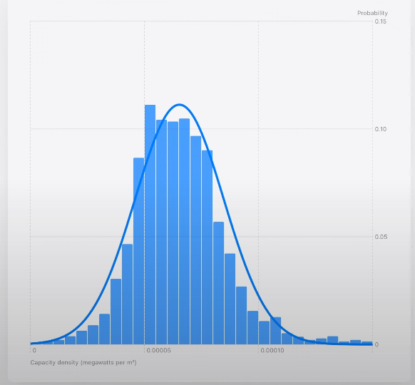
Chart {
LinePlot(
x: "Capacity density", y: "Probability"
) { x in
normalDistribution(
    x,
    mean: mean,
    standardDeviation: standardDeviation
)
}
.foregroundStyle(.gray)
}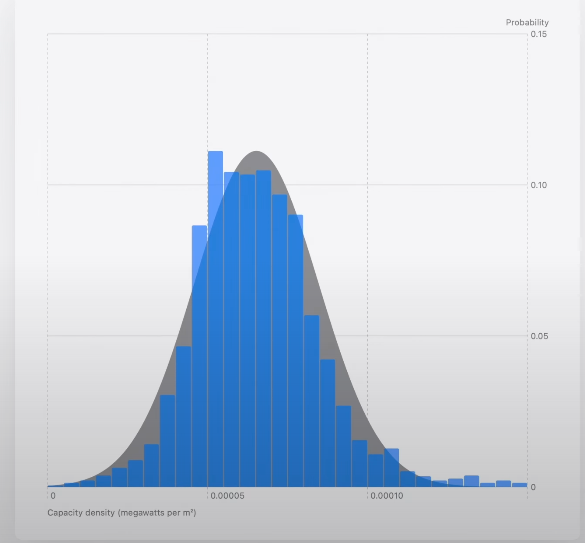
Chart {
AreaPlot(
    x: "Capacity density", y: "Probability"
) { x in
    normalDistribution(
        x,
        mean: mean,
        standardDeviation: standardDeviation
    )
}
.foregroundStyle(.gray)
.opacity(0.2)
}
AreaPlot can visualize area between functions by returning a tuple of yStart and yEnd for a given input x.
Functions accept an unbound range of x values.
Set Bounds using XScale and YScale. Also you can limit AreaPlot’s domain.
Chart {
    AreaPlot(
        x: "x", yStart: "cos(x)", yEnd: "sin(x)",
        domain: -135...45
    ) { x in
        (yStart: cos(x / 180 * .pi),
        yEnd: sin(x / 180 * .pi))
    }
}
.chartXScale(domain: -315...225)
.chartYScale(domain: -5...5)
Parametric Functions
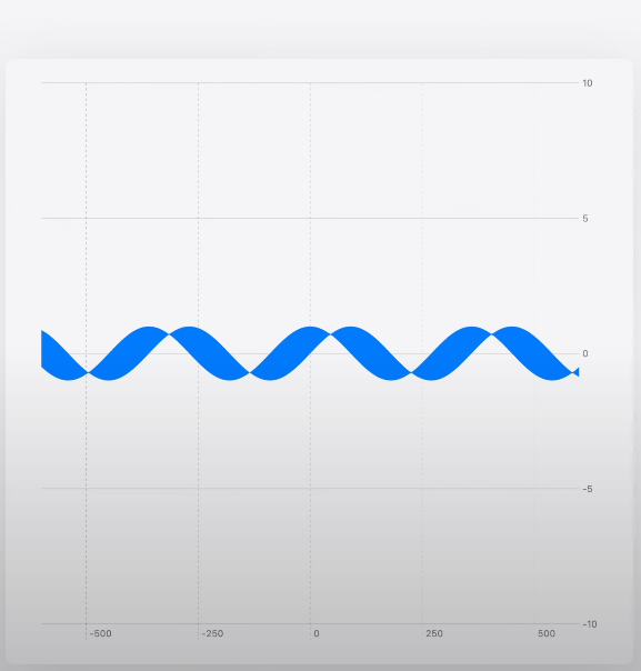
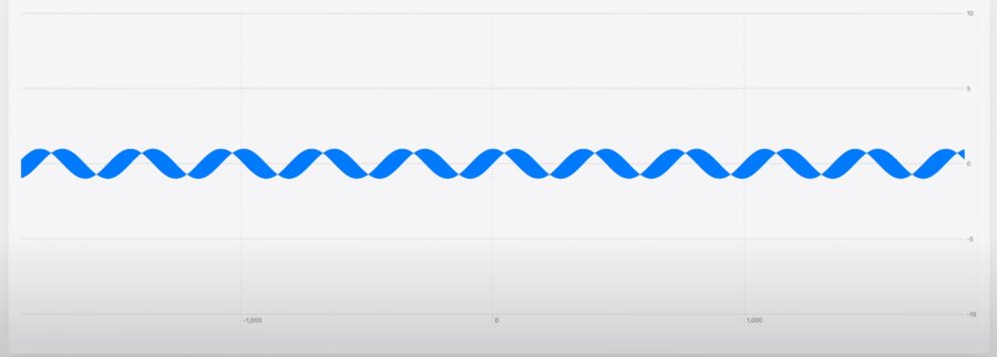
Parametric fuctions can be graphed using the same LinePlot API
x and y are defined in terms of a 3rd variable, t.
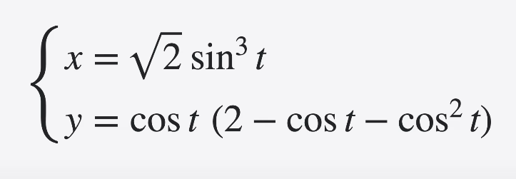
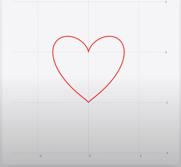
Chart {
    LinePlot(
        x: "x", y: "y", t: "t", domain: -.pi ... .pi
    ) { t in
        let x = sqrt(2) * pow(sin(t), 3)
        let y = cos(t) * (2 - cos(t) - pow(cos(t), 2))
        return (x, y)
    }
}
.chartXScale(domain: -3...3)
.chartYScale(domain: -4...2)
Piecewise functions
Piecewise functions may not have certain values within domain.
Returning .nan informs Swift Charts there’s not a number for that input value x or special values of x
Chart {
    LinePlot(x: "x", y: "x + 1 for x ≥ 0") { x in
        guard x != 0 else {
            return .nan
        }
        return x + 1
    }
}
.chartXScale(domain: -5...10)
.chartYScale(domain: -5...10)
Chart {
LinePlot(x: "x", y: "1 / x") { x in
guard x != 0 else {
return .nan
}
return 1 / x
}
}
.chartXScale(domain: -10...10)
.chartYScale(domain: -10...10)Extensive Data Visualizations
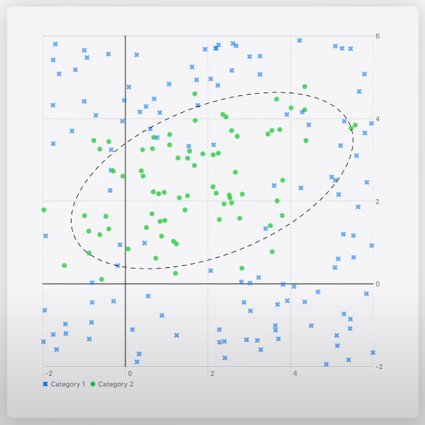
Scatter plots can visualize a classification model
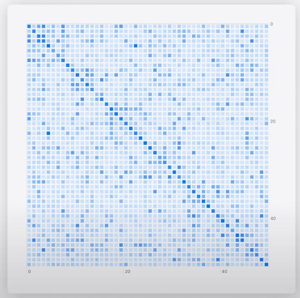
Heatmaps can visualize a transformer language model’s self-attention
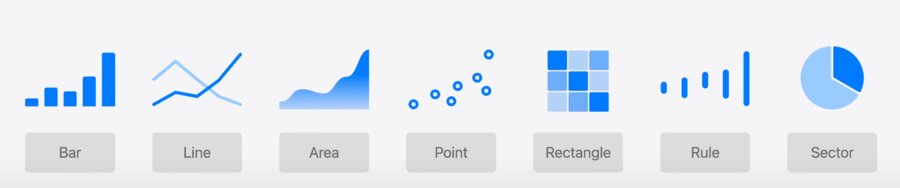
Marks API Review
The flexibility of marks allows you to style each data point differently, though entire collections tend to be styled homogeneously.
Chart {
    ForEach(model.data) {
        if $0.capacityDensity > 0.0001 {
            RectangleMark(
                x: .value("Longitude", $0.x),
                y: .value("Latitude", $0.y)
            )
            .foregroundStyle(by: .value("Axis type", $0.axisType))
        } else {
            PointMark(
                x: .value("Longitude", $0.x),
                y: .value("Latitude", $0.y)
            )
            .opacity(0.5)
        }
    }
}
Chart {
ForEach(model.data) {
RectangleMark(
x: .value("Longitude", $0.x),
y: .value("Latitude", $0.y)
)
.foregroundStyle(by: .value("Axis type", $0.panelAxisType))
.opacity($0.capacityDensity)
}
}RectanglePlot API Example
Chart {
    RectanglePlot(
        model.data,
        x: .value("Longitude", \.x),
        y: .value("Latitude", \.y)
    )
    .foregroundStyle(by: .value("Axis type", \.panelAxisType))
    .opacity(\.capacityDensity)
}
PointPlot API Example
PointPlots take the same .value syntax. It’s use of KeyPaths allow styling all points without iterating over the dataset. Use of .symbolSize makes points represent capacity.
Chart {
    contiguousUSMap

    PointPlot(
        model.data,
        x: .value("Longitude", \.x),
        y: .value("Latitude", \.y)
    )
    .symbolSize(by: .value("Capacity", \.capacity))
    .foregroundStyle(
        by: .value("Axis type", \.panelAxisType)
    )
}
Model definition
@Observable class Model {
    var data: [DataPoint]
}
Stored Properties allows Swift Charts to access the x and y values for all data points with a constant memory offset instead of calling the getter for every data point.
struct DataPoint: Identifiable {
    let id: Int

    let: capacity: Double
    let: panelAxisType: String

    let: xLongitude: Double
    let: yLatitude: Double

    // Albers projection
    var x: Double
    var y: Double
}
Chart Modifiers
foregroundStyle
opacity
symbol
symbolSize
lineStyle
accessibilityLabel
accessibilityValue
accessibilityIdentifier
position
accessibilityHidden
When to Use
Use Vectorized Plots for larger datasets where the entire plot is customized with the same modifiers and properties.
Use the Mark API when you have fewer data points, but need to customize each element with individual mark types and modifiers, or if you need complex layering with zIndex.
Vectorized Plot Performance
Group data by style
Avoid computed properties
Specify scale domains if known
Avoid unnecessary styling
