
Key Takeaways
Design = making something with intention, focused on what matters most to people
8 principles: Purpose, Agency, Responsibility, Familiarity, Flexibility, Simplicity, Craft, Delight
There’s no formula for combining these principles that guarantees a perfect solution — use your knowledge and intuition
Presenters
Linda Dong, Design Evangelism
Doug LeMoine, Design Evangelism
Purpose
Before sketching or writing a line of code, ask whether what you’re making has a purpose
Every feature asks for the user’s time, attention, and trust — don’t waste them
Design through subtraction: choosing what to build is often deciding what to leave out
Agency
People feel in control when you let them do things their own way
An interface should never stand in the way of what someone is trying to do
Don’t guide someone down a pre-determined path — let them dive into your experience and explore at their own pace
Offering choices is the best way to bring agency into your experience → people are far more engaged
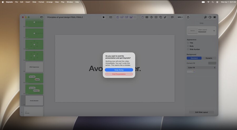
Offer forgiveness — people will make mistakes or wander down paths they didn’t mean to
Make it easy to undo any action (send, change, delete)
Double-check destructive actions with a confirmation
Interrupt only when someone is about to make a big mistake → avoid disaster
Forgiveness lets people feel capable and free to explore, knowing they can always recover
Responsibility
Giving people freedom means also protecting their well-being — act in their best interest
Start with privacy (privacy is a human right)
Anti-pattern: throwing permission prompts the second the app launches, long before the user knows what it does
Anti-pattern: asking for information without context for what it’s for
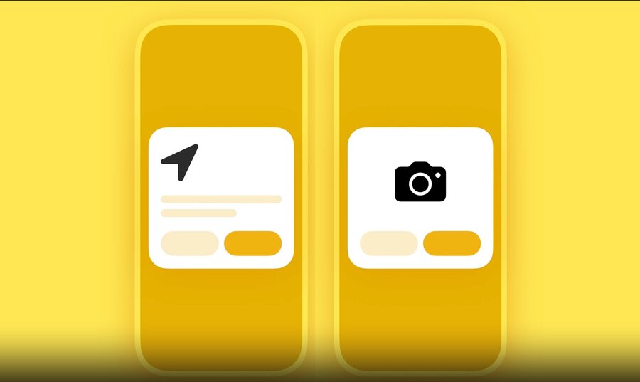
Treat people and their private information with respect, just like in the real world
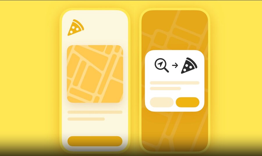
Wait for the right moment to ask for personal data
Only ask for what’s necessary, and be transparent about what the data is for
Beyond privacy, keep people safe
How could this be misused?
Who would be harmed by this?
How do I prevent it?
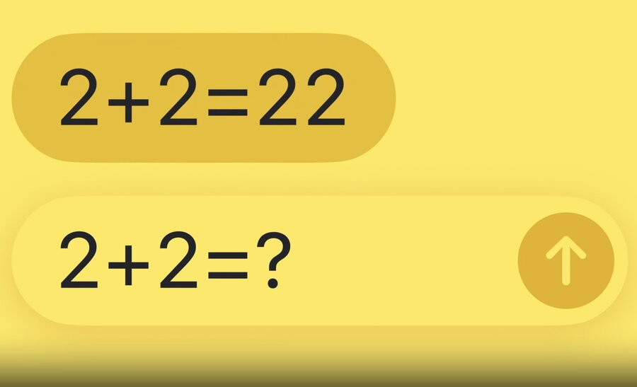
For intelligence features, anticipate that a model might generate something unexpected or inaccurate
e.g. a recipe app suggesting an ingredient someone logged an allergy to → real-world harm
Think realistically about what could go wrong and add safeguards (previews, confirmations, disclaimers)
Consider removing a feature entirely if the risks to safety outweigh its value

Familiarity
Building on what people already know — lean on their real-world experience and conventions from other interfaces to make your design intuitive
Use metaphor (used since the earliest interfaces to help people get familiar with software)
Too literal → people may not recognize what you’re trying to show
Too abstract → you risk your idea not getting across
A good metaphor draws on something people know and helps them predict what it will do
Don’t reinvent established metaphors — using a trash can for anything but delete breaks people’s expectations
For common actions, use the metaphors people already know and make them do what’s expected

Familiarity also comes from being consistent — it helps people predict what happens next
Things that look the same should behave the same
Keep actions in the same place across screens and devices (e.g. close a window from the top-left on Mac) → people don’t have to think, it speeds them up
Flexibility
People use your design in ways as unique as they are → support all the different contexts they’re in
Flex across hardware and contexts — the same task (e.g. listening to music) differs at home (speakers), on a run (AirPods + watch), or driving (hands-free)
Tailor to each platform’s strengths: iPhone → quick touch interactions, Mac → deep workflows and precise pointer control
Flex for the person using it
Get curious: how old are they? what languages? pro or novice? do they rely on accessibility features?
You won’t solve for everyone on day one, but start making the experience more inclusive
Personalize — when no single layout fits everyone, let people rearrange or hide controls to match their workflow
Simplicity
Strip away the unnecessary so the core purpose of your design can shine
Simple ≠ minimal — burying all functionality in one place looks minimal but isn’t simple
Simple designs are frictionless and intuitive: people find what they need without effort
Achieved by being concise and clear
Concise interfaces use plain language and respect people’s time
Strip away jargon and speak naturally
Avoid redundancy and get straight to the point
Reduce the number of steps it takes to get things done
Clear interfaces perfectly communicate what they do — use hierarchy (order, spacing, contrast) to guide people to what matters most
Answer people’s questions: what do I pay attention to? what can I interact with? how?
Every element should earn its place — cut anything that doesn’t clarify your point
Simpler can mean adding more — a play button plus progress, time remaining, and position gives context so people can make informed decisions. You’ve arrived at simplicity when you have exactly enough.
Craft
Attention to detail that tells people you really care about the experience
Poor craft feels fragile — laggy buttons, jittery scrolling, misaligned icons, broken layout on rotation
Ingredients of well-crafted design
Beautiful fonts that look great across devices
Thoughtful colors that adapt across light and dark
Clear graphics and iconography
Responsive animations that feel fluid and give immediate, natural feedback

Getting to that quality takes time — craft comes from iteration, making every last piece work beautifully
Maintain your design over time — great design has longevity, so keep evolving it as new features and hardware arrive
Craft is an uncompromising commitment to the details. Get them right and people will know you care.
Delight
Hard to define, but you recognize it instantly — delightful interfaces are satisfying, enriching, and create a real emotional connection
Not confetti or flourishes tacked on at the end
Starts when an experience feels human — identify the emotion you want people to feel (relaxed, confident, excited) and reinforce it through your design
Delight is the sum of the consideration you put in — the natural result of getting all the other principles right
