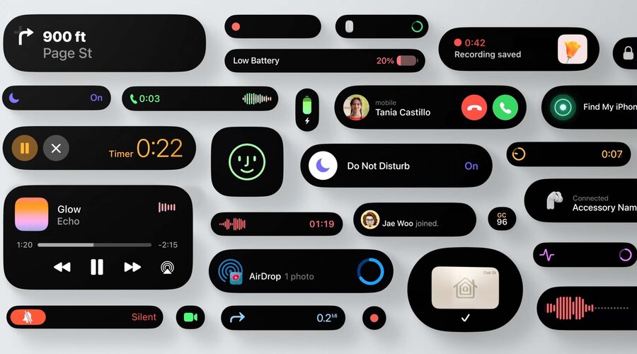
What are Live Activities?
Use rich graphical layouts to display their information and update seamlessly inline
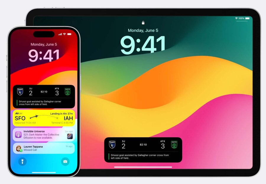
On the lock screen, Live Activities live at the top of the list alongside notifications
What can be a Live Activity?
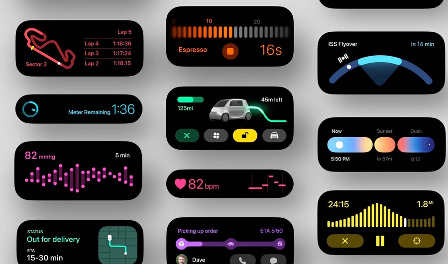
Anything someone wants to keep track of for a few minutes to a couple hours can be a Live Activity
Examples:
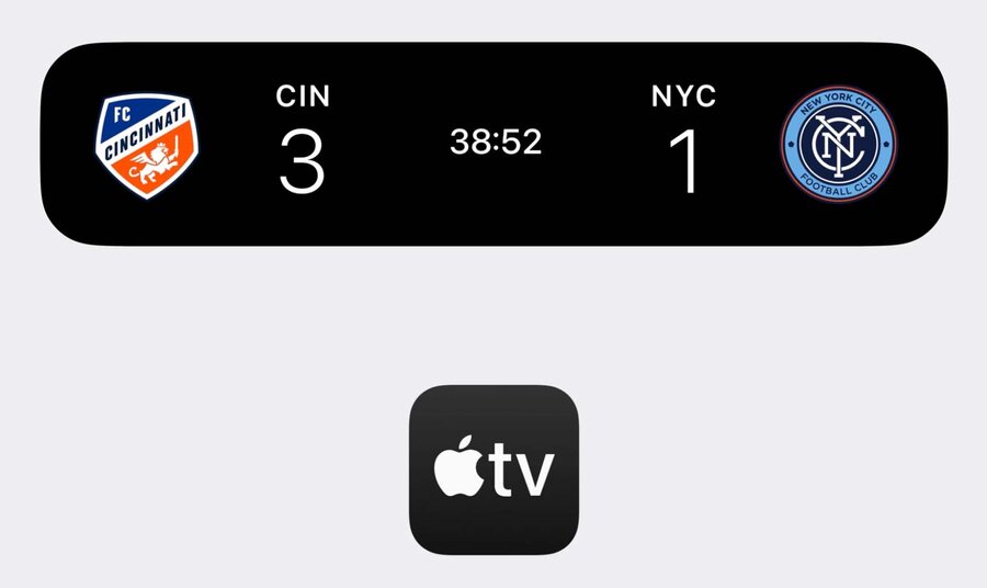
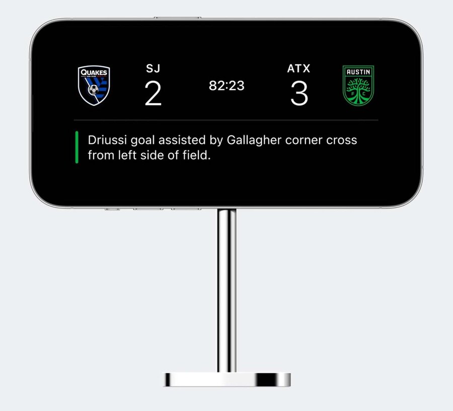
Sports
Ridesharing
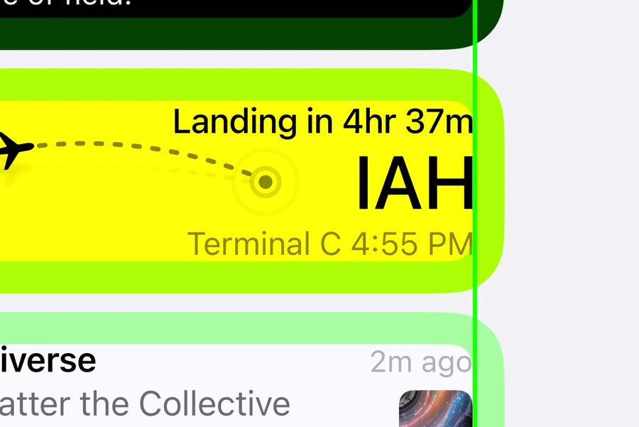
Delivery tracking
Live workouts
Lock Screen
Lock Screen Design Tips
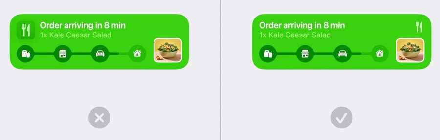
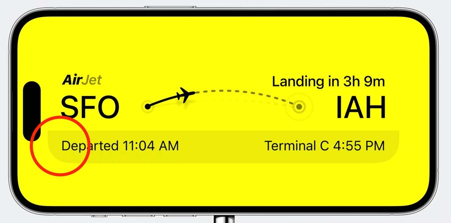
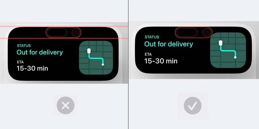
Be aware of 14pt margins added to all notifications.
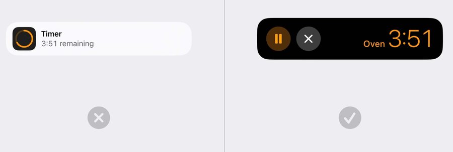
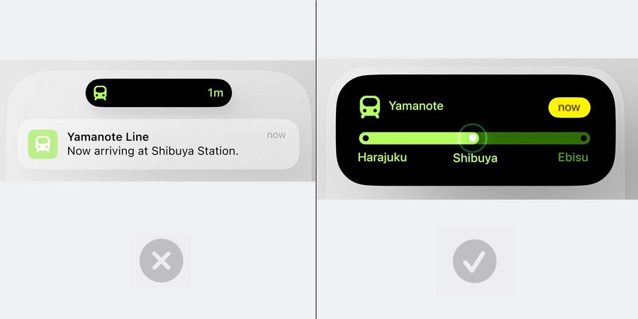
Try not to replicate the notification layouts themselves. Rather, create a layout that is unique and specific to the information you are displaying.
Buttons should only be used if they’re controlling an essential part of the activity itself
Best result is when your Live Activity and app feel like they share the same visual aesthetic and personality
Consider the colors, iconography, typefaces, and other attributes from your app that you can use
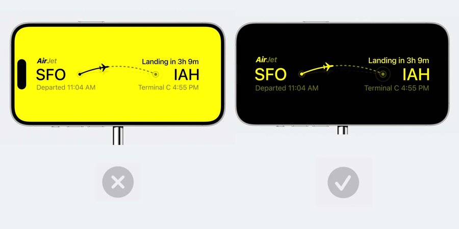
Don’t alter your colors between light and dark mode if it breaks this visual association
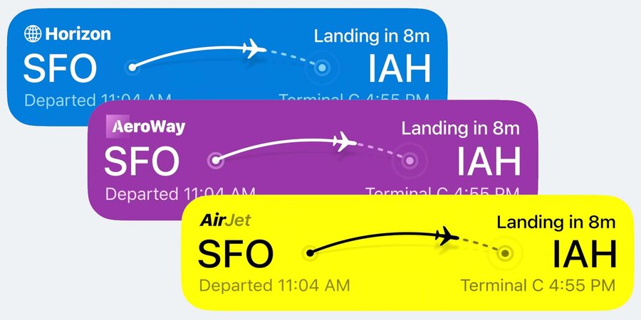
You can also change the colors based on the content that it’s representing to create a more dynamic and engaging visual of your information.
If you do use a logo mark as part of your brand, make sure it’s integrated uncontained into the layout itself rather than just using your whole app icon
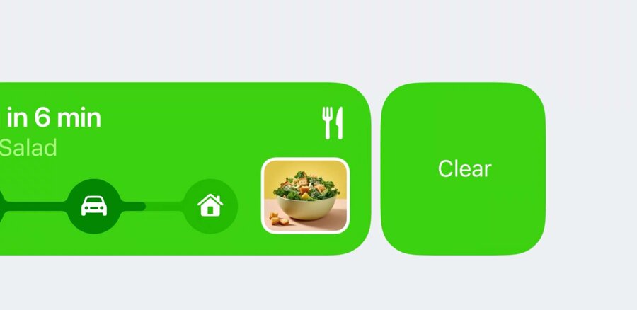
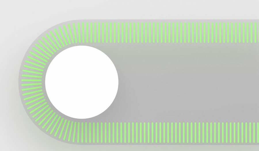
The background and foreground colors your Live Activity provides are used to automatically generate a matching dismiss button when swiping
Make sure to check that the resulting button looks correct
Spacing
IMPORTANT: Ensure your Live Activities are not too tall, since this area is shared with notifications, music player, etc
Look for ways to reduce the height of your design by adjusting the size and placement of elements so they can better fit together and be more compact.
Dynamically change the height of your Live Activity between different moments as you have more or less information to display.
Transitions
Use the numeric content transition to count up or down important numbers in your Activity.
For animating in and out graphic elements and text, use the content replace transition.
You can also create your own by combining different animations of the scale, opacity, and position of elements.
Alerting
Do not send secondary notifications to alert user of something related to your Live Activity, instead use your Live Activity
Alerting lights up the screen and plays the standard notification sound
Emphasize the information that caused the alert in your layout during this transition.
Removal
If your Live Activity has ended and is no longer relevant, make sure to remove it from the lock screen after a short duration of time
Standby Design Tips
Standby is a new feature that lets you use your iPhone as an ambient informational display.
Your layout is scaled up 200% to maximize its size
Ensure assets and images you are using in your design are high enough resolution to be displayed at this larger size
Avoid using graphic elements that extend to the edge of your Live Activity, use dividing lines or a containing shape instead
When in Standby mode, consider removing your background and blend your layout seamlessly into the device bezel
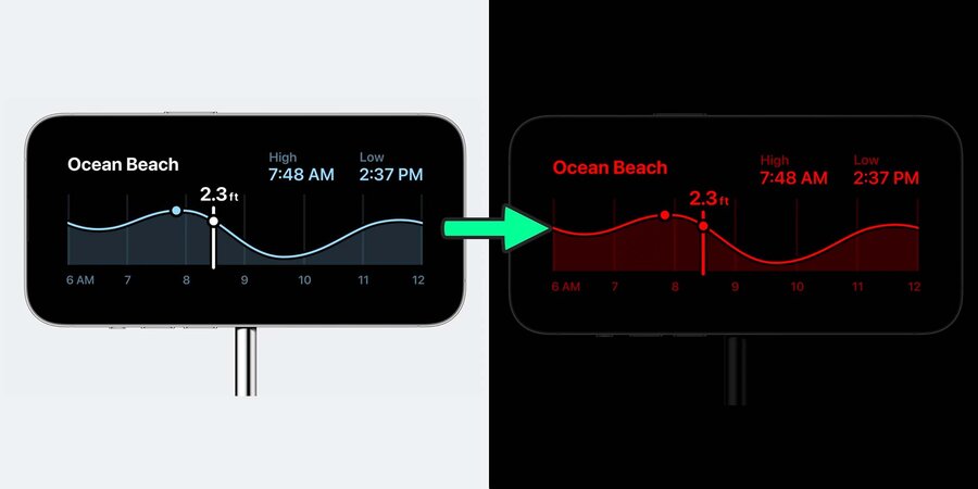
Live Activities in SandBy automatically gain “night mode” that transitions the display to a red tint in low light.
Check to make sure your colors have enough contrast while in night mode
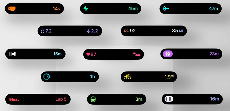
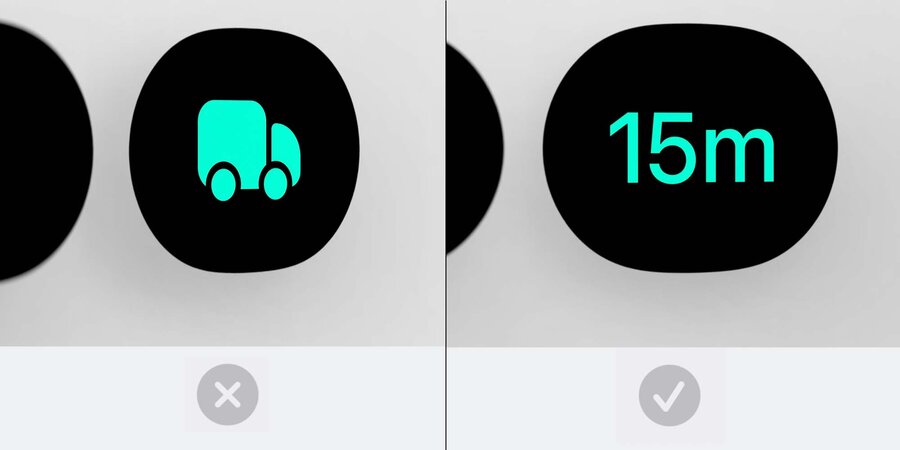
Dynamic Island Design Tips
Use of animation and continuously updating data here makes it feel more alive
Extra rounded, thicker shapes, as well as large, heavier weight, easy-to-read text works well
Use color to convey identity
Dynamic Island is very sensitive to the shape and placement of things inside it. It’s really important to place objects and information in it in a way that stays in harmony with this shape.
Be concentric with its shape. This is when rounded shapes nest inside of each other with even margins all the way around.
Different Size Classes
Compact View
Compact is most common. Used help people keep an eye on an Activity while using their phone.
It’s meant to be informational, communicating the most essential things about an activity
When you want to show multiple sessions for your app going on at once, consider ticking between the display of them
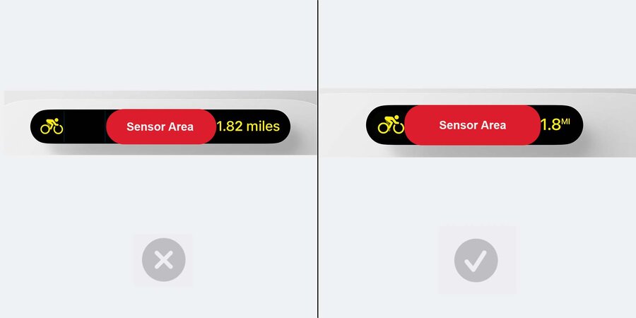
Be as narrow as possible with no wasted space.
Ensure content is snug against the sensor region.
If you need to alert users of an event during your session, rather than sending a push notification, when possible, expand the island to present that information
Expanded View
In addition to alerting you, people can press into the Dynamic Island to zoom into this view and see more information, and access essential controls.
Try to get to the essence of your activity here, not showing too little or too much.
Emphasize rounded, thicker shapes, and a liberal use of color to establish identity.
Try and maintain the relative placement of things between the expanded/compact views for cohesiveness.
Try to keep the tallness of your expanded view within reason
Avoid having a “forehead” at the top that calls attention to the sensor region
Minimal View
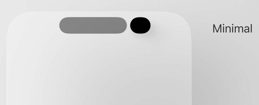
This view is shown when juggling between multiple sessions going on at once
Avoid reverting to purely just a logo here, and think about how your session can continue to convey information even in this tiny state.
