Speakers: Lorena Pazmio, Miquel Estany Rodriguez
UI Foundations
App icons
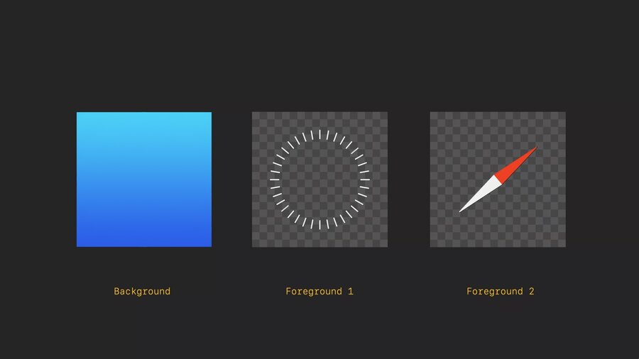
App icons are familiar but 3D
When looked at, they expand
System handles this effect by adding specular highlights and shadows
Use multiple layers
Up to 3
Each layer is a square image
1024×1024
Circular mask is automatic
Automatically shadow cast behind foreground layers
Keep graphics centered
Avoid layers with reduced opacity
Materials
Apps should be easy to place
Apps should be easy to use at any distance
Apps should be easy to view in any lighting condition
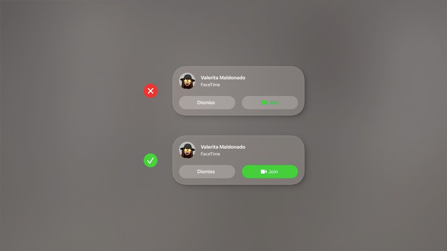
Windows act as a canvas for UI
Avoid opaque windows
Too many opaque windows makes UI feel heavy and overwhelming
No distinct light and dark mode
Lighting in the room influences the UI
Glass window
Sidebars use darker materials
Other elements uses lighter materials
Inputs that are highlighted might user darker materials
Don’t stack lighter materials because it impacts contrast
Unlike iOS/macOS: No light and dark modes, glass adapts naturally
Typography
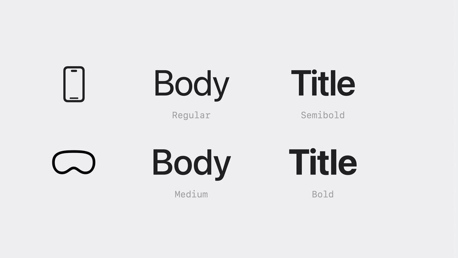
Semantic names
Point based unit sytem
Font weight
Modified to be slightly heavier on visionOS
Body is semibold by default
Extra Large Title Styles
Editorial
Use bolder font weights for legibility
Vibrancy
Updates in real time
Works on top of the glass material
Use system components when possible
Takes advantage of vibrancy by default
Three modes:
primary: for standard textsecondary: for descriptions, footnotes, subtitlestertiary
Colors
Consider using white text or symbols
For color
Use it in a full button rather than just text
System colors adjust hue/vibrancy based on background
Layout
Ergonomics
Left and right neck motion is easier than up and down
Use wider aspect ratios than taller
Center important information in your app
Sizing
Use sizes that are easy to target
Tap targets should be at least 60x60 points of tappable space.
44 point buttons should have at least 8 points of space around it
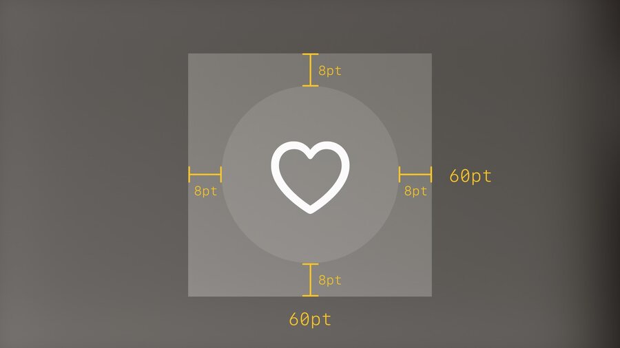
Buttons in stacks should have at least 16 points of space around them
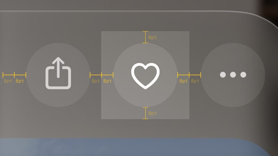
Mini buttons like 28 pixel size in section headers may look small but they have at least 60 points of space around them
Large and XL buttons require less spacing around them
Give interactive elements at least 60 points of space
Focus feedback
Hover effect is automatic
Disabled buttons don’t have a hover effect
Lists and menus should have 4 points of space for the hover effect
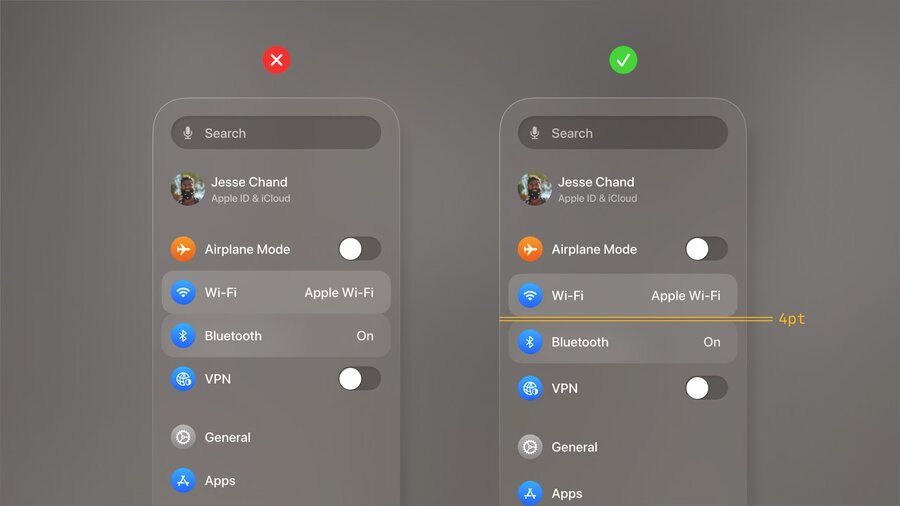
Same for a lockup like Music.
Define a custom region for a single selectable element.
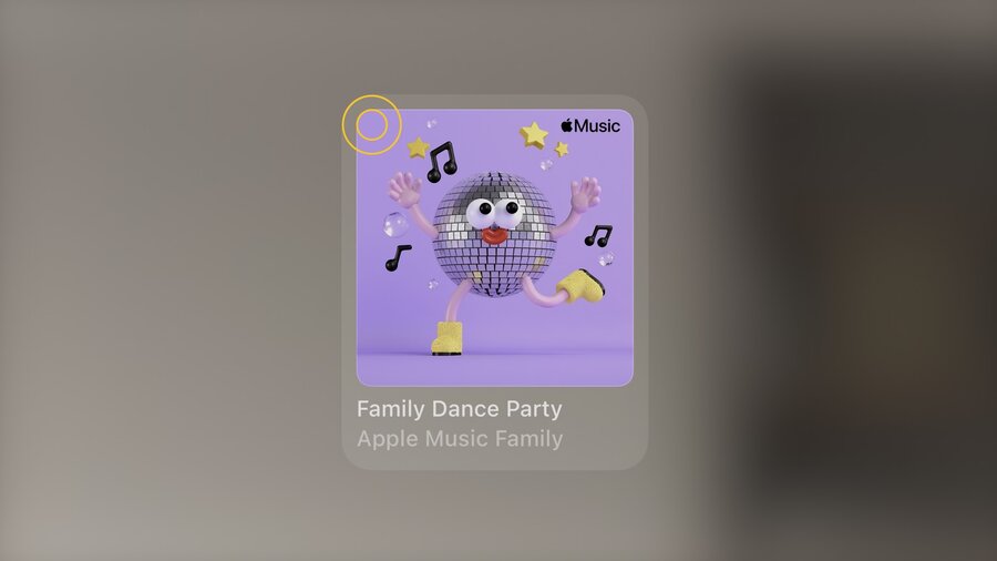
Nested elements should have concentric continuous corners.
inner corner radius + padding = outer corner radius
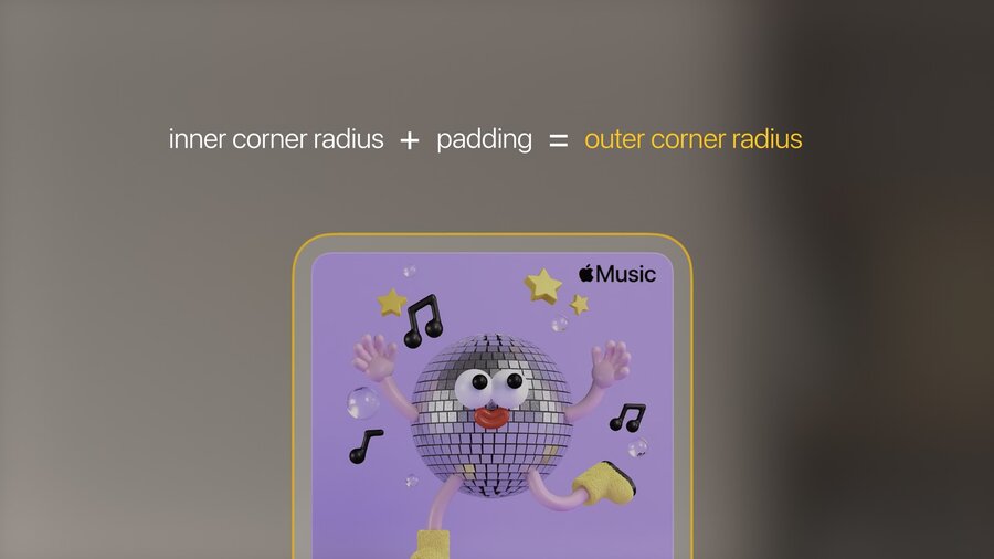
Every element is concentric to its nested elements
From screen to spatial
Inputs
Most interaction happens at a distance
Additionally, direct interaction or keyboard / trackpad
Use system components
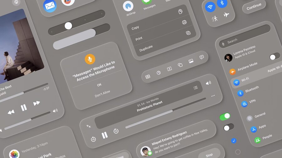
Window
made of glass material
with window bar below
Tab bar
Vertical and fixed on the left side of Windows
Avoid having more than 6 items
Long looks shows labels for each section (automatic expand & collapse)
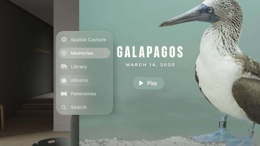
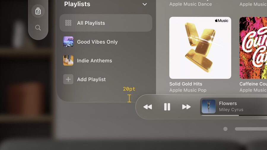
Side bar
Used to provide sub navigation from the tab bar
Ornaments
Replaced for segmented controls in iOS
Positioned outside the window with depth, at the bottom
Great for toolbars
Usually a collection of buttons: Borderless buttons
Examples: Years/Months/Days in Photos, Playback Controls in Music
At the bottom: Overlap by 20 points
Only hide ornaments when looking at a single piece of content
Ornaments can expand or have navigation hierarchy
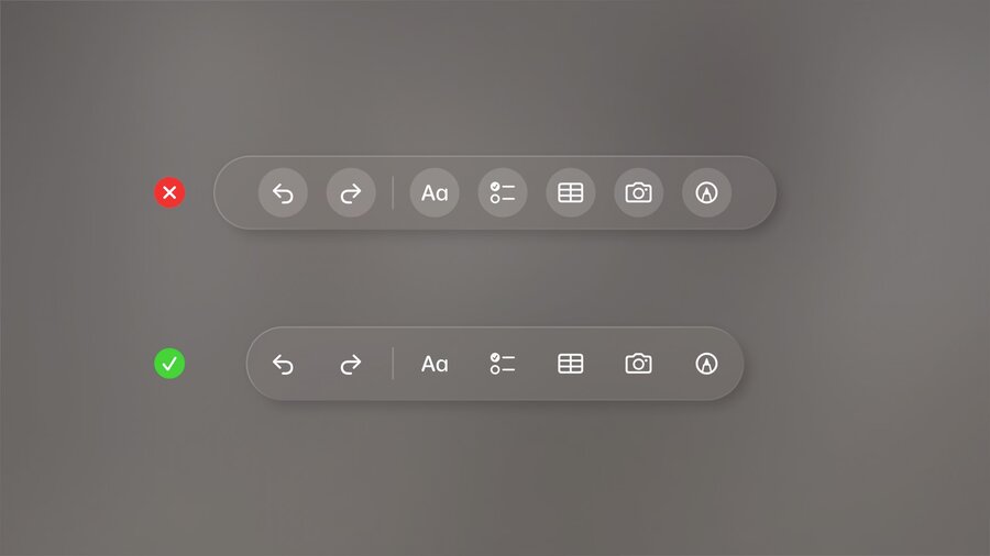
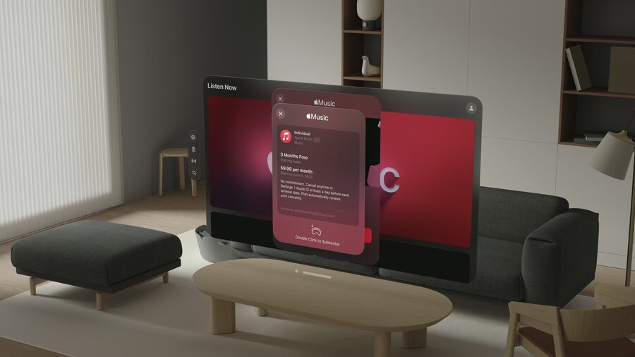
Menus and Popover
Centered
Can expand outside the window
Buttons should be selected when the menu or popover is open
Avoid using buttons with white backgrounds unless selected
Sheets
Centered
Maintain z position of the window and the window pushes back
Secondary modal cal be used with additional dimming
Consider push navigation within modals
Close and back buttons should be in the top left
“Pushing” a view onto the stack uses “cross dissolve” animation instead of moving to right
Outside windows
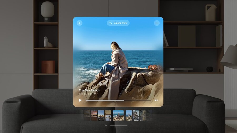
Spatial Captures, can be expanded

