About ScrollView
A ScrollView is an important block that lets you show everything that won’t fit on screen. Scroll views have axes that define the directions in which they’re scrollable. Scroll views have content, when it exceeds the size of the ScrollView, some of that content will be clipped. Scroll views ensure that the content is placed within the safe area by resolving the safe area into margins outsetting its content. A ScrollView evaluates its content either eagerly or lazily by using a lazy stack.
Margins and safe area
Content is clipped when scrolling if you add padding to the ScrollView
ScrollView(.horizontal) {
  LazyHStack(spacing: Spacing) {
    ForEach(palettes) { palette in
      HeroView(palette: palette)
    }
  }
}
.padding(.horizontal, hMargin)
New safeAreaPadding adds padding to the safe area
ScrollView(.horizontal) {
  LazyHStack(spacing: Spacing) {
    ForEach(palettes) { palette in
      HeroView(palette: palette)
    }
  }
}
.safeAreaPadding(.horizontal, hMargin)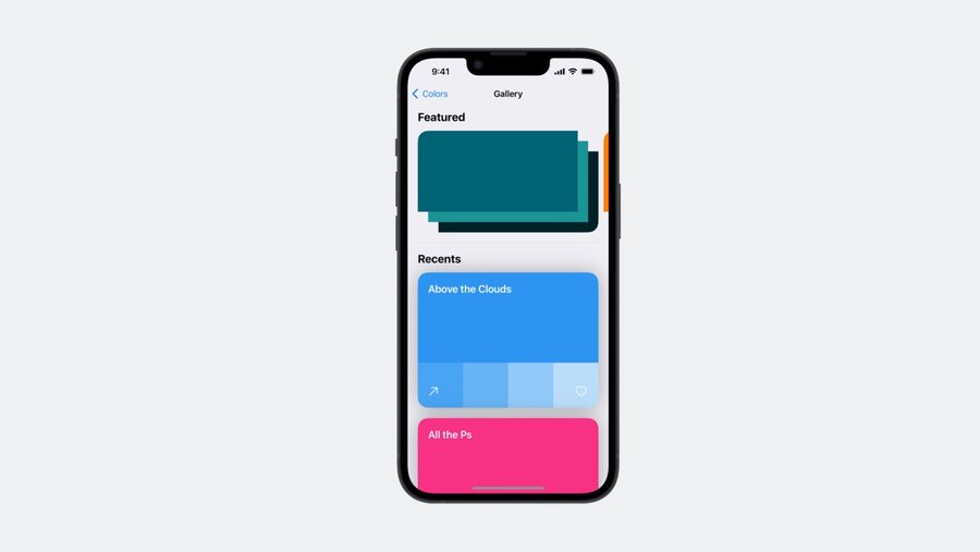
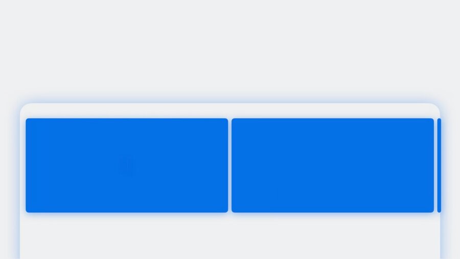
Different insets for different kinds of content
Inset the content of the ScrollView separately from the scroll indicators with contentMargins
ScrollView {
  // content
}
.contentMargins(
  .vertical, 50.0,
  for: .scrollContent
)
Inset the indicators separately from the content
ScrollView {
  // content
}
.contentMargins(
  .vertical, 50.0,
  for: .scrollIndicators
)
So, for the previous example, it is better to use the contentMargins API
ScrollView(.horizontal) {
  LazyHStack(spacing: Spacing) {
    ForEach(palettes) { palette in
      HeroView(palette: palette)
    }
  }
}
.contentMargins(
  .horizontal, hMargin,
  for: .scrollContent
)
Target content offset
Control what content offset the ScrollView will scroll to once someone lifts their finger with the new scrollTargetBehavior modifier.
Paging
Swipes one page at a time
ScrollView(.horizontal) {
  LazyHStack(spacing: Spacing) {
    ForEach(palettes) { palette in
      HeroView(palette: palette)
    }
  }
}
.contentMargins(.horizontal, hMargin)
.scrollTargetBehavior(.paging)
View aligned
When aligned to individual views, ScrollView needs to know which views it should consider for alignment. Use the scrollTargetLayout modifier to have each view in the stack be considered a scroll target.
ScrollView(.horizontal) {
  LazyHStack(spacing: Spacing) {
    ForEach(palettes) { palette in
      HeroView(palette: palette)
    }
  }
  .scrollTargetLayout()
}
.contentMargins(.horizontal, hMargin)
.scrollTargetBehavior(.viewAligned)
⚠️ Note: One more API to mark individual views as targets with
scrollTargetmodifier was mentioned during the session, but in fact it wasn’t released.
Custom alignment
Conform to the ScrollTargetBehavior protocol
struct GalleryScrollTargetBehavior: ScrollTargetBehavior {
  func updateTarget(_ target: inout ScrollTarget, context: TargetContext) {
    if target.rect.minY < (context.containerSize.height / 3.0),
      context.velocity.dy < 0.0
    {
      target.rect.origin.y = 0.0
    }
  }
}
View size based on container size
Use new containerRelativeFrame modifier to set view size based on it’s container size.
Witdh of a container
HeroColorStack(palette: palette)
  .frame(height: 250.0)
  .containerRelativeFrame(.horizontal)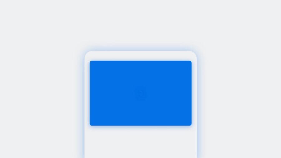
Grid like layout
HeroColorStack(palette: palette)
  .frame(height: 250.0)
  .containerRelativeFrame(
    .horizontal,
    count: 2,
    spacing: 10.0
  )
Conditionalize the count based on the horizontalSizeClass - two columns on ipad and one column on iphone
@Environment(\.horizontalSizeClass) private var sizeClass

HeroColorStack(palette: palette)
  .frame(height: 250.0)
  .containerRelativeFrame(
    .horizontal,
    count: sizeClass == .regular ? 2 : 1,
    spacing: 10.0
  )
Use aspectRatio to have a height relative to the width, instead of hardcoding a fixed height
@Environment(\.horizontalSizeClass) private var sizeClass

HeroColorStack(palette: palette)
  .aspectRatio(16.0/9.0, contentMode: .fit)
  .containerRelativeFrame(
    .horizontal,
    count: sizeClass == .regular ? 2 : 1,
    spacing: 10.0
  )
Scroll indicators
scrollIndicators(.hidden) hides the indicators on touch devices or when using more flexible input devices, like trackpads on Mac, but to allow the indicators to show when a mouse is connected.
Use scrollIndicators(.never) to always hide the indicators regardless of input device.
Change position
Change scroll position programmatically wth scrollPosition modifier
@State private var mainID: Palette.ID? = nil

VStack {
  GallerySectionHeader(mainID: $mainID)
  ScrollView(.horizontal) { ... }
    .scrollPosition(id: $mainID)
}

// in GallerySectionHeader
VStack {
  GalleryHeaderText()
  .overlay {
    GalleryPaddle(edge: .leading) {
      // When the binding is written to, the ScrollView will scroll to the view with that ID
      mainID = previousID()
    }
    // ...
  }
}
Scroll position modifier also uses the scrollTargetLayout modifier to know which views to consider for querying their identity values
Read position
scrollPosition also allows to know the identity of the view currently scrolled
// in GallerySectionHeader
@Binding var mainID: Palette.ID?

VStack {
  GalleryHeaderText()
  // Header view has text that shows the value of the hero image currently scrolled
  // When the most leading view changes, the binding automatically updates
  GallerySubheaderText(id: mainID)
}
Scroll transitions
Scale view down in size when it gets near the edges of the ScrollView wirh scrollTransition
HeroView(palette: palette)
  .scrollTransition(axis: .horizontal) { content, phase in
    content
      .scaleEffect(
        x: phase.isIdentity ? 1.0 : 0.80,
        y: phase.isIdentity ? 1.0 : 0.80
      )
}
Rotation or offset can be custimized as well. But not all view modifiers can be used inside of a scrollTransition. For example, customizing the font is not supported. Anything that will change the overall content size of the ScrollView cannot be used within a scrollTransition modifier.
HeroView(palette: palette)
  .scrollTransition(axis: .horizontal) {
    content, phase in
    content
      .scaleEffect(
        x: phase.isIdentity ? 1.0 : 0.80,
        y: phase.isIdentity ? 1.0 : 0.80
      )
      .rotationEffect(
        .degrees(phase.isIdentity ? 0.0 : 90.0)
      )
      .offset(
        x: phase.isIdentity ? 0.0 : 20.0,
        y: phase.isIdentity ? 0.0 : 20.0
      )
  }