Creating experiences in three dimensions makes use of unique modalities such as depth and full field of view.
We will introduce you to how a person may experience this new level of immersion through visual cues and motion information from 3D content, and where human limitations may interfere with comfort of people experiencing your apps.
Visual depth cues
Your content needs to give the viewer the right visual depth clues, as well-designed 3D content helps the brain to perceive depth
Vision comfort requires agreement between the depth intended by you and the depth perceived by the viewer
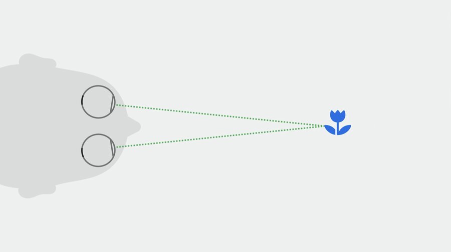
The brain relies on the eye muscles to converge the line of sight and fixate the eyes at the image depth to perceive a single image, so it needs correct visual depth cues to converge the eyes correctly
How to use image cues to maintain vision comfort
Color perception helps us recognize familiar size cues
Blur gives a sense of depth
The relative size of an image can be used to provide depth information
Gentle motion can help to figure out how far away you need to look
Missing visual depth cues can be added with a background, light and shadow, occlusion, and texture density
Conflicting cues are troublesome
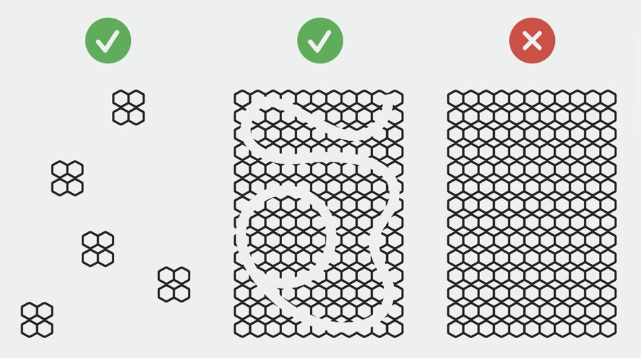
Correct visual cues that can be confusing, like repeating patterns
You can avoid double vision by using smaller pieces of the pattern or breaking up the pattern with another design
Warning If you decide to create stereo video content manually, it is extremely important to have the correct depth cues and also the correct disparity for each eye
Content parameters
Depth
Content that requires the eyes to be fixed for a long time, like reading, is most comfortable when it is placed farther than arms-length distance
Allow the content depth to be adjusted
Reserve content closest to the viewer for momentary visual effort experiences or for inviting direct interaction
Size and contrast
Content size and contrast should match the particular visual experience you are designing to allow for vision comfort For example:
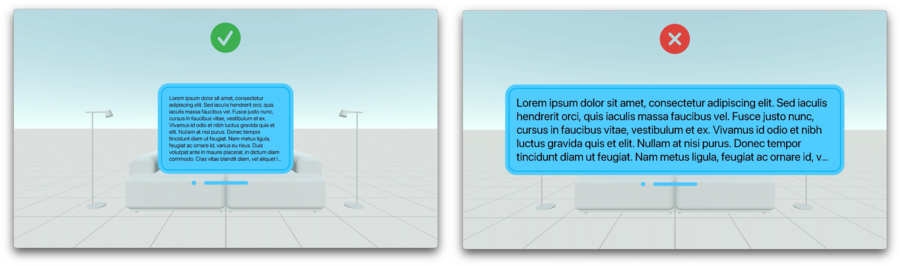
Higher contrast for reading text
Lower contrast, transparency, or blur to redirect visual attention elsewhere
Choose the right font size, window size, and depth for long reading. Doing this will make it easy to read without having to move your head or body
When a large portion of the field of view is dark, slow down the transition to a bright scene to give time to the eye for brightness adaptation
Eye effort
It’s most comfortable for people to look downwards or left and right
Upward and diagonal eye rotation takes the most eye-muscle effort
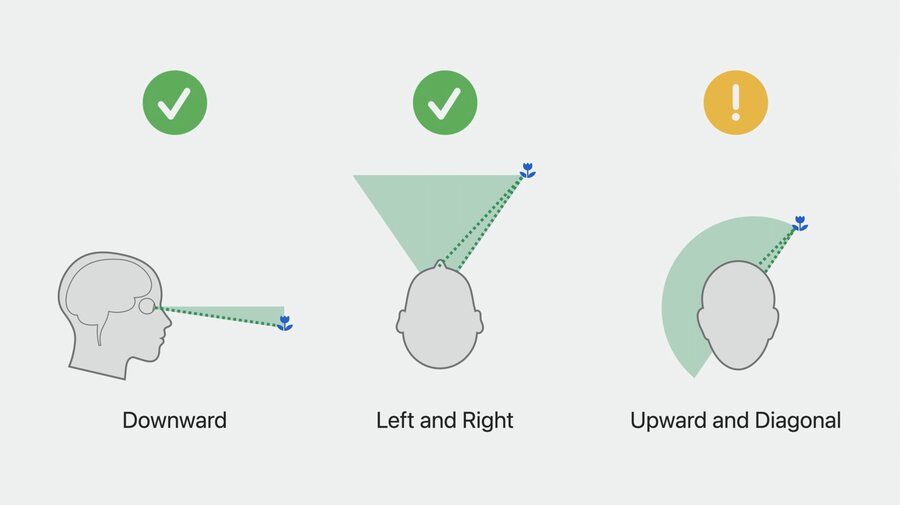
Content requiring extended reading or elongated target fixations should be placed towards the center and slightly below line of sight
Design for natural breaks in your experience to allow the person’s eyes to rest
Motion of virtual objects
You might feel motion discomfort like dizziness or an upset stomach when the visual motion information doesn’t match the vestibular data
Note Well-designed content enables the brain to perceive the world as stationary
When virtual objects, cover a large part of the field of view and move, the viewer’s brain might interpret the visual motion of the objects as if the viewer themself is moving
Make the objects semitransparent when they move, so the passthrough content is clearly visible during the motion
Head-locked content
Warning When possible, avoid content that is anchored to the user’s head
If head-locked views are necessary:
Consider using a smaller window near the center of the view and farther away from the person
Use a lazy-follow animation
Motion in windows
When a window’s content moves, the viewer’s brain might think that the viewer themself is moving
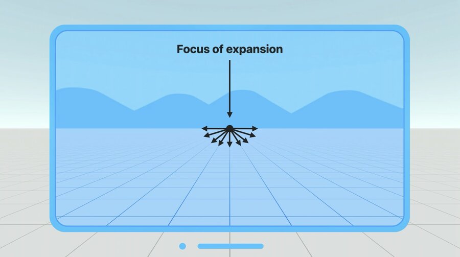
Be mindful about camera motions
Keep the content horizon aligned with the real horizon
Move the camera in a way that the motion of the focus of expansion is slow and predictable
Keep the focus of expansion within the field of view
Avoid fast turns or pure rotational motion
Keep objects small and at a larger distance
If possible, use plain textures with low luminance contrast
Oscillating motion
Avoid oscillations in general, and in particular those with frequencies around 0.2 Hz (1 oscillation every 5 seconds)
Keep the amplitude of the motion low and make the content semitransparent
Note It’s always a good idea to provide an oscillation-free alternative through the Reduce Motion accessibility setting
