Meet the family
Currently supported
SF Pro (default on iOS / macOS)
SF Pro Rounded (default on iOS / macOS)
SF Compact (default on watchOS)
SF Compact Rounded (default on watchOS)
SF Mono (for Xcode)
Current weights
Ultralight to Black
Optical sizes (e.g. 96pt, 70pt, 48pt, 28pt, 12pt)
Today’s focus: “SF Pro”
Apple expanded the style in Photos, News and Maps apps
Explore the new widths
To weight and optical size, width is now added:
Condensed
Compressed
Expanded
Full overview of all styles:
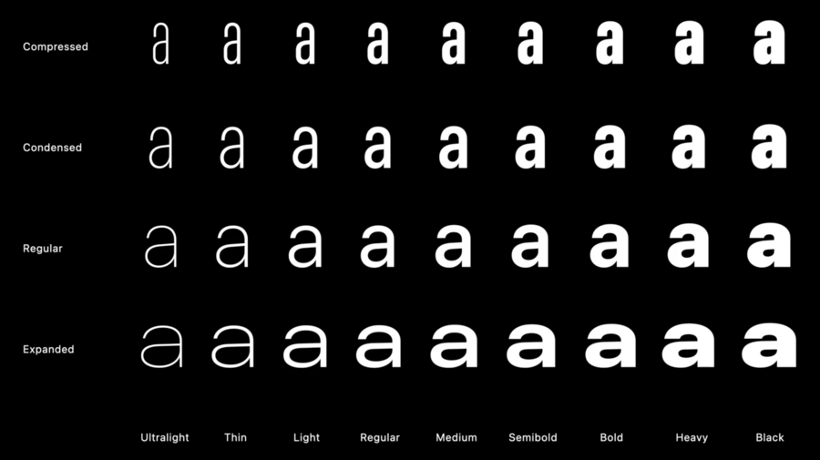
Styles towards center have more neutral voice
Outside ones more expressive and stronger voice
Choosing & pairing fonts:
All styles provide same language support
Vertical proportions are always the same for all
Stem thickness stays relatively the same
Regular: Is best to read, default to this
Condensed: Comfortable width, but fit more text
Compressed: Very densed proportions, nice as a display style
Expanded: Use on smaller labels and secondary content
Either you can save space, or use larger size with same space
Don’t use “Compressed” for long texts due to bad legibility
Example combinations:
Photos app combines Compressed Semibold for Title, Expanded Bold for Subtitle
A world of possible combinations:
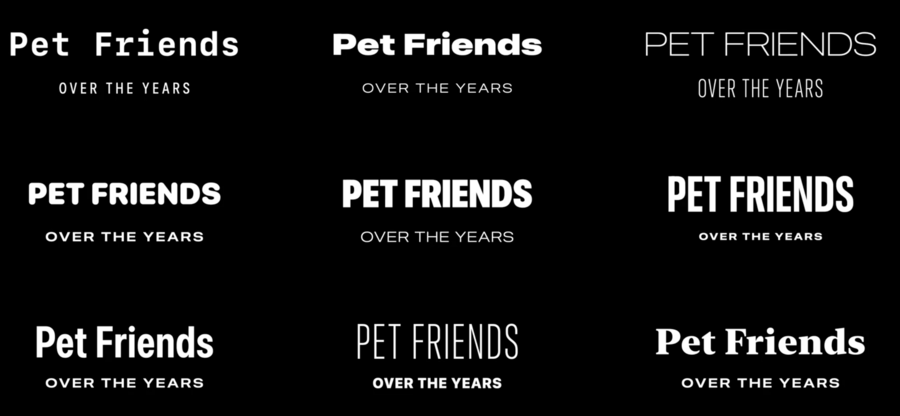
News app uses Condensed or Compressed for title to fit more in, giving the title personality
Expanded used for author
Maps app uses expanded for long mountains to fill greater space, for example
Recap:
Space efficiency
Reinforce hierarchies
Expressive display styles
Latin, Greek, and Cyrillic supported
Welcome SF Arabic
Extending the linguistic coverage of San Francisco, started last year
SF Arabic introduced last year, features full gamut of weights
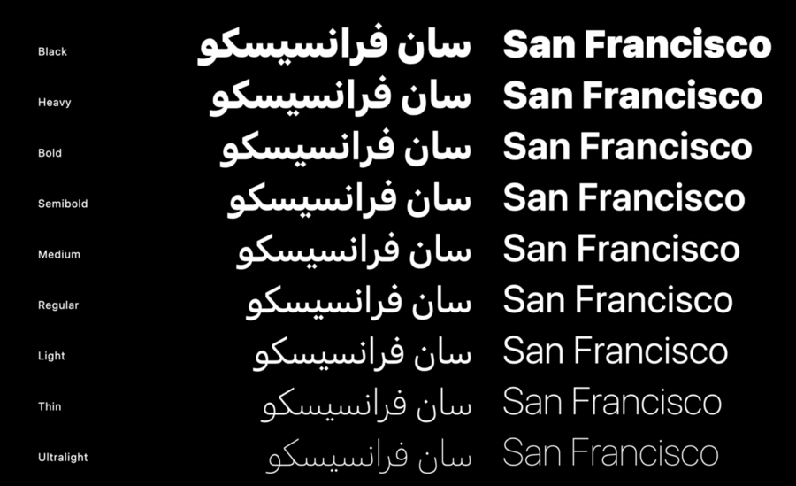
Optical sizes are tailored for Arabic, fine-tuned for legibility
Many extras like vocals and Quranic notations added
New this year: SF Arabic Rounded
Fonts are available for download on Apple Developer Website
