Intro
This session is about how to build great data visualizations with Swift Charts,
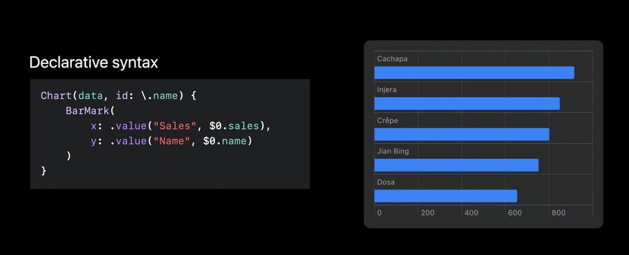
Chart (data, id: .name) {
	BarMark(
		x: .value ("Sales", $0. sales),
		y: .value ("Name", $0. name)
	)
}
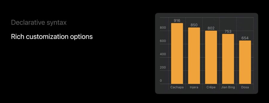
Which can be easily customisable.
declarative syntax, like SwiftUI
create charts by composition
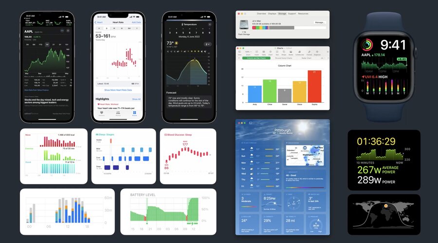
Some examples of charts on the Apple platform:
Problem space of chart libraries
Data Visualization
Communicate Data
Accessible
Localization
Dark Mode
Layout
Dynamic Type
Device Screen Sizes
Multi-Platform
Animation
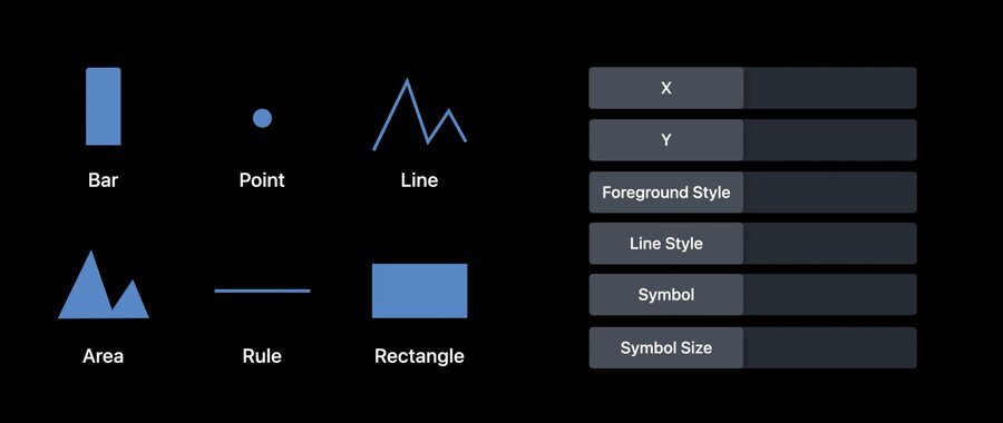
Marks and composition
a
Markis a graphical element that represents data

Chartis a SwiftUI view used as the wrapper for charts
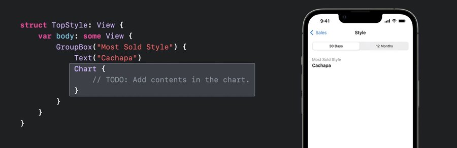
struct TopStyle: View {
	var body: some View {
		GroupBox ("Most Sold Style") {
			Text ("Cachapa")
			Chart {
				// TODO: Add contents in the chart.
			}
		}
	}
}
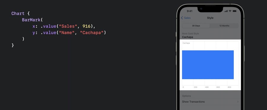
This is a chart with one BarMark
Chart {
	BarMark(
		x: .value("Sales", 916),
		y: .value ("Name", "Cachapa")
	)
}
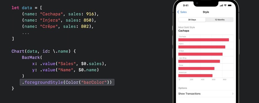
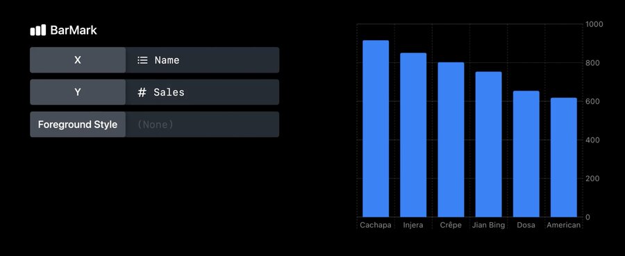
Provide multiple
BarMarkviews to show multiple bars.foregroundStylecan be used to specify a color
let data = [
	(name: "Cachapa", sales: 916),
	(name: "Injera", sales: 850),
	(name: "Crêpe", sales: 802),
]

Chart(data, id: \.name) {
	BarMark(
		x: .value ("Sales", $0.sales),
		y: value ("Name", $0. name)
	)
	.foregroundStyle(Color ("barColor"))
}
.accessisibilityLabeland.accessibilityValuecan be used to customize the default VoiceOver value
Chart(data, id: \.name) {
BarMark(
x: .value ("Sales", $0.sales),
y: value ("Name", $0. name)
)
.accessibilityLabel($0.name)
.accessibilityValue("\($0.sales) sold")
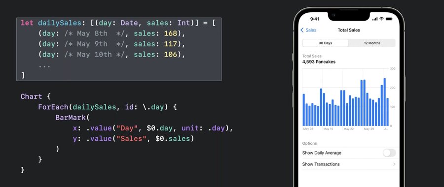
}Data driven, e.g.:
let dailySales: [(day: Date, sales: Int)] = [
  (day: /* May 8th */, sales: 168),
  (day: /* May 9th */, sales: 117),
  (day: /* May 10th */, sales: 106),
  ...
]

Chart {
  ForEach(dailySales, id: \.day) {
    BarMark(
      x: .value("Day", $0.day, unit: .day),
      y: .value("Sales", $0.sales)
    )
  }
}
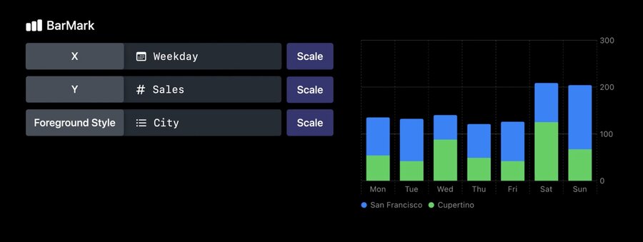
switching chart types is easy, e.g. replace
BarChartwithLineChart(orPointChart) as in this example with two series of data.
let cupertinoData: [(weekday: Date, sales: Int)] = [...]
let sfData: [(weekday: Date, sales: Int)] = [...]

let seriesData = [
	(city: "Cupertino", data: cupertinoData),
	(city: "San Francisco", data: sfData)
]

Chart {
	ForEach(seriesData, id: I.city) { series in
		ForEach(series.data, id: \.month) {
			LineMark(
				x: .value ("Weekday", $0.weekday, unit: .day),
				y: .value("Sales", $0.sales)
			)
		}
		.foregroundStyle(by: value("City", series .city))
		.symbol(by: value("City", series.city))
		.interpolationMethod(.catmullRom)
	}
}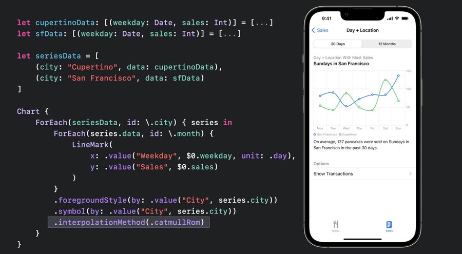
xparameter specifies the x-axis,yparam the y-axisuse
.foregroundStyle(by: .value("City", series.city)for automatic coloringUse
.symbol(by: .value...)for different shapes and for accessibility, in case the user is color blindSupports
.interpolationMethod(.catmullRom)for smoothing out the curveSupports
.positionfor grouping
.position (by: .value("City", series.city))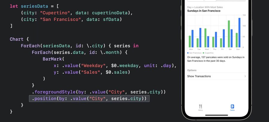
More types of marks
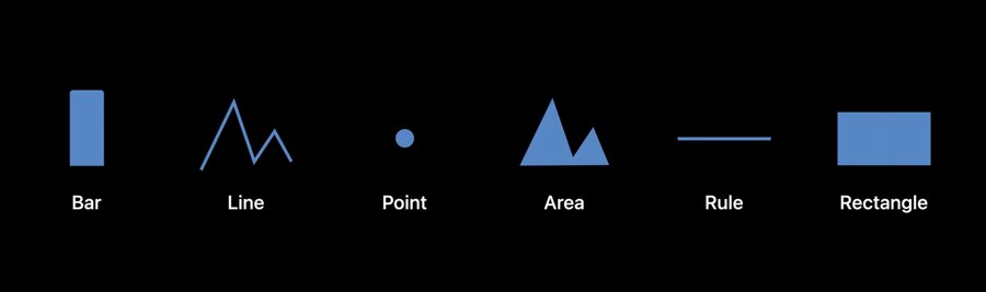
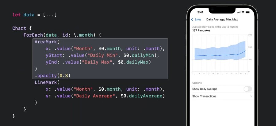
AreaMarkwithx:yStart:yEndto show a range of data
let data = [
	(month: /* Jul, 2021 */,
	dailyAverage: 127,
	dailyMin: 95,
	dailyMax: 194
	),
	...
]

Chart {
	ForEach(data, id: \.month) {
		AreaMark(
			x: .value ("Month", $0.month, unit: .month),
			yStart: .value("Daily Min", $0.dailyMin),
			yEnd: .value("Daily Max", $0.dailyMax)
		)
		.opacity (0.3)
		LineMark(
			x: value("Month", $0.month, unit: .month),
			y: .value ("Daily Average", $0 .dailyAverage)
		)
	}
}
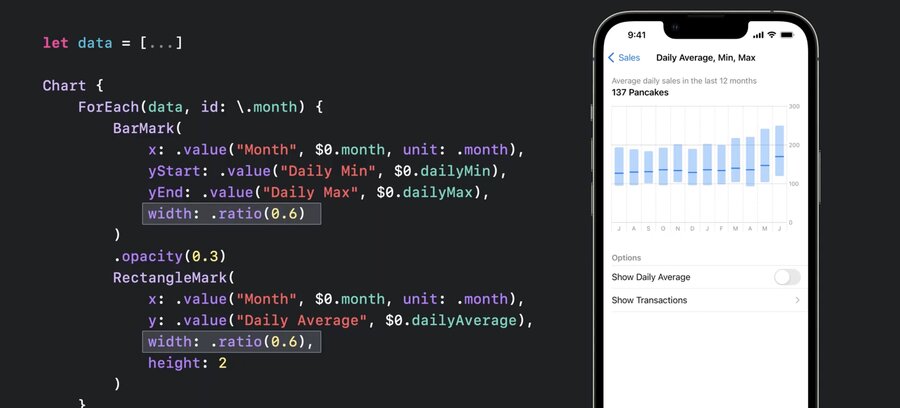
Also works with
BarMark(to show range of data)RectangleMarkshows distinct marks for mid instead of building a graph inBarMark
let data = [...]

Chart {
	ForEach(data, id: \.month) {
		BarMark(
			x: .value ("Month", $0.month, unit: .month),
			yStart: .value("Daily Min", $0.dailyMin),
			yEnd: .value("Daily Max", $0.dailyMax),
			charts13.jpg
		)
		.opacity (0.3)
		RectangleMark(
			x: value("Month", $0.month, unit: .month),
			y: .value ("Daily Average", $0 .dailyAverage),
			width: .ratio(0.6),
			height: 2
		)
	}
}
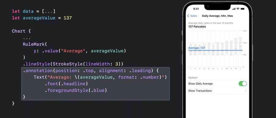
RuleMark(y:)can be used alongside with.annotation(position:)for guiding lines
let data = [...]
let averageValue = 137

Chart {
	ForEach(data, id: \.month) {
		BarMark(...)
		RectangleMark(...)
	}
	.foregroundStyle(.gray.opacity(0.5))

	RuleMark(
		y: .value("Average", averageValue)
	)
	.lineStyle(StrokeStyle(lineWidth: 3))
	.annotation(position: •top, alignment: .leading) {
		Text ("Average: \(averageValue, format: .number)")
			.font(.headline)
			.foregroundStyle(.blue)
	}
}
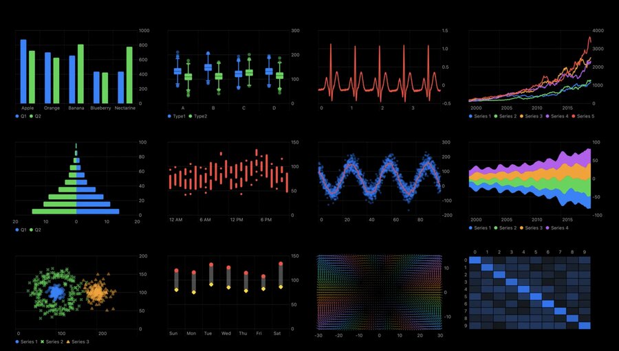
Example of different ways to use and combine these basic marks. In order
box plot
multi-series line chart
population pyramid
range plot
stream graph
multi-series scatter plot
heat map
a plot of a vector field
Plotting data with mark properties
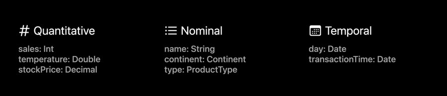
Data Types
Quantitative (Int, Double, Decimal)
Nominal (String, Continent, ProductType)
Temporal (day: Date, time: Date)
Quantitative Sales, Nominal Name
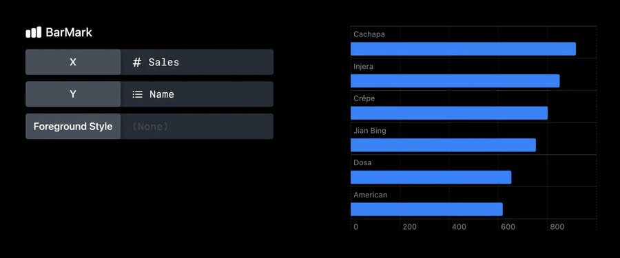
Orientation of the bar depends on where the nominal data is
Available data marks and properties:
scaleis available for all data types, e.g.yScale
func yScale(sales: Int) -> CGFloat {
	return CGFloat(sales) * someFactor + someOffset
}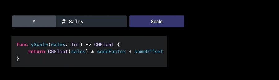
by default, the lib infers the scales automatically
Use
.chartYScale(domain:)modifier to have fixed range of values on the y axis
Chart {
	ForEach(seriesData, id: \city) { series in
		ForEach(series .weekdays, id: \.month) {
			LineMark(
				x: .value("Weekday", $0.weekday, unit: .day),
				y: value("Sales", $0.sales)
			)
		}
		.foregroundStyle(by: .value("City", series.city))
		.symbol(by: value("City", series .city))
	}
}
.chartYScale(domain: 0 ... 200)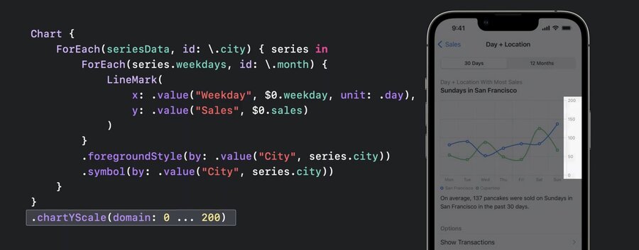
use the chartForegroundStyleScale modifier to change the colors of the lines on the chart
Chart {
	ForEach(seriesData, id: \city) { series in
		ForEach(series .weekdays, id: \.month) {
			LineMark(
				x: .value("Weekday", $0.weekday, unit: .day),
				y: value("Sales", $0.sales)
			)
		}
		.foregroundStyle(by: .value("City", series.city))
		.symbol(by: value("City", series .city))
	}
}
.chartYScale(domain: 0 ... 200)
.chartForegroundStyleScale([
	"San Francisco" : .orange,
	"Cupertino": .pink
])
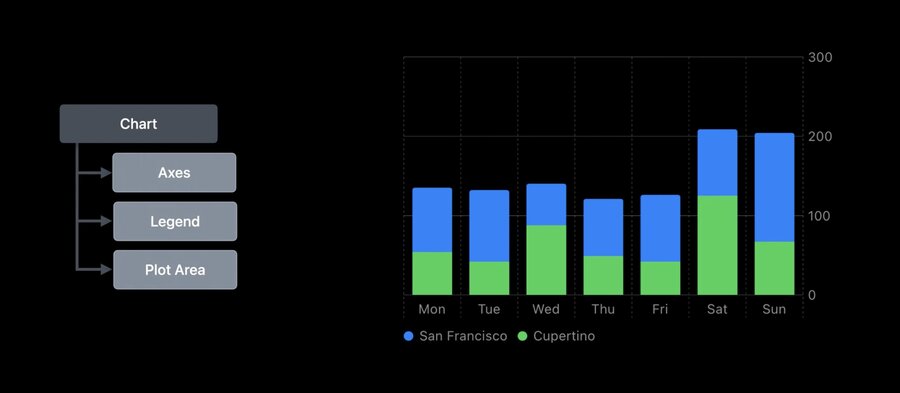
Customizations
All elements (axes, legends, plot area) are customizable
.chartXAxis {}withAxisMarksinside can be used for custom axis
let data: [(month: Date, sales: Int)] = [...]
Chart(data, id: \.month) {
BarMark(
x: .value("Month", $0.month, unit: .month),
y: .value("Sales", $0.sales)
)
}
.chartXAxis {
AxisMarks() // this defaults to the standard config
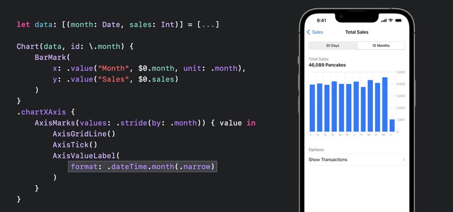
}Use
AxisGridLine,AxisTickandAxisValueLabelwith marks
let data: [(month: Date, sales: Int)] = [...]

Chart(data, id: \.month) {
	BarMark(
		x: .value("Month", $0.month, unit: .month),
		y: .value("Sales", $0.sales)
	)
}
.chartXAxis {
	AxisMarks (values: .stride(by: .month)) { value in
		AxisGridLine()
		AxisTick()
		AxisValueLabel(
			format: .dateTime.month(.narrow)
		)
	}
}
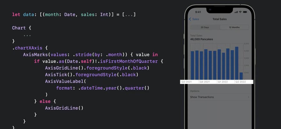
also supports
ifkind of conditionals for dynamic axis and showing quarter data
let data: [(month: Date, sales: Int)] = [...]

Chart(data, id: \.month) {
	...
}
.chartXAxis {
	AxisMarks (values: .stride(by: .month)) { value in
		if value.as(Date.self)!.isFirstMonthOfQuarter {
			AxisGridLine().foregroundStyle(.black)
			AxisTick().foregroundStyle(.black)
			AxisValueLabel(
				format: .dateTime.year().quarter()
			)
		} else {
			AxisGridLine ( )
		}
	}
}
AxisMarksaccepts apositionparam, e.g..leadingAxisMarksacceptspresetparam, e.g..extendedto align visually with rest of interface
let data: [(month: Date, sales: Int)] = [...]

Chart(data, id: \.month) {
	...
}
.chartYAxis {
	AxisMarks(preset: .extended, position: .leading)
hide axis via
.chartXAxis(.hidden)for example
Chart {
	...
}
.chartXAxis(.hidden)
.chartYAxis (.hidden)
hide legend via
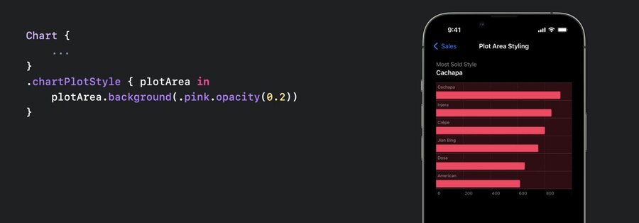
.chartLegend(.hidden).chartPlotStyle {}to customize plot areae.g.,
plotArea.frame(height: 60 * numberOfCategories)or
plotArea.background(.pink.opacity(0.2)), any modifiers for views available
Chart {
	...
}
.chartPlotStyle { plotArea in
	plotArea.background(.pink.opacity(0.2))
}
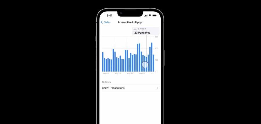
ChartProxycan be used to access theposition(forX:)orvalue(atX:)
let proxy: ChartProxy

proxy.position(forX: 123.0) // get the X position for value 123.0.
proxy.value(atX: 100) // get the data value at X position 100pt.
allows to coordinate other views with chart, e.g. select an interval in the chart with a slider
.chartOverlaymodifier provides aChartProxyin the content
Chart {
	...
}
.chartOverlay { proxy in
	// Define the overlay view as a function
	// of the chart proxy.
}
.chartBackground { proxy in
	// Define the background view as a function
	// of the chart proxy.
}
example
struct InteractiveBrushingChart: View {
  @State var range: (Date, Date)? = nil

  var body: some View {
    Chart { ... }
    .chartOverlay { proxy in
      GeometryReader { nthGeoItem in
        Rectangle().fill(.clear).contentShape(Rectangle())
          .gesture(DragGesture()
            .onChanged { value in
              // Find the x-coordinates in the chart’s plot area.
              let xStart = value.startLocation.x - nthGeoItem[proxy.plotAreaFrame].origin.x
              let xCurrent = value.location.x - nthGeoItem[proxy.plotAreaFrame].origin.x
              // Find the date values at the x-coordinates.
              if let dateStart: Date = proxy.value(atX: xStart),
                 let dateCurrent: Date = proxy.value(atX: xCurrent) {
                range = (dateStart, dateCurrent)
              }
            }
            .onEnded { _ in range = nil } // Clear the state on gesture end.
          )
      }
    }
  }

  // ...
}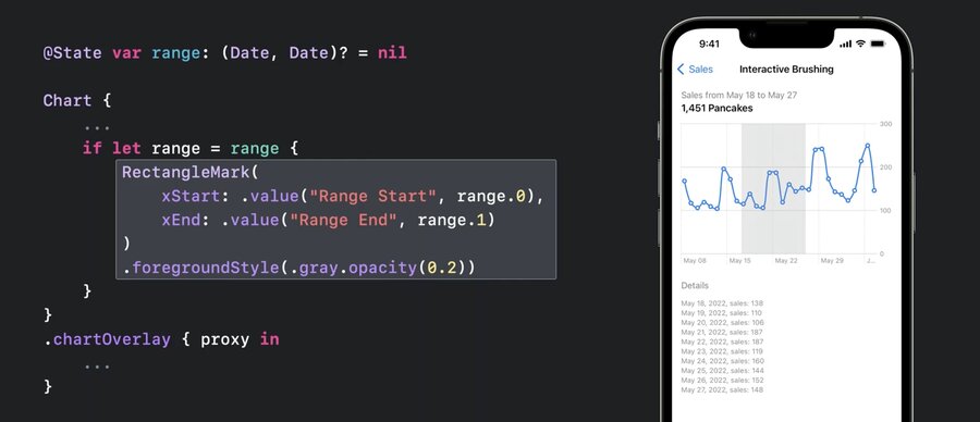
the code will look like this
@State var range: (Date, Date)? = nil

Chart {
...
	if let range = range {
		RectangleMark(
			xStart: .value("Range Start", range.0),
			xEnd: .value("Range End", range.1)
		)
		.foregroundStyle(.gray.opacity(0.2))
	}
}
.chartOverlay { proxy in
   ...
}
the proxy allows to store data in state and drive the chart rendering with that data (e.g. for a hover and show data effect)
Resources
Creating a chart using Swift Charts
Have a question? Ask with tag wwdc2022-10137
Search the forums for tag wwdc2022-10137
Swift Charts
Visualizing your app’s data
Tech Talks
What’s new for enterprise developers
Related Videos
Build a productivity app for Apple Watch - WWDC22
Design an effective chart - WWDC22
Design app experiences with charts - WWDC22
Hello Swift Charts - WWDC22
What’s new in SwiftUI - WWDC22
WWDC22 Day 1 recap - WWDC22

