Complication history
Complications present quick, glanceable information on the watch face
in watchOS 2, ClockKit enabled you to create your own complications
in watchOS 5, rich complications were introduced, with graphic colorful content
in watchOS 7, SwiftUI complications and multiple complications were introduced
in watchOS 9, complications have been re-imagined and remade with WidgetKit, embracing SwiftUI and bringing the glanceable complication experience to iOS in the form of widgets
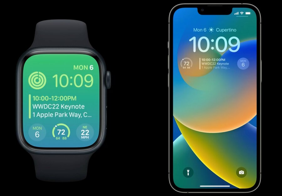
New WidgetFamily families
accessoryCircularA circular widget
great for brief information, gauges, and progress views
replaces ClockKit’s graphicCircular family
accessoryCornerwatchOS only
complication in the corner of a watch face in watchOS
accessoryRectangularA rectangular widget
can be used to show multiple lines of text or small graphs and charts
replaces ClockKit graphicRectangular family
accessoryInlineA flat widget that contains a single row of text and an optional image
present on many faces on watchOS and above the time on iOS LockScreen
Colors
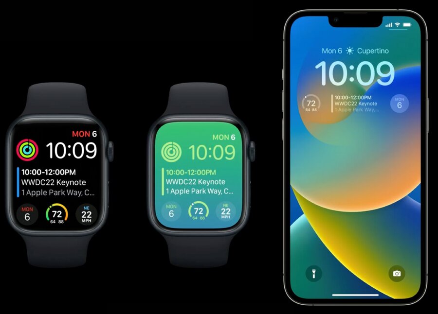
the system controls the look of accessory family widgets
three different rendering modes your widget might be shown in (refer to image above):
full color
accented
vibrant
This is exposed via a new widgetRenderingMode environment variable of type WidgetRenderingMode:
struct MyWidgetView: View {
  @Environment(\.widgetRenderingMode) var widgetRenderingMode // 👈🏻

  var body: some View {
    ...
  }
}
Full color mode
content is displayed exactly as specified
Accented mode
your views are split into two groups and colored independently
the two coloring groups are flatly colored, preserving only their original opacities
you can tell the system how to group your views with the
.widgetAccentable(_:)view modifier…or switch out your content based on the Widget Rendering Mode environment value to look perfect when flattened
VStack(alignment: .leading) {
  Text("Headline")
    .font(.headline)
    .widgetAccentable() // 👈🏻
  Text("Body 1")
  Text("Body 2")
}.frame(maxWidth: .infinity, alignment: .leading)
Note that the system can tint your content in a number of ways, some of which are inverted
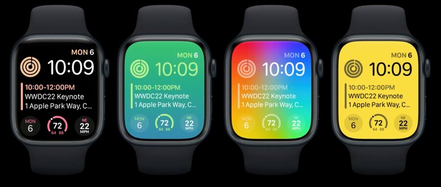
Vibrant mode
your views are desaturated then colored appropriately for the Lock Screen background
the system maps your greyscale content in to a material appearance
a light source color ends up mostly opaque and brighter
a dark source color appears as a less prominent blur of the background behind it, with only a slight amount of brightening
avoid using transparent colors in this mode, instead, use darker colors or black to represent less prominent content while maintaining legibility
AccessoryWidgetBackground
New AccessoryWidgetBackground view, to give a consistent backdrop to widgets that need them:
takes on different appearances in the various widget rendering modes
tuned by the system to look right for the style of the face or Lock Screen
soft transparent view in full color and accented
black in vibrant mode, which results in a low brightness and full blur
ZStack {
   AccessoryWidgetBackground() // 👈🏻
   VStack {
    Text("MON")
    Text("6")
     .font(.title)
  }
}