“Design through the lens of language”
All Apple devices greet with “hello” (like the original Mac)
An app with the words removed looks empty (proves the point how important words are)
Structure, timing and feeling people have are important, too
Make writing an early part of your design process, not something you fill in later
Purpose
Consider information hierarchy (order of elements in a screen)
People don’t read text in a screen in order
e.g. a large bottom button is seen faster
Know what to leave out
Don’t show too much text, focus on the purpose of the screen
e.g. “iPhone Needs to Cool Down” screen with information about details why it is and a large emergency button
Aim for simplicity
Have a purpose for every screen
Both for a whole flow and all screens, have a clear purpose
Don’t use multiple screens for one purpose
Represent your apps values (like privacy) and show throughout
Anticipation
Think of a conversation (= your app having a conversation with user)
e.g. changing alarm schedule provides “just next day”
or the sleep screen says “Sleep Well”
iPhone asks when you’re awake early “Turn Off Alarm?”
Develop your voice and vary your tone (according to situation)
Game is friendly, Banking app is secure and trustworthy etc.
e.g. “it looks like you’ve taken a hard fall.” → “I’m OK” – being calm in a stressful moment
e.g. “You set a personal record for your longest daily Move streak: 35 days!” – exclamation point used to sound motivational – but don’t overuse, can be silly
Know what to say
“No inhale…” “and exhale” in Breathe app
“8 mins to Home”, “Take Audubon Ave, traffic is light” → clear what to do next
Context
Think outside the app
Are your users likely to be home, or in airport, cooking?
“It looks like you’re working out.” “Record outdoor walk” → you’re on the go, keep it simple
Summary of sports has more details, as you’re home
When taking a panorama, words appear right below arrow, because that’s where you’re looking
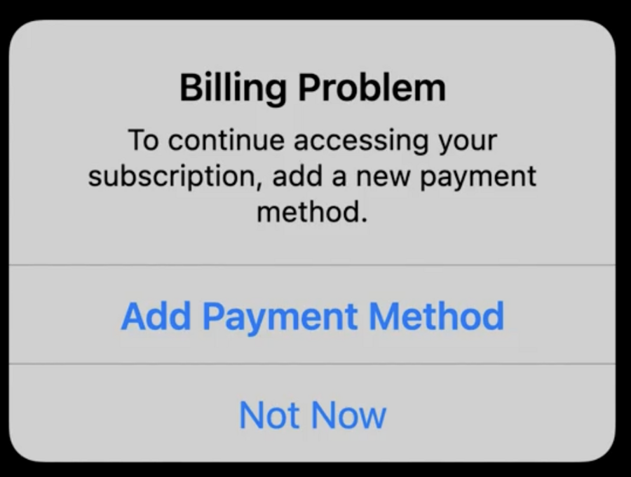
Write helpful alerts
e.g. “Allow Weather to also user your location …” on app start
“Remove iPhone?” with “Remove” and “Cancel” buttons, mark destructive buttons red and put to left
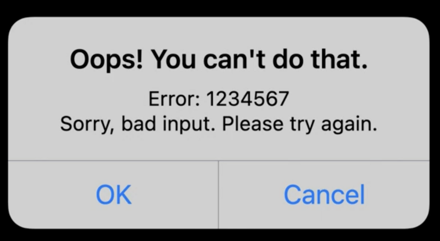
“Confirm Cancellation” → “Cancel” | “Confirm” → hard to know what to do – detail text isn’t really helpful
Better to be explicit: “Cancel Subscription” and “Keep Subscription”
and make clear which plan instead of “this” plan
Never label alert buttons “Yes” and “No”, be more specific
Don’t use things like “Oops”, “Sorry” and “Please” too much
 |  |
|---|
Create useful empty states
Give helpful hints, or party in an inbox for example
Use an appropriate tone
Make clear what user can do instead of being too playful
Empathy
Write for everyone
Speak to the audience, but don’t leave people out
Idioms or humor can be easily misunderstood
Be responsive to localization
Consider that words can get longer, or need more vertical space
Space of text should be able to grow or adjust width
Also consider things like calendar day abbreviations
Design for accessibility
Consider dynamic type settings, VoiceOver
Have thoughtful and descriptive text
Consider symbols & images as well
VoiceOver has descriptions for emojis
provide context and position
Be thoughtful to include everybody – e.g. “person” instead of woman
Last tip: Read your writing out loud (helps find repetitive words, how it sounds, naturality, etc.)
