Designing an interface is fundamentally about serving other human beings.
The goal isn’t to make a beautiful, well-organized, simple, or focused app. The goal is about serving the human beings or positively affecting the lives of the people who use the apps that you make.
The only thing that really matters is how well your app satisfies the emotional and practical needs of the people you are designing for.
Users need to:
feel safe
understand
accomplish tasks and achieve our goals
experience beauty
Well designed apps provide:
Predictability and stability
clear and helpful information
streamlined and simple workflows
a delightful experience
Design principles don’t tell us how to do specific things in our design, they tell us why we should do those things.
This talk is separate in the following design principles:
Wayfinding
Feedback
Visibility
Consistency
Mental Model
Proximity
Grouping
Mapping
Affordance
Progressive Disclosure
80/20 Rule
Symmetry
Wayfinding
Good wayfinding systems offer a comprehensive and understandable list of general locations that people can visit
They provide needed detail about what’s in those locations
They are highly contextual
They become increasingly specific as we navigate deeper and deeper into the system
They help people to orient themselves by clearly highlighting their current location relative to other locations
They provide a clear exit path
Wayfinding helps us to feel safe by answering really basic questions like:
Where am I?
Where can I go?
What will I find when I get there?
What’s nearby?
How do I get out?
Without answers to questions like these, we’d be lost.
Your app’s interface is one big wayfinding system:
the navigation bar, the content area, the tab bar, they’re all just tools for providing wayfinding in your app
the navigation bar title and selected tab bar item lets people know where they are
…
Feedback
Car example:
Feedback helps us to operate cars confidently and safely
Feedback helps us to anticipate problems that might cause the car to stop functioning properly or to stop moving all together
Cars provide various forms of feedback:
Status feedback - to let us know how the car is doing
Completion feedback - to let us know whether actions we’ve performed are completed successfully or have failed
Warning feedback - to tell us about potential problems
Errors feedback - to let us know when something we’ve tried to do has caused an error
For our safety, for the safety of other drivers and pedestrians, the feedback that cars provide must be clear, immediate, and understandable.
Feedback answers super important questions:
What can I do?
What just happened?
What is currently happening?
What will happen in the future?
Status feedback
Examples:
looking at the gear shifter, I can see that the car is in park
knowing what gear the car is in is super important information, it is so important that it’s displayed twice, on the gearshift, and in the instrument cluster
fuel level, letting us anticipate and predict how far we can go before we need to refuel
speedometer shows us the current speed, helping us to avoid getting costly speeding tickets.
Status information in apps should be just as clear for the car:
in the mail.app, unread status indicators help people to prioritize which emails to read first.
in calendar.app, status indicators help people to see when someone can’t make a meeting and it helps them determine if they need to reschedule
in the camera.app, there are three elements to let people know that a video is being recorded:
the red dot
the incrementing time code
the state of the record button
Showing status clearly and directly is crucial for saving people time and helping them to avoid making mistakes.
Completion feedback
Examples:
when we turn on the engine:
we can hear the engine turn over
we can feel the vibration of the motor running
we see that instrument cluster come to life
when we change shift, the shift gives us a tactile feedback to let us know that we’re moving through gears
as soon as we pull out of the parking spot, we hear the doors lock
this happens automatically, so it is even more important that we get this feedback
Completion feedback in apps serves the very same purpose:
the sound of a locked iPhone
the animation of an email being marked as unread
the animation of an email being deleted
the animation and sound of a successful Apple Pay transaction
Every action taken in your app should provide some form of confirmation feedback, because it is absolutely necessary for letting people know that actions they’ve performed were successful.
Warning feedback
Examples:
Low fuel level
Low break pads
Low oil level
Warnings can be communicated using status indicators, messages, and the instrument cluster, built-in display, sounds, or all of the above.
These warnings are important. They keep us safe, and they protect our car from damage.
Errors feedback
if you try to start a car without gas, you will get an error message about that
errors are always disappointing and frustrating
it’s best to help people avoid making errors in the first place.
Clear, timely, and understandable and informative feedback is essential
Visibility
The usability of a design is greatly improved when controls and information are clearly visible
in the Mail.app, badges provide helpful status information about email messages
it is important to surface key status information at higher levels whenever possible.
tradeoff: densely packed interfaces can be overwhelming and they can slow decision-making, especially for people who are new to your app
visibility has to be weighed against other considerations
Consistency
the principle is about representing similar design features in similar ways
consistency improves usability
you have to fully consider what expectations people have when they come to your app
those expectations are mostly informed by their experiences with the other apps that they use
you should pay attention to platform conventions, iconography, terminology, navigation schemes, etc.
internal consistency helps to make an app feel cohesive or whole
Mental Model
You have a mental model of every system that you’ve ever interacted with
Mental models are developed through personal experience, and they’re based on an incomplete set of facts, so everyone’s mental model is unique
Two parts of a mental model:
System Model - how a system works
Interaction Model -how we interact with the system
when a system doesn’t match our mental model, it breaks our expectations, and we perceive it to be unintuitive:
Labels and subtle variations of form are design cues that can easily be overlooked, especially when people have deeply ingrained notions about how a system works, and how they interact with it
Trying to get people to change their mental model of how your app works is risky.
Changes to any long-lived existing product will inevitably be hard for people to adjust to. It really doesn’t matter how good or how necessary those changes may be
When considering big changes to an existing app, you have to be 100 percent positive that those changes will lead to clear wins for the people who currently use your app
Making changes just for the sake of it is not a good justification. Prove to yourself beyond a shadow of a doubt that your innovations are objectively better.
Proximity
Proximity is about the distance between a control and the object that it affects
The closer a control is to that object, the more we assume there to be a connection between the two
Greater proximity also makes ergonomic sense: the closer you are to an object or region of interest, the more likely you are to want to interact with it and control it
Proximity is also useful for expressing relationships between controls
e.g., if you see a set of switches on the wall, and you know that one of them controls lights, then it’s reasonable for you to assume that every switch is a light switch
If one of them controls the shade, then it would be better to separate it out from the rest
This configuration makes it easier for people to remember which switch controls the shade, and which ones control the lights
Grouping
Grouping helps people to understand the relationships between elements, and it is key for giving a design structure
the need for proximity and grouping is higher the larger your interface is
Mapping
Mapping is about designing controls to resemble the objects that they affect
Mapping also relates to how controls are arranged relative to each other
Their order should resemble the configuration of the objects that they affect
e.g., say there are three light switches to control three sets of ceiling lights in the bedroom. Good mapping involves arranging the switches to mirror the layout of those lights
By focusing on mapping, it is so much easier to make choices about where to position controls, how to order them, and even which controls to use
Affordance
An object physical characteristics:
provide visual and tactile cues about what interactions it affords to us
make certain actions seem possible, and others less possible
Affordance is not an attribute of the object itself, it’s more about the relationship that individuals have to an object
Affordance is subjective, it varies based on one’s physical abilities.
Progressive Disclosure
Progressive disclosure is a technique for managing complexity:
it eases people from the simple to the more complex
Progressive Disclosure is also about hiding away complexity, so that people can accomplish basic tasks with simple and more approachable interfaces
Progressive disclosure is a necessary and helpful technique for managing complexity and simplifying decision making
But the same technique can bury information or functionality.
80/20 Rule
80 percent of a system’s effects come from 20 percent of its causes
For an app, this might mean that either:
80 percent of its benefit comes from 20 percent of the actions that it presents
80 percent of the people who use an app are only going to use 20 percent of its functions.
if your app is complex, it is okay to make the most useful 20 percent of functions easier to find by hiding the other 80 percent
By keeping things simple for novices, they are less likely to feel intimidated, overwhelmed, or get themselves into trouble, while more experienced users can quickly reveal the options and actions that they require, that they understand, and that they are capable of using
Symmetry
Reflectional, bilateral, radial, rotational, and translational symmetry
Symmetrical forms are efficient forms, and we tend to associate them with good health, with stability, balance, and orderliness
Symmetrical forms are considered aesthetically pleasing
Symmetrical elements, even if they are not physically connected to each other, are perceived as though they are (e.g., two facing square brackets,
[ ], our mind unconsciously integrates them into one coherent object)Attractive interfaces tend to demonstrate a mixture of reflectional and translational symmetry
For example in some apps key elements are centered along a median line, while almost all of the other elements are counter-balanced with each other:
| Camera.app | Clock.app | Phone.app |
|---|---|---|
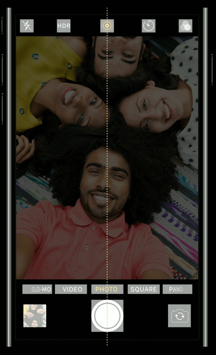 | 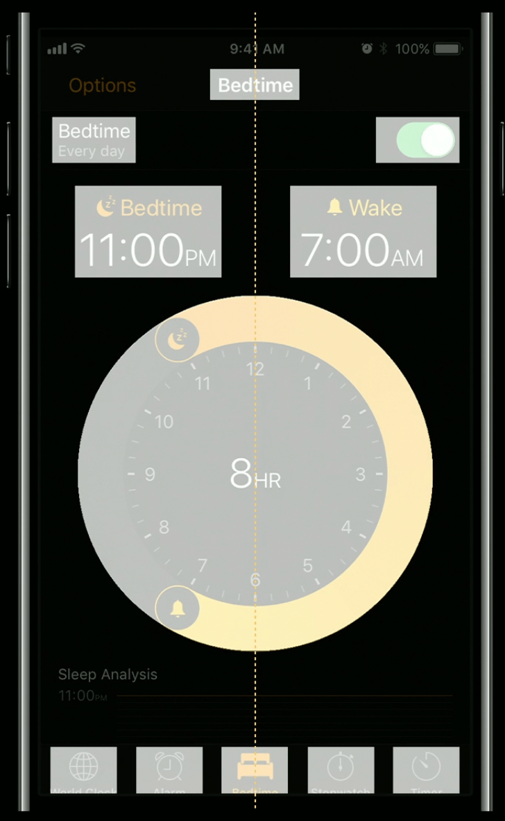 | 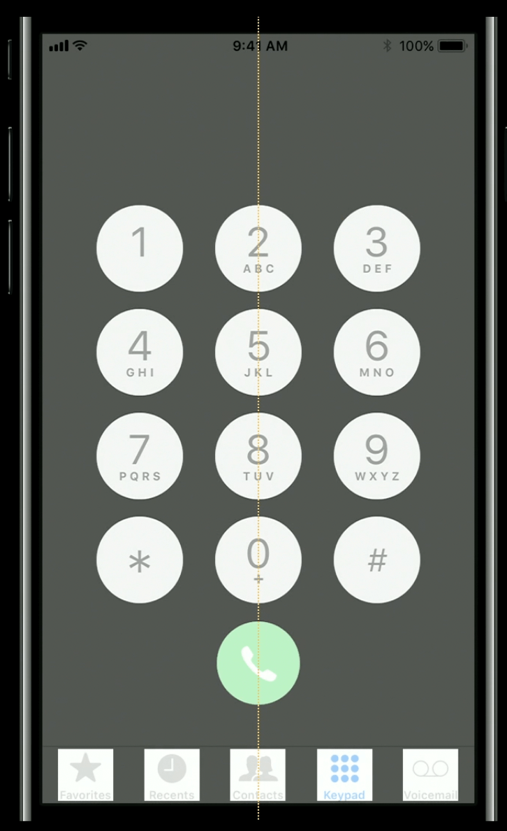 |
Translational symmetry gives an interface a sense of structure, and order through the repetition of like elements.
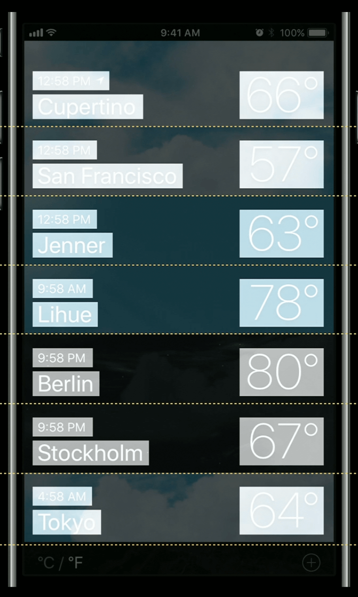
For example you can see translational symmetry in the even repetition of cities and times in the clock.app, or the cadence of locations in the weather.app.
| Clock.app | Weather.app |
|---|---|
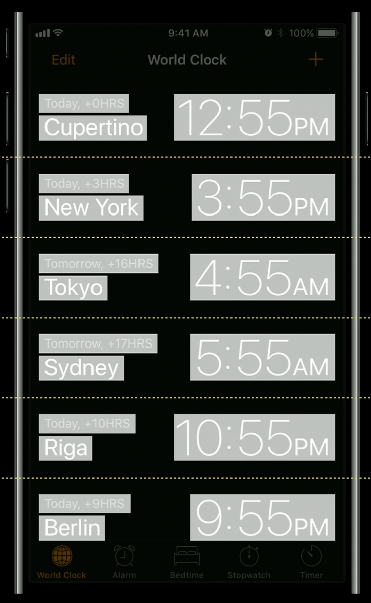 |  |
When laying out your app’s interface, look for opportunities to use symmetry to provide a sense of balance and order
Conclusions
These design principles express fundamental truths about human perception and cognition
They are simple, but powerful reminders about the true nature and purpose of design
They provide a framework for understanding, and a language for articulating a design’s strengths and its shortcomings
Each of these principles could lead you into different directions about what you should do with the design of your app
It is also possible to have too much of a good thing:
Too much feedback is annoying. Too much visibility is distracting.
Too much progressive disclosure can make work flows inefficient.
Platform. Screen size. Use case. The experience level of the people who you are designing for. These factors and more should influence what principles are most relevant at any given moment.
