Design widgets for the Smart Stack on Apple Watch
 Lorin van Riel
Description: Bring your widgets to watchOS with the new Smart Stack. We'll show you how to use standard design layouts, color and iconography, and signal-based relevancy to ensure your app's widgets are glanceable, distinctive and smart. When you're ready to make your own, watch this codealong: "Build widgets for the Smart Stack on watchOS"
Introducing the Smart Stack
The Smart Stack is being introduced in watchOS 10 as a way of providing glanceable information outside of complications. It's a scrollable stack of widgets accessed with an upward turn of the digital crown.
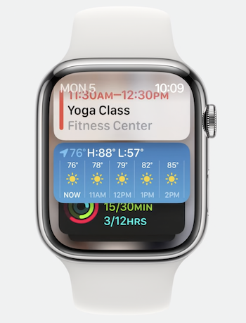
Users can choose which widgets to include in the stack. There is an upper limit on the number of widgets. Ordering is based on relevance, however widgets can also be pinned to the top.
Designing widgets for the Smart Stack
Layouts
Using a standard layout helps with readability and consistency. There are six recommended design layouts for widgets.
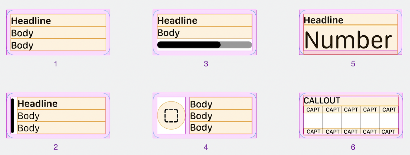
Choose a layout based on whether the information to display is
- primarily text (1)
- primarily text with a colored bar to indicate it is part of a collection, such as color-coded calendar items (2)
- graphical with supporting text (3 or 4)
- primarily numerical or a single important word (5)
- a chart (6)
The layouts should be used as a guideline and point of reference. Sometimes a unique design may better suit the information you are presenting.
Information displayed in widgets should be limited to only what is necessary because it is expected that a user will spend no more than 10 seconds engaging with glanceable information on their watch.
By default, the bottom widget in the Smart Stack is the combo widget that displays three circular accessory widgets chosen by the user.
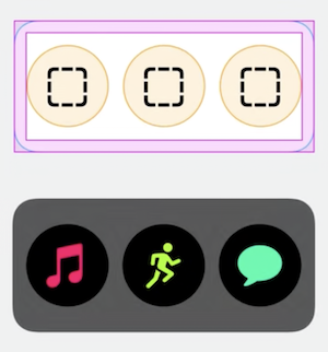
Ideally, circular widgets should display rich information, however they can also be simple app launchers. Users may choose three widgets from the same app that work together well as a set, for example weather widgets for temperature, UV index and air quality index.
Color and iconography
Complications are tinted based on the color of the watch face. Widgets in the Smart Stack are more flexible.
By default, Smart Stack widgets have a dark material background with white text. The widget background can be dynamic and can aid app recognition or provide information. Examples:
- The background of the Books widget is the book cover image.
- The background of the Stocks widget is red or green to indicate performance.
SF Symbols or vector icons are recommended.
Sessions
A session is an active state in an app that has a start and an end, such as playing a song or tracking a workout.
Session control widgets automatically appear at the top of the Smart Stack when a session is in progress. For example, a play/pause widget appears while a song is playing.
Session control widgets are system-generated and cannot be created by developers. To prevent redundancy, developers should instead provide widgets that relate to sessions but do not control them. For example, a 'recommended song' widget would be a good complement to the system generated widget. It may encourage a user to start a session, but does not actually affect an active session.
Relevancy
Widgets rise to the top of the Smart Stack based on relevance. Widgets can be prioritized based on
- Time and date. For example, showing an event that is happening in the next hour.
- Location. For example, showing a reminder when the user reaches home or a specific GPS location.
- Headphones detection. For example, showing the current audiobook when headphones are connected.
- Active workout. For example, showing the activity rings when a workout is in progress.
- Wakeup and bedtime.
 GitHub