Meet MapKit for SwiftUI
 laurent b
Description: Discover how expanded SwiftUI support for MapKit has made it easier than ever for you to integrate Maps into your app. We'll show you how to use SwiftUI to add annotations and overlays to a map, control the camera, and more.
In this session the Apple engineer will build a fully functional trip planner from scratch.
- We use annotations to mark places on the map.
- And enable selection so that we can tap on each marker to learn more about that place.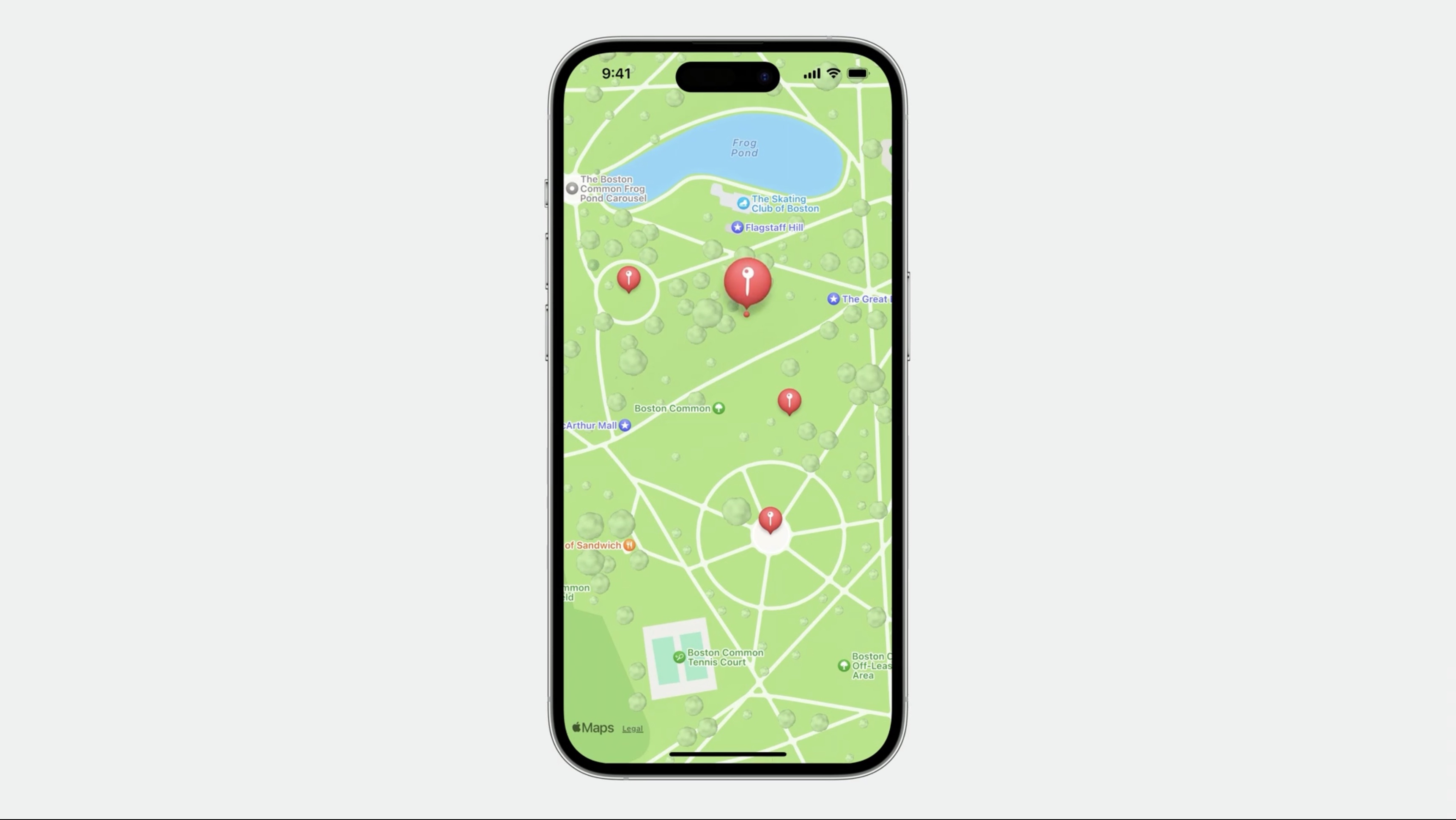
- Integrate
Look Aroundto explore some places.
- Add an overlay that shows a driving route.
- Use the map to display different locations and regions.
- Add another dimension to the map by enabling realistic elevation.
- Show how to display satellite and flyover imagery as well.
- Add some controls to the map, including a user location button.
Let's start with a brand-new SwiftUI project
After removing the boilerplate code, we add import MapKit and Map() to the ContentView() and this alone is already enough to show the map in the preview.
import SwiftUI
import MapKit

struct ContentView: View {
    var body: some View {
        Map ()
    }
}
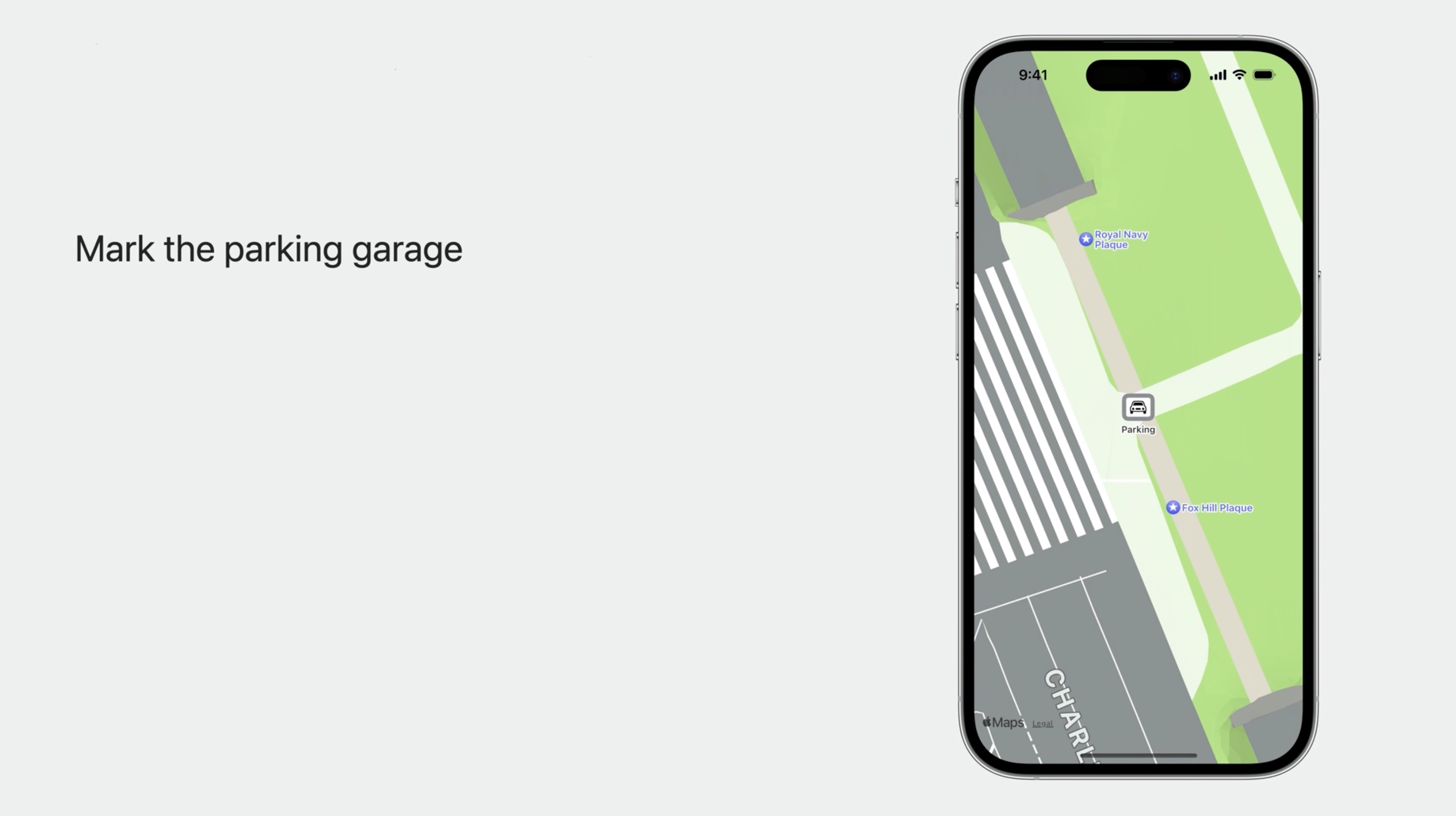
The parking garage is right underneath the Common. Add some content to the map to mark the parking garage.
Show content on the map
Markers can be added to the map within the MapContentBuilder closure.
extension CLLocationCoordinate2D {
    static let parking = CLLocationCoordinate2D(
        latitude: 42.354528, longitude: -71.068369
    )
}
and
import SwiftUI
import MapKit

struct ContentView: View {
    var body: some View {
        Map () {
            Marker("Parking", coordinate: .parking)
        }
    }
}
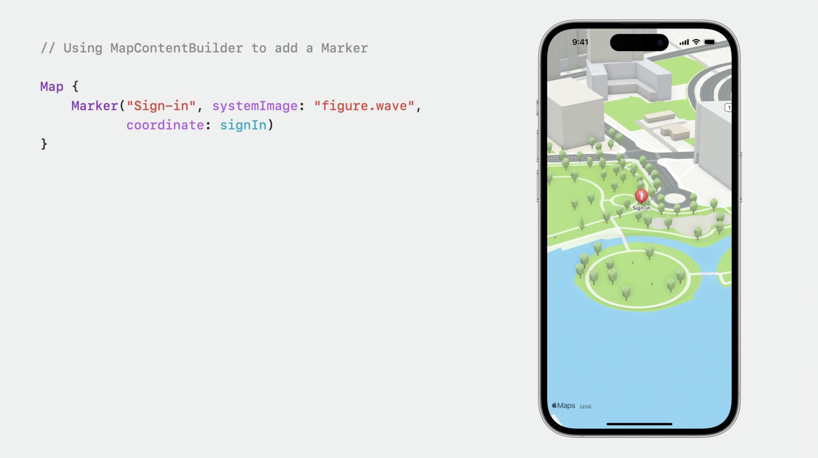
Adding a Marker to the map is a lot like adding a View to a List. The map has automatically framed our content by zooming in to show the Marker. Markers are used to display content at a specific coordinate on the map. The balloon shape is one of the defaults.
Map {
    Marker ("Sign-in", systemImage: "figure.wave", coordinate: signIn)
}
Like Marker, Annotation is used to display content at a specific coordinate.
    Annotation(
        "Sign-in",
        coordinate: signIn,
        anchor: .bottom
    ) {
        Image(systemName: "figure.wave")
            .padding (4)
            .foregroundStyle(.white)
            .background (Color.indigo)
            .cornerRadius (4)
    }
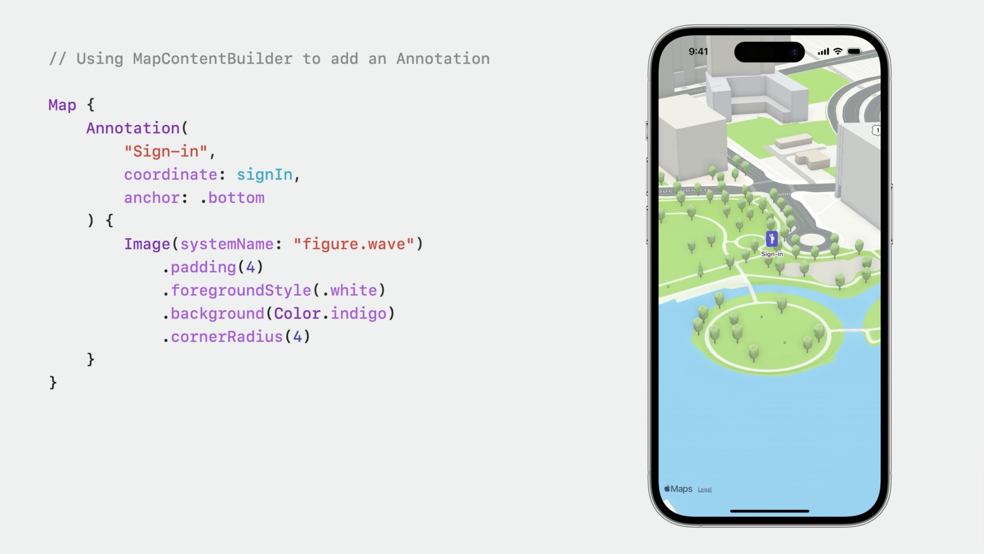
Instead of a Marker's balloon, Annotation displays a SwiftUI View.
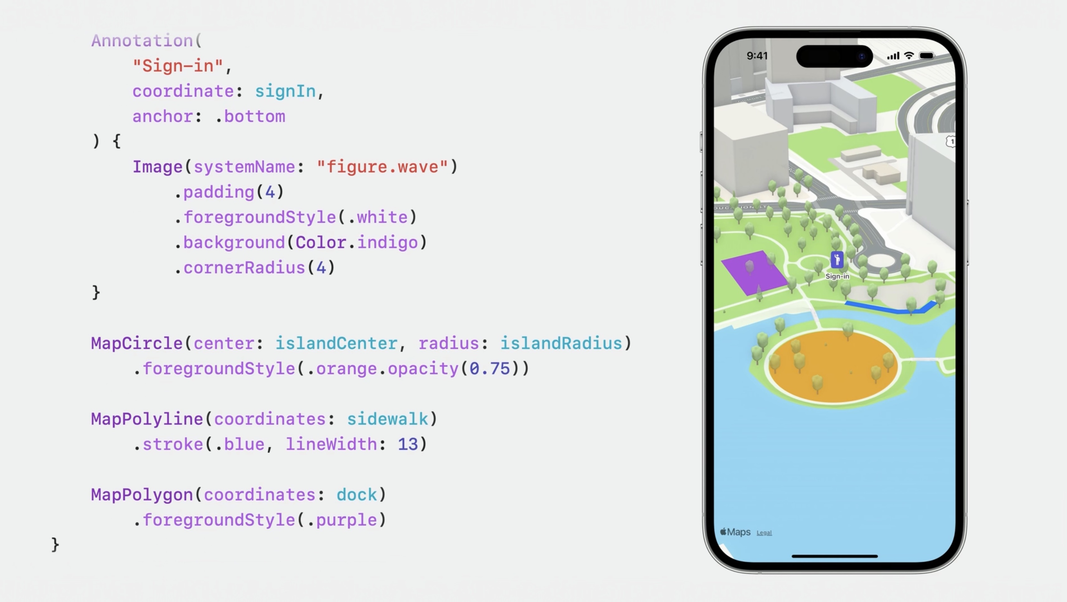
The content builder can be used to present an overlay content as well. Use the content builder closure to add all kinds of content to the map.
        MapCircle(center: islandCenter, radius: islandRadius)
            .foregroundStyle(.orange.opacity(0.75))

        MapPolyline(coordinates: sidewalk)
            .stroke(.blue, linewidth: 13)

        MapPolygon(coordinates: dock)
            .foregroundStyle(.purple)
We will display a custom SwiftUI view for the parking spot, so we will use an Annotation to mark it, and using ZStack to compose some shapes and an image. This SwiftUI view will be displayed on the map centered right on the parking coordinate. If we'd like the view to be positioned above the coordinate instead, we can use Annotation's anchor parameter. Specifying an anchor value of "bottom” will position the bottom of the view right on the annotation's coordinate.
struct ContentView: View {
    var body: some View {
        Map() {
            Annotation("Parking", coordinate: .parking) {
                ZStack {
                    RoundedRectangle(cornerRadius: 5)
                        .fill(.background)
                    RoundedRectangle(cornerRadius: 5)
                        .stroke(.secondary, lineWidth: 5)
                    Image(systemName: "car")
                        .padding(5)
                }
            }
            .annotationTitles(.hidden) // hide the title, icon only
        }
    }
}
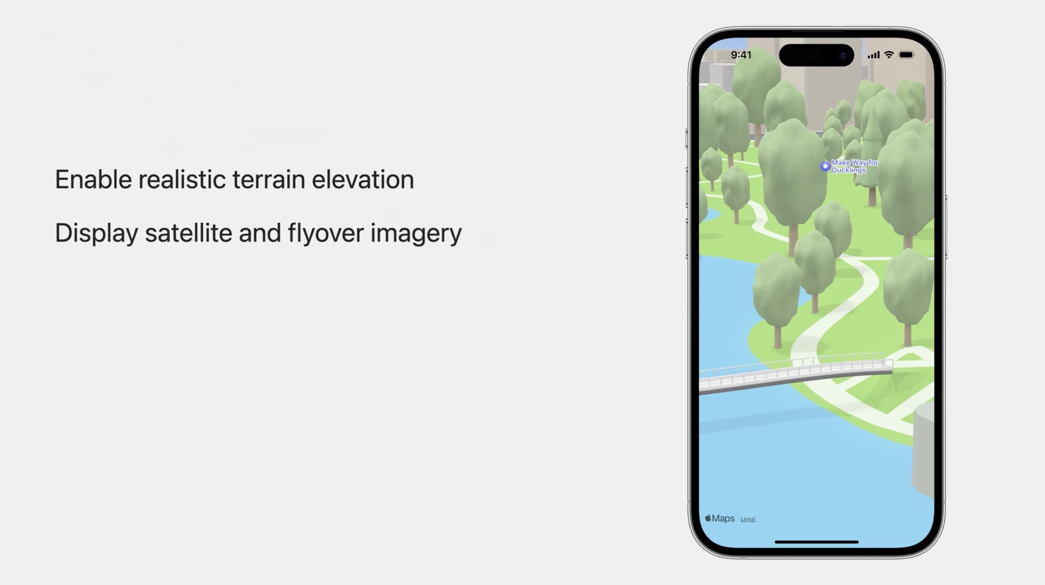
Enabling realistic terrain elevation
We can set a style using the mapStyle modifier.
.mapStyle(.standard)
Enable realistic elevated terrain with:
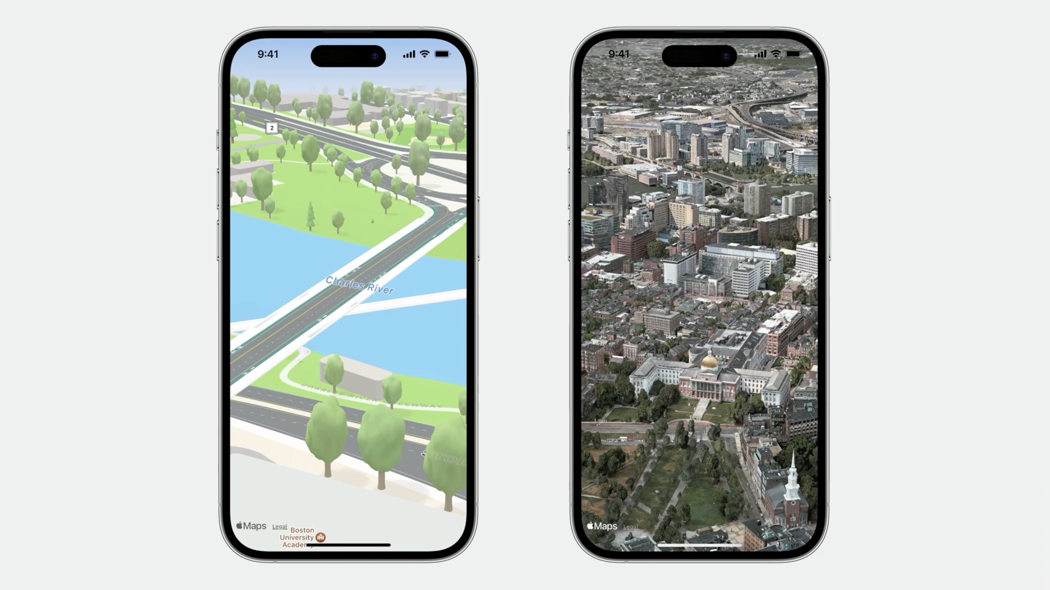
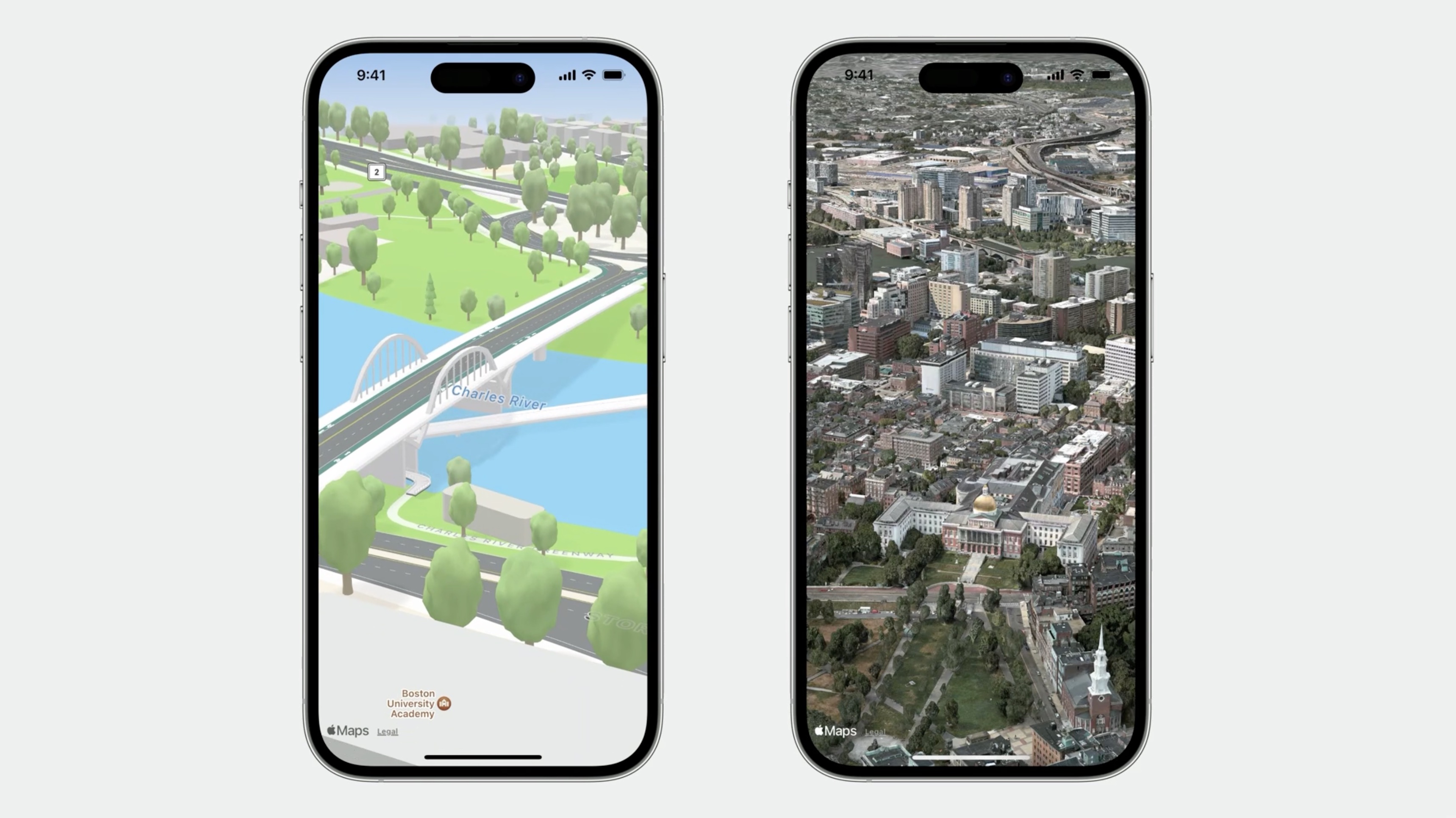
.mapStyle(.standard(elevation: .realistic))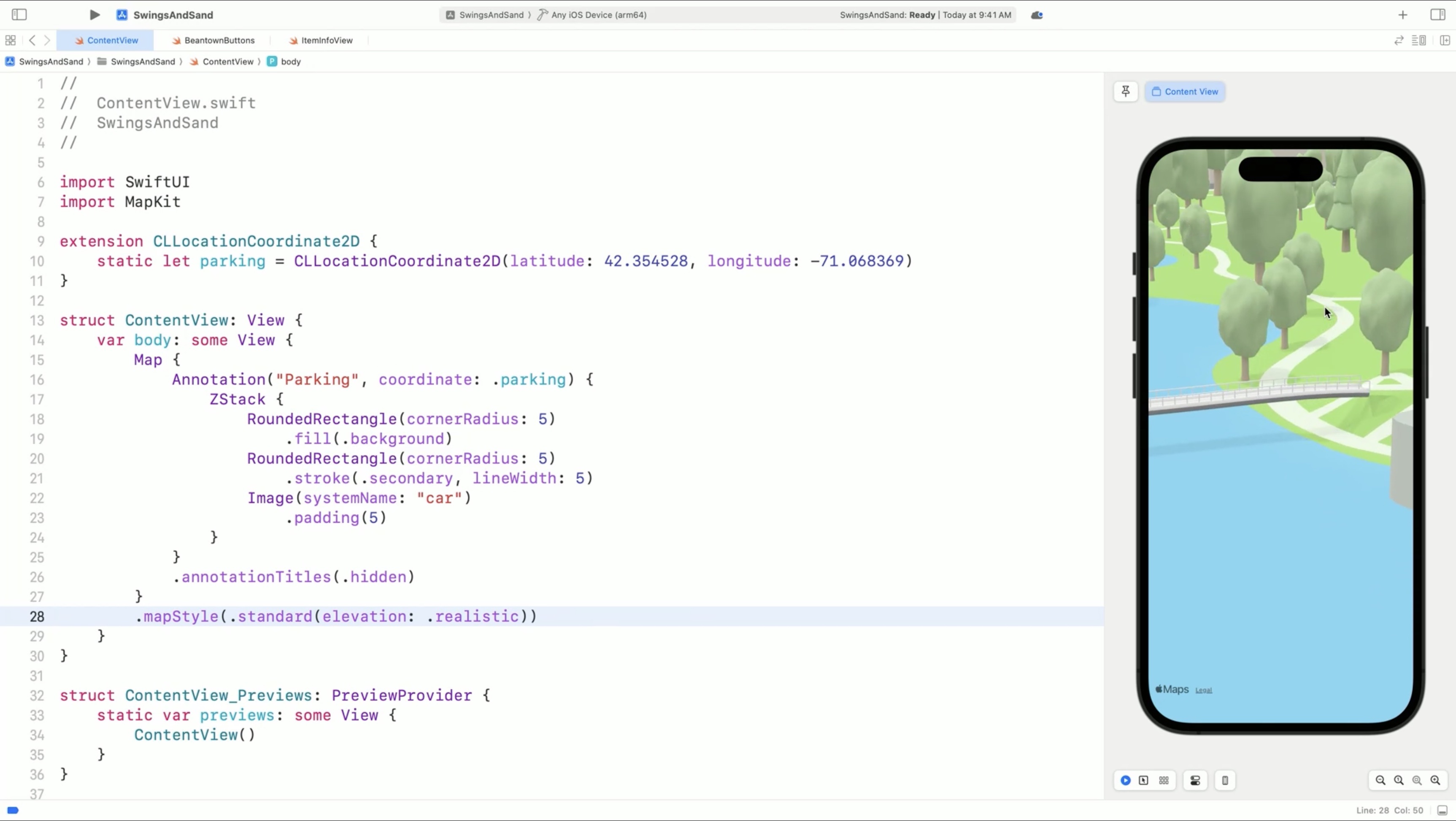
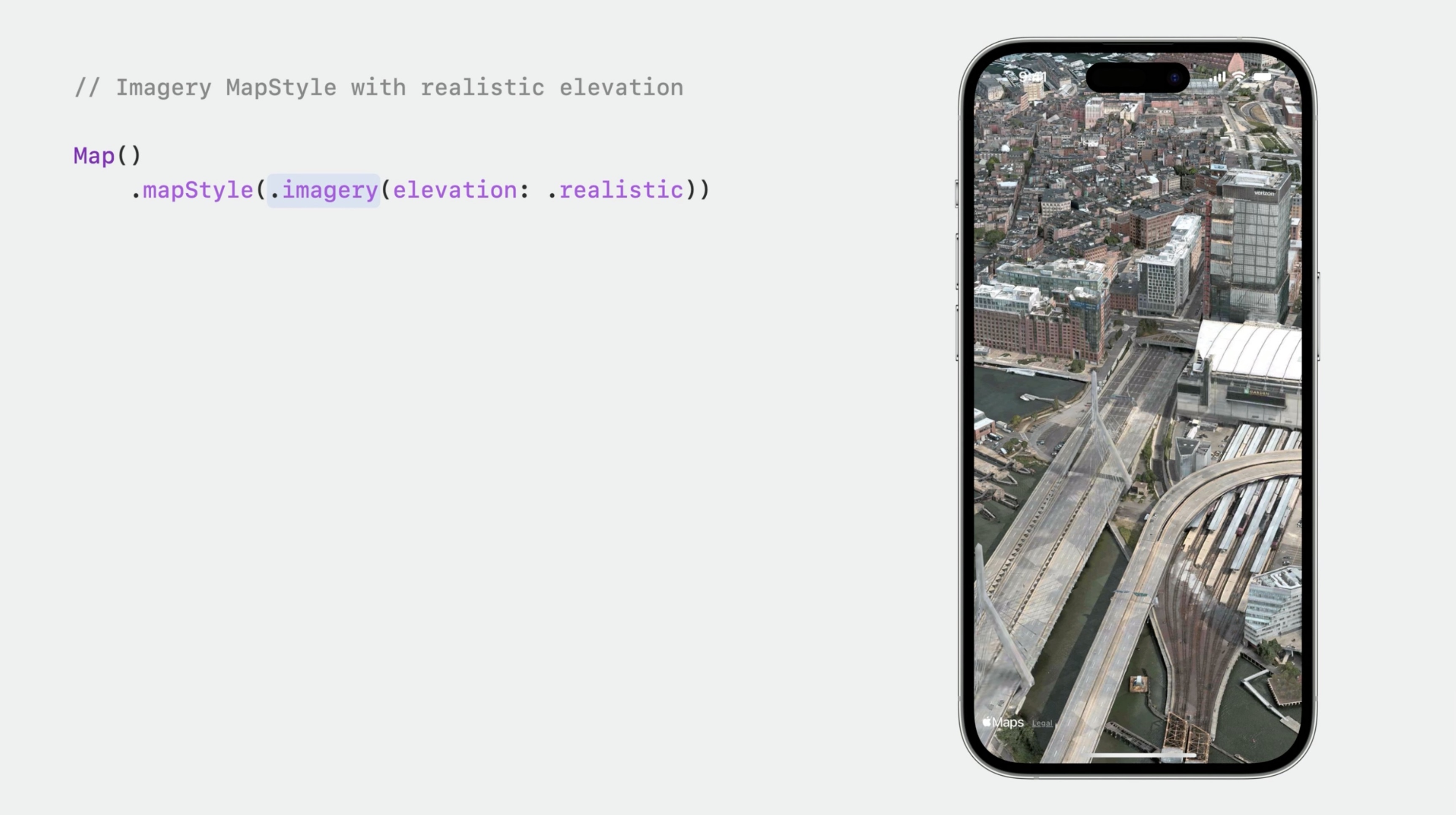
The imagery map style displays a map rendered using satellite or flyover imagery..mapStyle(.imagery(elevation: .realistic))
.mapStyle(.hybrid(elevation: .realistic))
The Hybrid map style combines imagery with roads and labels.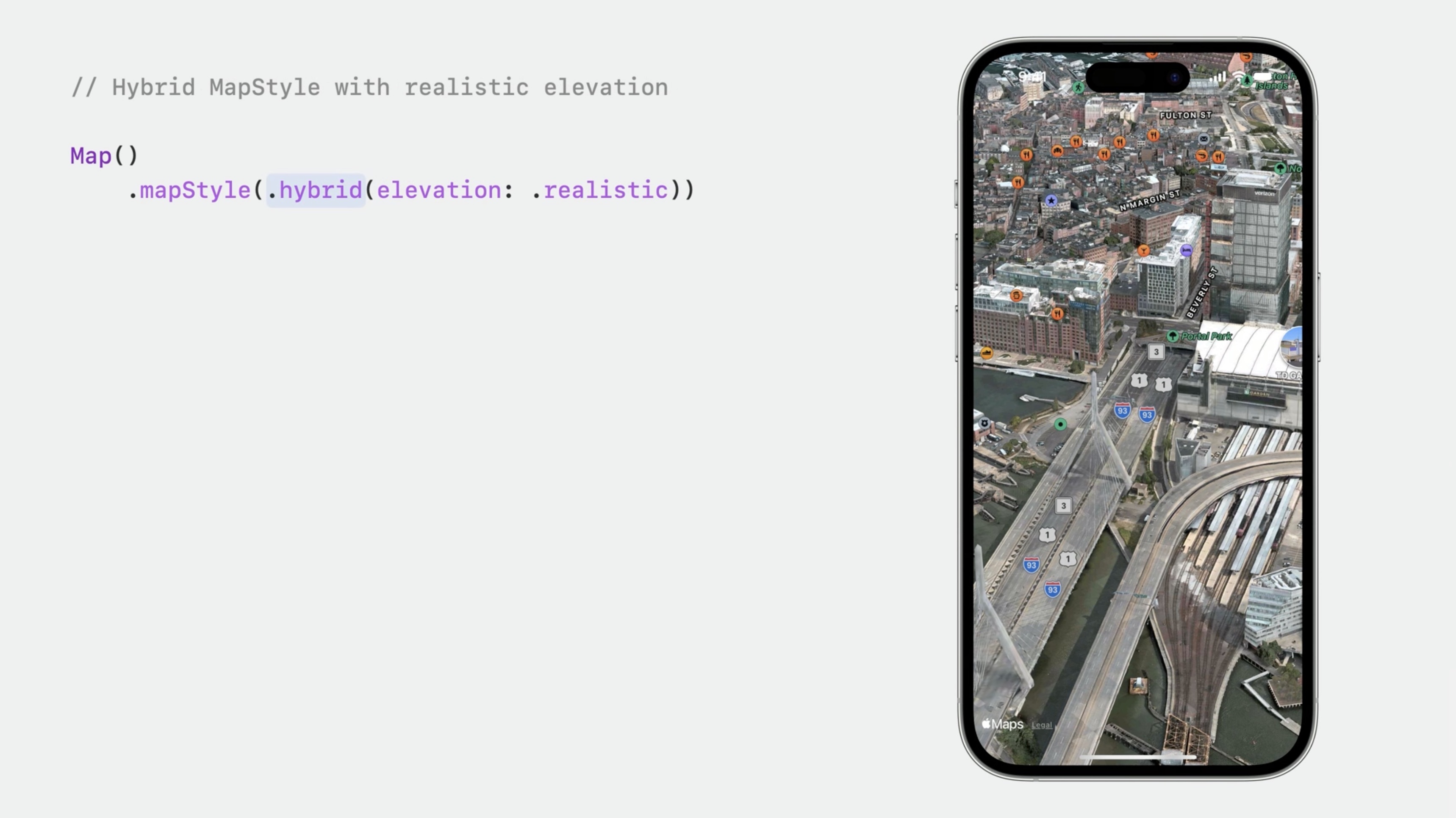
Add a Search to the App
The app will help us search for the places we want to visit.
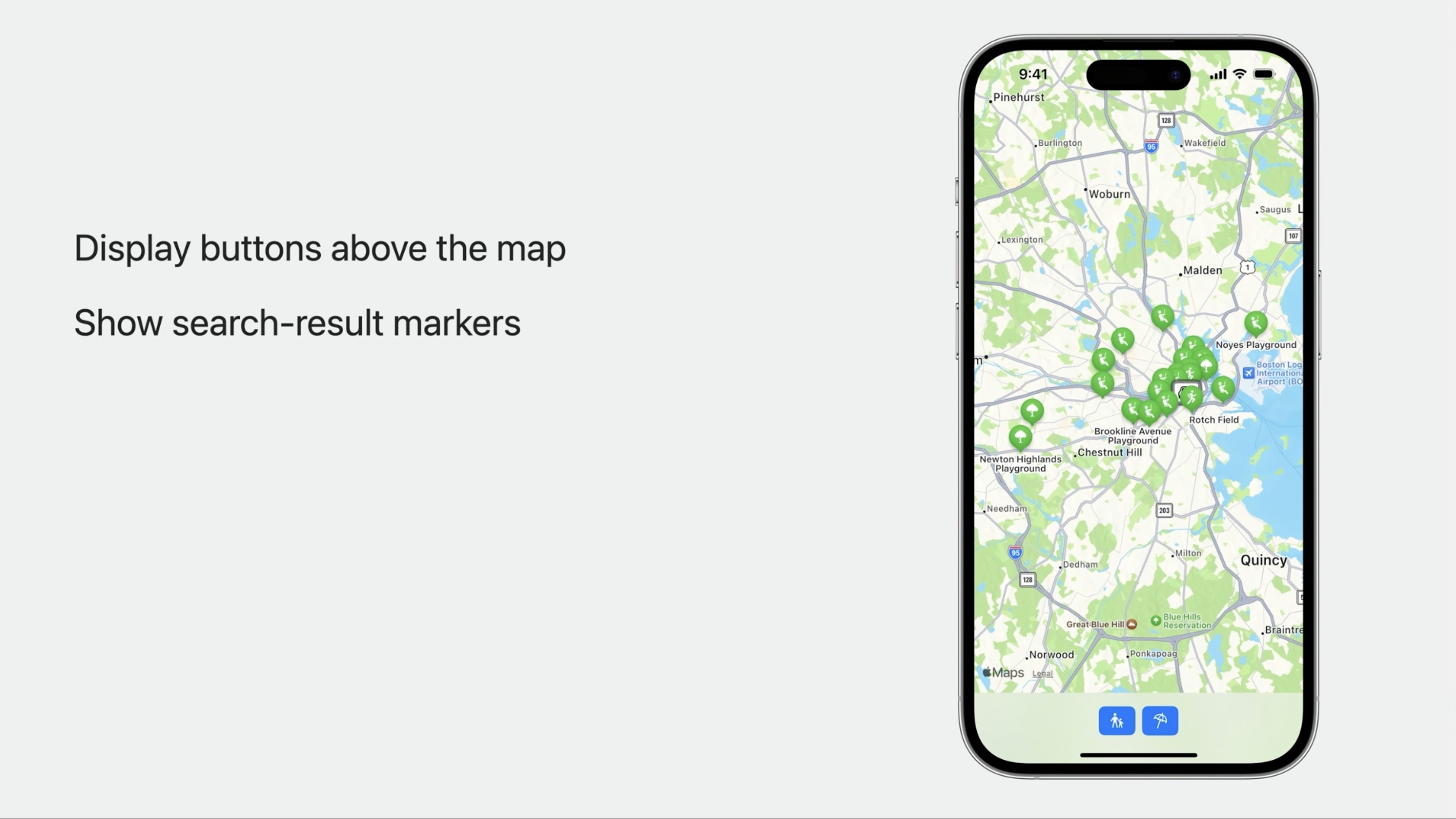
We add a SwiftUI file, BeantownButtons. And add a button to search for playgrounds, and a button to search for beaches. The app will add a Marker for each search result. Tapping a button calls a search function with a simple query, either playground or beach.
HStack {
    Button {
        search(for: "playground")
    } label: {
        Label("Playgrounds", systemImage: "figure.and.child.holdinghands")
    }
    .buttonStyle(.borderedProminent)

    Button {
        search(for: "beach")
    } label: {
        Label("Beaches", systemImage: "beach.umbrella")
    }
    .buttonStyle(.borderedProminent)
}
.labelStyle(.iconOnly)
The search function uses MKLocalSearch to find places near the Boston Common parking garage, and writes the results using a binding. We add this to the new BeantownButtons view.
@Binding var searchResults: [MKMapItem]

func search(for query: String) {
    let request = MKLocalSearch.Request()
    request.naturalLanguageQuery = query
    request.resultTypes = .pointOfInterest
    request.region = MKCoordinateRegion(
        center: .parking,
        span: MKCoordinateSpan (latitudeDelta: 0.0125, longitudeDelta: 0.0125)
        )

    Task {
        let search = MKLocalSearch(request: request)
        let response = try? await search.start()
        searchResults = response?.mapItems ?? []
    }
}
Back in the app's main ContentView, we'll add State to keep track of the search results.@State private var searchResults: [MKMapItem] = []
When the BeantownButtons UI performs a search, it will write the results back to this state using a binding.
Let's add the buttons above the map at the bottom of the screen. Using safeAreaInset will make sure the app's UI doesn't obscure any of the content or any system-provided controls that can appear on the map, such as the Apple Maps logo and Legal link. Put this code below the mapStyle modifier.
    .safeAreaInset(edge: .bottom) {
        HStack {
            Spacer()
            BeanTownButtons(searchResults: $searchResults)
                .padding(.top)
            Spacer()
        }
        .background(.ultraThinMaterial)
    }
Next, use the content builder to add search result Markers. We are using ForEach to add a marker for each search result.
Add this below the annotationTitles modifier.
    ForEach(searchResults, id: \.self) { result in
        Marker(item: result)
    }
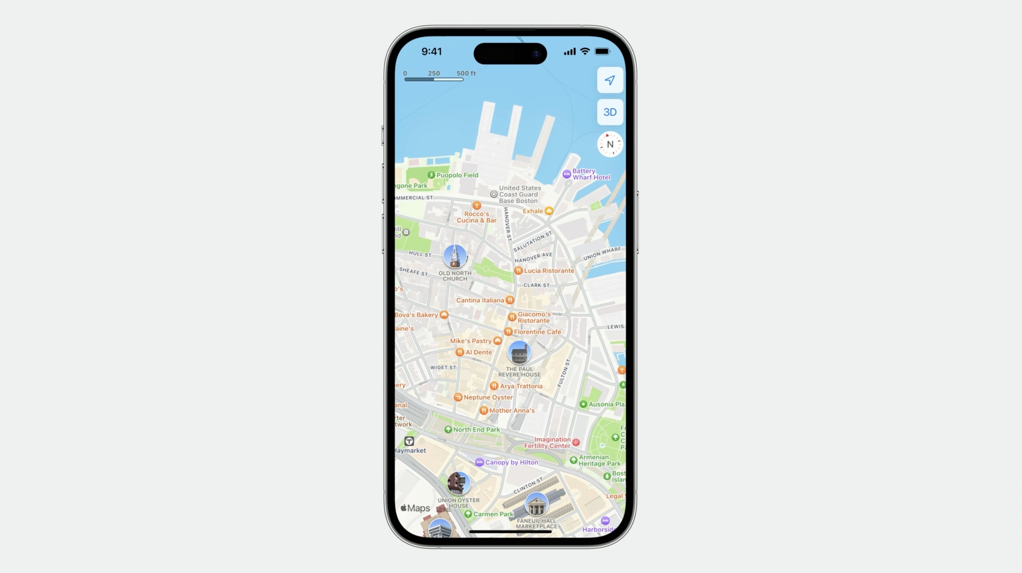
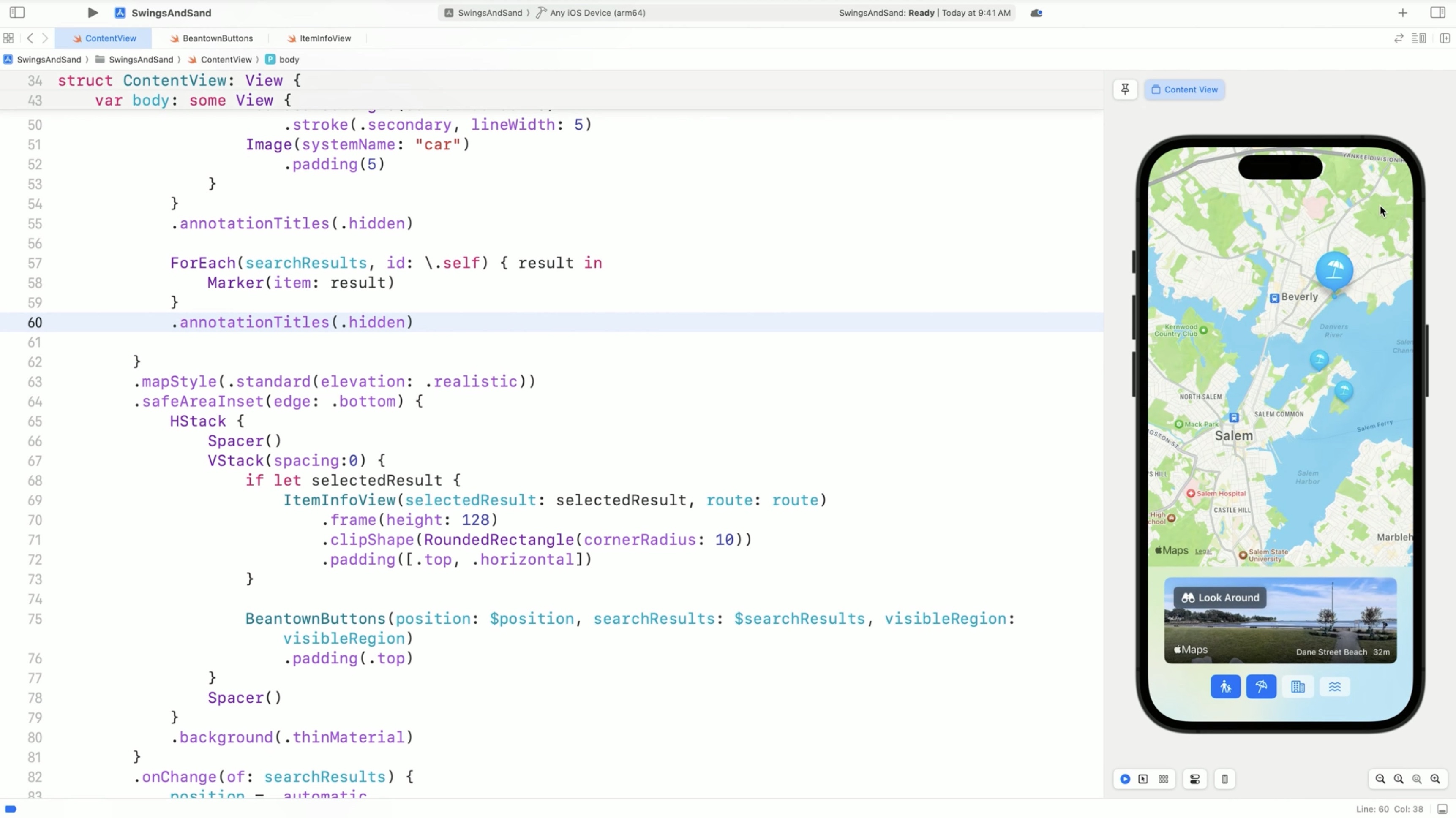
The search results are MKMapItems, which is the type MapKit APIs like MKLocalSearch use to represent places. Markers created this way use the map item's name for their title and use information from the map item to show an icon and tint color that represent the place. Most of these search results show as light blue beach umbrella markers, which is Marker's automatic content and style support.
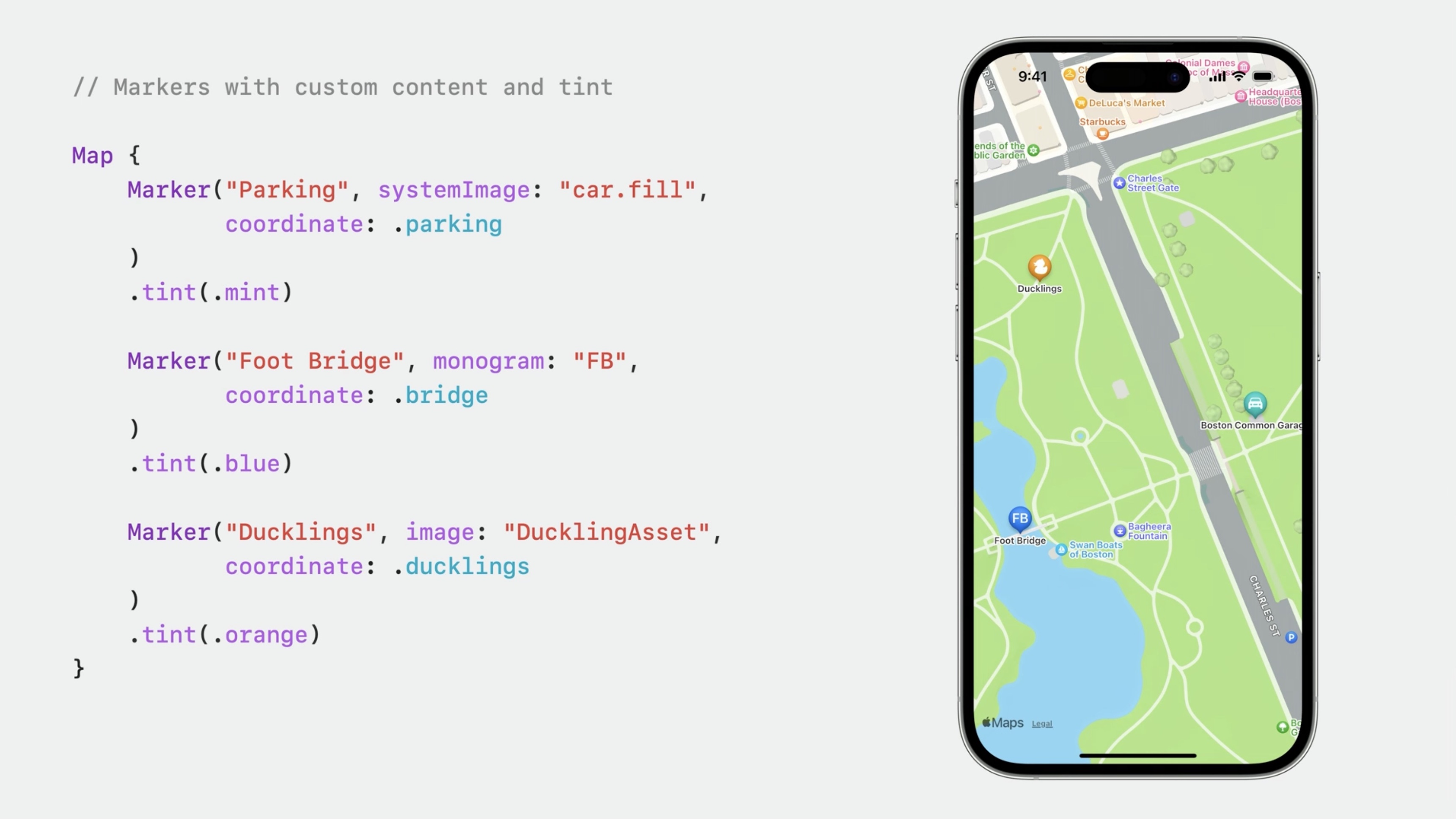
By default, Marker shows a map pin icon in its balloon. We can provide our own icon using an Image asset or a system image. we can also show up to three letters of text using monogram. And change the Marker's color using the tint modifier.
// Markers with custom content and tint
Map {
    Marker("Parking", systemImage: "car.fill",
        coordinate: parking
    )
    .tint(.mint)

    Marker("Foot Bridge", monogram: "FB",
        coordinate: bridge
    )
    .tint(.blue)

    Marker ("Ducklings", image: "DucklingAsset",
        coordinate: ducklings
    )
    .tint(.orange)
}
Display a Place or a Region
The map frames content automatically.
If we pan away and search for playgrounds... the map no longer automatically displays the results near the Boston Common parking spot. To display the search results after the user has interacted with the map, we need to re-set the Map's camera position state so that the map will frame the markers...
Let's add state to track the position using the default automatic position that frames the content we've added to the map.@State private var position: MapCameraPosition = .automatic
And I'll pass the binding to Map's initializer.Map(position: $position) { ... }
We use an onChange modifier to find out when the search results are updated. When they are, the camera position will be set back to automatic to make sure they're visible.
        .onChange(of: searchResults) {
            position = .automatic
        }
Now when performing a search, the results are all displayed even if we had panned away. Let's add coordinate regions for the city and for the North Shore.
extension MKCoordinateRegion {
    static let boston = MKCoordinateRegion(
        center: CLLocationCoordinate2D(
            latitude: 42.360256, longitude: -71.057279),
            span: MKCoordinateSpan(latitudeDelta: 0.1, longitudeDelta: 0.1)
    )

    static let northShore = MKCoordinateRegion(
        center: CLLocationCoordinate2D(
            latitude: 42.547408, longitude: -70.870085),
            span: MKCoordinateSpan(latitudeDelta: 0.5, longitudeDelta: 0.5)
    )
}
Switching over to the BeantownButtons UI and adding a binding for the position state.@Binding var position: MapCameraPosition
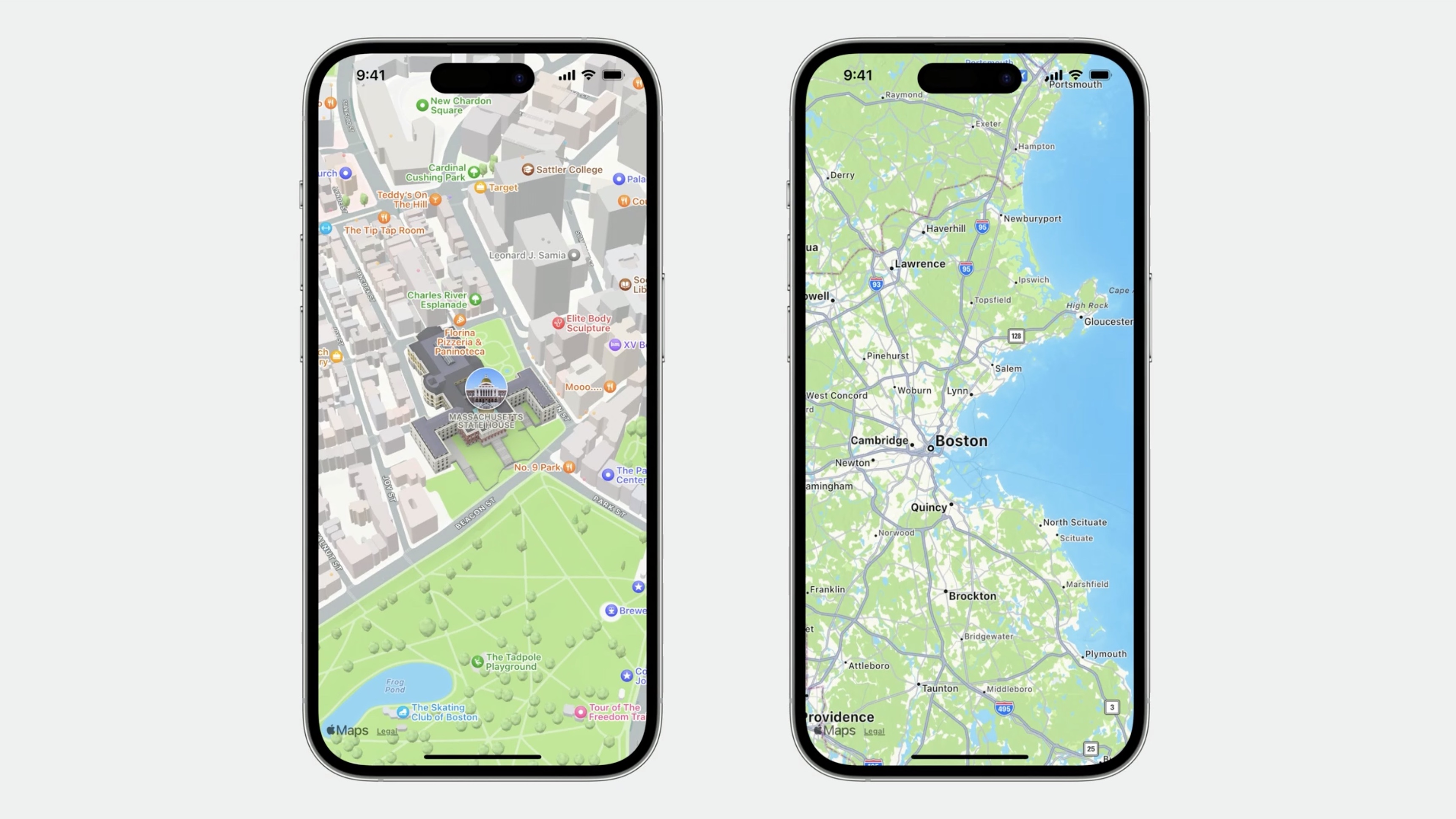
We add a couple of buttons, each setting the camera position to a region. Pressing the City button, the Map will show Boston. When pressing the Waves button, the map will show the north shore coastline.
In BeantownButtons buttons in the bottom view have a binding to position:
    Button {
        position = .region(.boston)
    } label: {
        Label("Boston", systemImage: "building.2")
    }
    .buttonStyle(.bordered)

    Button {
        position = .region(.northShore)
    } label: {
        Label("North Shore", systemImage: "water.waves")
    }
    .buttonStyle(.bordered)
Switch back to ContentView and pass a position binding to the buttons UI.BeanTownButtons(position: $position, searchResults: $searchResults)
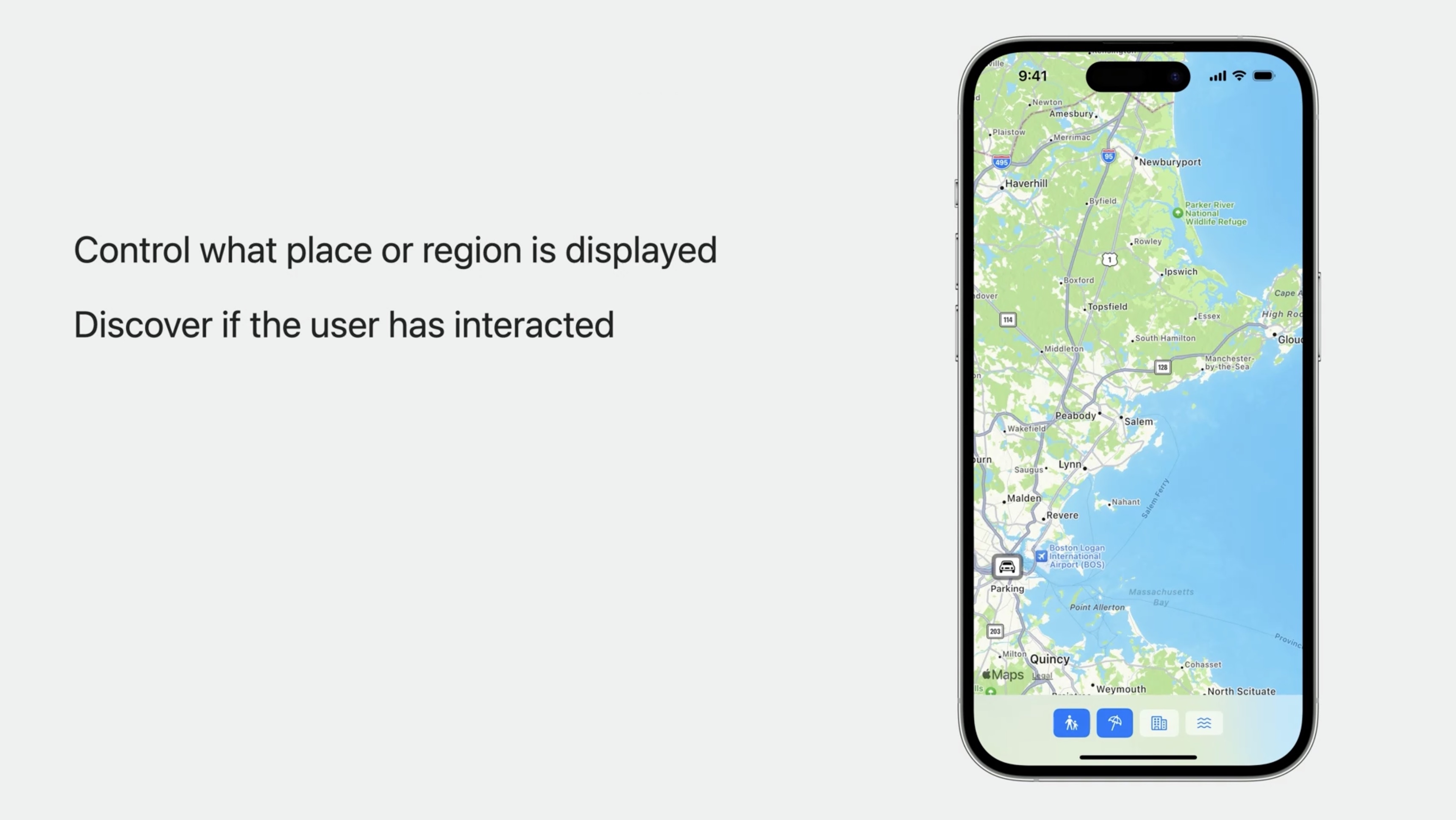
Control What the Map Displays
- Explicit:
MapCamera - Semantic Positioning:
MapCameraPosition
Behind the scenes, what the Map shows is ultimately controlled by a MapCamera. The camera looks at a coordinate on the ground from a certain distance and the orientation of the camera determines what is visible in the map. MapKit takes care of the camera for us.
Position the camera: MapCameraPosition
Control what place or region is displayed:
- automatic The app uses an automatic camera position to frame content, such as search results.
- region (
MKCoordinateRegion) It uses a region position to show Boston and the North Shore. - rect (
MKMapRect) we can specify a camera position to frame other things. Rect position is used to show an area. It simply uses a map rect to represent that area, instead of a coordinate region. - item (
MKMapItem) - camera (
MapCamera) userLocation()
Using MKMapItem, we can show a particular place. If the map item represents Cape Cod Bay, MapKit will automatically zoom out so that it fits.
position = .item(.capeCodBay)
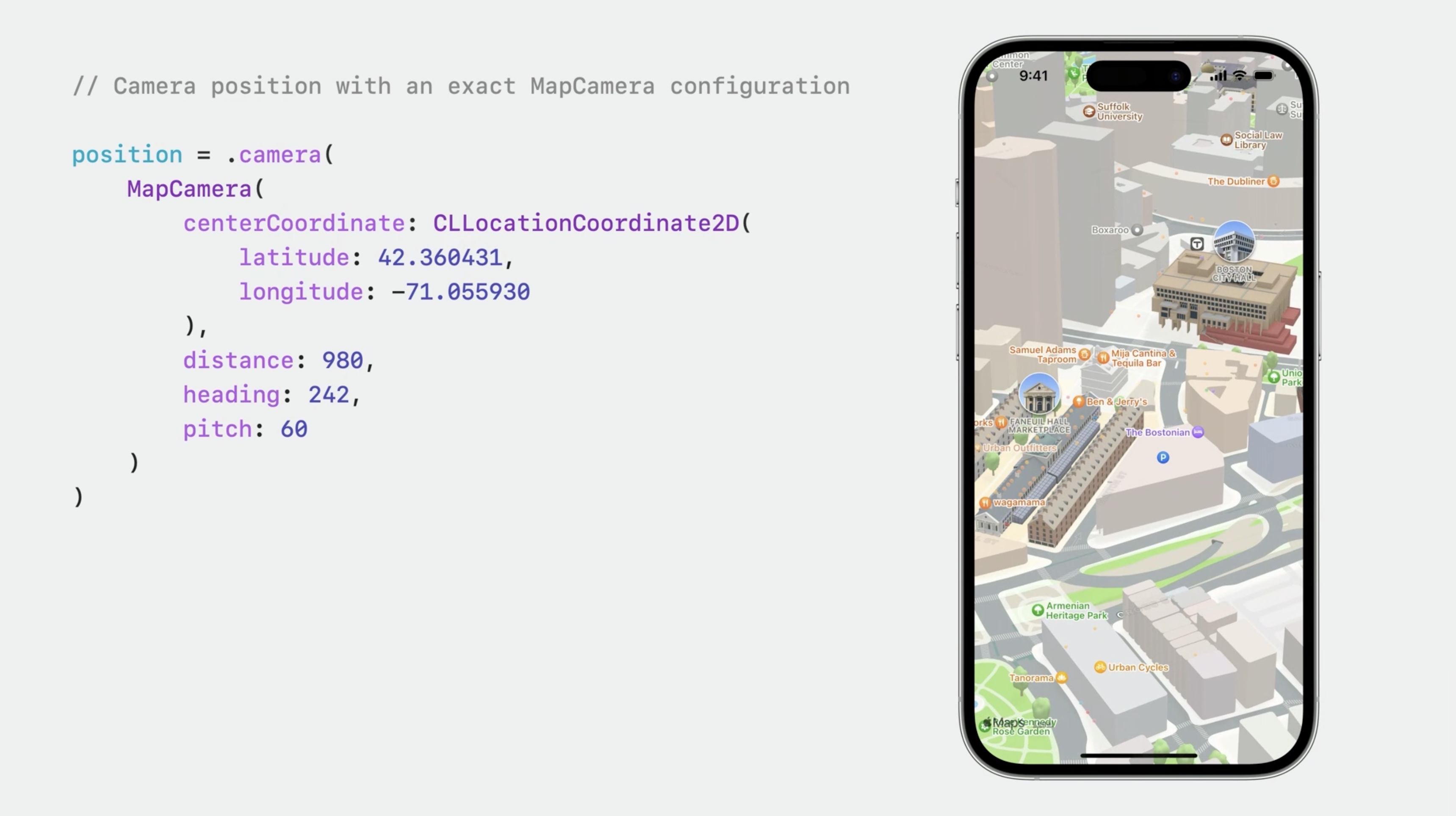
Using a MapCamera with a pitch angle is a great way to deliver a 3D perspective.
// Camera position with an exact MapCamera configuration
position = .camera (
    MapCamera (
        centerCoordinate: CLLocationCoordinate2D(
            latitude: 42.360431,
            longitude: -71.055930
    ),
    distance: 980,
    heading: 242,
    pitch: 60
    )
)
We can supply a fallback position that will be used when the user's location is not known, such as when location authorization has not been granted or while the device is trying to get a location fix. If we provide a binding to the camera position state, MapKit will update it when the camera position changes.
// Camera position that follows the user's location
position = .userLocation(fallback: .automatic)
Here is a user location camera position. The followsUserLocation property is true.
position.followsUserLocation == true
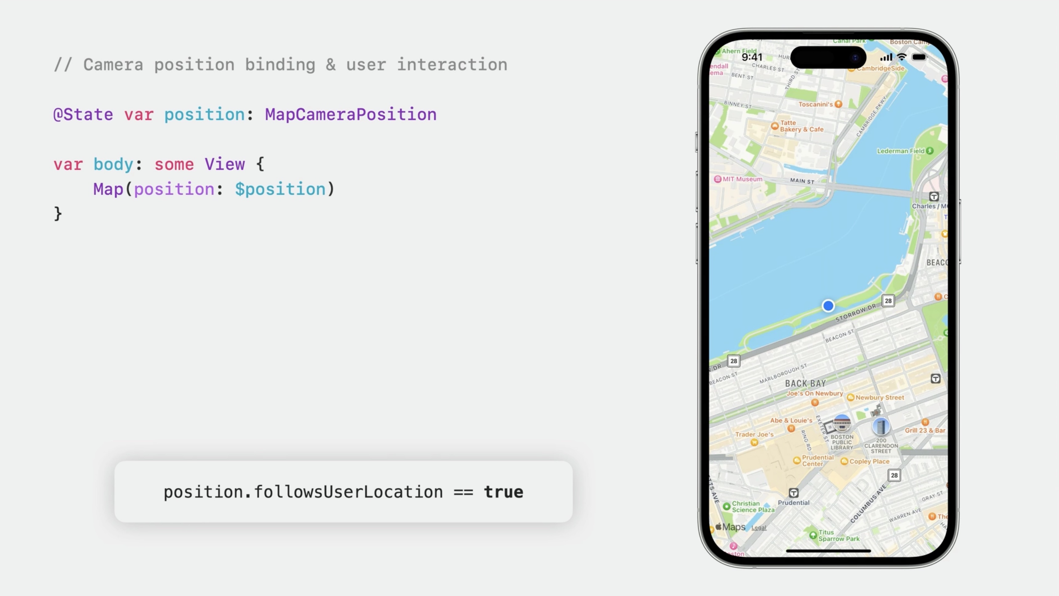
If the user pans away, the camera is no longer following the user's location. When the user interacts with the map, the camera position state is positionedByUser.position.followsUserLocation == falseposition.positionedByUser == true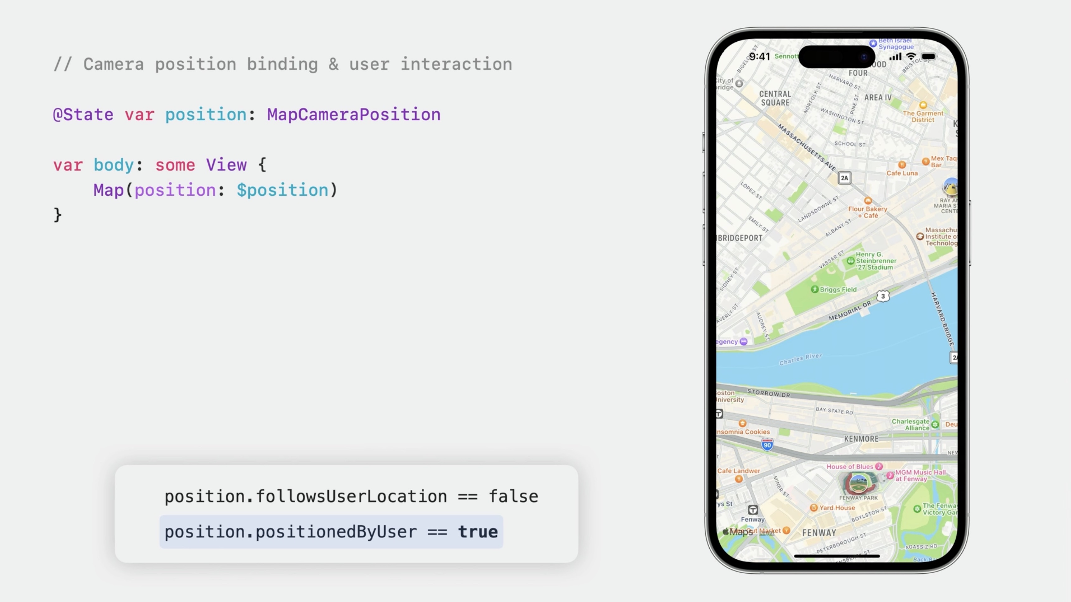
When the app sets the camera position state, it is not positionedByUser.
position.followsUserLocation == trueposition.positionedByUser == false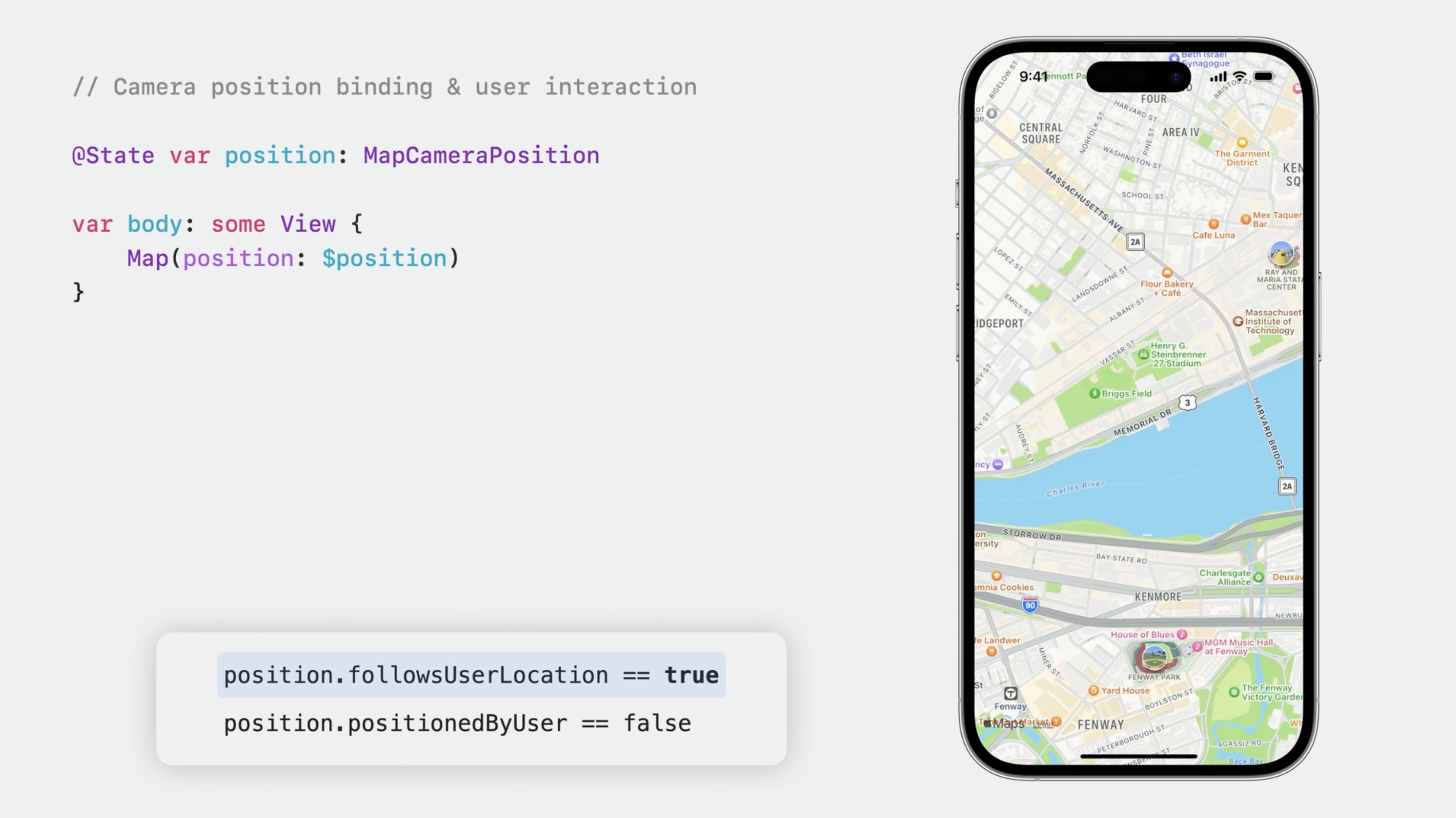
Search in the visible region
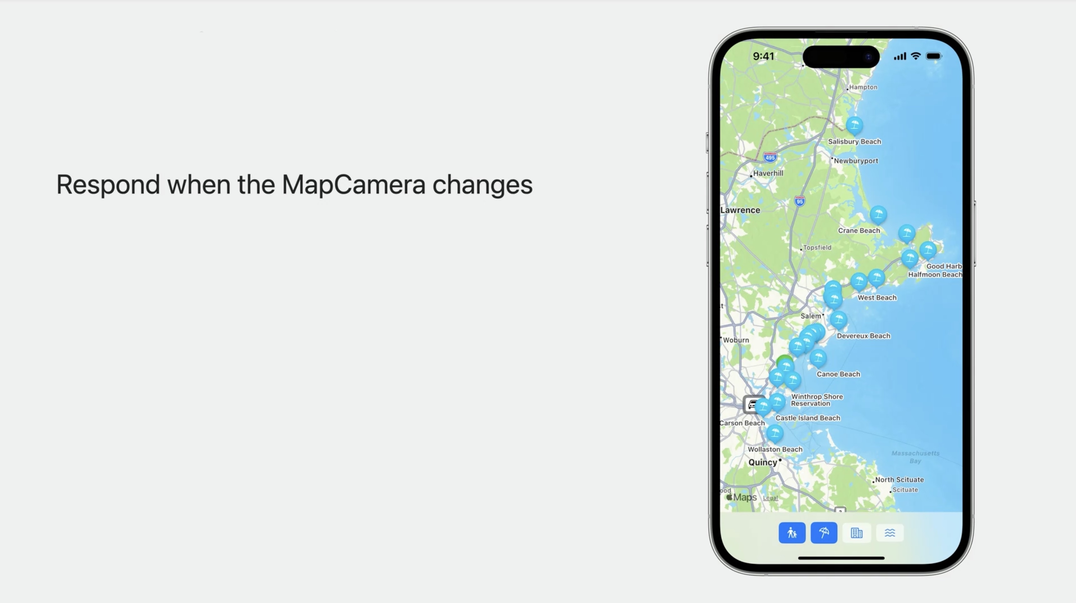
How to get the visible region when the camera changes?
We add state to track the region that's visible in the map and an onMapCameraChange modifier, where we grab the visible region from the update context and stash it in our own state.
@State private var visibleRegion: MKCoordinateRegion?
and
         .onMapCameraChange { context in
            visibleRegion = context.region
        }
By default, the closure supplied to onMapCameraChange will be called when the user has finished interacting with the map. To have the closure called while the user is interacting with the map, we can request continuous updates by passing a frequency parameter. In addition to the region property that used here, the context also has a property for the visible map rect and one for the map camera itself.
Update BeantownButtons so that it will search within the region that's visible to the user. Add the visibleRegion to the buttons.
var visibleRegion: MKCoordinateRegion?
Use it in the search request:
            [...]
        request.region = visibleRegion ?? MKCoordinateRegion(
            center: .parking,
            span: MKCoordinateSpan(
                latitudeDelta: 0.0125,
                longitudeDelta: 0.0125))
            [...]
In ContentView, we'll pass the visibleRegion to the buttons UI.
    BeanTownButtons(
        position: $position,
        searchResults: $searchResults,
        visibleRegion: visibleRegion
        )
onMapCameraChange will inform us when there's been a change in what's visible.
Interact with search results
Enable selection for Map Content
Let's add support for selecting a search result. Right now, there is no selection state, so the markers are not selectable. To enable selection, we'll just add a selection binding to our Map.
@State private var selectedResult: MKMapItem?
The balloon animates to show that it's selected. Each marker that represents a map item is now selectable. The Parking Spot annotation doesn't represent a map item, so it is not selectable.
If we want to support selection for Markers and Annotations that don't necessarily have the same type of identity, we can simply tag them. This works the same way it does when managing selection with Picker and List. Here, the selectedTag state is an Int. Each marker is tagged with an Int, so the binding enables selection for both of them. When using tag to enable selection, we can use any type conforming to hashable for the selection state.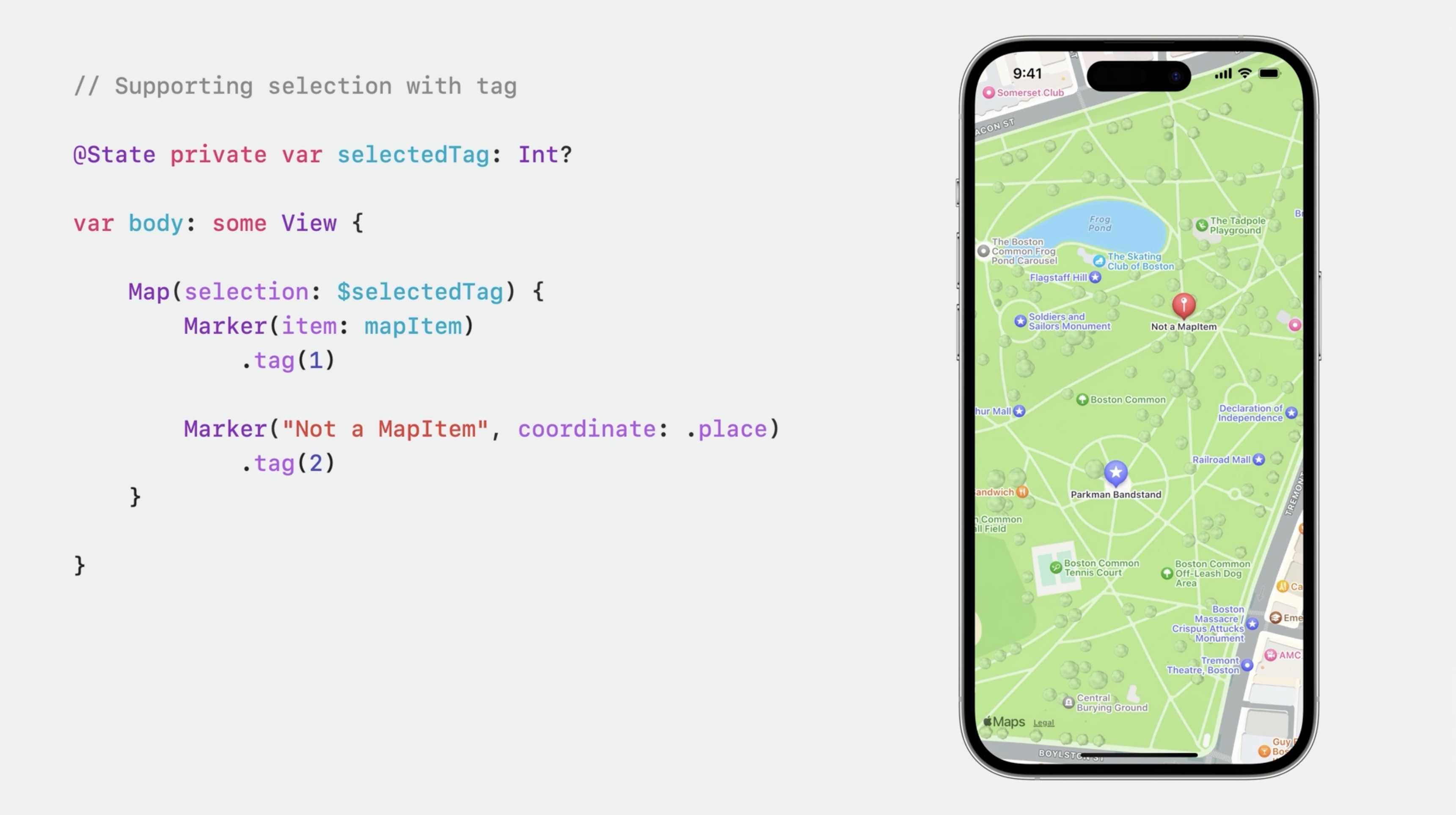
Display useful search-result information
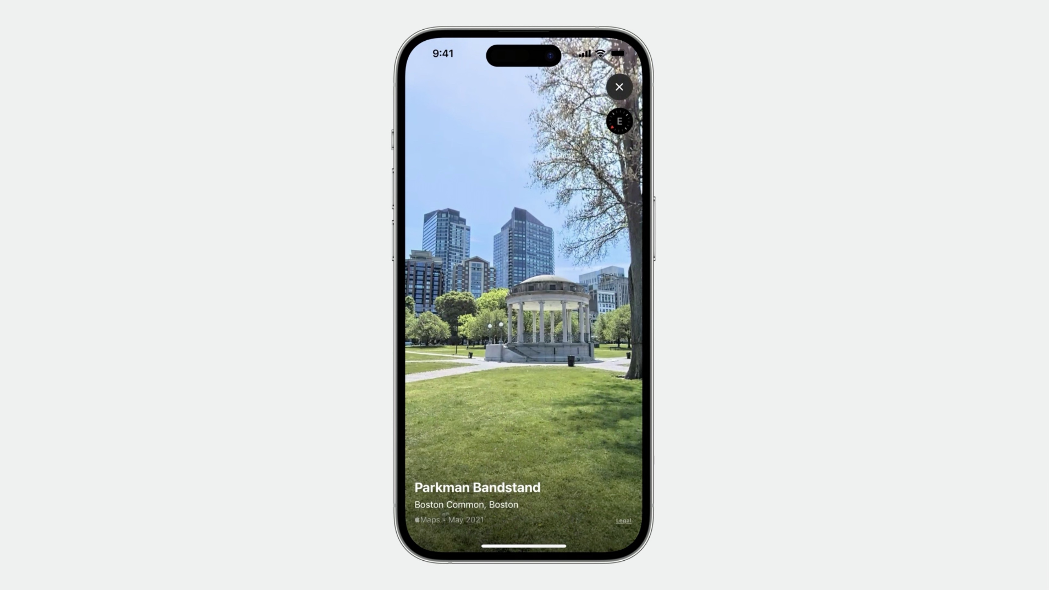
- Look Around
- Place name
- Travel time
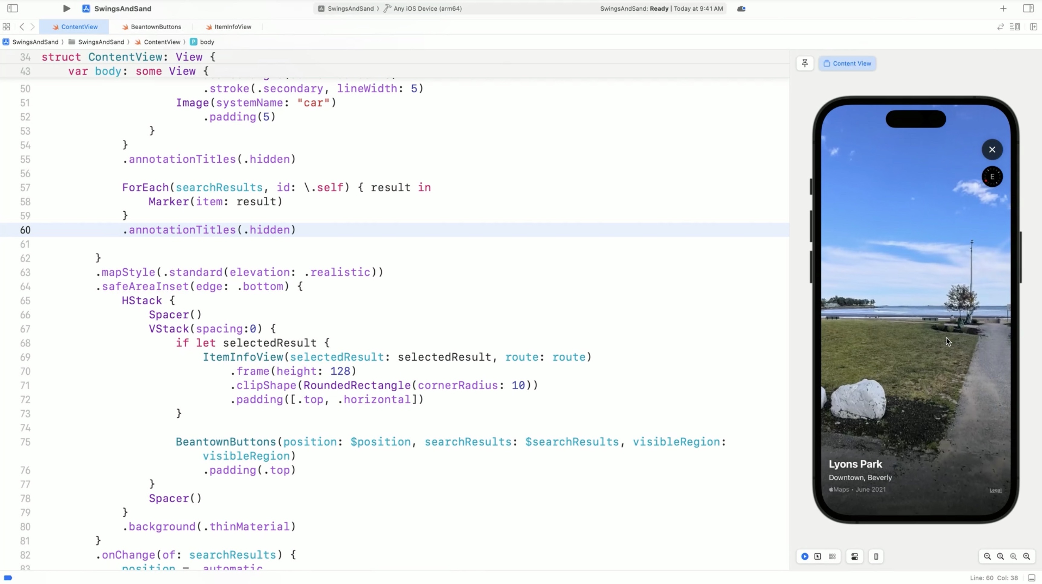
The app should display some additional information about the selected search result. We'll add a look around preview to offer a sneak peek and the name of the place and the drive time as well.
Let's make a new SwiftUI file called ItemInfoView that shows... a title, the estimated travel time, and a Look Around Preview.
    var body: some View {
        LookAroundPreview(initialScene: lookAroundScene)
            .overlay(alignment: .bottomTrailing) {
                HStack {
                    Text ("\(selectedResult.name ?? "")")
                    if let travelTime {
                        Text(travelTime)
                    }
                }
                .font(.caption)
                .foregroundStyle(.white)
                .padding (10)
            }
            .onAppear {
                getLookAroundScene()
            }
            .onChange(of: selectedResult) {
                getLookAroundScene()
            }
    }
The Look Around Preview will show what the selected place looks like. The Preview displays a Look Around Scene. We get the scene for a given map item using MKLookAroundSceneRequest. The scene will be fetched when the view is displayed, and again any time the selected search result changes.
    // ItemInfoView.swift - Fetch a Look Around scene
    @State private var lookAroundScene: MKLookAroundScene?

    func getLookAroundScene () {
        lookAroundScene = nil
        Task {
            let request = MKLookAroundSceneRequest(mapItem: selectedResult)
            lookAroundScene = try? await request.scene
        }
    }
There's a property that formats an MKRoute's expected travel time for display, using DateComponentsFormatter.
// ItemInfoView.swift - Format travel time for display
    private var travelTime: String? {
        guard let route else { return nil }
        let formatter = DateComponentsFormatter()
        formatter.unitsStyle = .abbreviated
        formatter.allowedUnits = [.hour, .minute]
        return formatter.string(from: route.expectedTravelTime)
    }
Switch back to ContentView and adding this ItemInfoView. Then add state to keep track of a route...@State private var route: MKRoute?
We add a function that uses MKDirections to get one... and set the state.
func getDirections() {
    route = nil
    guard let selectedResult else { return }
    let request = MKDirections.Request()
    request.source = MKMapItem(placemark: MKPlacemark(coordinate: .parking))
    request.destination = selectedResult

    Task {
        let directions = MKDirections(request: request)
        let response = try? await directions.calculate()
        route = response?.routes.first
    }
}
Here we add another onChange modifier to call the function when the selection changes, the app will show the itemInfoView when it has a selected search result.
        .onChange(of: selectedResult) {
            getDirections()
        }
and
    VStack(spacing:0) {
        if let selectedResult {
            ItemInfoView(selectedResult: selectedResult, route: route)
                .frame(height: 128)
                .clipShape(RoundedRectangle (cornerRadius: 10))
                .padding([.top, .horizontal])
        }
        BeantownButtons( //...
    }
We hide the Marker titles for the search results to clean up the appearance of the map.
The ItemInfoView will display the name of the selected place instead.
    ForEach (searchResults, id: \.self) { result in
        //...
    }
    .annotationTitles(.hidden) // hide the Marker titles
Show Overlay Content
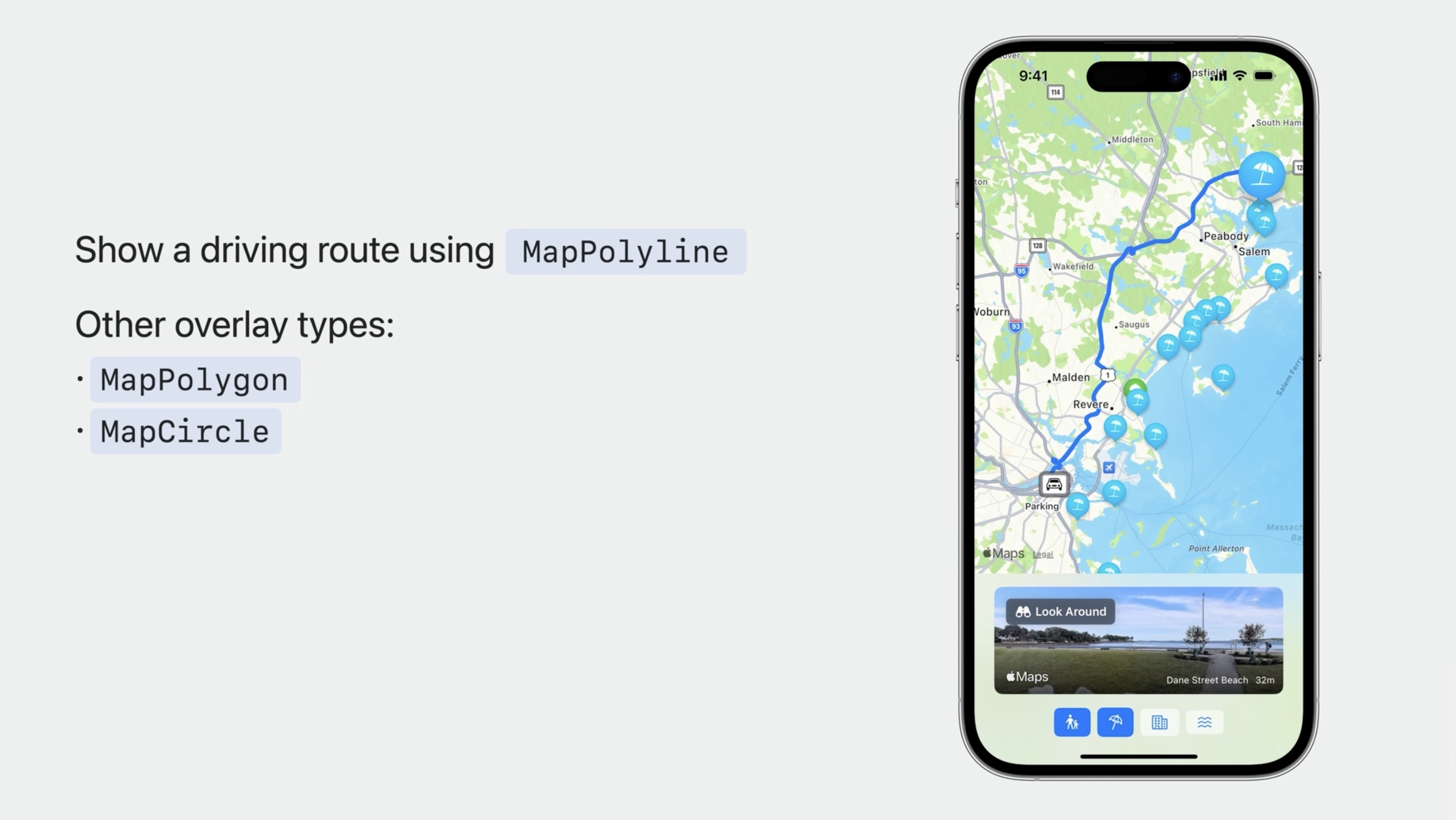
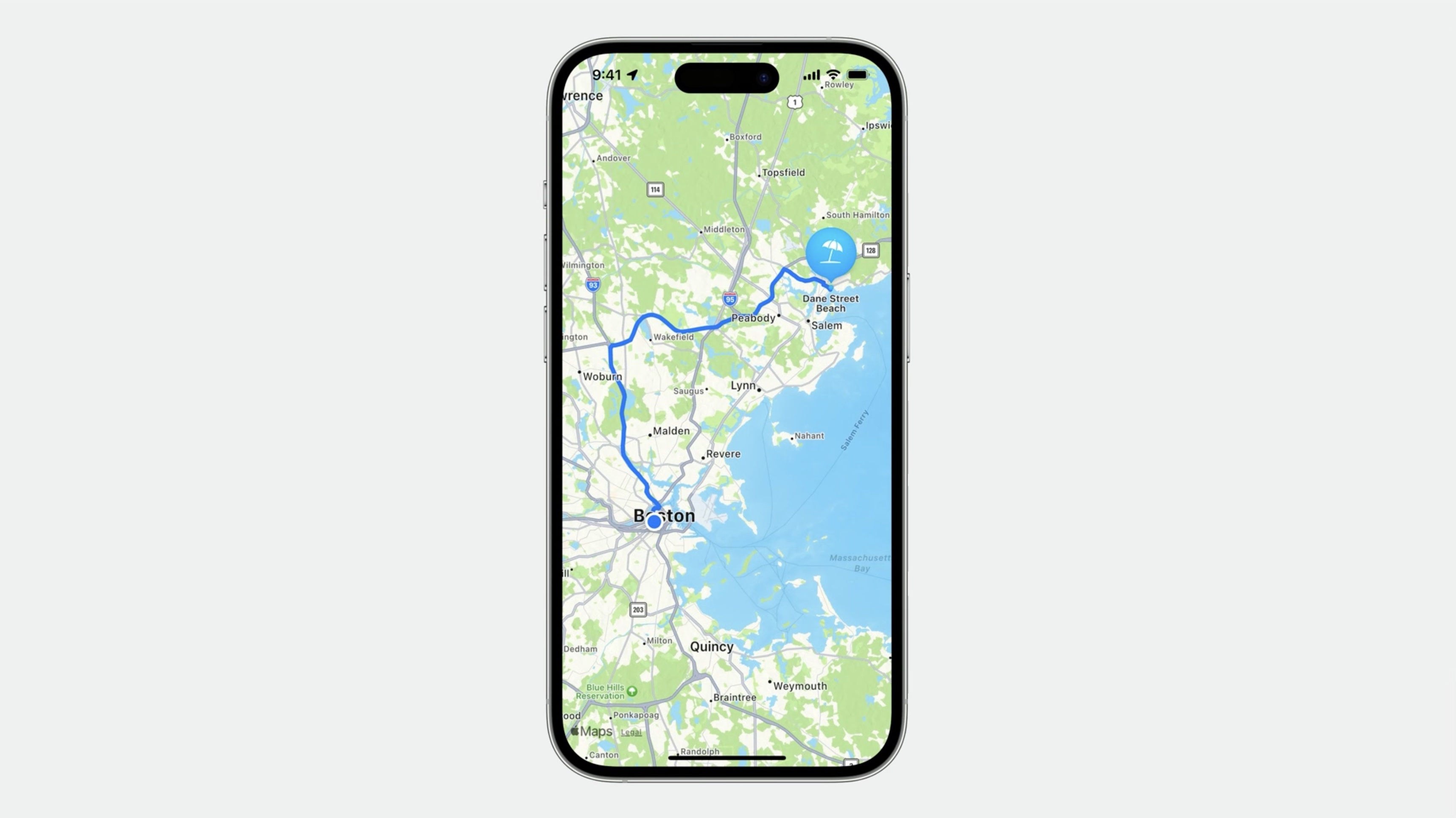
Since we already have a route to show the travel time, we can use it to display the driving route to the selected search result. We'll add a MapPolyline overlay to show the route and stroke it with blue.
    if let route {
        MapPolyline(route)
            .stroke(.blue, lineWidth: 5)
    }
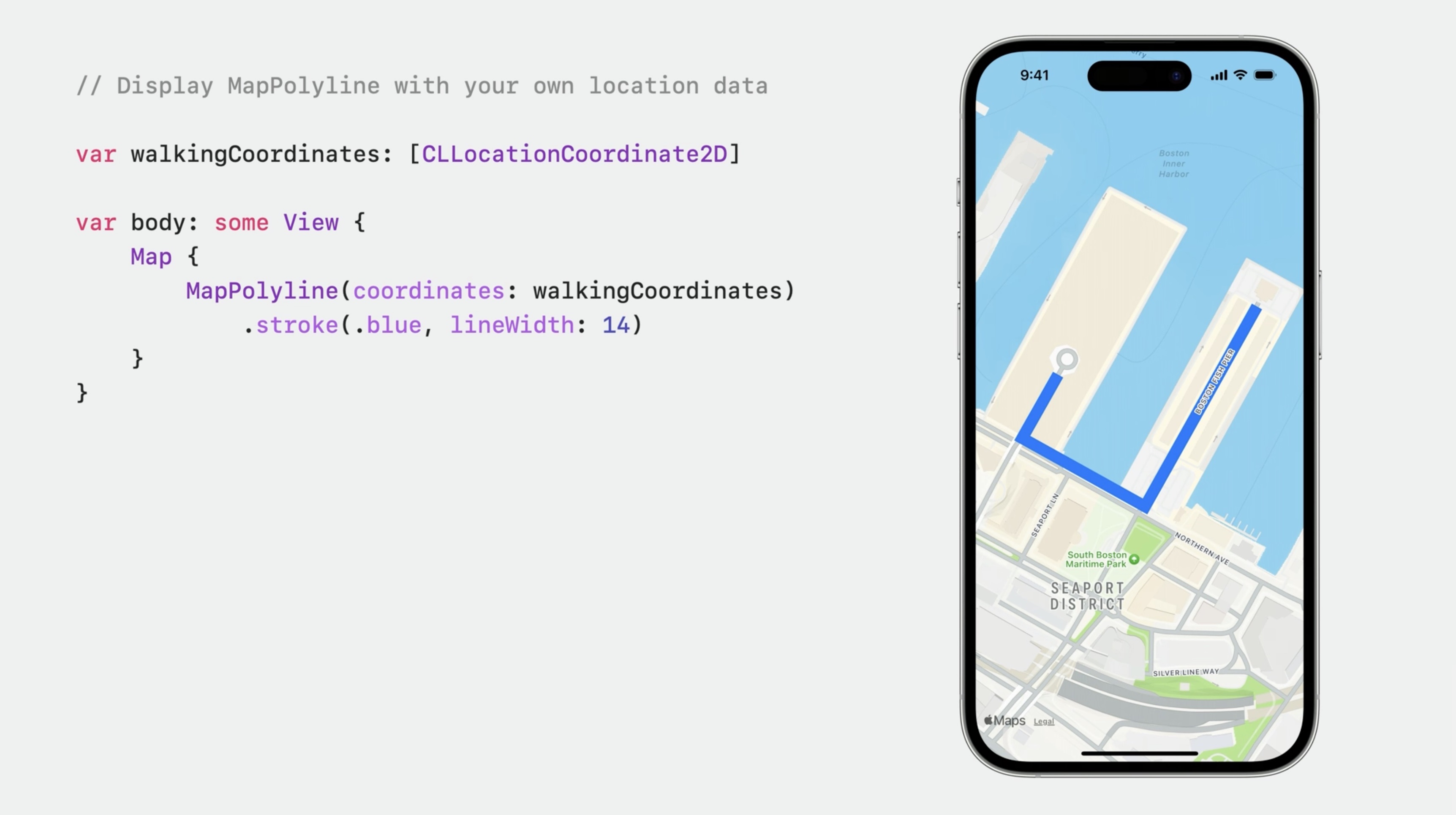
We can also use MapPolyline to show our own location data. StrokeStyle can draw dashes and gradients as well...
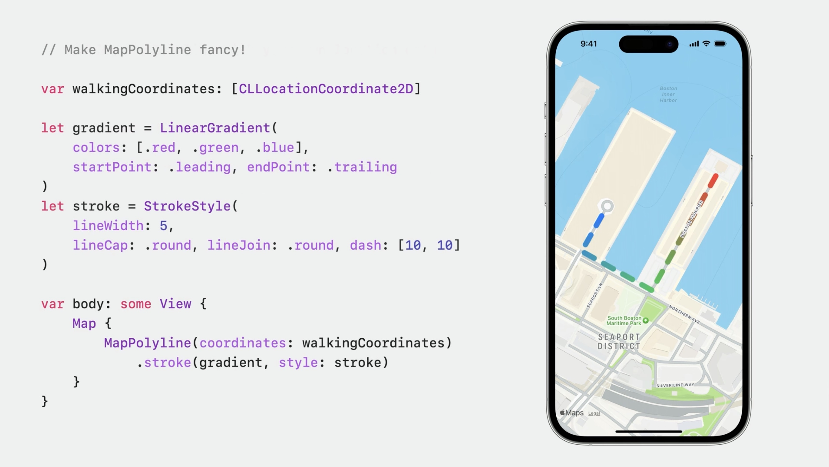
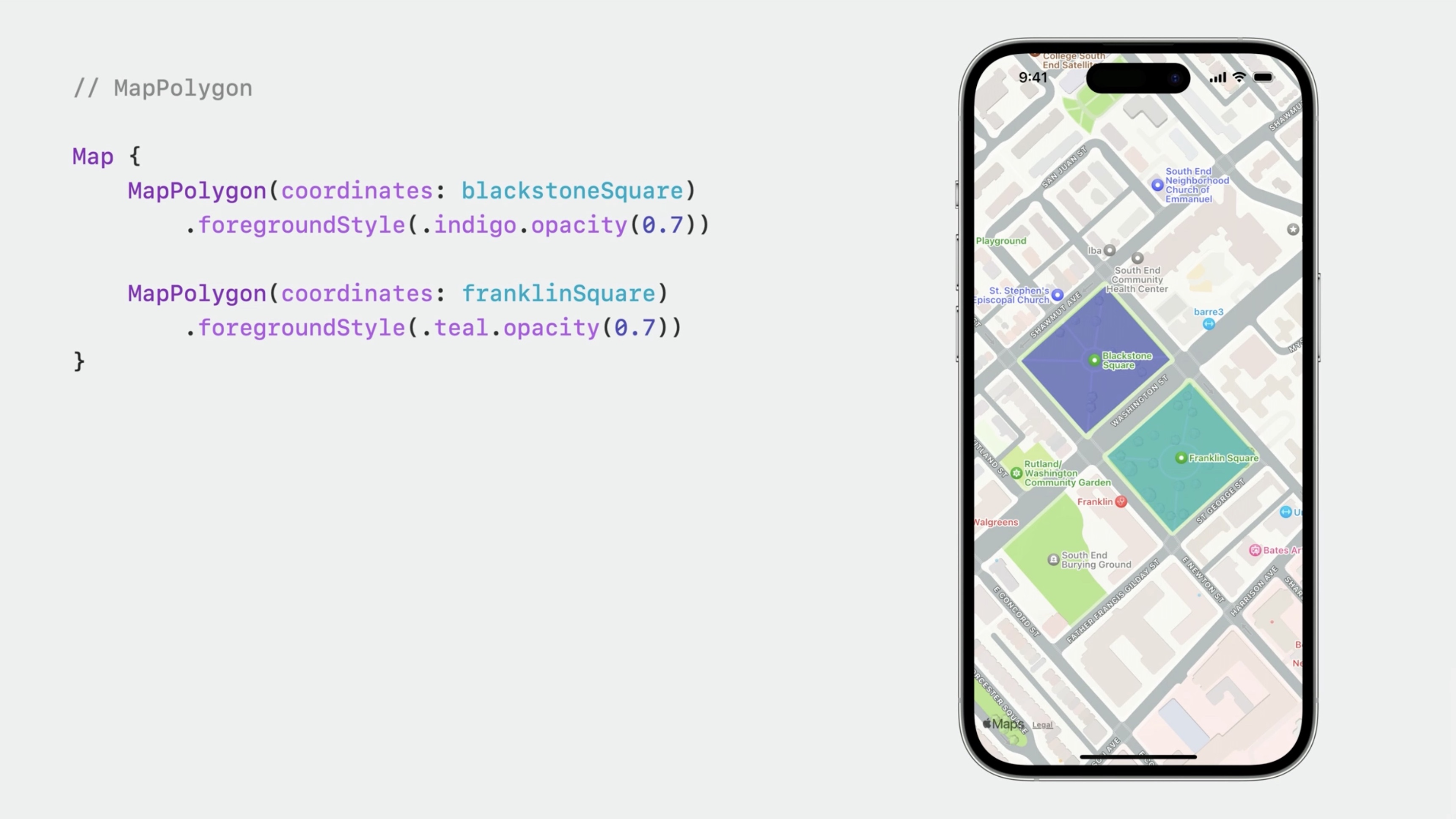
To highlight an area, we use MapPolygon or MapCircle.
Here are two circles marking the same parks. An overlay level is specified for each circle. The pink circle is using the default overlay level of above roads, which puts the map's labels above the circle. The cyan circle is using above labels.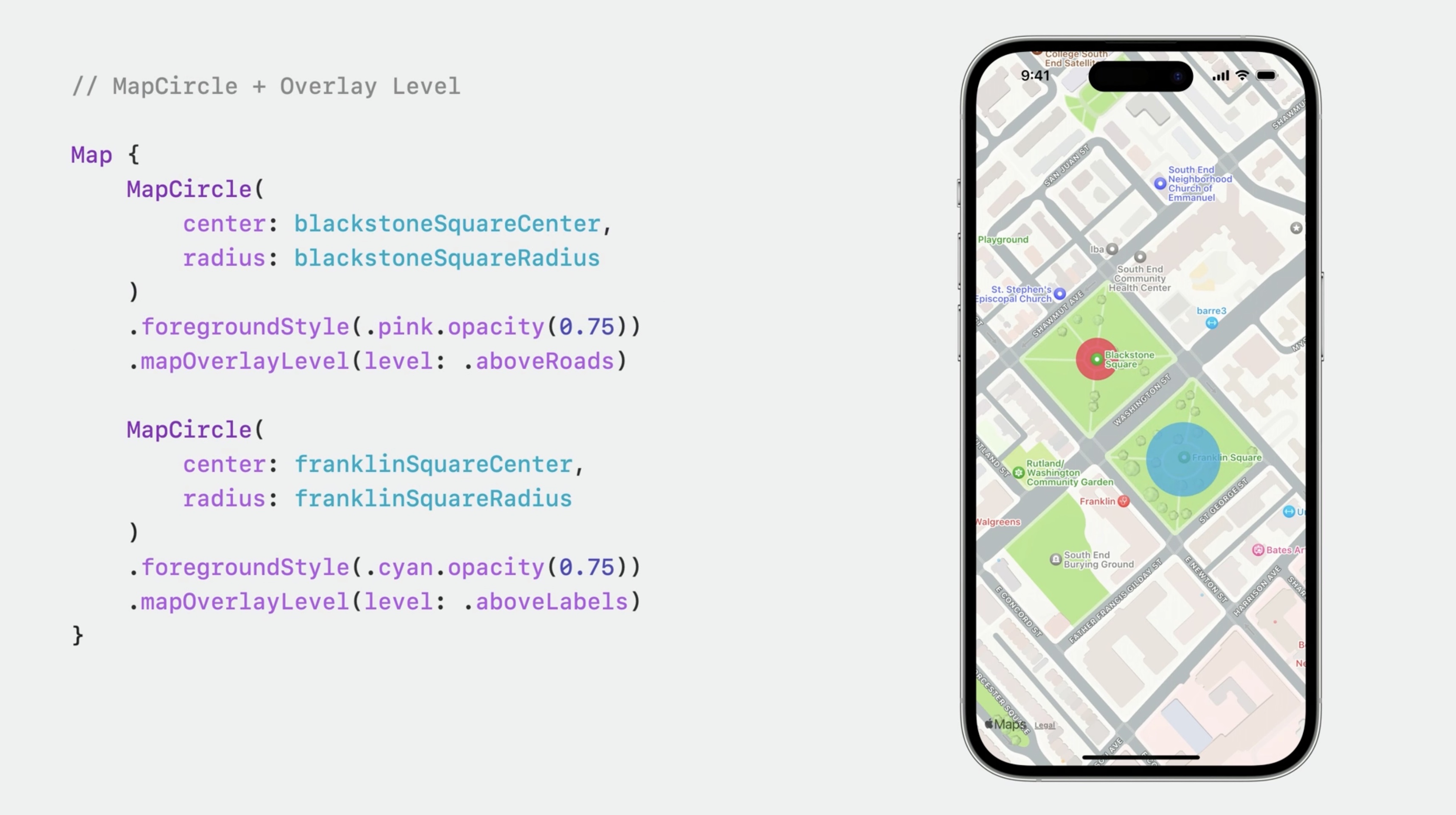
# User Location and Map Controls
- Show the user's location
- Learn about Map Control views
We'll add UserAnnotation to the map content to show our position:
UserAnnotation()
and a MapUserLocationButton.
    .mapControls {
        MapUserLocationButton()
        MapCompass()
        MapScaleView()
    }
Now, tapping the button to display our location, the map camera will follow us as we move around. We've also added a MapCompass and a MapScaleView.
The default mapControls configuration shows a compass when the map is rotated, and a scale indicator while the user is zooming in or out. We've specified them in addition to the user location button.
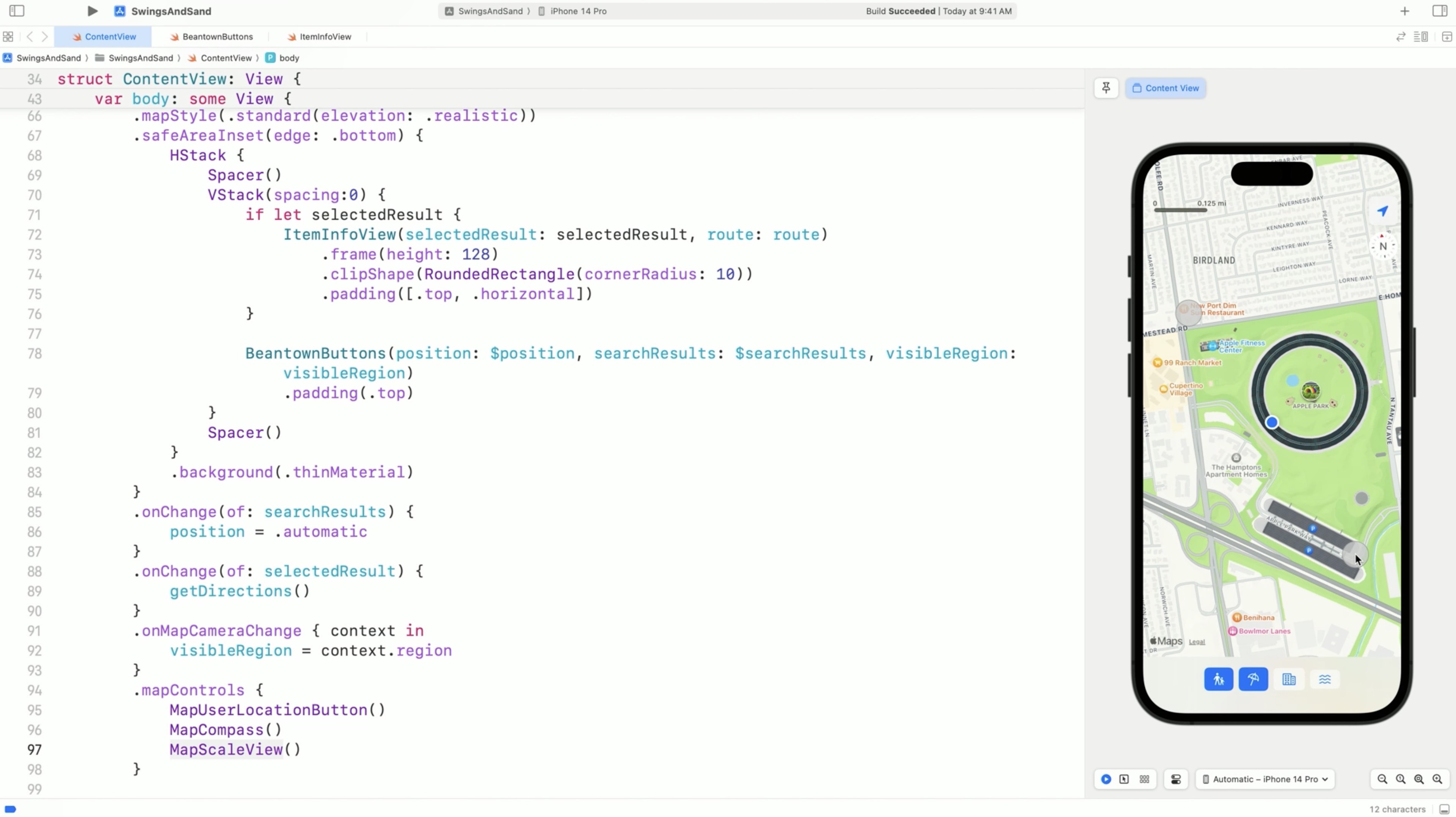
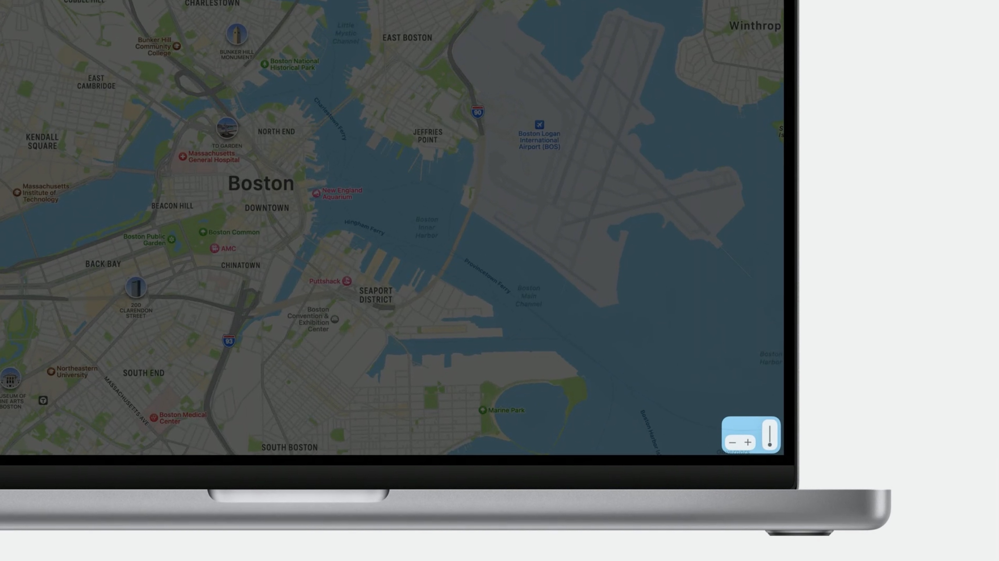
All of these are added using the mapControls modifier, so the map will automatically display them in their default locations. This includes map controls on all platforms, including the MapZoomStepper and MapPitchSlider on macOS.
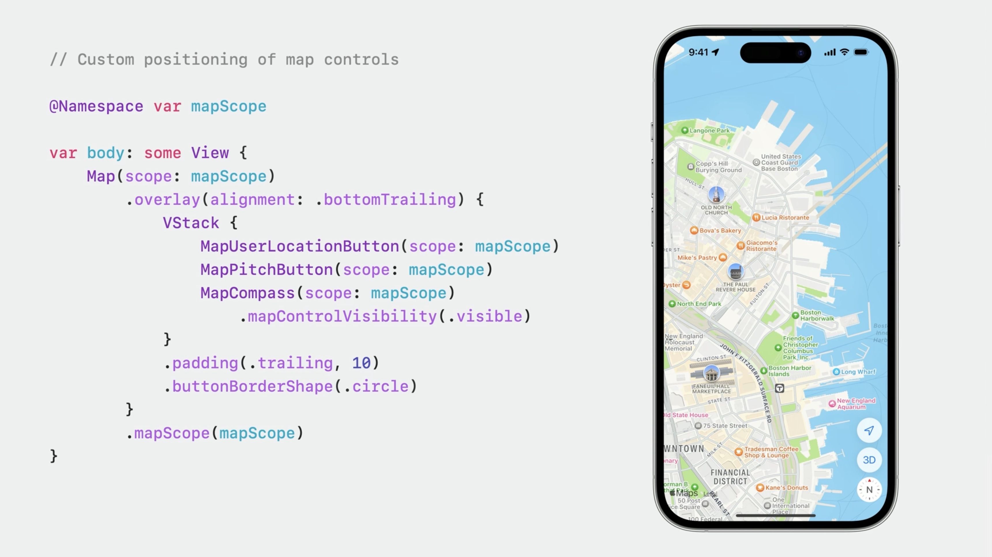
The Map controls are simply views, so instead of using the mapControls modifier, we can just add them as you would any other view. To customize we will need to use the mapScope modifier to associate the controls with a particular Map scope.
// Custom positioning of map controls

@Namespace var mapScope

var body: some View {
    Map(scope: mapScope)
        .overlay(alignment: .bottomTrailing) {
            VStack {
                MapUserLocationButton(scope: mapScope)
                MapPitchButton(scope: mapScope)
                MapCompass(scope: mapScope)
                    .mapControlVisibility(.visible)
            }
            .padding(.trailing, 10)
            .buttonBorderShape(.circle)
        }
        .mapScope(mapScope)
}
A few final thoughts
Apple Maps Server APIs has been extended to support Autocomplete and Directions. To learn more check out last year's dub-dub session "Meet Apple Maps Server APIs.”
Resources
Have a question? Ask with tag wwdc2023-10043
MapKit
MapKit for SwiftUI
Search the forums for tag wwdc2023-10043
Related Videos
Explore SwiftUI animation - WWDC23
What’s new in SwiftUI - WWDC23
Wind your way through advanced animations in SwiftUI - WWDC23
Meet Apple Maps Server APIs - WWDC22
 Twitter
 GitHub
 iosdev.space