Design app experiences with charts
 laurent b
Description: Learn how you can enhance your app with charts to communicate data with more clarity and appeal. We'll show you when to use charts, how to use them and how they work together in a chart design system.
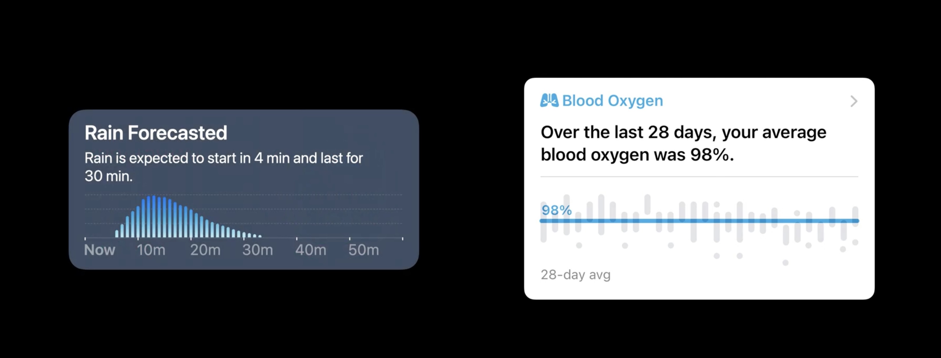
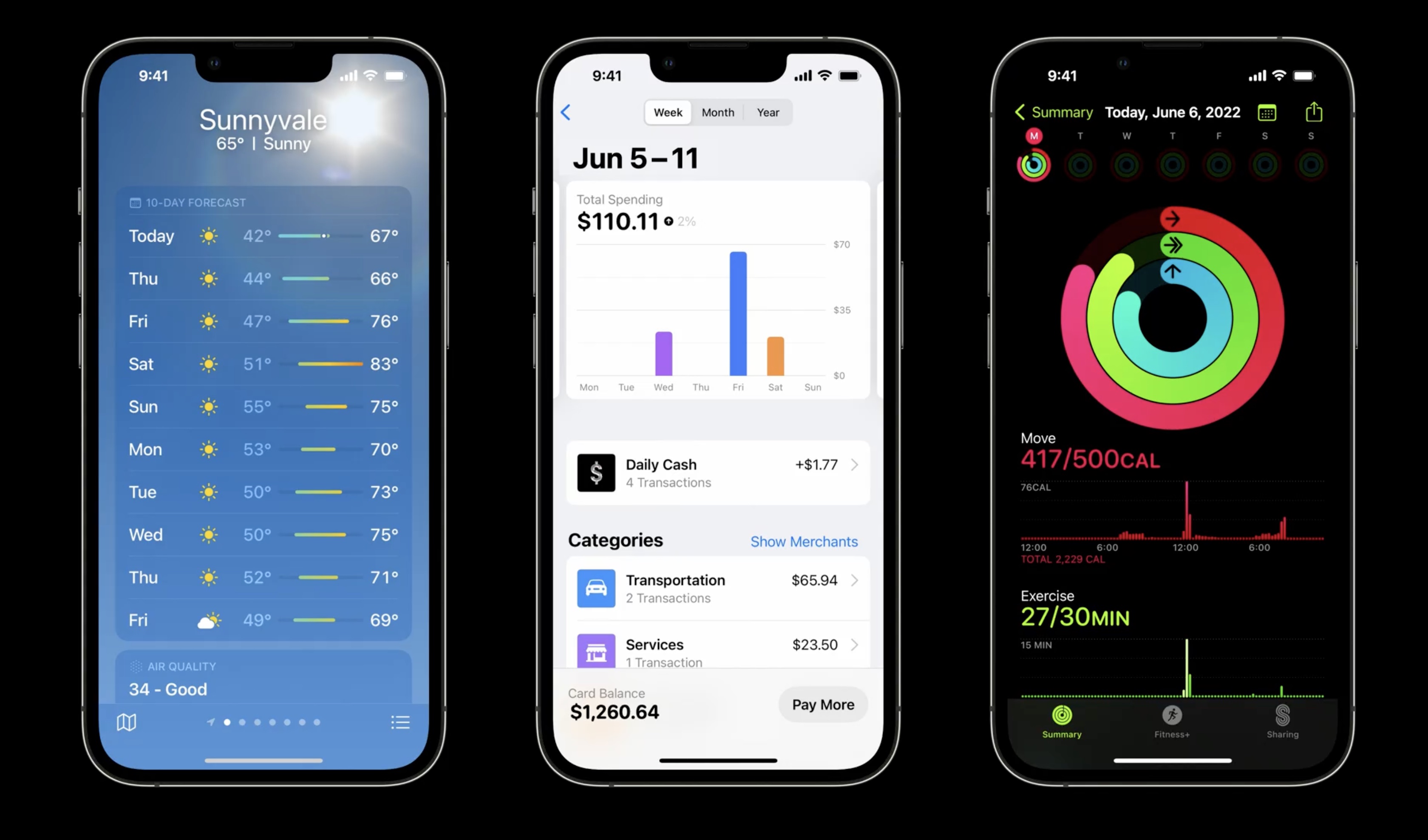
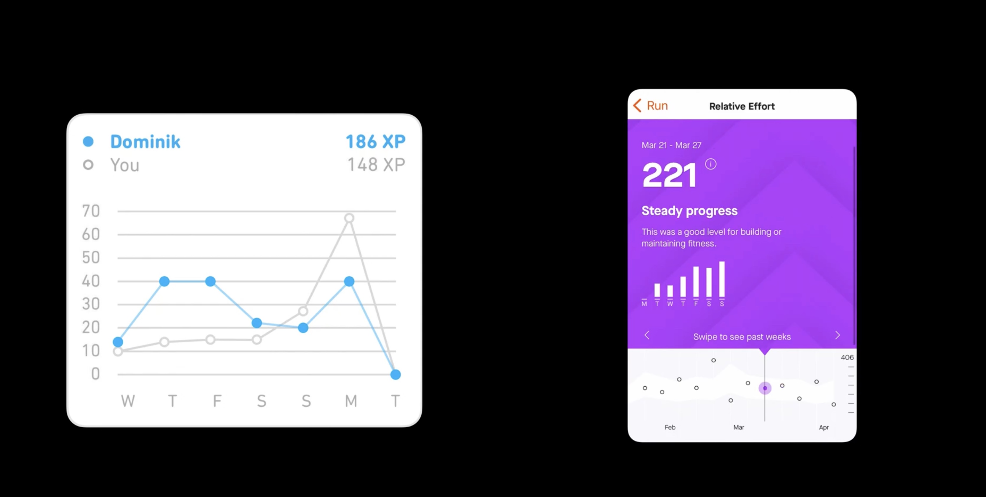
Intro: examples of charts with health, weather and fitness.
When to use charts
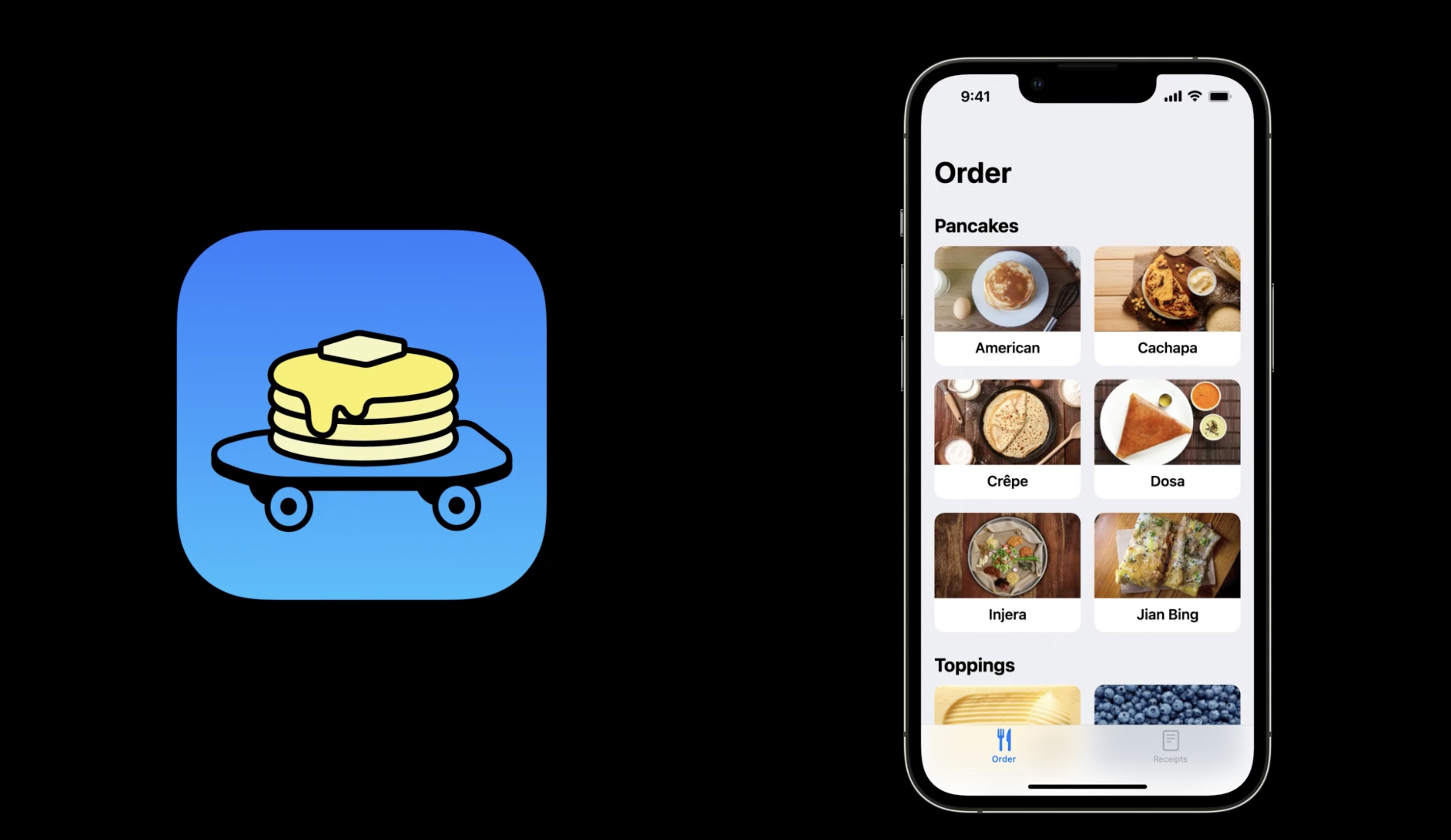
Back to our food truck selling pancakes app:
Here are some common cases where a chart can be used to highlight the information being presented: - When showing historical or predicted values - By visualizing a portion of a whole - When comparing items or categories, we can evaluate their values with charts.
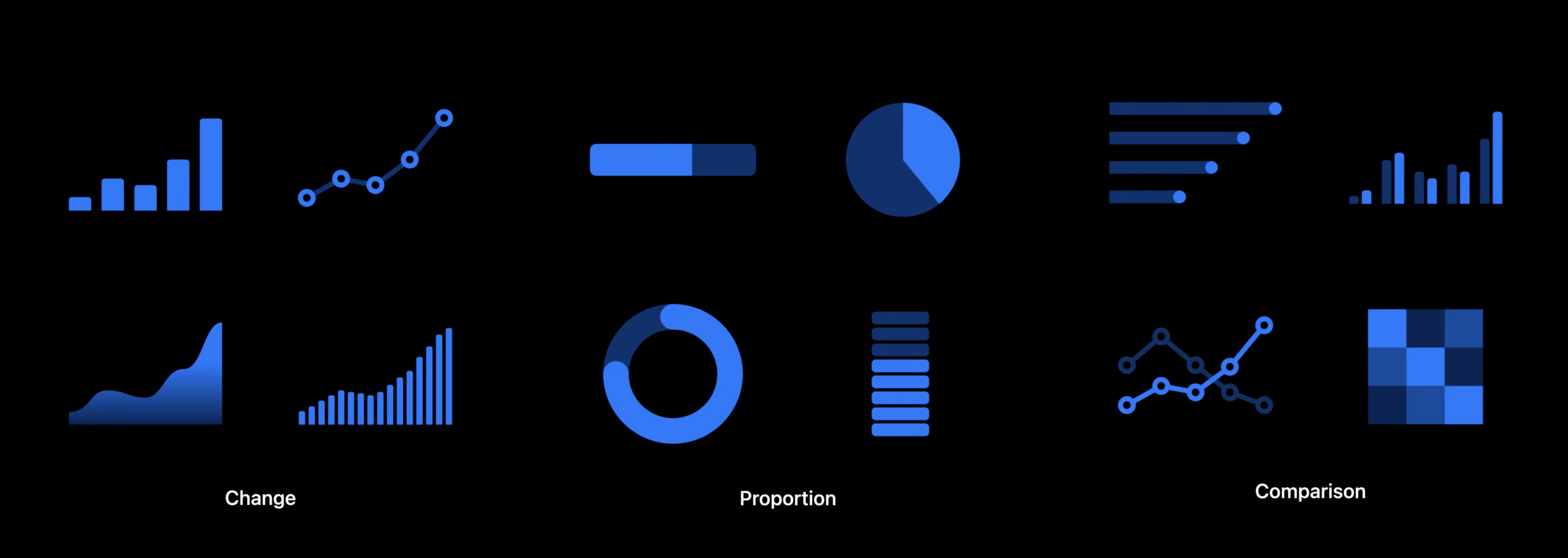
When used correctly, charts provide focus.
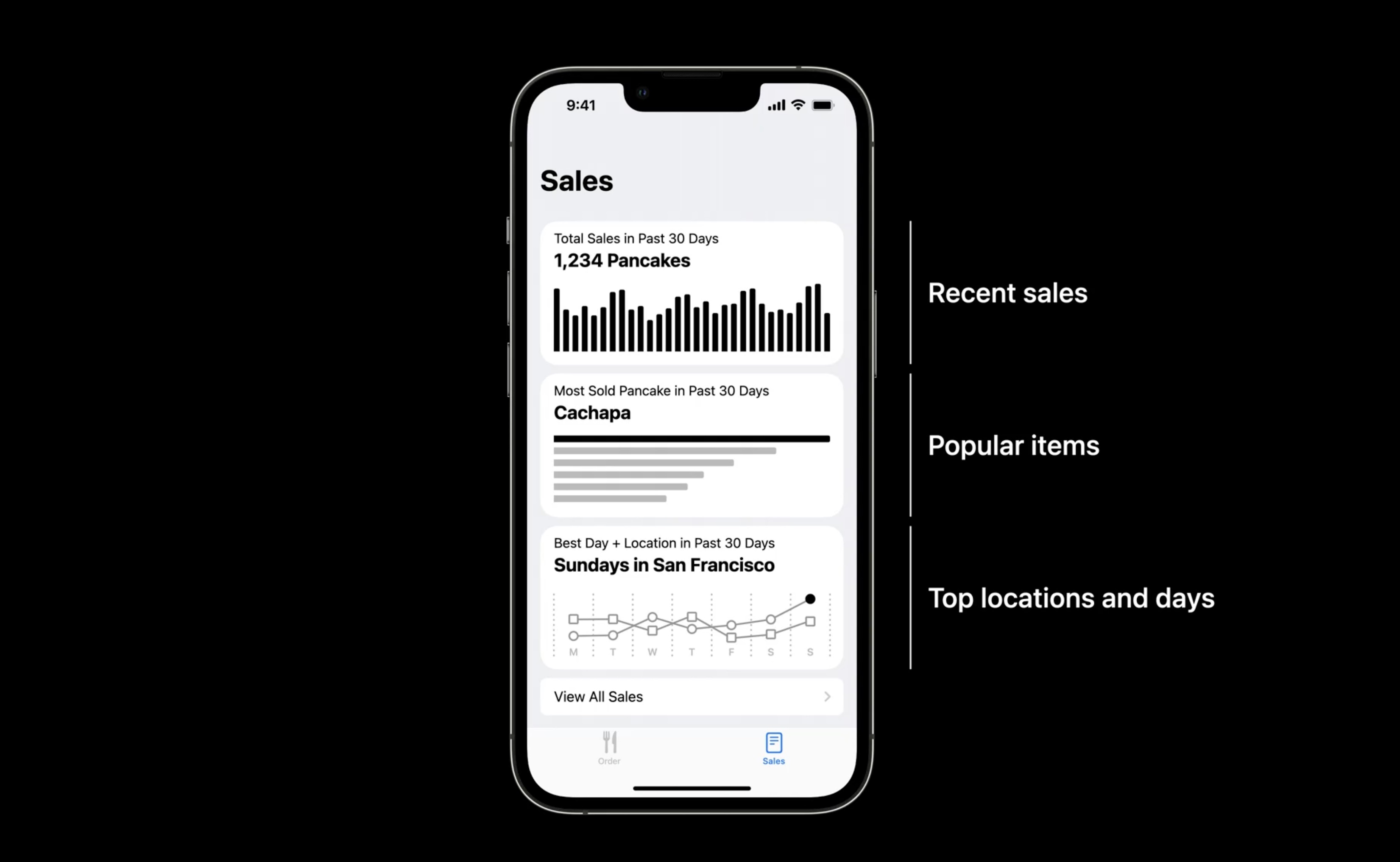
They direct attention to the information. Example: The goal of the food truck app is to improve the operation of the businesses using it.
Here is some key information useful to the food truck: viewing recent sales, understanding what items are popular, and knowing the best location to visit each day.
How to use charts
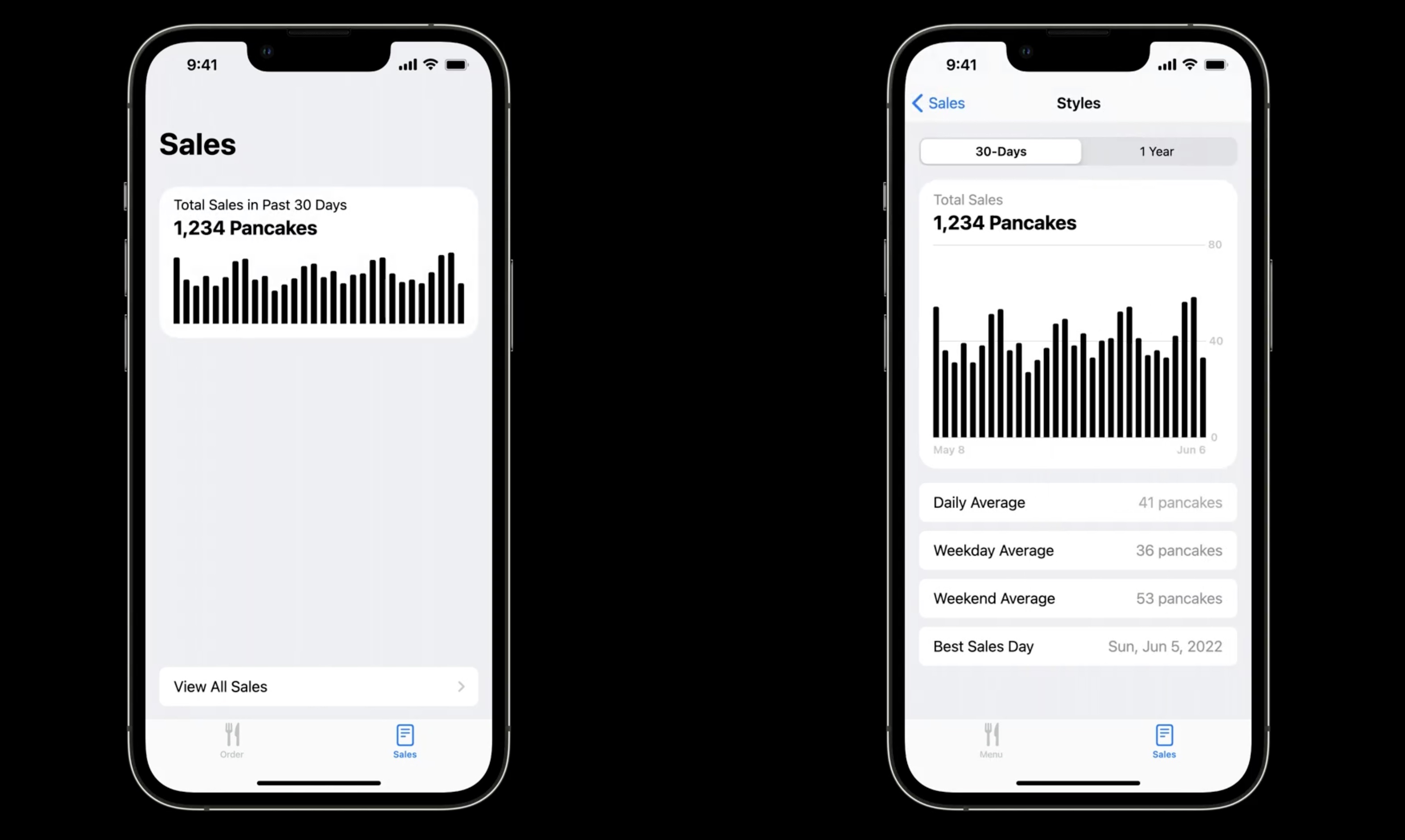
To illustrate recent sales, a chart showing change over time will be appropriate. One way of doing this is to use a bar chart showing sales totals for each of the last 30 days.
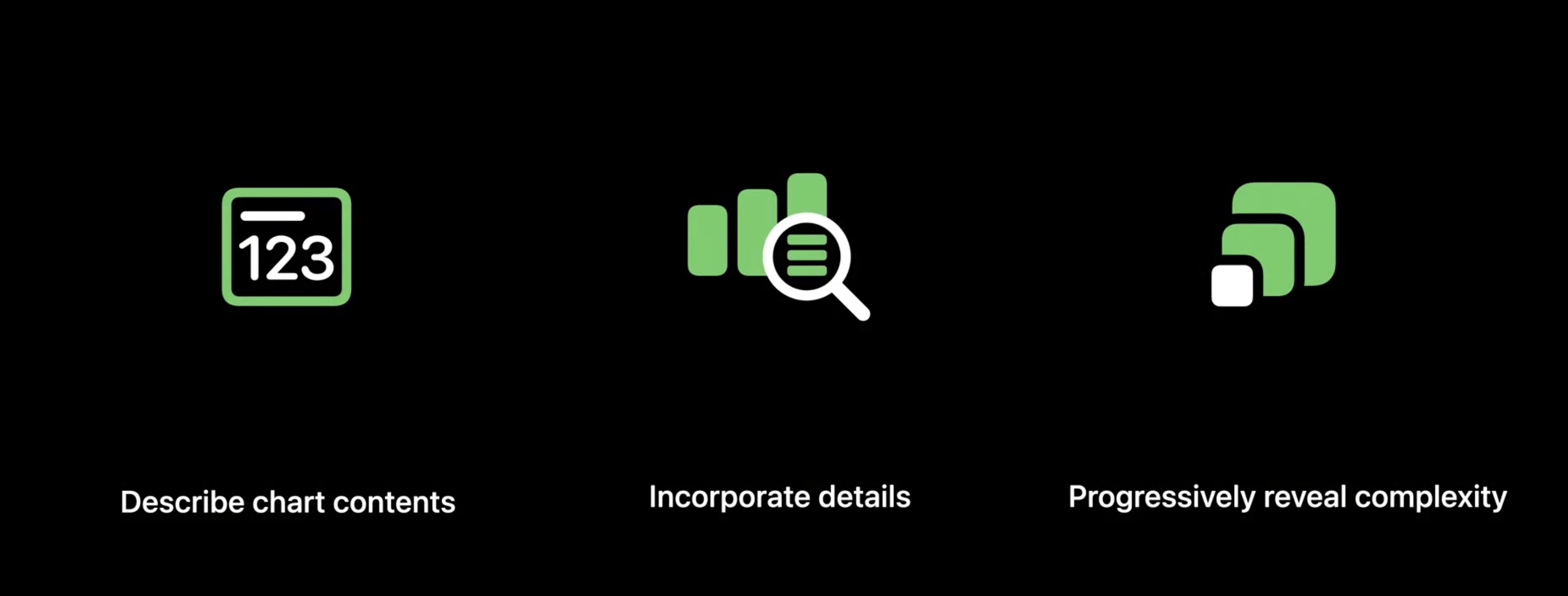
Describe chart contents
A chart should be accompanied by text that describes the chart contents. If read in isolation, it should be informative.
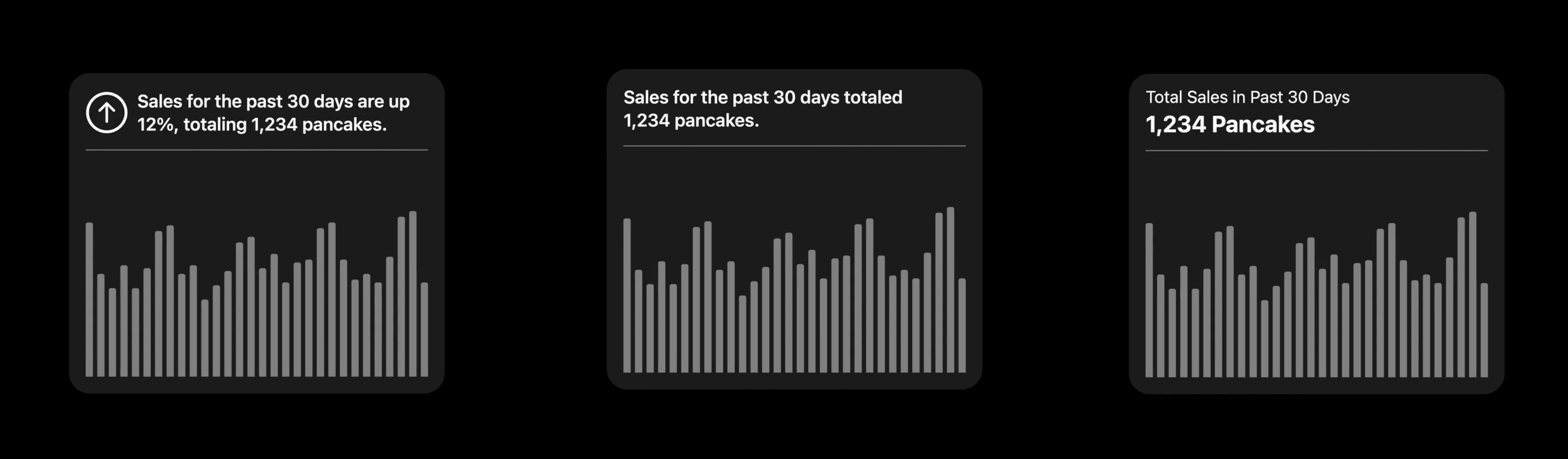
For example: "Sales in the past 30 days totaled 1,234 pancakes." Another way of framing the chart is to interpret the data. For example: "Sales for the past 30 days are up 12%, totaling 1,234 pancakes." This will help someone understand if the level of recent sales is high or low or if it is increasing or decreasing.
Incorporate details
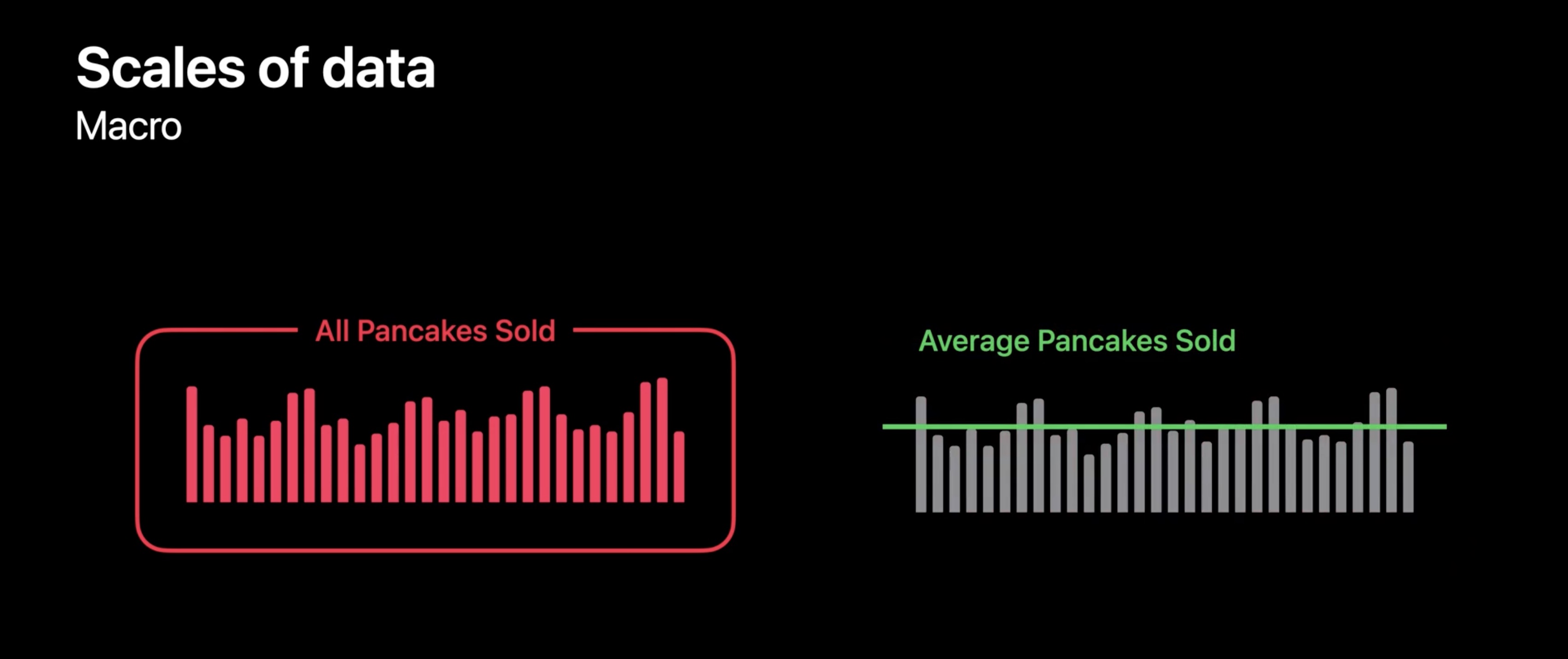
Each of these approaches is a good way of describing a chart, but this overview is just one way of explaining sales data.
Try to incorporate details from other perspectives. A chart can become multi-dimensional.
- At a macro level, it describes the entire data set, like a total, or average value.
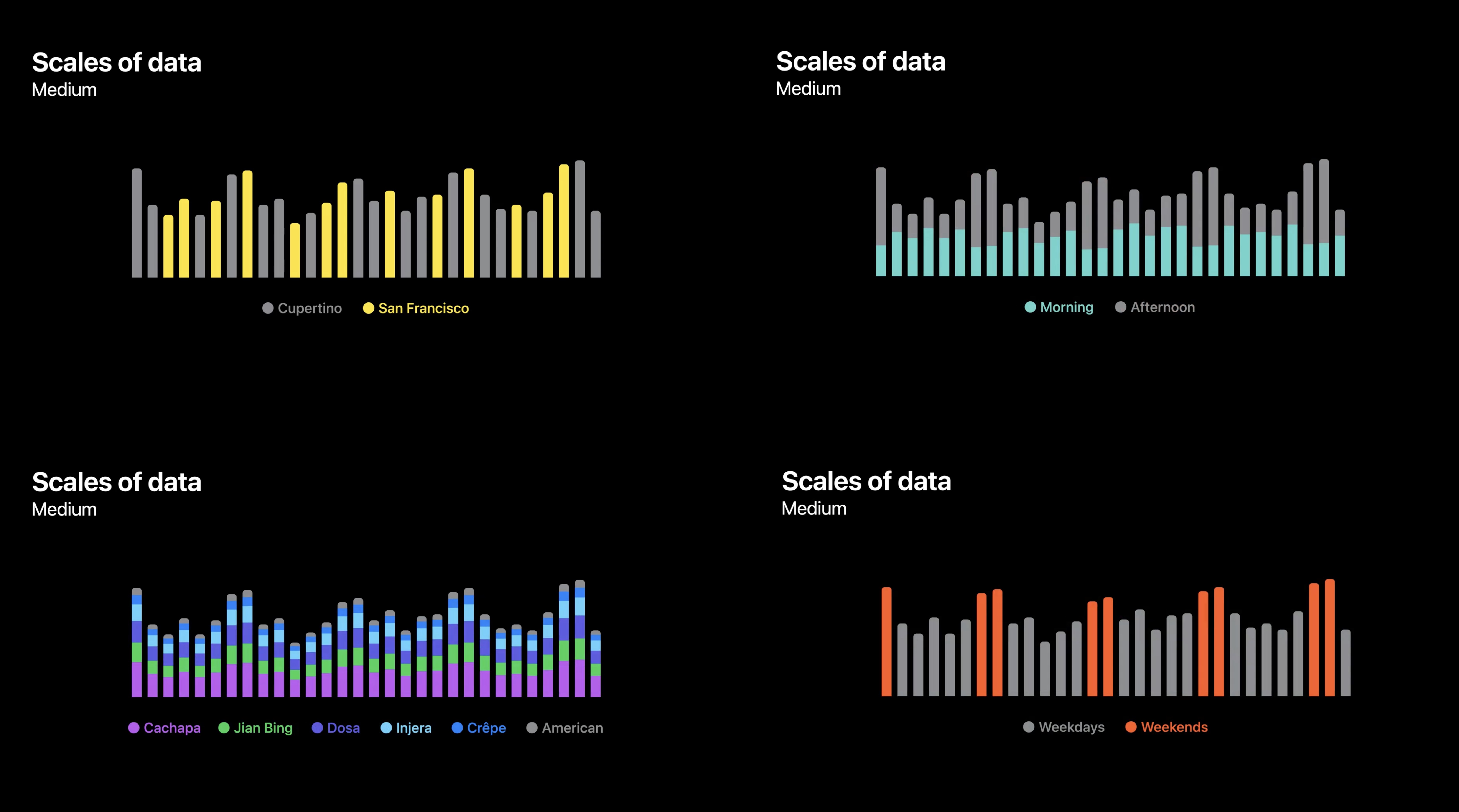
- At a medium scale, shows sub-sets of data. These might be time-based, like comparing weekdays to weekends or investigating changes related to the time of day.
- At the micro level, it focus on individual data points. The last transaction or largest sale are important small-scale details.
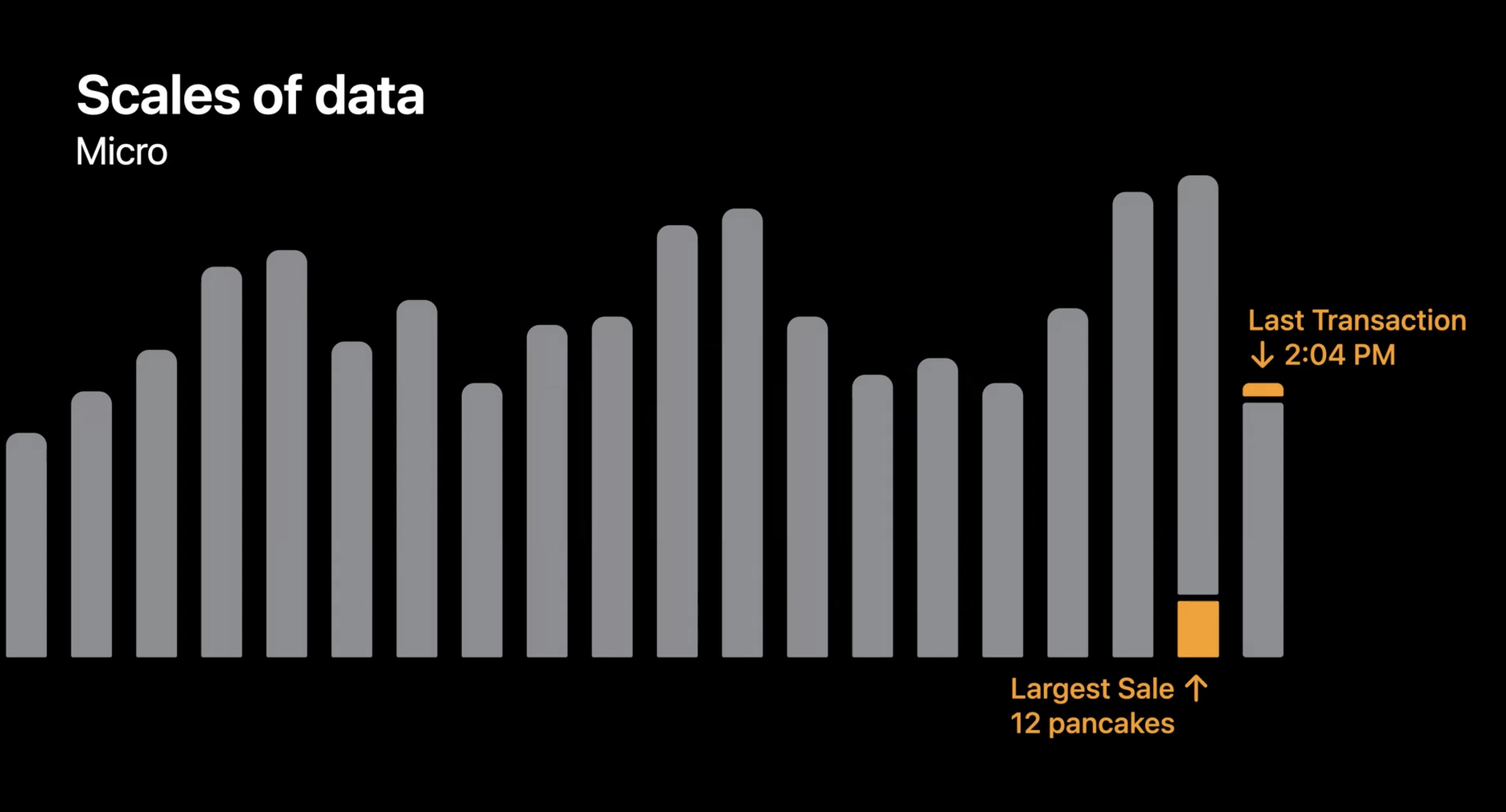
The more carefully we observe a data set, the more detail will emerge.
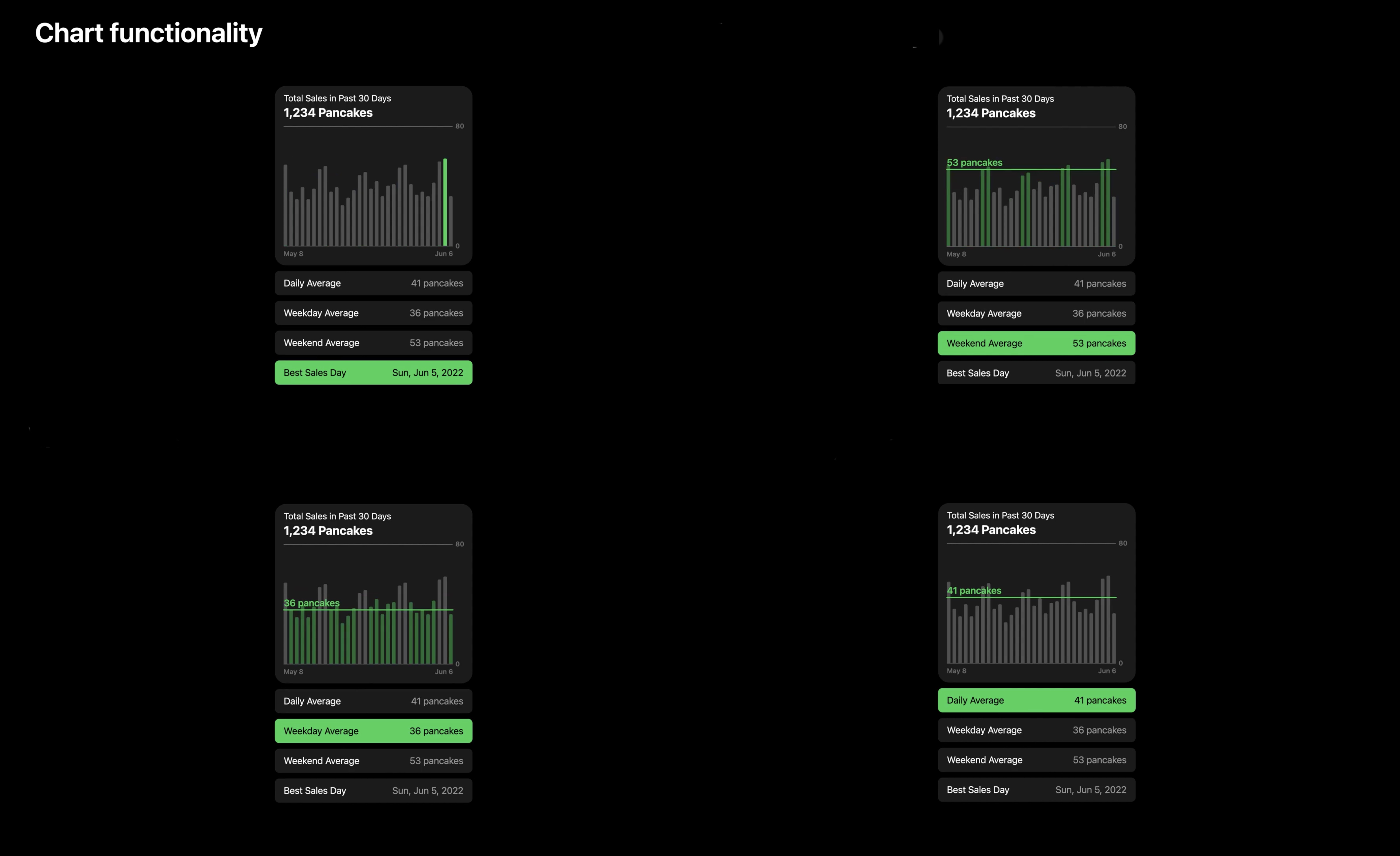
Ex. A set of tappable rows under the chart. Each row provides a summary statistic, and when tapped, the chart is updated to match. It shows the daily average value or the difference between weekday and weekend sales or the best sales day. These overlays can be extremely useful, but this amount of information requires a large surface to work effectively.
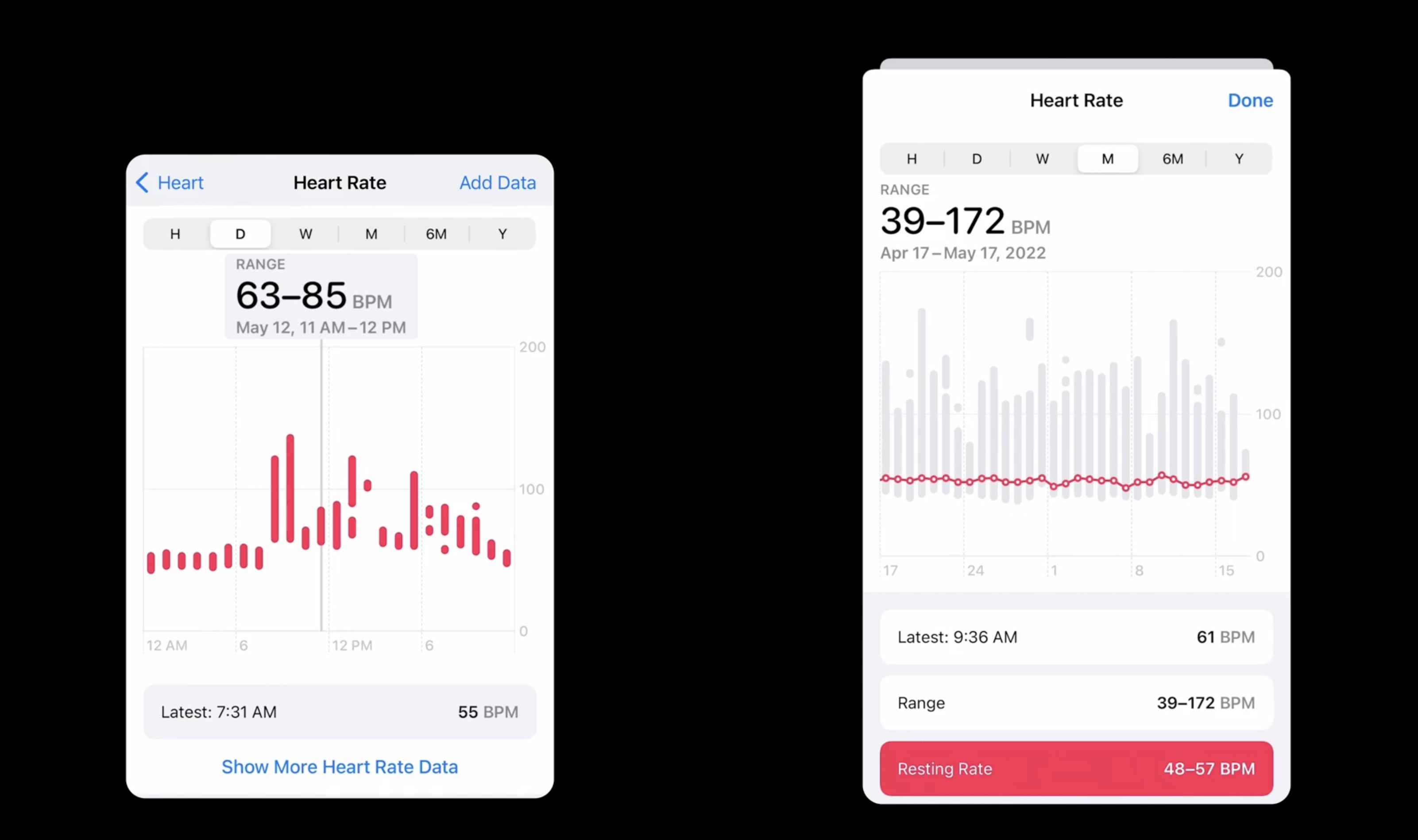
Smaller charts tend to be static. Examples include Watch complications, the repeating thumbnail charts in Stocks, and the trend platters in Health.
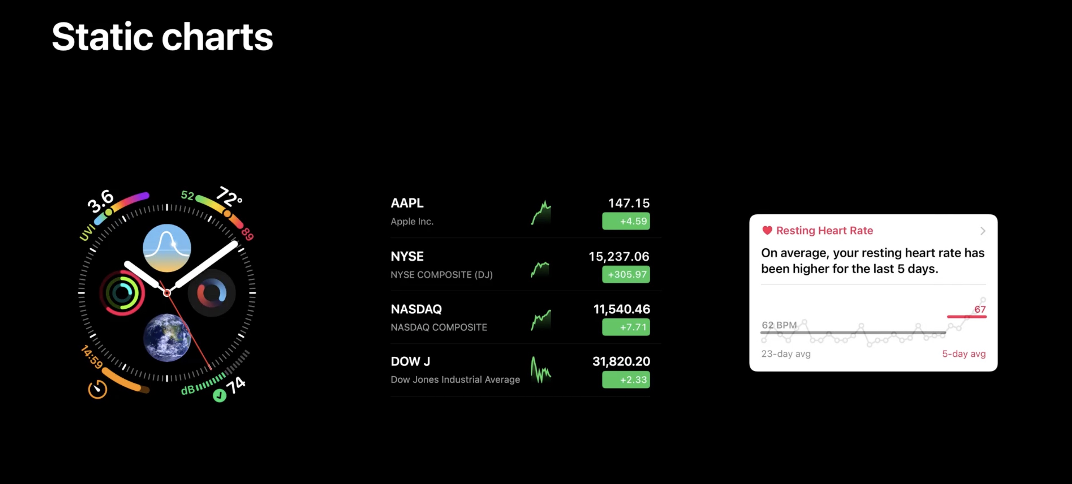
Static charts tend to provide a preview of a larger chart in another view. As they are generally small, static charts don’t require grid lines, labels, or interactivity, since they create the expectation that additional detail is just a tap away.
Interactive charts tend to be larger, and include much more detail, like the charts in Stocks and in Health.
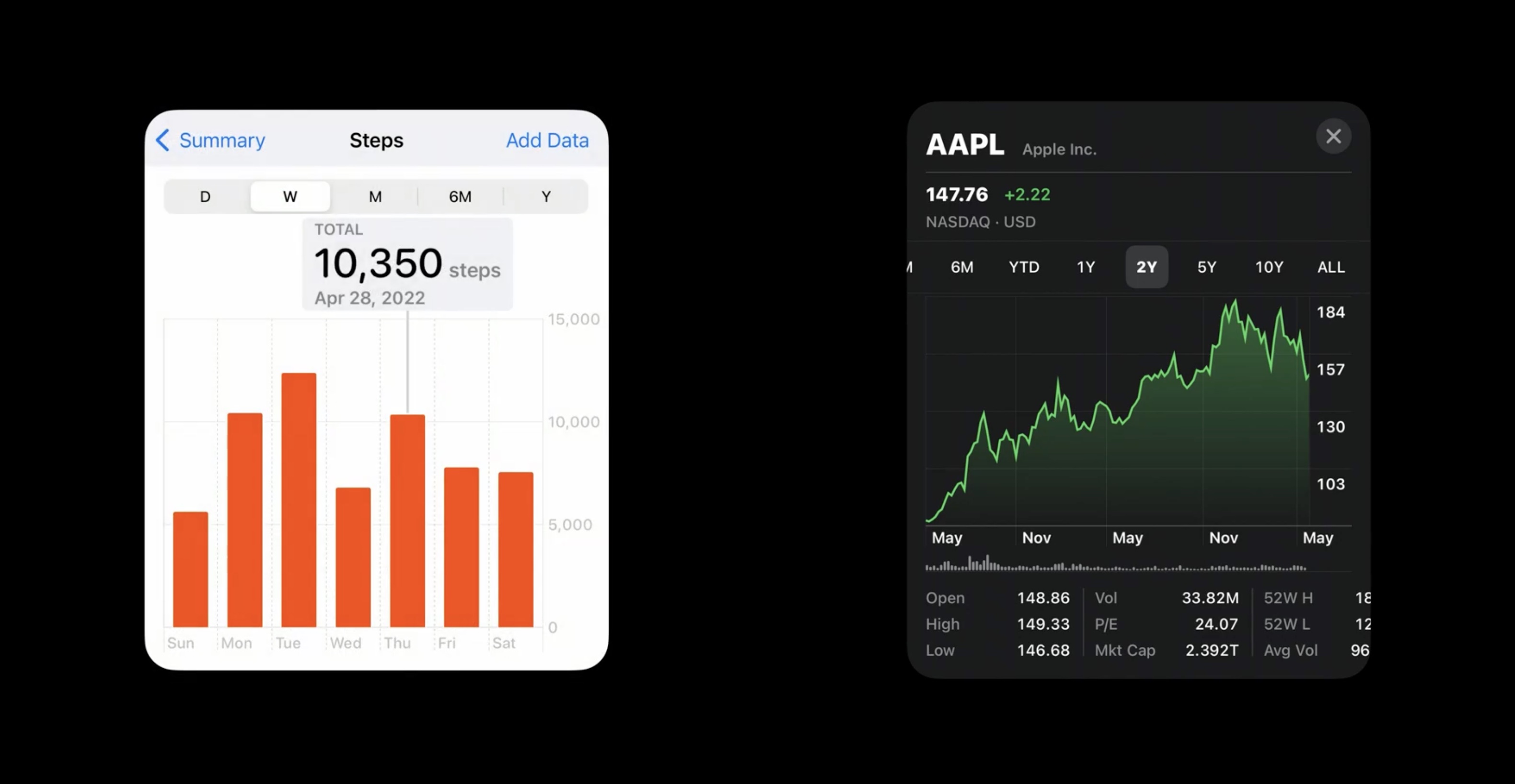
An interactive chart should include axis lines and labels so that values can be estimated.
Interactivity is recommended at this size for accessing precise values in the chart.
Progressively reveal complexity
Start with a small static chart higher in the navigation hierarchy to offer a path to expanded versions of the chart.
When creating a link between two versions of the same chart, that progression should maintain continuity by preserving values, context and state.
(Back to the food truck example)
Start from a static chart, which tapped leads to an expanded interactive chart.
Charts need descriptions to inform the contents and the details in the data can add richness to the charts, and should progressively reveal chart complexity.
Chart design systems.
When planning multiple charts: Use familiar forms.
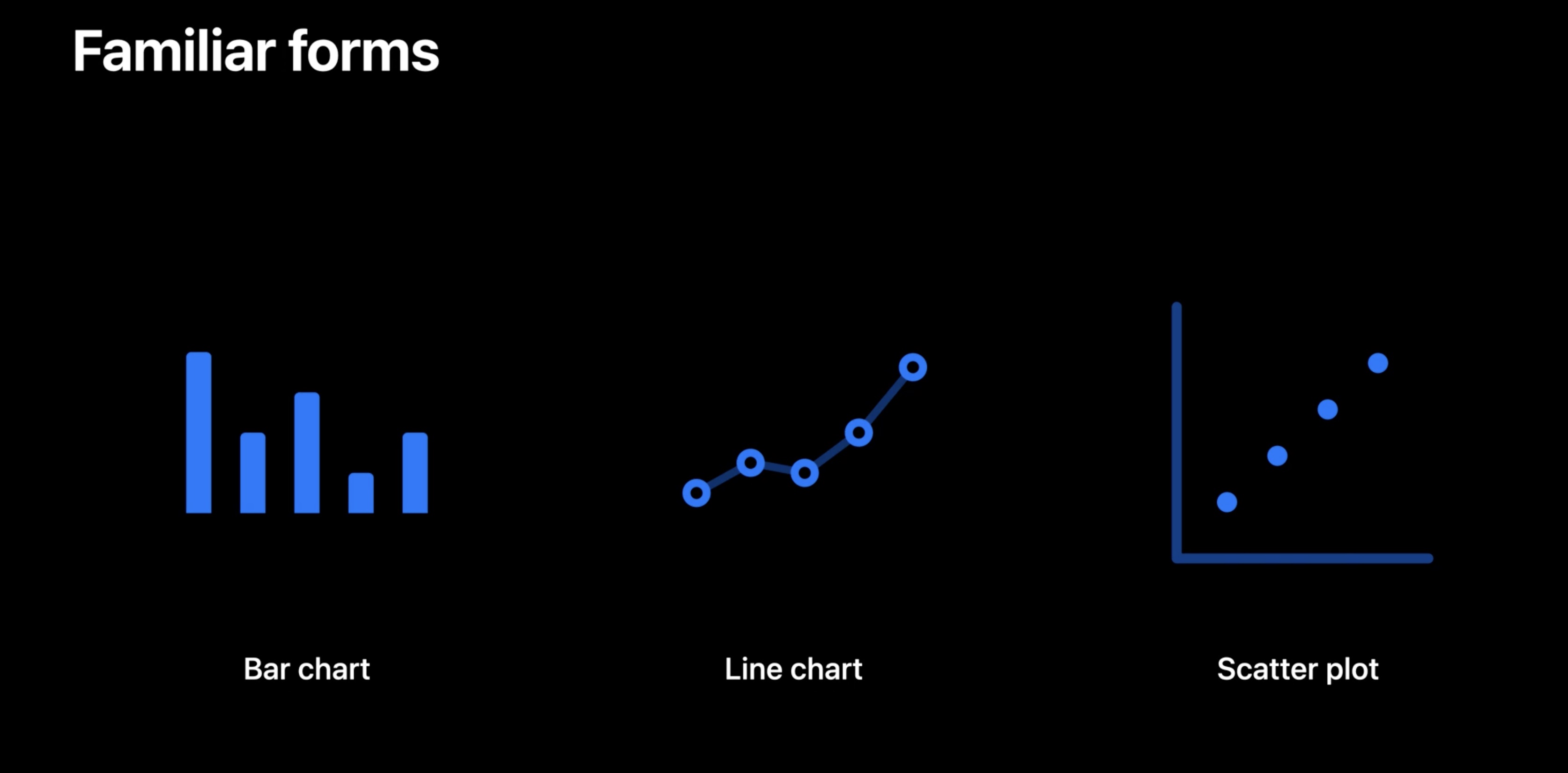
Start with common chart styles. Bar charts and line charts are forms that many people encounter and use daily, while a scatter plot is less common and may require extra guidance
Something unique should be introduced clearly, like here in the onboarding flow for Activity.
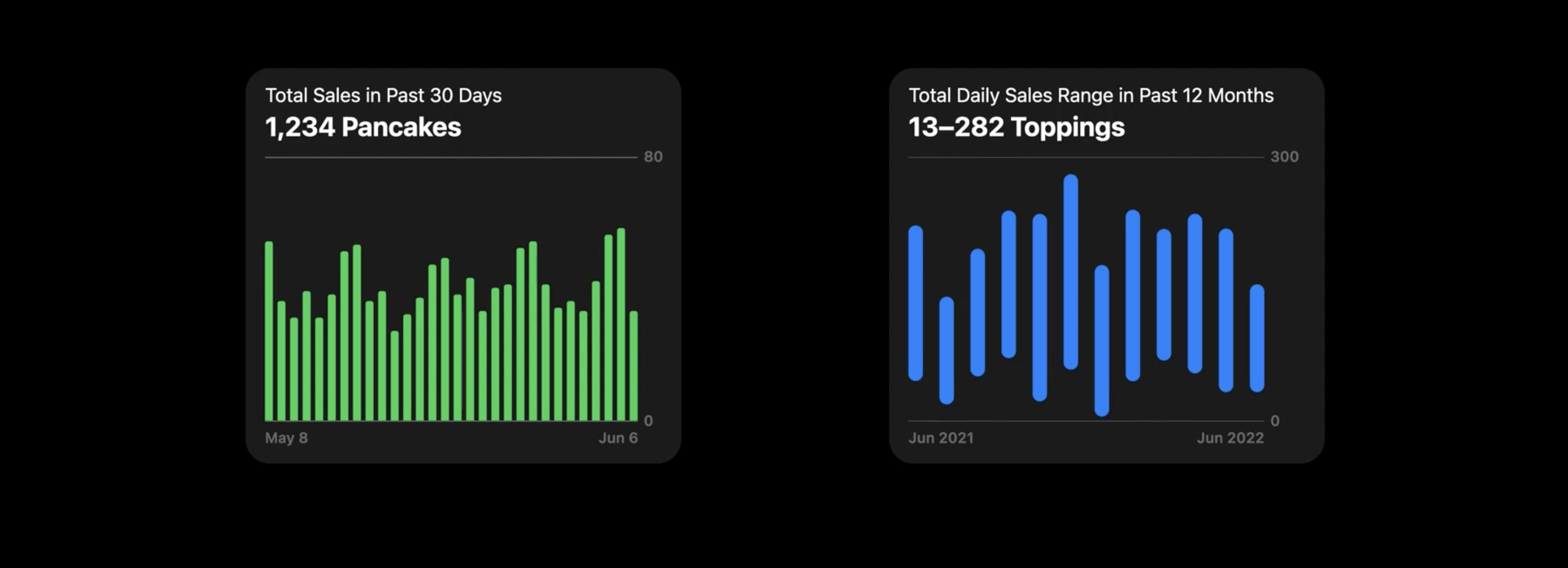
let’s start with two copies of the recent sales chart.
the chart on the right will be updated to communicate different information, to show how the design evolves to signal these distinctions.
Changing the time scope of the chart on the right. Rather than showing recent sales, it now shows sales for the last 12 months. Minimal changes are required for this modification.
Noticing this change in text could be easily missed, so each of these charts gets a distinct color. Now it is easier to notice that these charts are unique.
Updating the chart on the right to show the range of daily sales for each of past 12 months. This requires both a change to the description and the way that the data is represented.
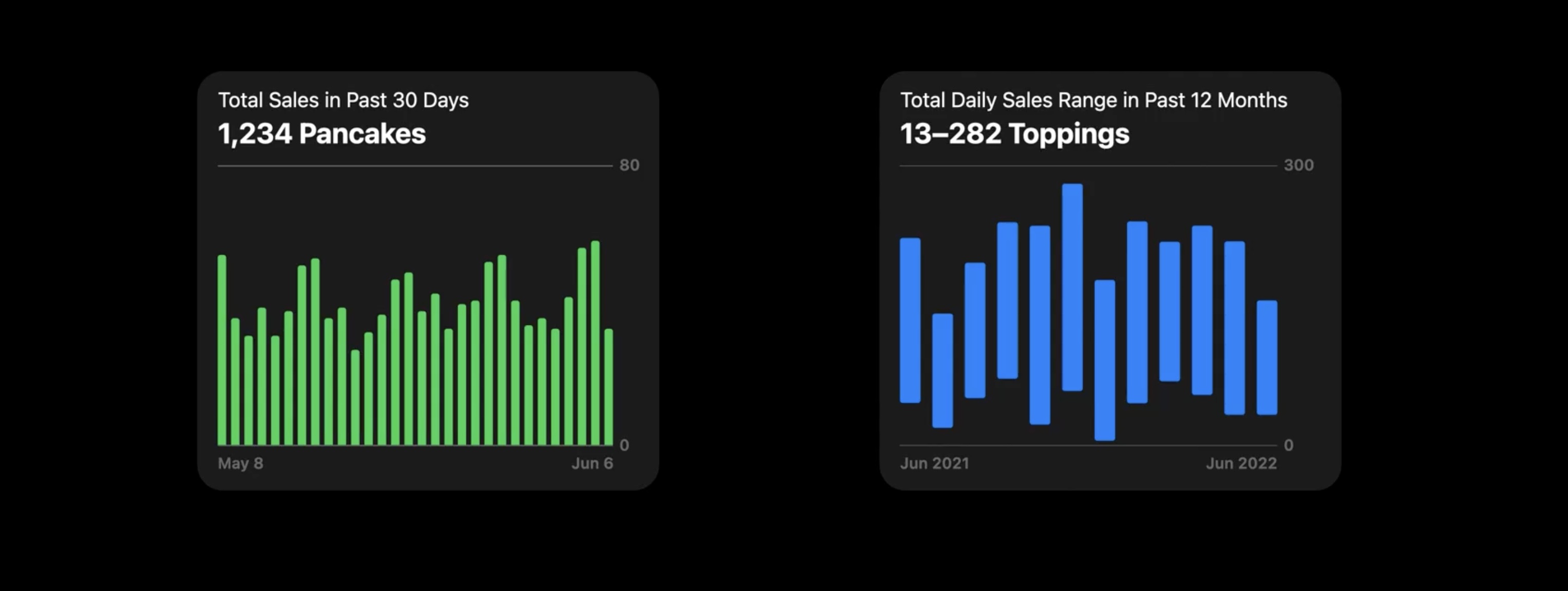
To underscore the significance of this change, modifying the styling of the bars is ok.
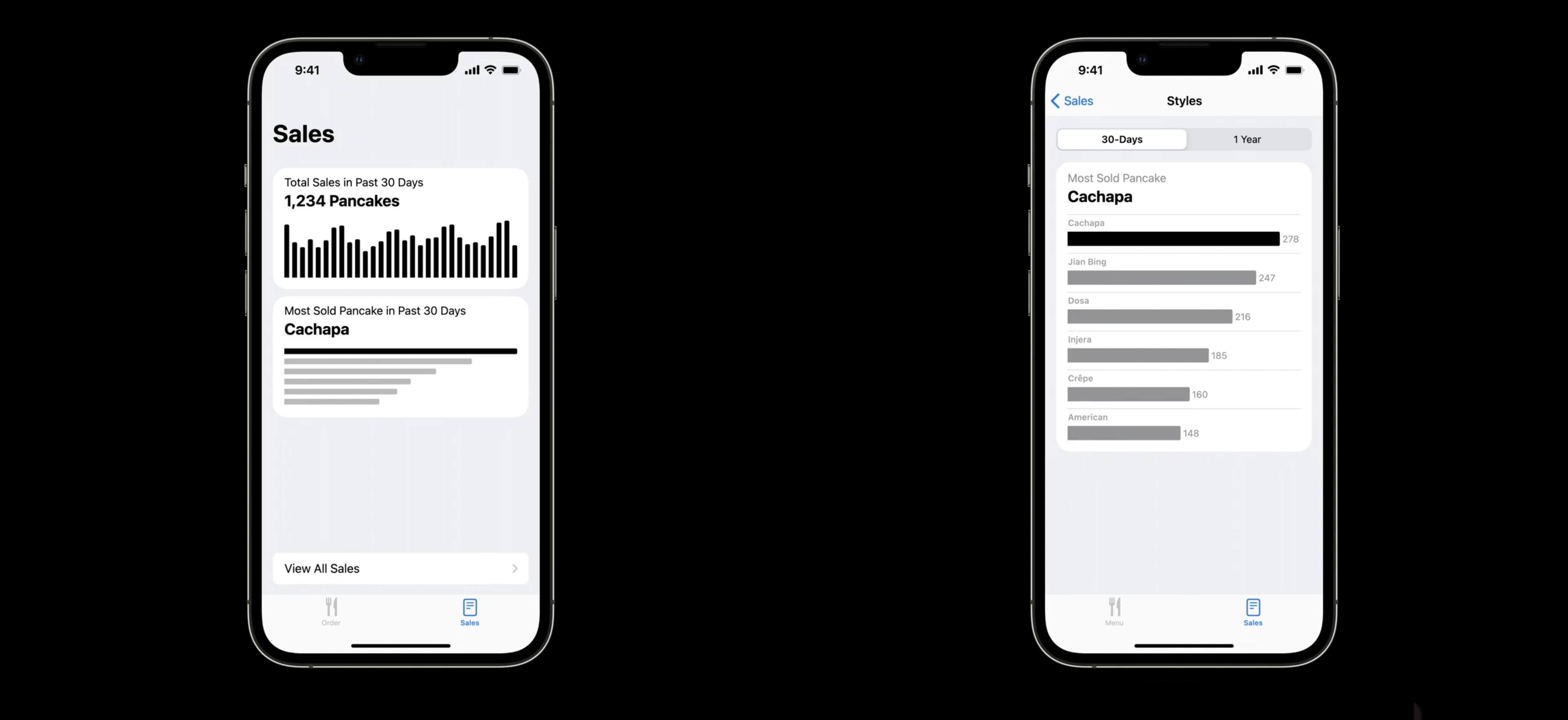
Let show the most popular style of pancake.
Being interested in the last 30 days as a whole, only one bar is needed to compare the popularity of styles. By making the bars horizontal, the difference between this chart and the recent sales chart is accentuated.
In the detail view, each bar is labeled, and the relative values are visible.
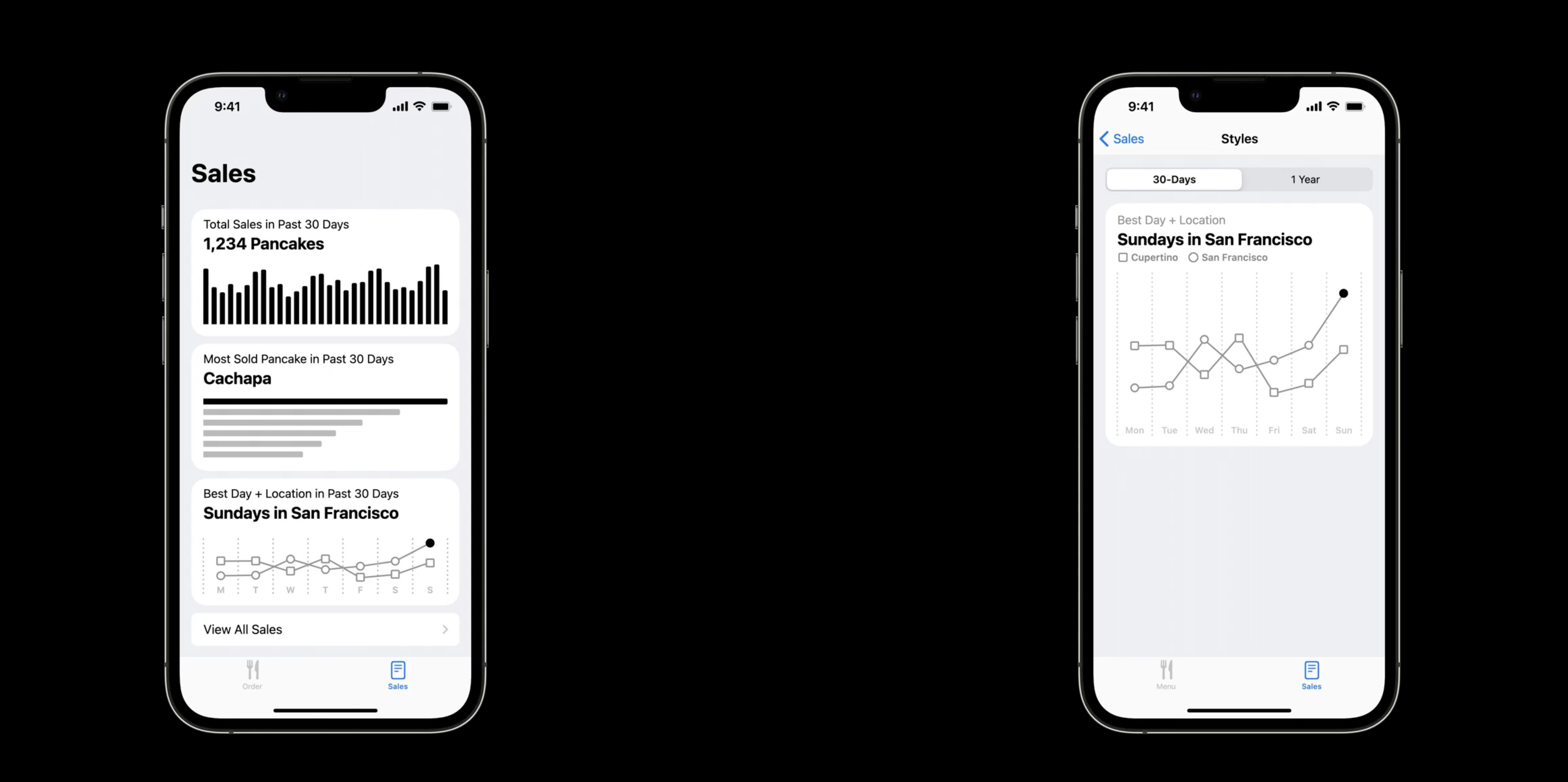
Next let's show the sales in the two cities where the truck operates for each day of the week.
converting these bars into lines to focus on the daily changes and adding this chart to the sales tab and including a description to summarize the data.
In this case, the best sales day over the past 30 days was Sunday in San Francisco. The subsequent detail page is the last chart to add to the app. It provides additional interactivity and details, including keys for the two lines.
Using charts to show recent sales, popular items, and top days and locations.
Resources
Creating a chart using Swift Charts
Have a question? Ask with tag wwdc2022-110342
Search the forums for tag wwdc2022-110342
Swift Charts
Visualizing your app’s data
Related Videos
Design an effective chart - WWDC22
Hello Swift Charts - WWDC22
Swift Charts: Raise the bar - WWDC22
 Twitter
 GitHub
 iosdev.space