Design an effective chart
 David Lee
 laurent b
Description: Learn how to design focused, approachable, and accessible charts. We'll show you how to design great charts with clear marks, axes, descriptions, interaction, and color and help you create useful experiences for everyone.
By identifying your app’s needs, you can decide when to use charts, how to use charts, and what design system will unify them.

To learn more about the first steps of the design process watch:
Design app experiences with charts
In this session, Apple will talk about the next part: how to design a chart.
An effective chart - Focused - Approachable - Accessible
There is an example app about a food truck selling international pancakes in San Francisco and Cupertino. This finished app has an entire system of charts to help plan and manage pancake sales

Good chart design begins with identifying the chart’s goal. For example, a goal to communicate information like ‘Pancake sales in the last 30 days’ may go in many directions.
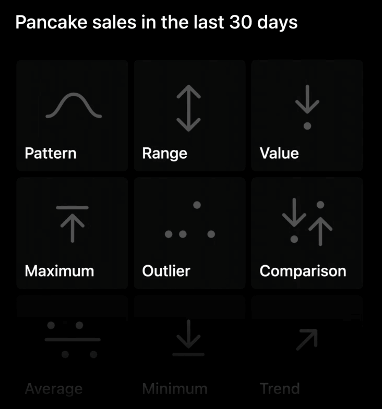
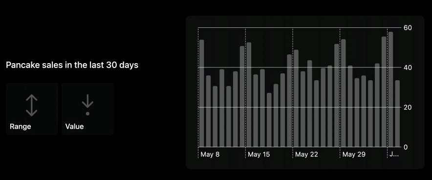
- Pattern: how sales are fluctuated
- Range: how big these fluctuations were
- Value: examine specific day
- the list can go on and on…
Design charts with intention. An effective chart focuses on a few key pieces of information.
Five topics of our design process - Marks: the visual building blocks - Axes: provide framing for marks - Descriptions: make charts more approachable and easy to interpret - Interaction: deeper exploration of data & critical to accesibility - Color: add personality & enhance clarity

Marks
A mark is the bar in a bar chart, the line in a line chart, and the point in a scatterplot.

Bars, for example, can be lined up to represent data's change over time, stacked to show proportions (how different categories add up to a total). Or side by side to compare values between different categories.
These are just a few examples

Choosing the mark to use
As we choose our mark, we will pay close attention to pattern. It would be useful for our food truck owner to see any fluctuations or trajectories in their sales. We could start with time and pancake sales on our axes.
One option for a mark could be to use points to represent each day of pancake sales.
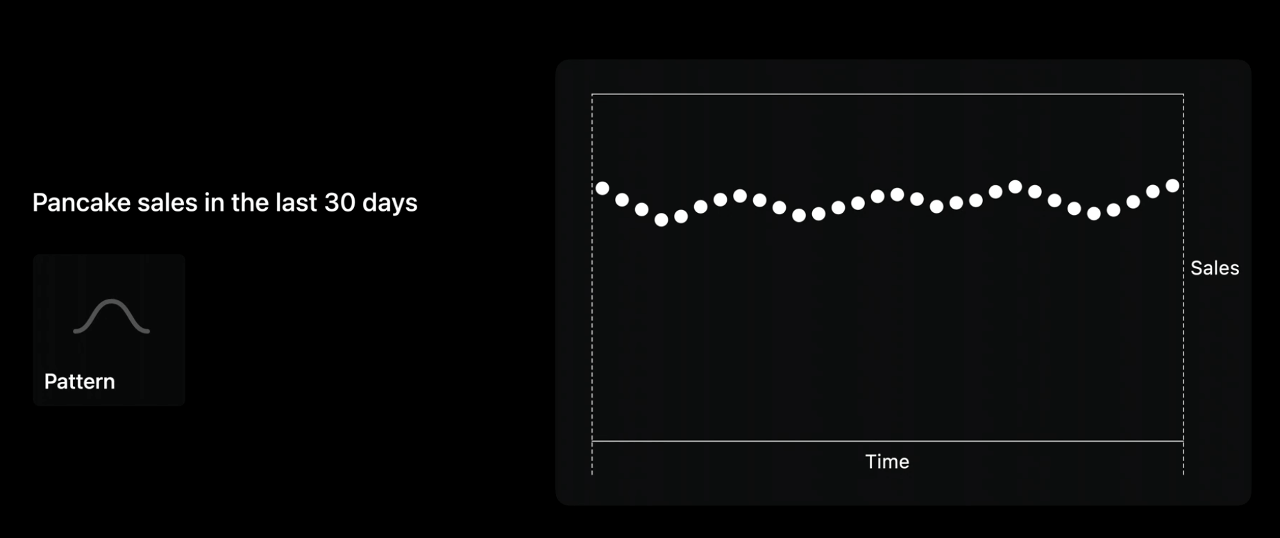
Envisioning nice smooth data like this, points look great.
But real data is rarely this neat.
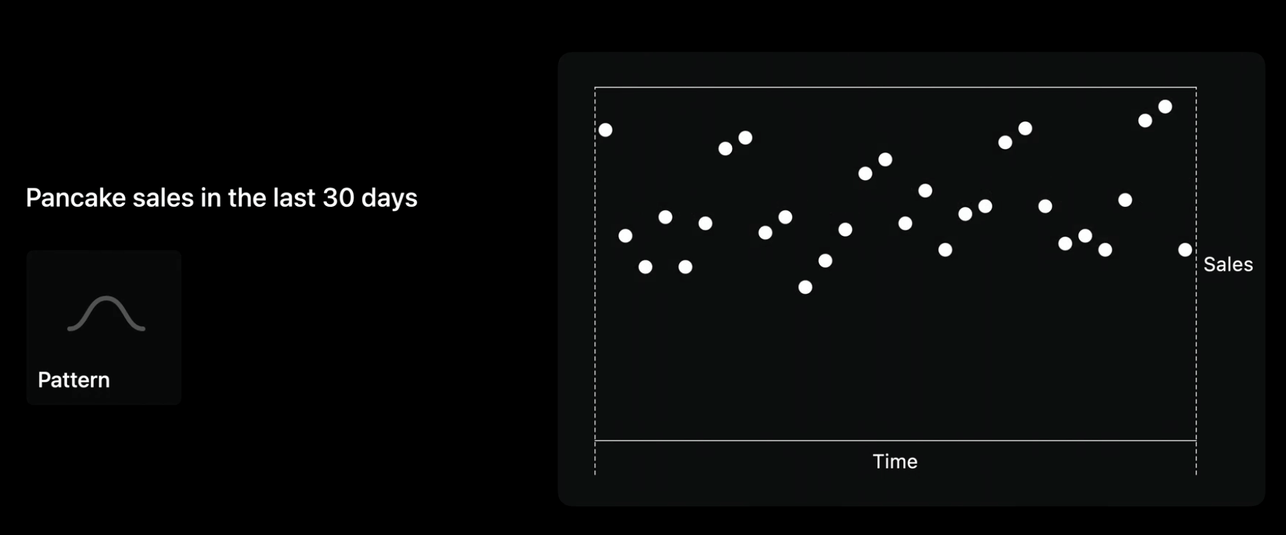
WIth realistic data, using points make it difficult to make out any pattern. > It’s important to test your desings with real data early.
To make the pattern of sales easier to see, we could connect sales counts by using a line mark. Lines are great at representing rates of change.
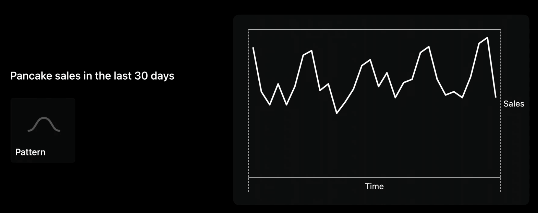
Here patterns and trajectories are clear. But what if our food truck needed to close for five alternative days?
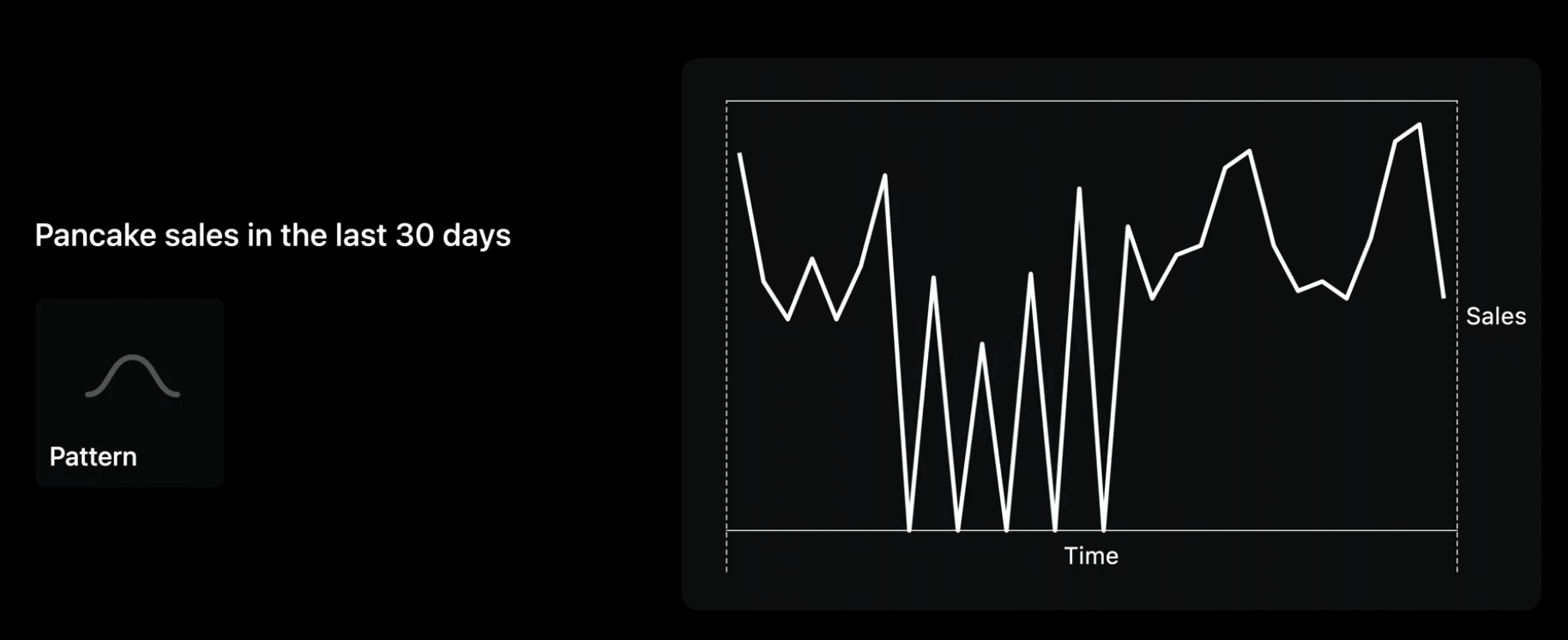
In this situtaion the segements connecting far-apart values become more prominent than the values themselves. > Remember to design for a variety of scenarios in your data.
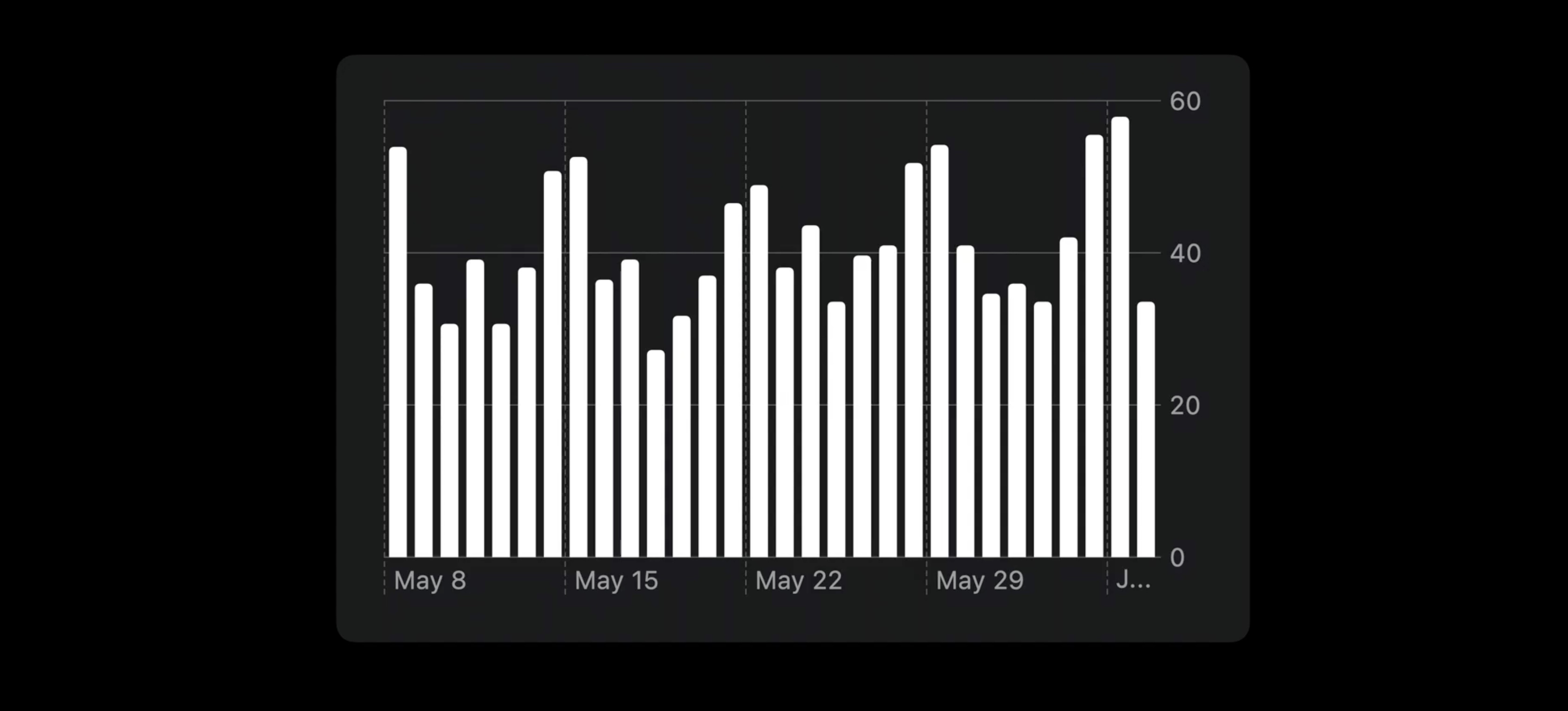
Bar Marks
Bar marks are more flexible for our chart. Here, zeros are visible without creating a distraction.
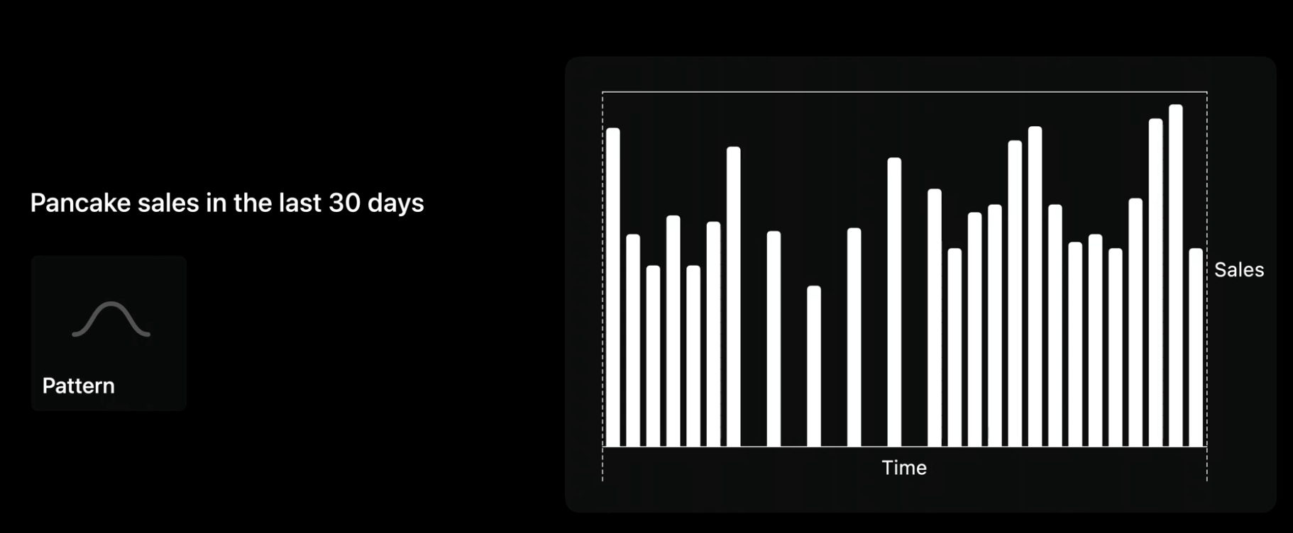
This chart are more intuitive to read: more white means more sales.
Accessible design

- Design for goals and data
- Make accessible in VoiceOver: for all the information you show visually, you also need to design how to represent it non-visually.
- Navigate data values
- Use Audio Graphs
VoiceOver is a screen reader. It lets people read information on their screen through Braille or speech so people who are blind and others can use apps without needing to see.
An audio graph turns the data in your chart into an audible representation by encoding the data on each axis as audio.
To make charts marks non-visually accessible, we need to design how VoiceOver will navigate over data values, and use audio graphs. Conveniently, charts implemented with the Swift Charts API automatically include customizable accessibility labels for marks and an implementation of audio graphs.
See the related session:
Bring accessibility to charts in your app - WWDC21
and
Axes
One part of the question was: "how were pancake sales over the last 30 days?" and we can see the pattern. Now the food truck owners can see recent fluctuations in their sales. But what about the range of these fluctuations, and values on specific days?
- Consider the range
- Fixed range
- Dynamic range
- Tailor the density of grid lines and labels
Fixed range
An example of a fixed range is the vertical axis of the battery chart in the Settings app. We know that the battery level will always go from 0 to 100%.

Dynamic range example
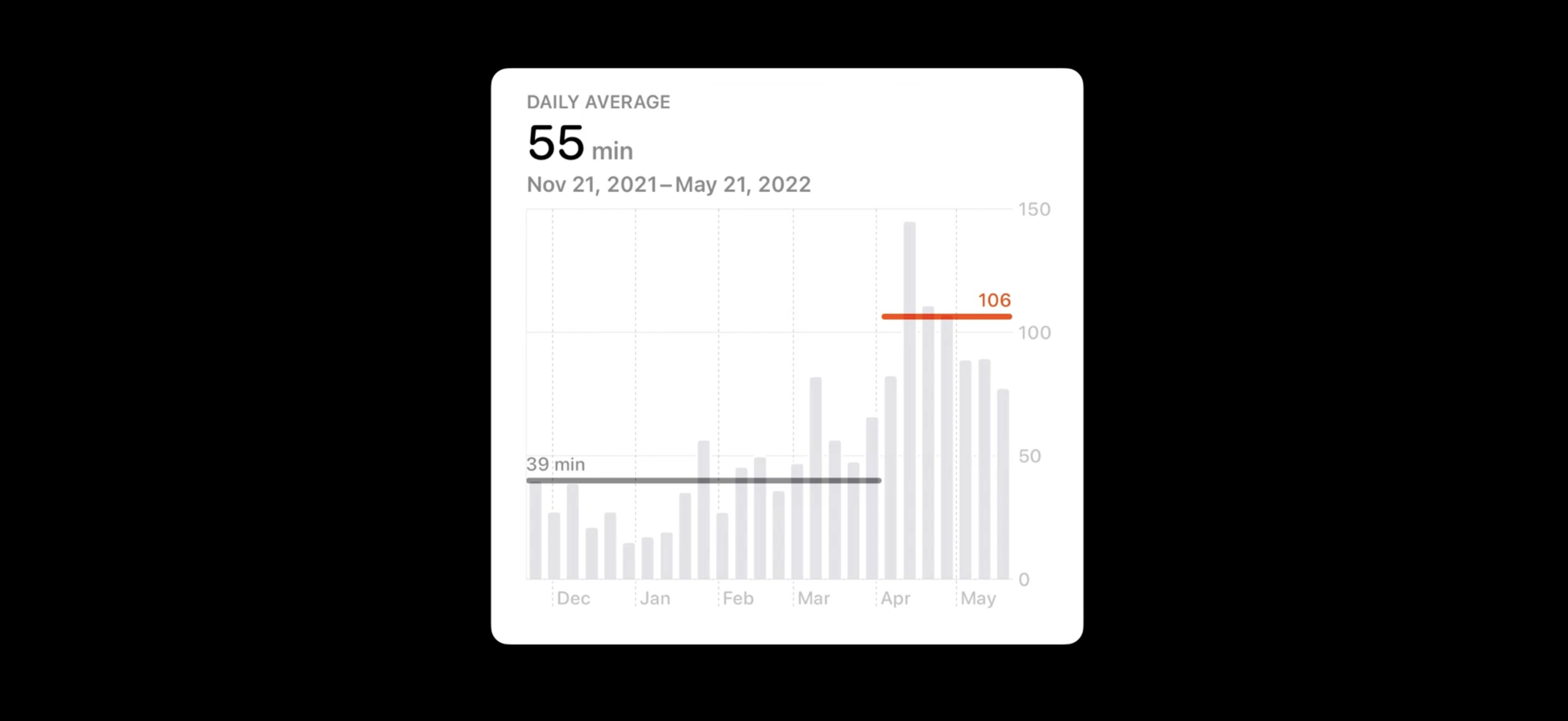
Consider the step count chart in the Health app, which uses a dynamic range. There is no fixed maximum step count, so it makes sense to dynamically adapt the vertical axis range to fit the data.
In our case for the app a dynamic range is better. The lower bound is 0. It keeps the heights of the bars meaningful. This way, a bar that's twice as tall as another has twice as many sales.
The density of our axis grid lines and labels.
Some charts don't need grid lines and labels at all, such as the trend platter in the Health app.
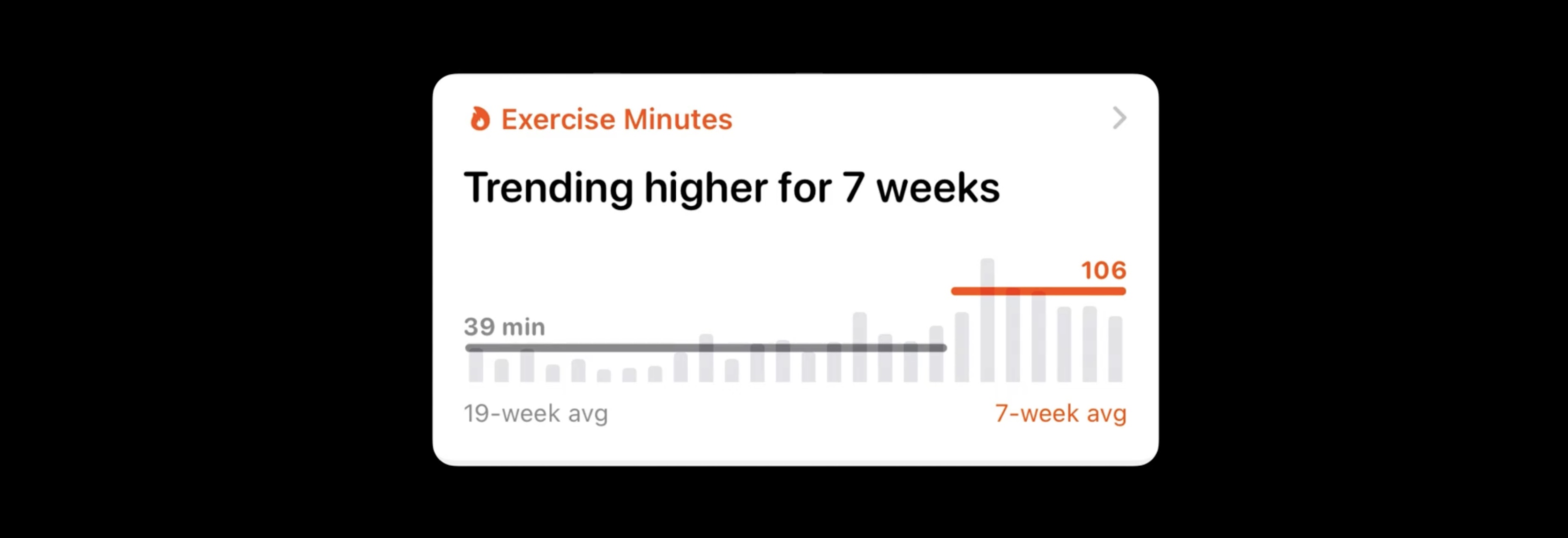
These charts tend to be sneak peeks of larger charts in another view like this:
Tailor the density of grid lines and labels
Too many grid lines and labels can be distracting.
Having seven horizontal grid lines might be overwhelming. For this chart's context and intended use, it's more effective to use around four horizontal grid lines and adjust as the range of the axis changes. In the same way, it's intuitive for people to read time in steps of seven days, giving five grid lines for a 30-day period:
Descriptions
- Provide context
- Summarize the main take-away
- Use Audio Graphs
Provide context
what is the vertical axis showing?
Are we looking at sales in terms of money? In number of pancakes?
By using "Pancakes sold" as a heading for the chart, the chart's meaning is front and center. Providing this context is important for framing the chart

Summarize the main take-away
Providing descriptions that contextualize the data and summarize key take-aways eases readers into your charts. It makes the chart more approachable and accessible for everyone.
For example, the text above a precipitation chart in Weather describes its main take-away. In this example, it's: "Light Rain Forecasted– Light rain is expected to start in 9 minutes and last for 36 minutes"

Let's rewriting our chart title to say "Total Sales: 1,234 Pancakes". This description summarizes the most critical information. Providing descriptions that contextualize the data and summarize key take-aways makes a chart more approachable and accessible for everyone.
Can be especially helpful for people with certain disabilities that make examining the details of the chart particularly time consuming or challenging.

Interaction
- Use large touch targets
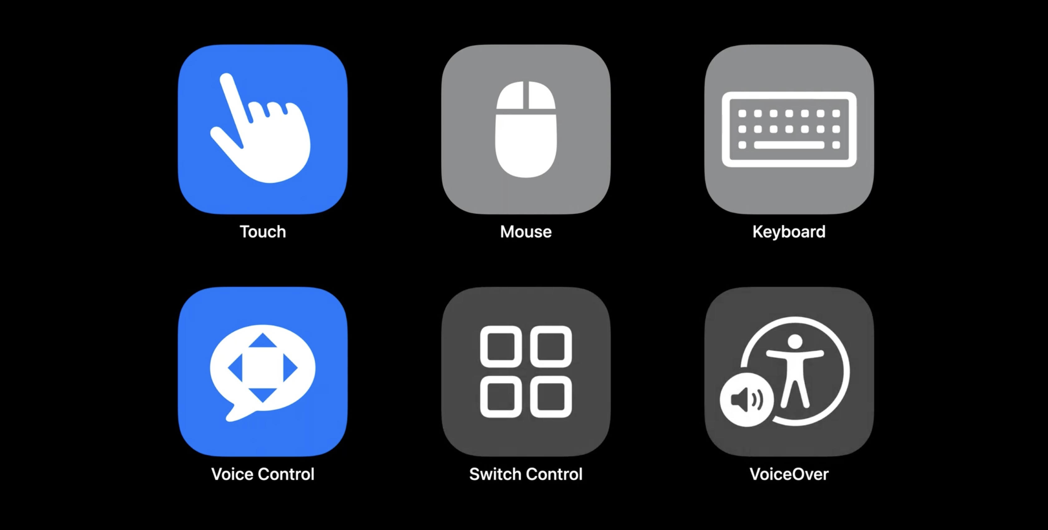
- Design multiple types of input
- Touch
- Mouse
- Keyboard
- Voice Control
- Switch Control
- VoiceOver
- Design accessibility labels
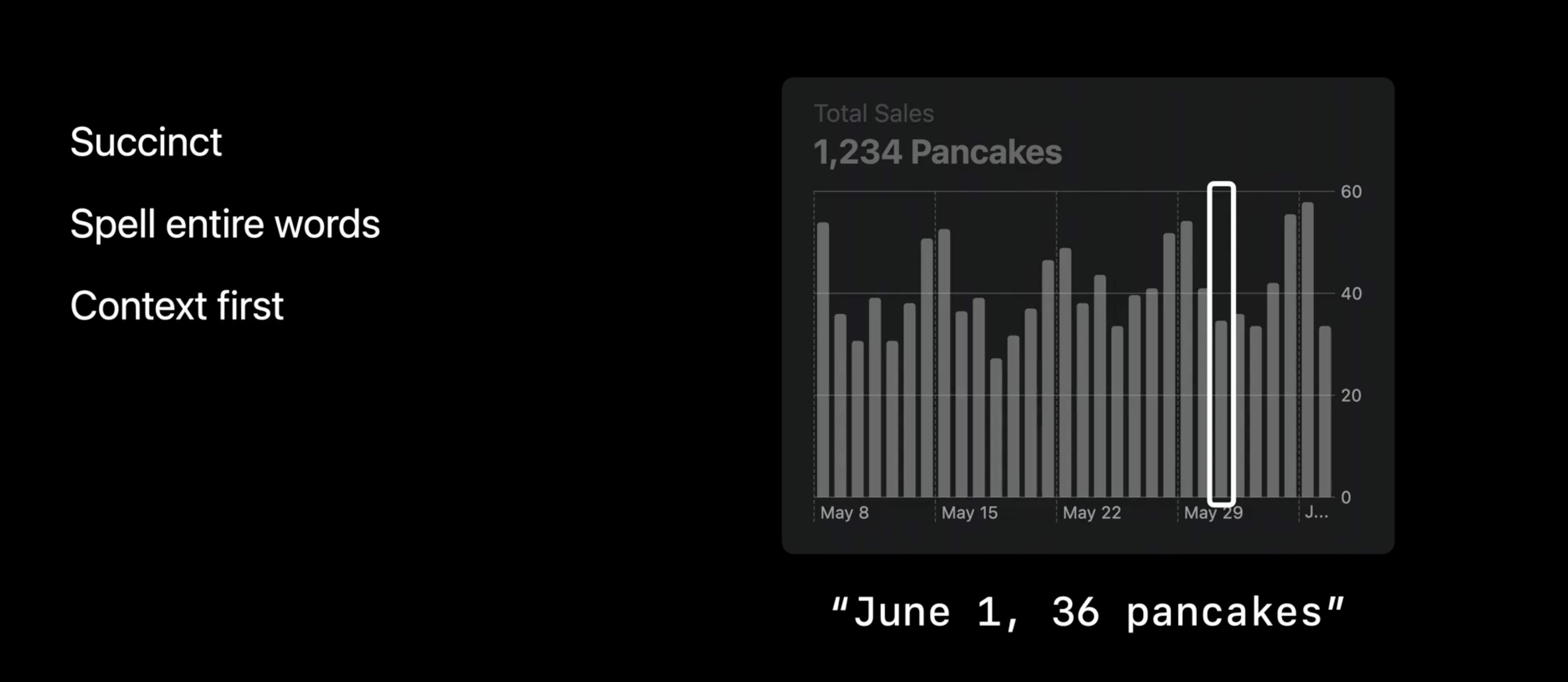
- Succinct
- Spell entire words
- Context first
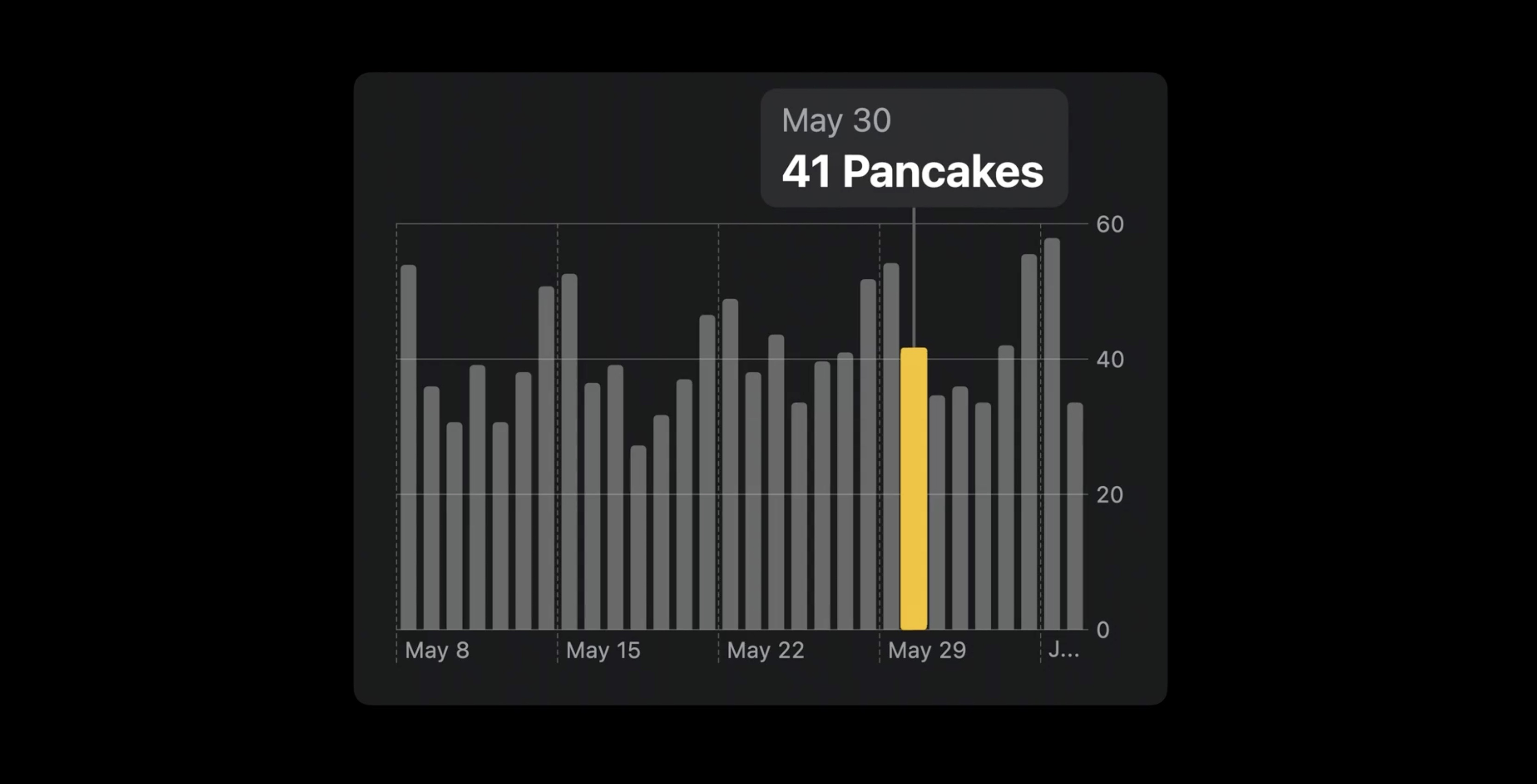
Use interactions to highlight sections of a chart to explore data or toggle between days, weeks, months, and years.
Enhancing the pancake sales chart with interaction, with an interactive tooltip, which lets us touch the chart to highlight and read these specific values.
Design for multiple types of input
For every interaction for touch or mouse clicks, need to design the same experience for inputs like keyboard, Voice Control, Switch Control, and VoiceOver. It's important to make changes on the screen visible, like sizing the focus indicator for Switch Control or VoiceOver to be large.
Accessibility labels
Part of providing support for VoiceOver is that we also need to design good accessibility labels.
When VoiceOver navigates onto one of the bars, it reads out values like "June 1, 36 pancakes".
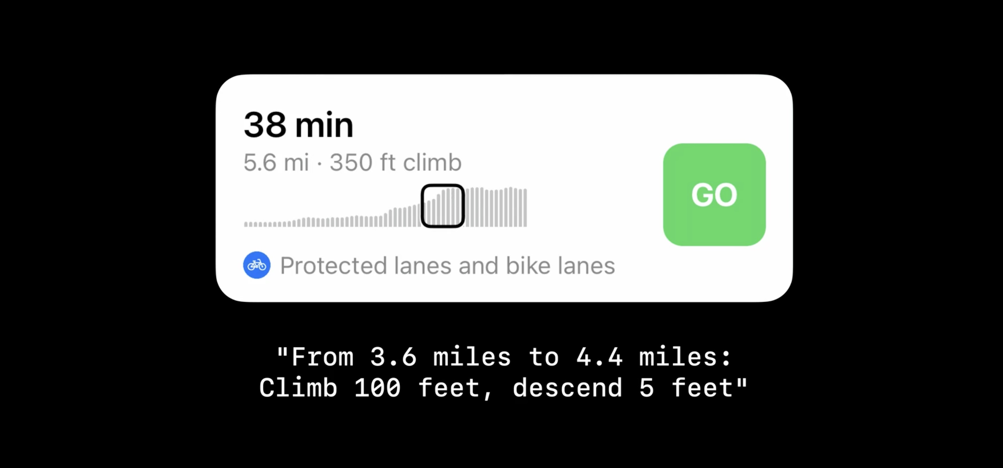
The kind of labels depend a lot on the goals of the chart. For example, the charts on elevation changes in cycling routes don't show individual values, but a route's pattern of elevation gains and losses. A well-designed accessibility label could then label a section of bars with: "From 3.6 miles to 4.4 miles: Climb 100 feet, descend 5 feet".
In contrast, if a chart is a tiny preview inside a button for opening the same chart in more detail, it might make sense to summarize the entire button, chart and all, with one label.

Color
- Use color to enhance
- Consider associated meanings
- Different colors of gain & lost in stock app for different culture
- Balance visual weight
- Choose distinct colors
- Not only distinct from each other, but also from the background
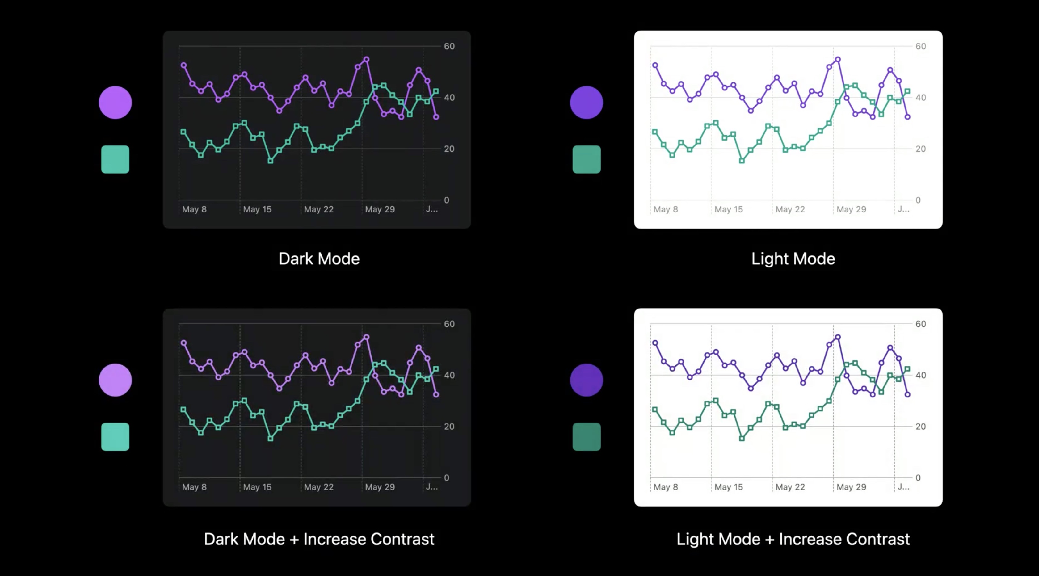
- Respect system settings
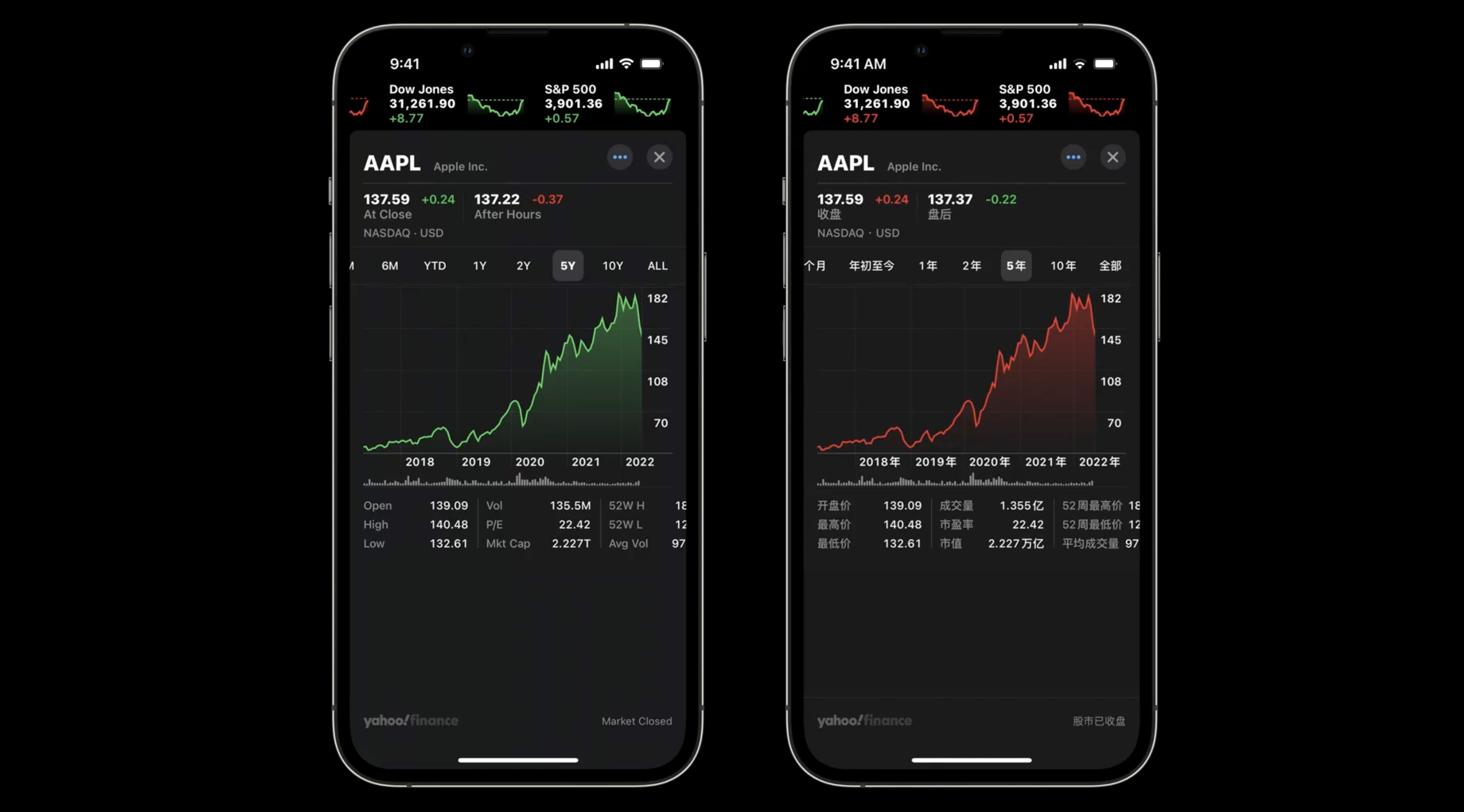
- Dark Mode/Light Mode
- Increase Contrast
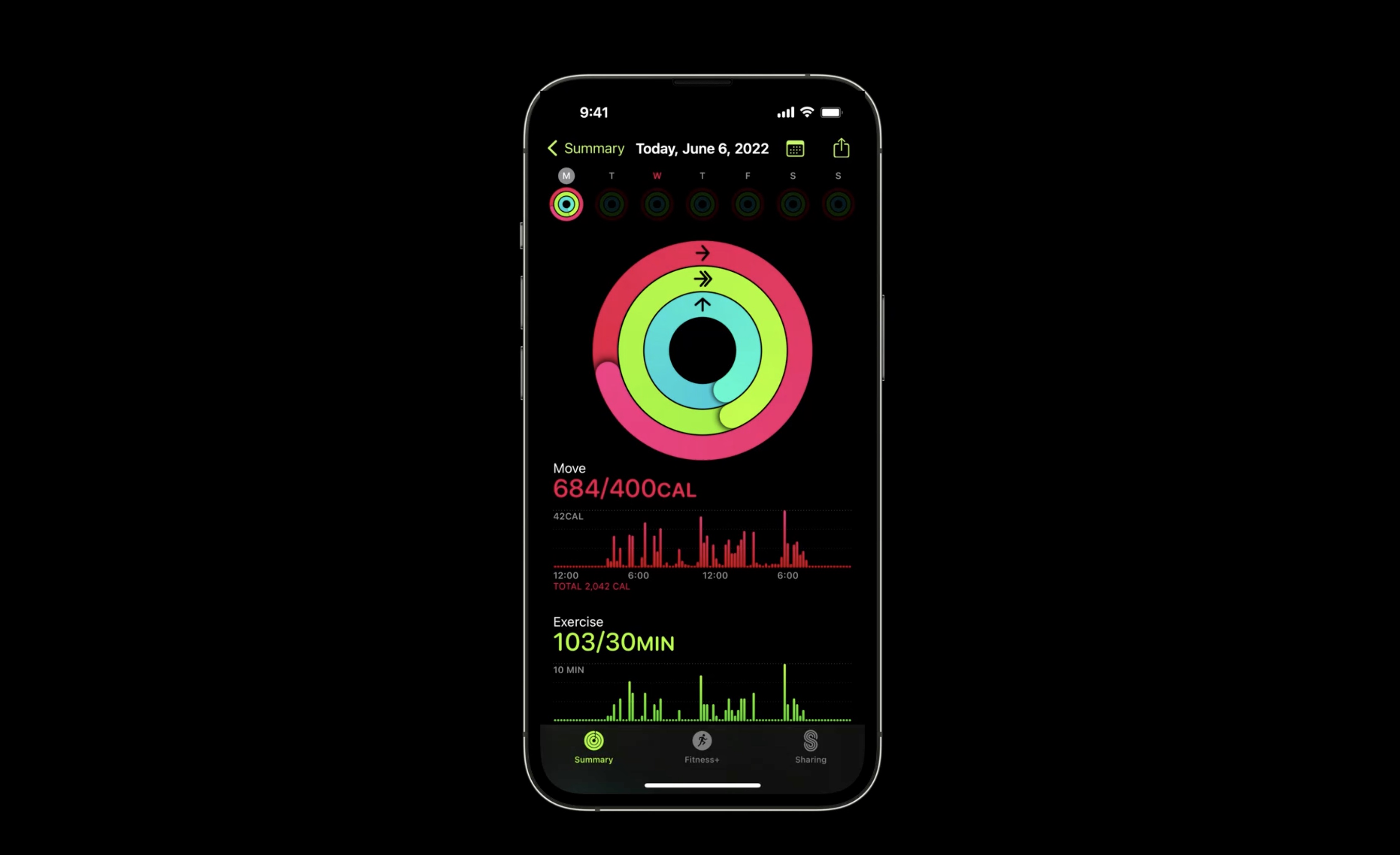
Use color to distinguish categories, as with the three activity rings in the Fitness app.
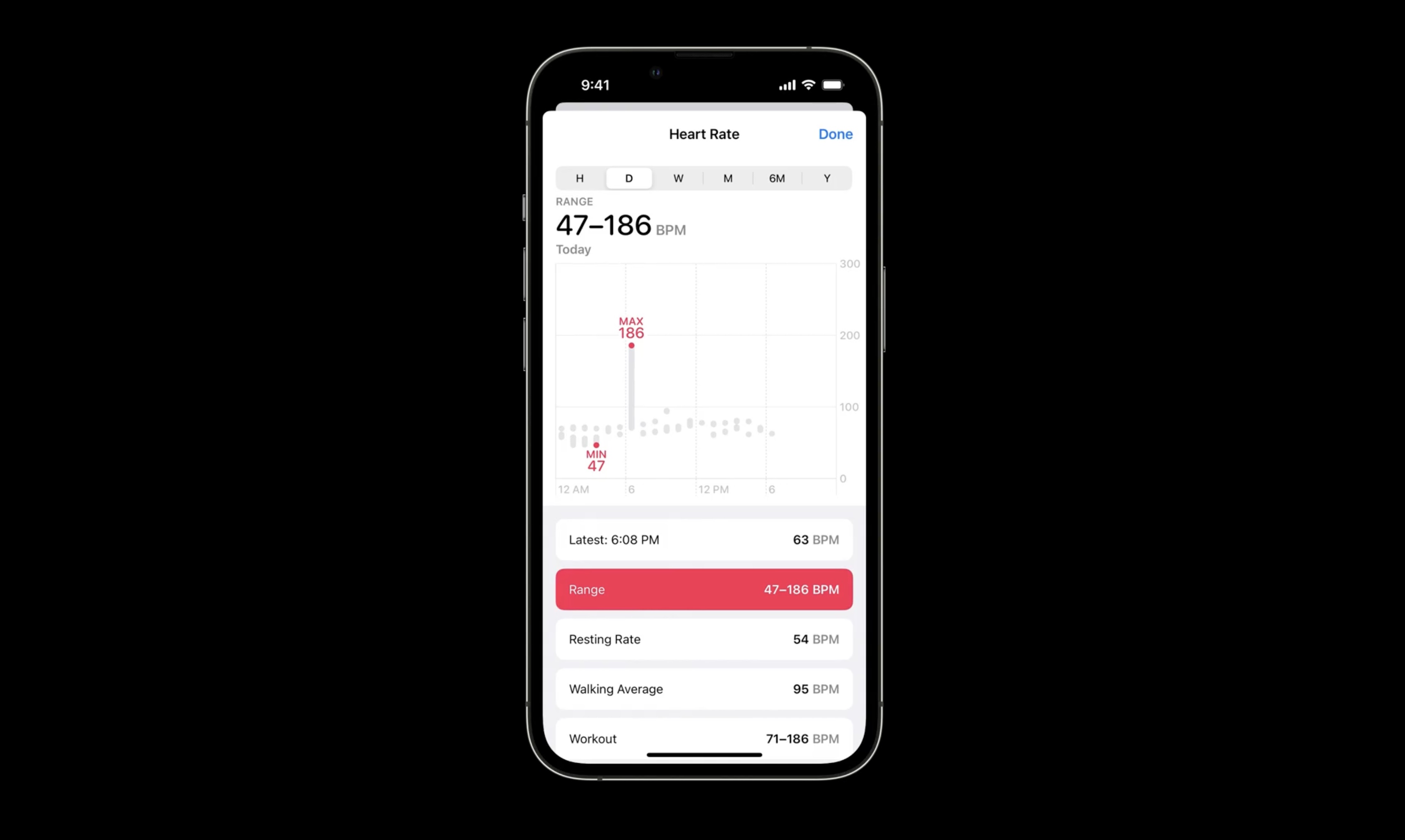
Use it to communicate intensity, such as heat in a weather forecast. Or even remove color to draw attention to features of a chart. Here the health app does so to highlight the minimum and maximum heart rate within a day.
Color can carry meaning.
For example, red and green for low versus charged battery levels.

Culture can inform the meanings of colors too. In the US, it makes sense to color code Stocks with green for gains and red for losses. In some countries like China, however, people expect the opposite, with red indicating gains and green indicating losses.
When choosing a palette, it's also important to choose visually distinct colors to improve accessibility and readability. Ensuring that colors have high contrast both from each other and the rest of the chart makes the chart more accessible for people with visual impairments and is a better overall design for everyone.
Also try making your colors distinct for people with color blindness.
Can check with color blindness filters. Finally, respects system settings by designing colors to adapt for both Dark Mode and Light Mode, as well as Increase Contrast.
Resources
Creating a chart using Swift Charts - WWDC22
Have a question? Ask with tag wwdc2022-110340 - WWDC22
Search the forums for tag wwdc2022-110340 - WWDC22
Swift Charts - WWDC22
Visualizing your app’s data - WWDC22
Related Videos
Design app experiences with charts - WWDC22
Hello Swift Charts - WWDC22
Swift Charts: Raise the bar - WWDC22
 GitHub
 davidleee.com
 Twitter