Design with SwiftUI
 laurent b
Description: Discover how SwiftUI can help you quickly iterate and explore design ideas. Learn from Apple designers as they share how working with SwiftUI influenced the design of the Maps app in watchOS 10 and other elements of their work, and find out how you can incorporate these workflows in your own process.
Chapters
0:00 - Introduction
1:40 - SwiftUI as a design tool
5:56 - Getting the details right
9:11 - Designing for interaction
11:50 - Testing your ideas
15:23 - Presenting your work
## Intro
- SwiftUl as a design tool
- Getting the details right
- Designing for interaction
- Testing ideas
- Presenting our work
How SwiftUI can enhance the design process, from the perspective as designers.
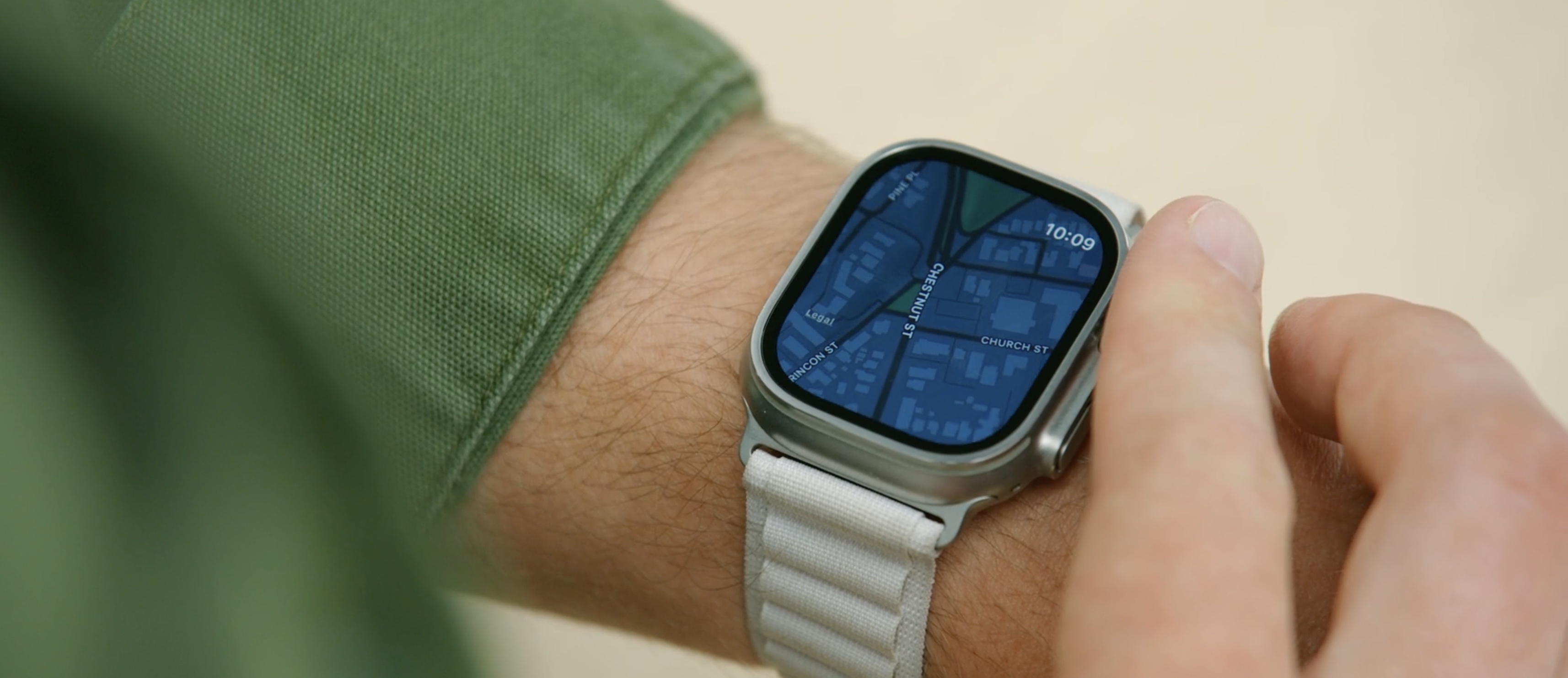
With real examples from the newly redesigned Maps app in watchOS 10.
For this year's watchOS app, all designs were developed in SwiftUI.
SwiftUl as a design tool
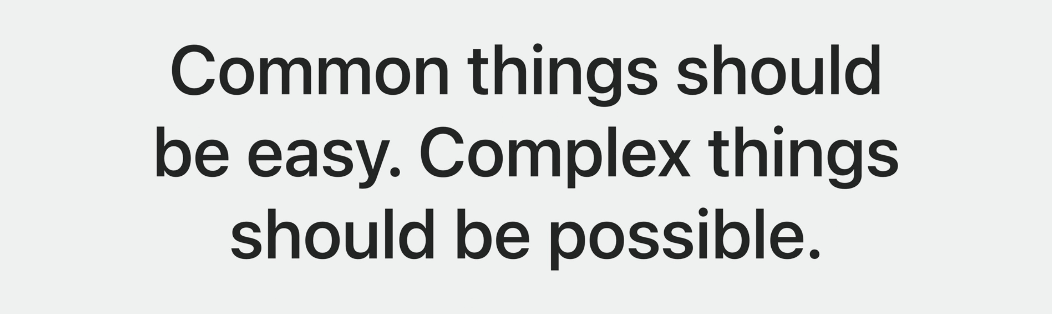
SwiftUI is built on the idea that common things should be easy and complex things should be possible.
Some tools are really good at making things easy. They lower the floor. A microwave is a good example. Most everyone can use one, and it's great for lots of simple things. However, if I need to make a fancy dinner, a microwave isn't the right tool.
Other tools are focused on being powerful. They raise the ceiling and enable us to make things that are complex and rich. A good example of this is an industrial espresso machine. While these machines enable to make incredible drinks, they can be unapproachable, hard to learn, and difficult for doing something simple, like making a basic cup of coffee.
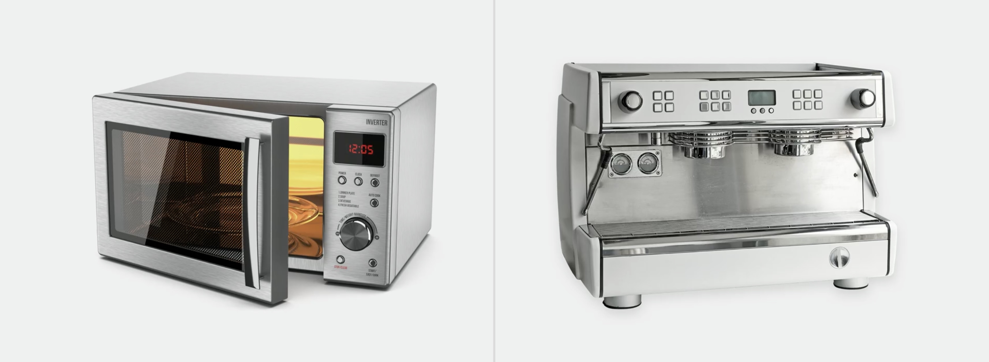
SwiftUI strikes the balance between these two types of tools. It lowers the floor for simple tasks and raises the ceiling for creating new and novel things.

In recent years, Xcode has become even more useful for designers, thanks to the addition of the visual canvas
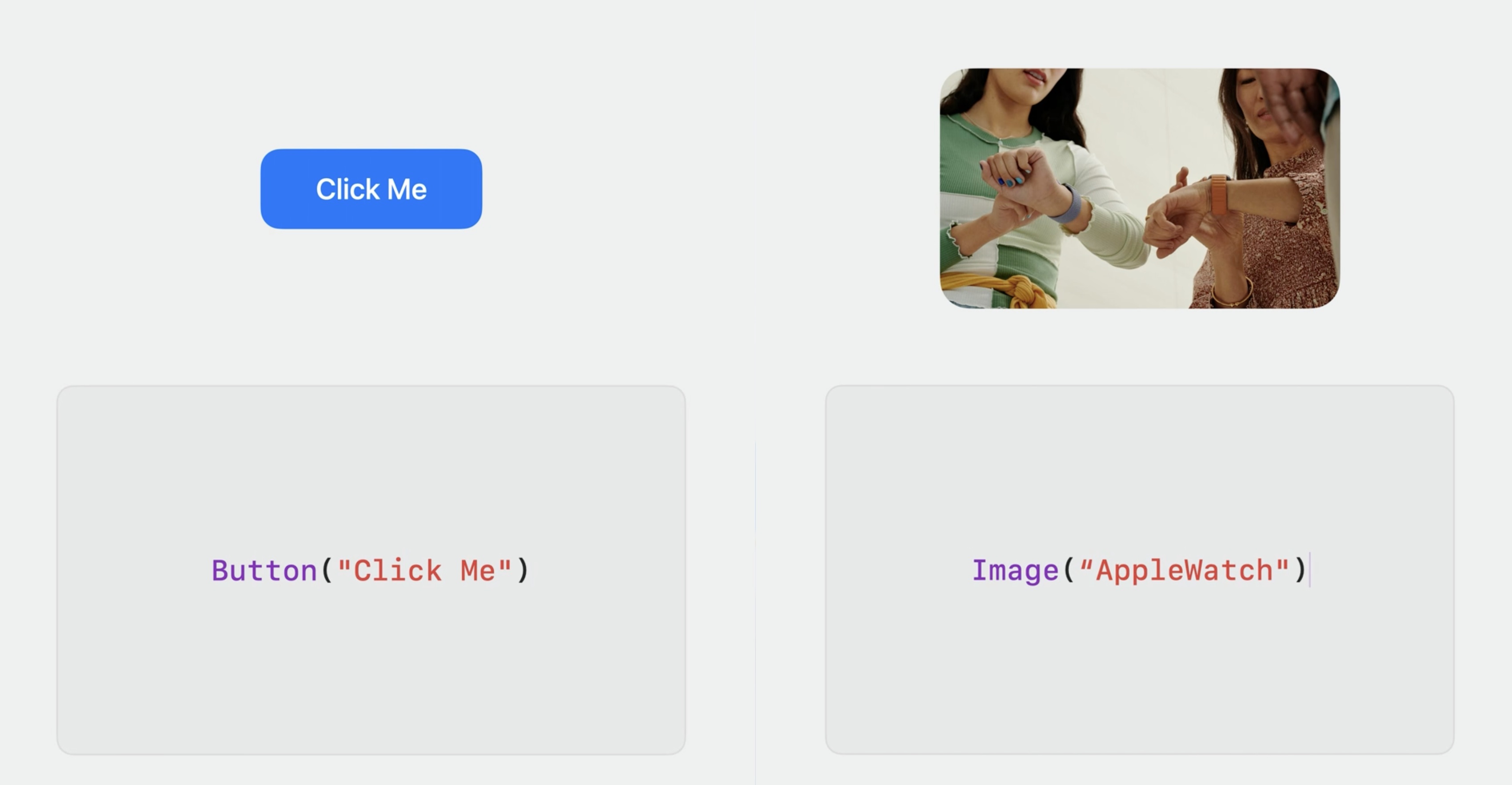
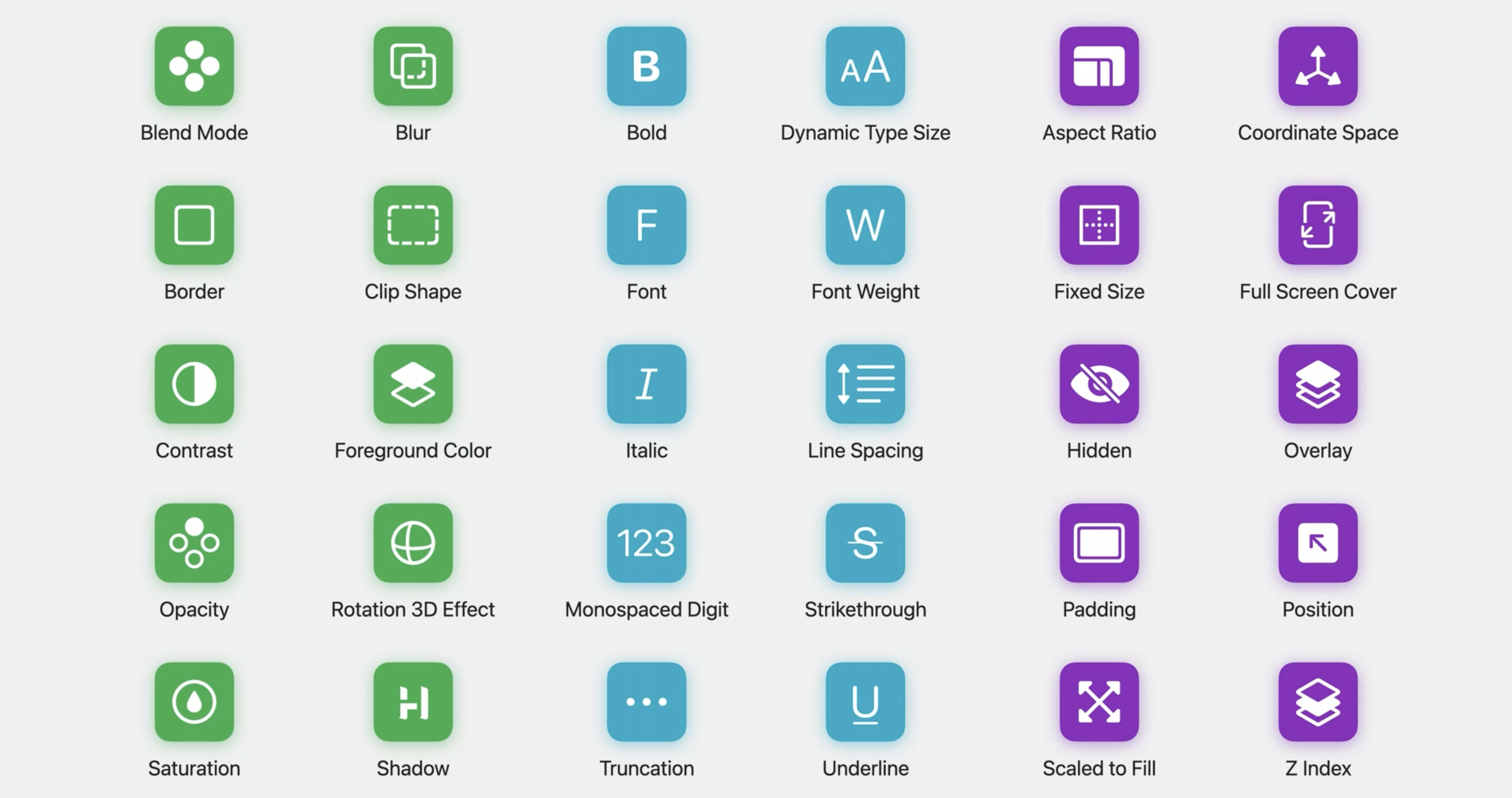
Equally helpful for designers is the declarative way that SwiftUI is written. For common elements like a button, just write Button. And for an image, just write Image.
SwiftUI provides us with Modifiers to change the appearance of things just as in any other design tool. This could be adding effects like drop shadows or borders, changing format of text though unique fonts, or manipulating the layout of elements by changing properties like aspect ratios or paddings. SwiftUI also provides easy access to system controls, like color pickers, and behaviors, like push transitions.
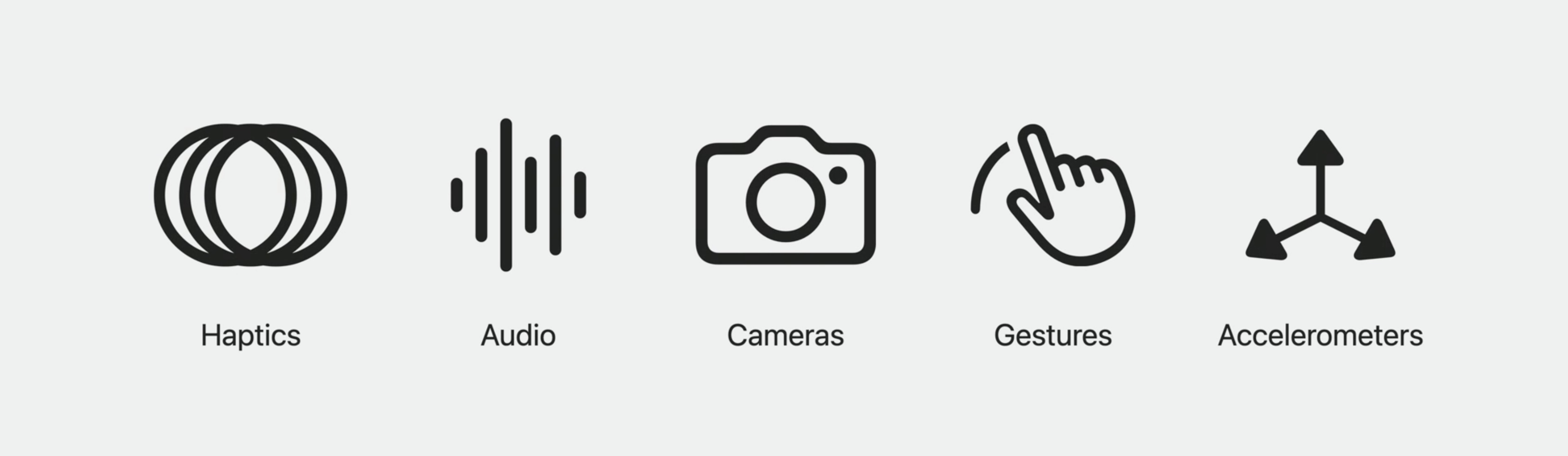
Using SwiftUI, now we have access to the unique capabilities of Apple hardware. With a bit of work, we can take advantage of things like haptic feedback, audio feeds, cameras, gestures, and sensors like accelerometers.
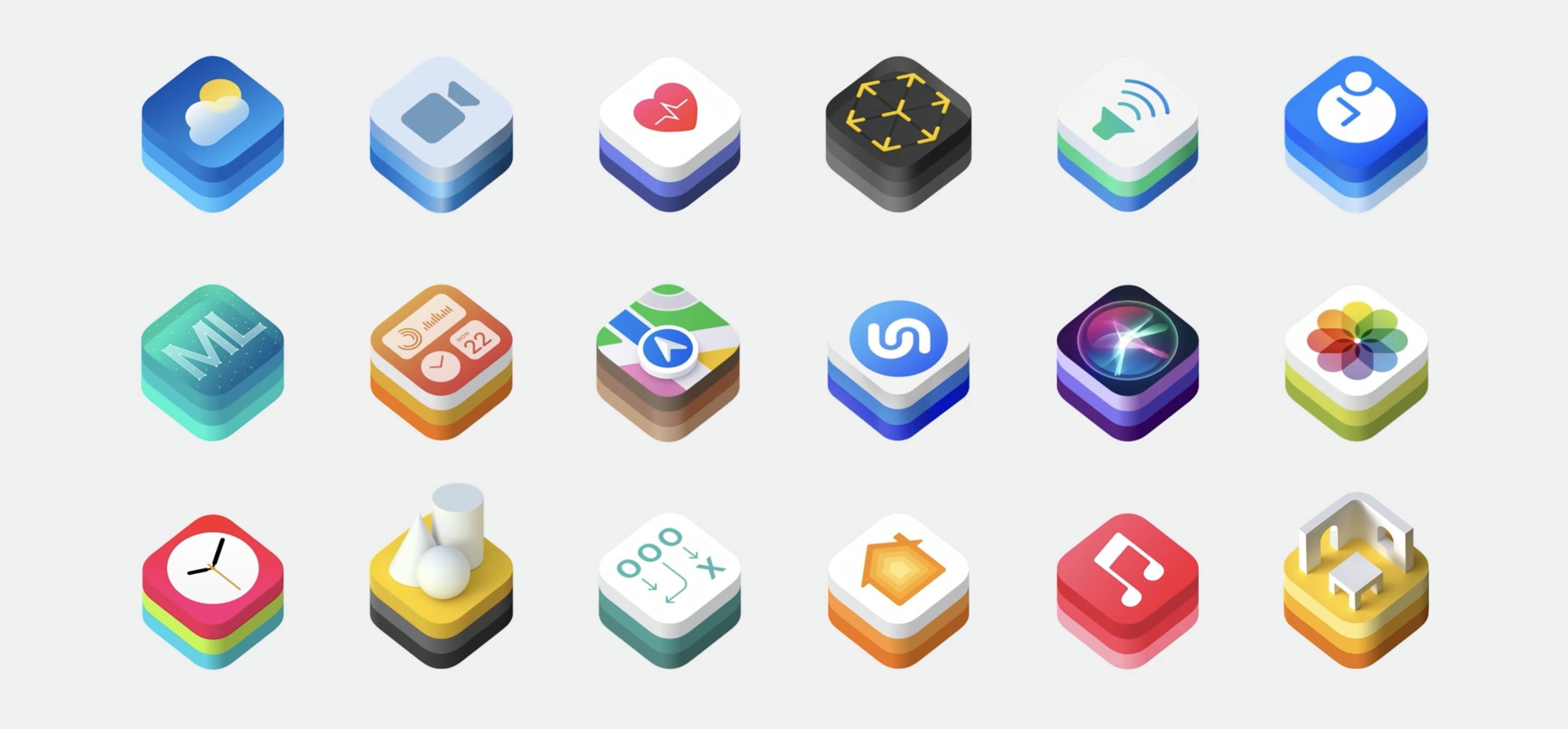
We can design with dynamic maps using MapKit, pull in live weather information from WeatherKit, or render objects in augmented reality using RealityKit. All of this can happens across Apple platforms because SwiftUI works with iPhone, as well as iPad, Apple Watch, and Mac.
Getting the details right
Modern interfaces are dynamic. SwiftUI helps by quickly surfacing all of those important details.

Separate parts now interact together. This process quickly reveals what's working in the design and what still needs attention or polish.
For example, how an image should look when it's loading or how a button appears when it's pressed.
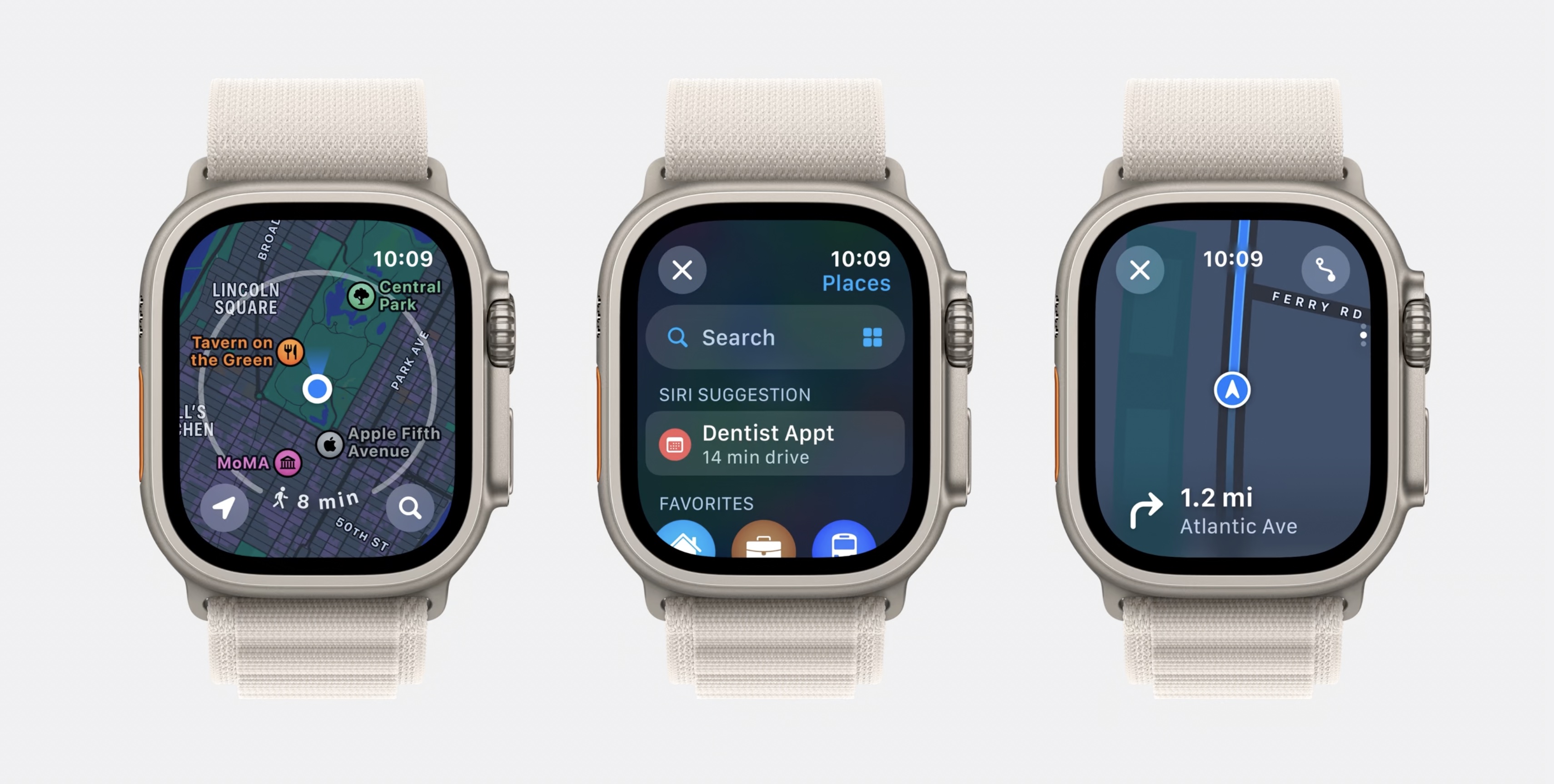
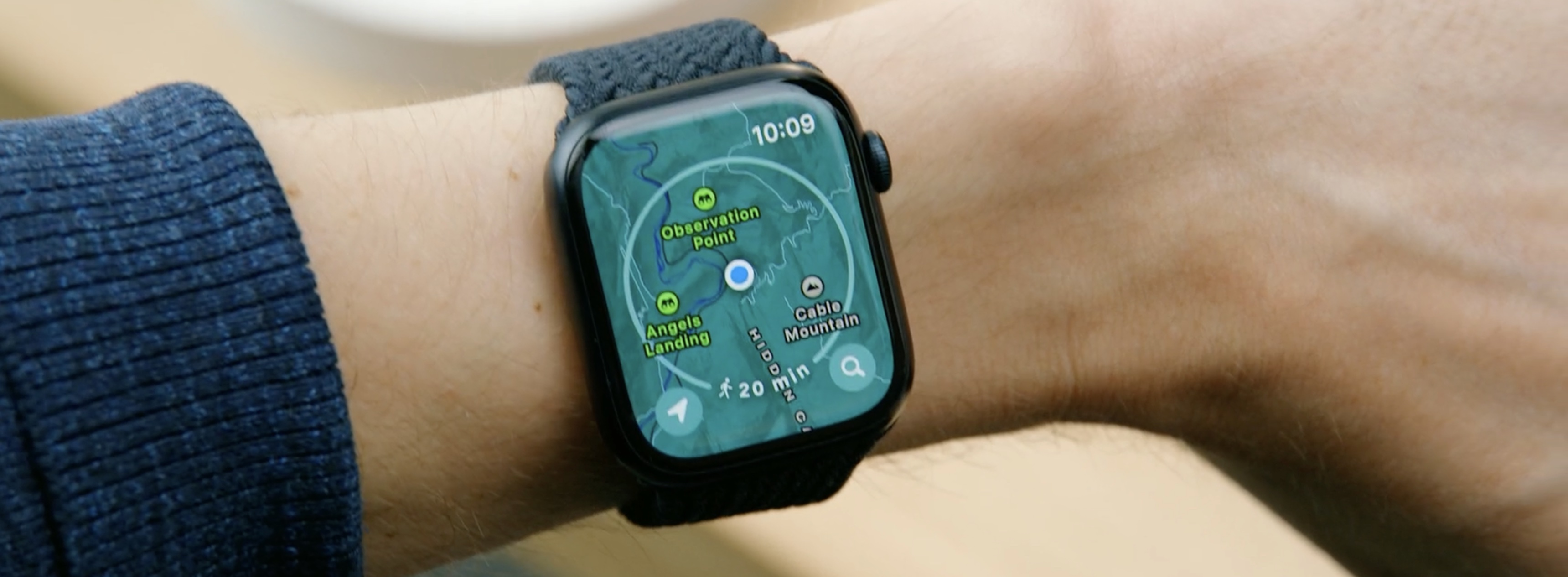
In this year's watchOS App, a more map-centric experience for people's wrists has been created. Because testing on device, the apple engineers immediately discovered an issue: The speed at which the Digital Crown zoomed into the map was much too fast.
To improve this experience, they tested multiple values in the SwiftUI prototype, adjusting the sensitivity of the Digital Crown until they found a zoom speed that felt natural. Once they improved the zoom speed, they started adding to the map, first adding points of interest, then UI controls, and finally, to better contextualize the map, a walking radius around the current location.

Adding to our SwiftUI prototype, new things surfaced that needed attention, like the interaction of the walking radius. They prototyped several different options. The favorite was this ticker animation, which developed as a separate SwiftUI prototype.
Lots of complexity can be hidden in such a seemingly simple design. All of these details were initially opaque when they began designing. But the moment when started making prototypes, they were obvious.
Designing for interaction
Animations in SwiftUI are performant, easy to use, and fully interruptible.
Interactions give you a sense of how your designs feel, not just how they look.

Often, interactions involve gestures, like dragging, scrolling, or tapping. But there are other input sources, like hardware sensors, you can use for interactions.
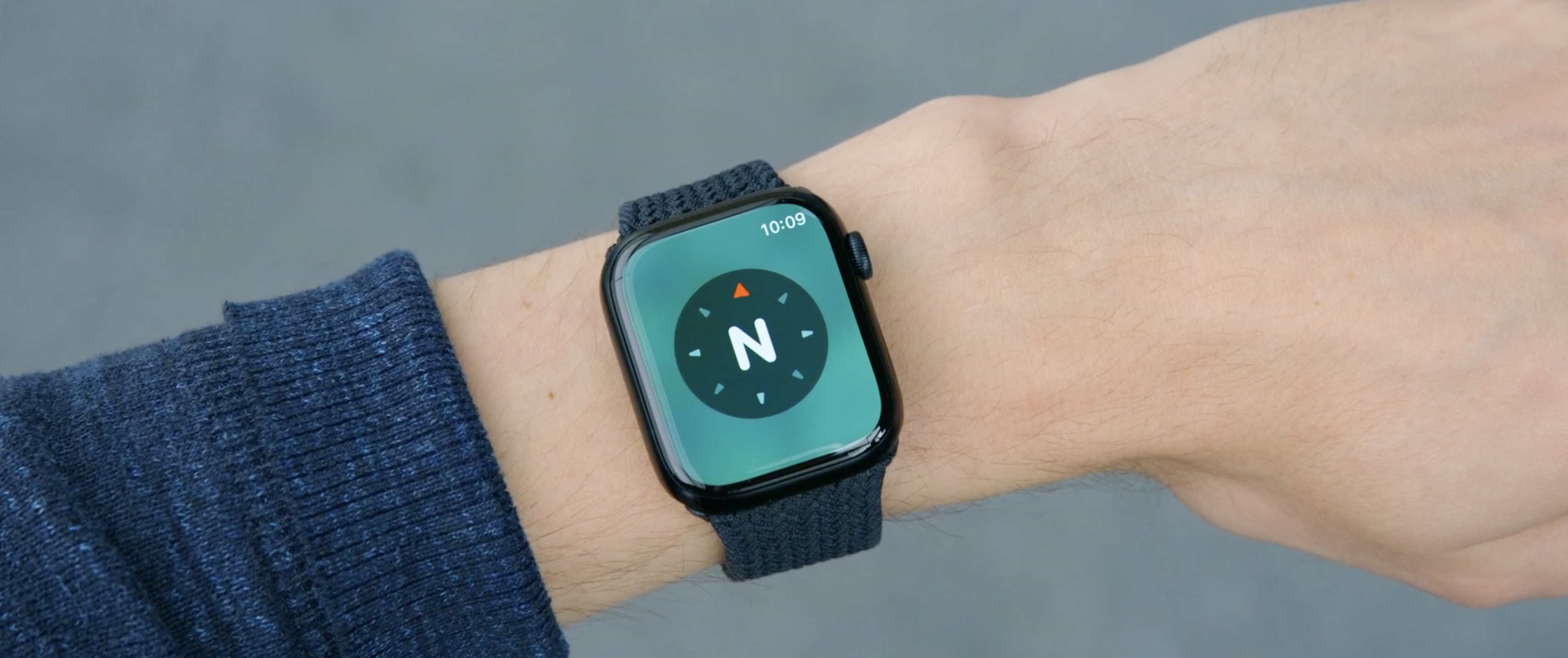
On the new Maps home screen, when tapping the location button, it activates a compass. As we move around, the compass displays the cardinal direction you're currently facing.
In order to get a sense of how this interaction would feel, they created a SwiftUI prototype with a magnified compass to test out transitions using the watch's internal sensors.
Another interaction was related to the search experience. Searching for a location, like a restaurant, this new split screen shows a map and list of results. This design required a unique scroll interaction that would have been difficult to achieve in other tools.
The platter responds to slow movements of the Crown, and once a threshold is hit, a new platter quickly transitions into place, along with a haptic response.
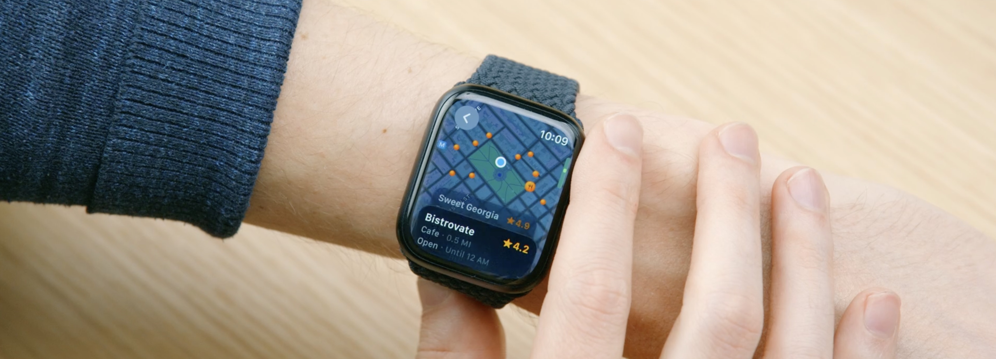
Fast movements, use a tighter spring animation. This helps the interaction feel snappy.
Testing ideas
Design isn't just about how something looks or feels though. It's also about how it works.

As design work progresses, it's important to find out where designs break, testing them in the real world to see how they hold up.
SwiftUI makes it easy to design and evaluate work in realistic scenarios. For example, in maps they pay attention to how glare and sunlight impacts the readability of the cartography and interface. This often leads us to adjust contrast levels across the app to provide a more legible experience.
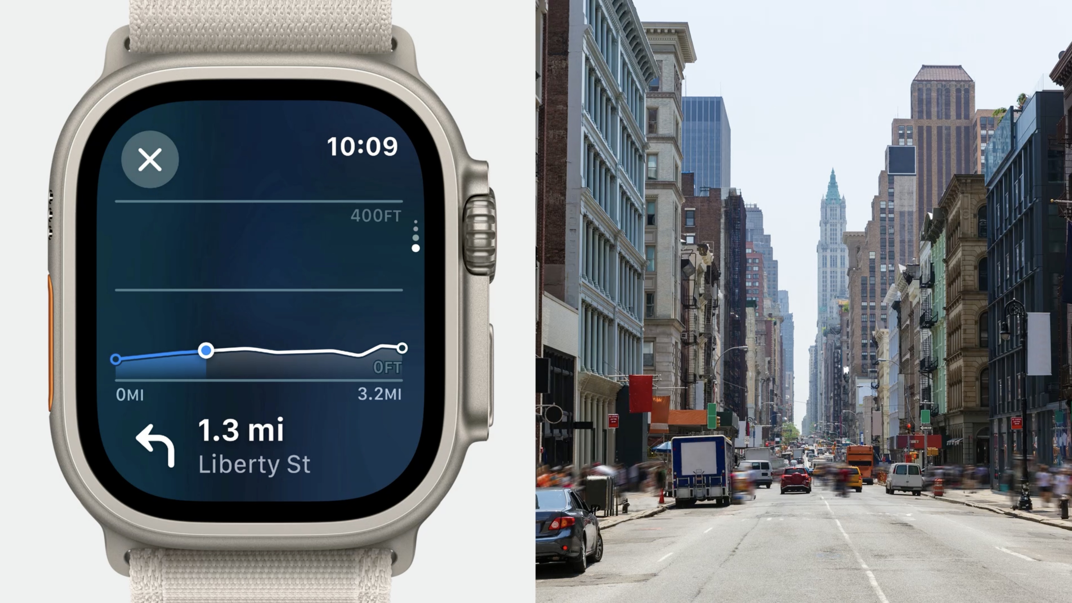
Another practice is to use real data in the designs. For hilly routes, like those found in San Francisco, the chart worked just as expected.
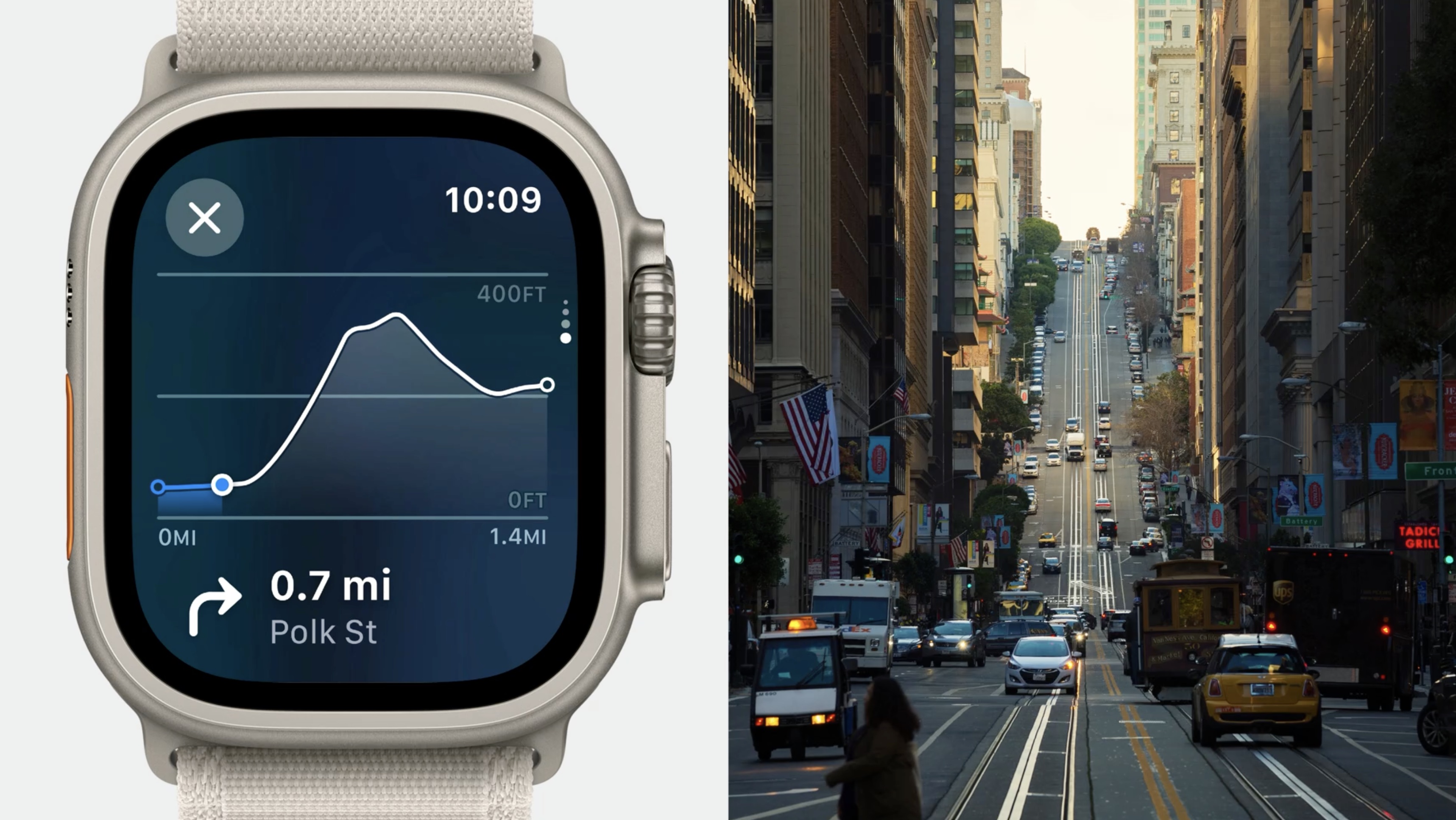
However, when using data for flat routes, like in New York City, it looked much more extreme than it actually was, as hiking a mountain.
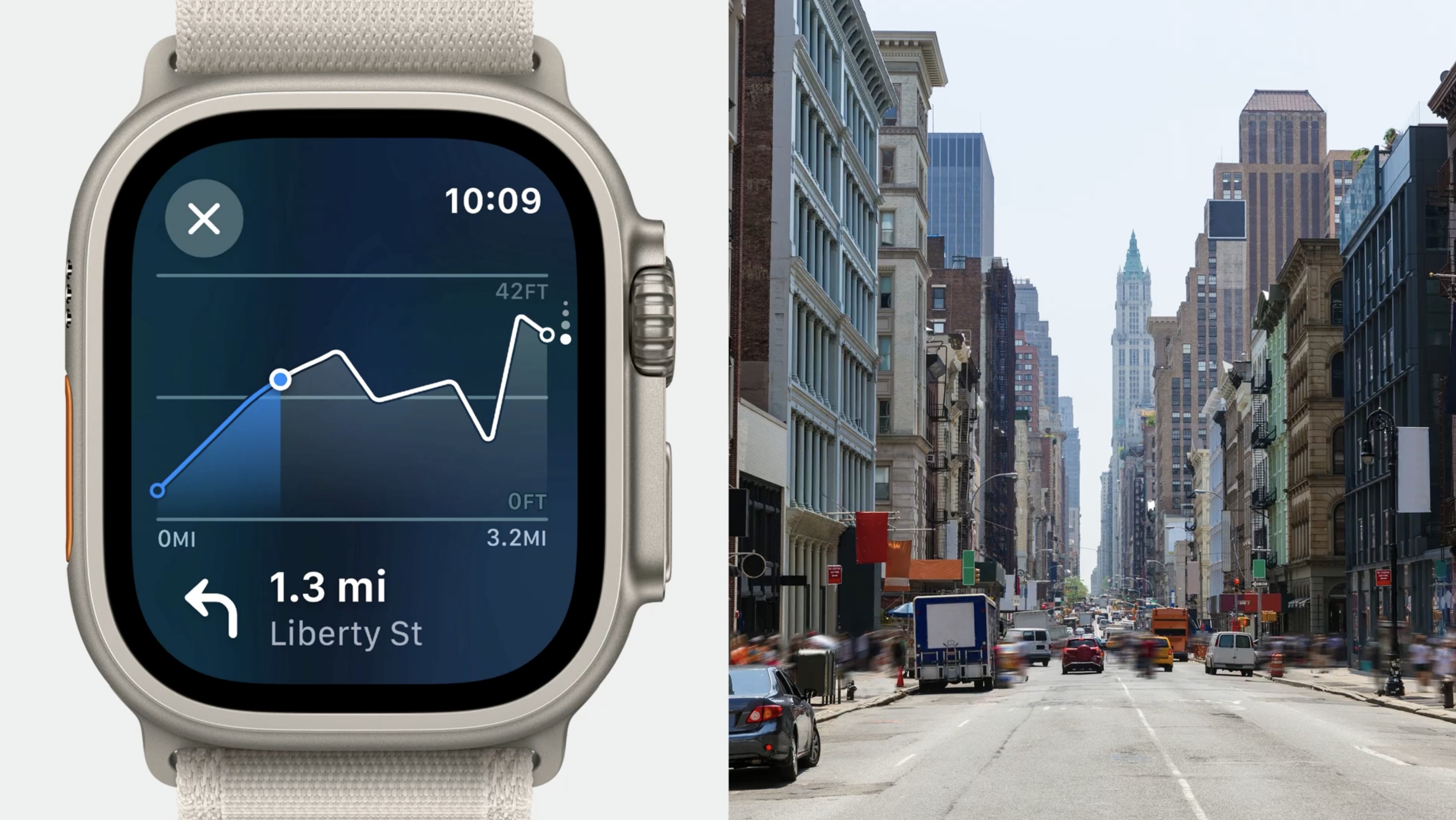
An adjustment of the scale of the Y-axis was needed so that flat routes appeared as expected.
One more practice is creating one-off design tools using SwiftUI.
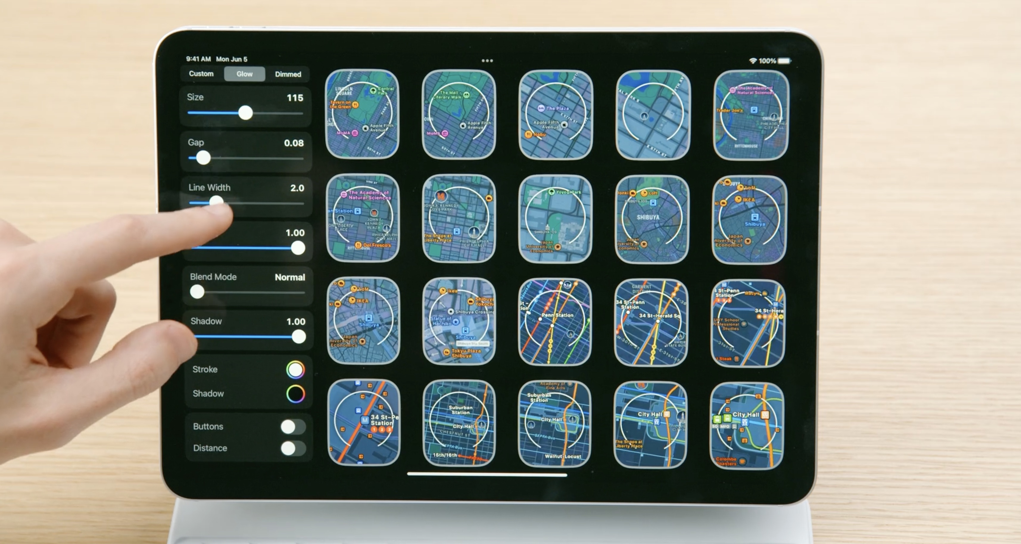
Small parameterized tools like this one allow to scrub through way more variations than in a static design tool. They're easy to build in SwiftUI and can help answer specific questions or solve complex problems.
Presenting our work
Another way to test ideas is to share them with others.
When people can hold a demo of our work in their hands, designs explain themselves. This helps build consensus and can save everyone the hassle of more meetings.

Resources
Have a question? Ask with tag wwdc2023-10115
Search the forums for tag wwdc2023-10115
 Twitter
 GitHub
 iosdev.space