What's new in AppKit
 Darren Ford
Description: Discover the latest advances in Mac app development. We'll share improvements to controls and menus and explore the tools that can help you break free from your (view) bounds. Learn how to add motion to your user interface, take advantage of improvements to text input, and integrate your existing code with Swift and SwiftUI.
Presenters
- Aasim Kandrikar, AppKit Engineer
- Raleigh Ledet, AppKit Engineer
NSTableView/NSOutlineView improvements
Easier column visibility 🆕
A new delegate API method on NSTableViewDelegate to present column customization menus.
- The menu allows users to toggle visibility of columns in your table
- Specify which columns the user can hide, and AppKit will handle the rest (including localization and state restoration)
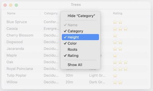
func tableView(_ tableView: NSTableView, userCanChangeVisibilityOf column: TableColumn) -> Bool {
   return column.identifier != "Name"
}
Progress
NSProgressIndicator now works automatically with the Progress type in Foundation
- Assign the progress to the new
observedProgressproperty onNSProgressIndicator - progress indicator will automatically update its value as the progress changes, even on background threads
func fetchData() {
   let url = URL(string: "https://developer.apple.com/wwdc23/")!
   let task = URLSession.shared.dataTask(with: .init(url: url))
   progressIndicator.observedProgress = task.progress
   task.resume()
}
NSButton updates
- ⚠️ All previously discouraged bezel styles are now deprecated.
⚠️ Bevel style names have changed
- Existing bezel style names have changed - no longer using appearance descriptions. Names are now semantic, based on their semantic use.
- Rounded ➔ Push
- Regular Square ➔ Flexible Push
- Textured Rounded ➔ Toolbar
- Recessed ➔ Accessory Bar
- Round Rect ➔ Accessory Bar Action
- Inline ➔ Badge
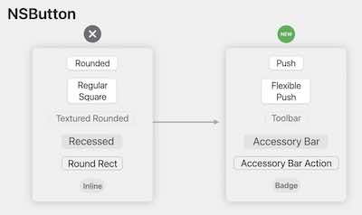
New bezel style 'automatic' 🆕
- New bezel style
.automatic- Adopts the most appropriate style depending on the contents and view hierarchy position of the button
- ⚠️ Is the default style now for all
NSButtoninitializers
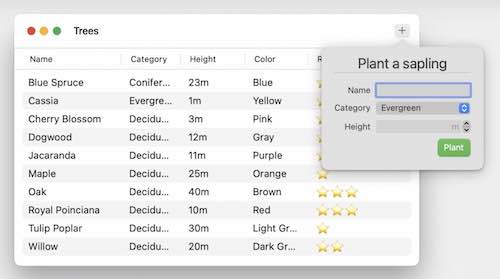
Inspector split view type 🆕
- New split view item type like Xcode's Inspector pane
- Is a trailing split view item
- Displays contextual information about content that is currently selected in a document
- ⚠️ Deployable back to Big Sur.
let inspectorItem = NSSplitViewItem(inspectorWithViewController: inspectorViewController)
splitViewController.addSplitViewItem(inspectorItem)

func toolbarDefaultItemIdentifiers(_ toolbar: NSToolbar) -> [NSToolbarItem.Identifier] {
    [.toggleSidebar, .sidebarTrackingSeparator, .flexibleSpace, .addPlant,
     .inspectorTrackingSeparator, .flexibleSpace, .toggleInspector]
}
NSPopover
Anchoring to a toolbar item 🆕
- Can now anchor a popover to a toolbar item using the
popover.show(relativeTo: toolbarItem)method - If the item is in the toolbar's overflow menu the popover appears anchored to the overflow chevron
func toolbarAction(_ toolbarItem: NSToolbarItem) {
    let popover = NSPopover()
    popover.contentViewController = PopoverViewController()
    popover.show(relativeTo: toolbarItem)
}
Full size content (FINALLY!!!) 🆕
- Set
.hasFullSizeContenton the popover to extend content into the popover's chevron area - Use the safe area rect to layout content that shouldn't be obscured inside the popover
Menus
- Completely re-written to take advantage of Cocoa
- improved performance
Section headers 🆕
- Easily add section headers to your menu using
.sectionHeaderclass method onNSMenuItem. - Used for conveying groups in your menu
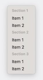
menu.items = [
   .sectionHeader(title: "Section 1"), .init(title: "Item 1"),
   .init(title: "Item 1", …),
   .init(title: "Item 2", …),

   .sectionHeader(title: "Section 2"), .init(title: "Item 2"),
   .init(title: "Item 1", …),
   .init(title: "Item 2", …),

   .sectionHeader(title: "Section 3"), .init(title: "Item 3"),
   .init(title: "Item 1", …),
   .init(title: "Item 2", …)
]
Palette menus 🆕
An NSMenu laying out its items as a horizontal series.
- Set the menu's
.presentationStyletopalette - For each menu item in the palette menu
- set its image (template images will automatically tint)
- alternatively, set the
onStateImageandoffStateImage - The title is used for accessibility -- USE IT
- Two selection modes,
.selectAnyand.selectOne - You can get/set item selection via the
.selectedItemsproperty on the menu selectionModeandselectedItemswork by organizing menu items that have the same target/action pair into a logical group- When manually creating palette menu items, give each item the same target/action pair to take advantage of the new selectionMode and selectedItems behavior
NSMenuprovides some convenience functions to create common palette menus.- Optional closure parameter that gets called whenever the selection changes
Using tinted images
- Template images will automatically tint to indicate selection
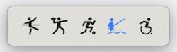
paletteMenu.presentationStyle = .palette
let item = NSMenuItem(title: "Fishing", action: #selector(action(_:)), keyEquivalent: "")
item. image = NSImage (systemSymbolName: "figure.fishing", accessibilityDescription: "Fishing")
paletteMenu.addItem(item)
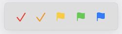
Using OnState/OffState images
.offStateImageindicates no selection.onStateImageindicates selection
paletteMenu.presentationStyle = .palette
let item = NSMenuItem(title: "Tag", action: #selector(action(_:)), keyEquivalent: "")
item.offStateImage = flagImage
item.onStateImage = checkImage
paletteMenu.addItem(item)
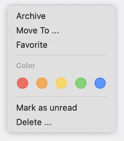
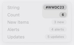
Menu badges 🆕
- Menu items can be easily badged
- A simple string, or a count
- Three specialized count badges that automatically take care of badge localization :-
- new items
- alerts
- updates
item.badge = NSMenuItemBadge (string: "#WWDC23")
item.badge = NSMenuItemBadge (count: 6)
item.badge = newItems (count: 3)
item.badge = .alerts (count: 4)
item.badge = .updates (count: 5)
Cooperative app activation 🆕
In macOS Sonoma, cooperative app activation reduces unexpected application switches, for example, an app switch while you are in the middle of typing.
- Activate is now a request, NOT a command
- The
ignoringOtherAppsparameter is now ignored- ⚠️
activate(ignoringOtherApps:)andactivateIgnoringOtherAppsare now deprecated - Only the active application can influence the activate context
- The currently active application will be asked to yield, and it can choose whether to honor the request.
- To manually hand activation to another application,
yieldActivationto the targetNSRunningApplicationor bundle identifier
- ⚠️
NSBezierPath/CGPath
- You can now create an
NSBezierPathfrom aCGPathand vice versa - NOT toll free bridged (always creates a copy of the path)
CADisplayLink 🆕
- Now available on macOS
- You can get a
CADisplayLinkfrom anNSView,NSWindoworNSScreen - Follows views across screens
- Best approach is to get a CADisplayLink from the most specific applicable element, usually a view
- Automatically suspends when the view is not on a display
var displayLink: CADisplayLink?

func startAnimating() {
   displayLink = displayLink(target: self, selector: #selector (stepAnimation))
   displayLink?.add(to: main, forMode: .common)
}
func stopAnimating() {
   displayLink?.invalidate ()
   displayLink = nil
}
NSColor
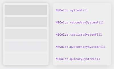
- Five new color variations for macOS Sonoma
.systemFill.secondarySystemFill.tertiarySystemFill.quaternarySystemFill.quinarySystemFill- Automatically adapt to different appearances, such as dark mode and high contrast.
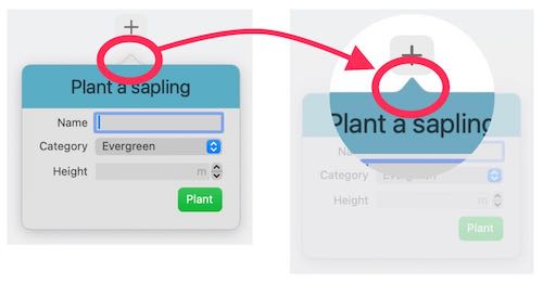
NSView Clipping ‼️
- Prior to macOS Sonoma,
NSViewclips to its bounds - Starting in macOS Sonoma,
NSViewdoes NOT explicitly clip to its bounds (!!!) - New property
NSView.clipsToBoundsto explicitly set whether a view clips to bounds. - Supported back to Mavericks 10.9 (!!!). Earlier systems may have problems with
.clipsToBounds = false - ⚠️ An
NSViews calculatedvisibleRectmay extend past its bounds - ⚠️
dirtyRectis no longer constrained to the view's bounds - Drawing outside the
dirtyRectis always safe - ⚠️ In macOS Sonoma, most
NSViews no longer clip to their bounds - Hit testing remains unchanged
Important takeaways
- AppKit reserves the right to pass a dirtyRect that is larger than the view's bounds
- AppKit also reserves the right to subdivide drawing into as many rectangles as it needs
This means that you should use the dirtyRect to decide what to draw, not where to draw!
Symbols 🆕
Symbol Effects
Symbol effects are great way to emphasize an action that has occurred or state change in your apps.
- Set an
NSImageView's image property to a symbol image - call addSymbolEffect to the image view
wifiImageView.image = NSImage(systemSymbolName: "wifi", accessibilityDescription: "wifi icon")
wifiImageView.addSymbolEffect(.variableColor.iterative, options: .repeating)
See: Animate symbols in your app
Symbol Localization
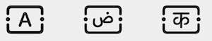
- Asset catalog images and symbols now automatically adapt to the system locale language
- Access alternate variants using
image(locale: Locale)
High Dynamic Range (HDR) content 🆕
- Starting with macOS Sonoma,
NSImageViewnow displays HDR images in HDR on Extended Dynamic Range capable hardware. - To display HDR content in standard dynamic range, use the
preferredImageDynamicRangeproperty
See: Support HDR images in your apps
Asset Catalog static names 🆕
- Starting in Xcode 15, Images and colors in your asset catalog are automatically reflected into your code as static properties on
NSImageandNSColor - Static properties are non optional, so can use simple .dot notation
let imageView = NSImageView(image: .tree)
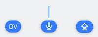
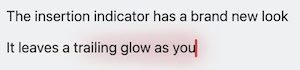
Typing experience 🆕
Starting with macOS Sonoma, text entry has a new look.
Changes to the editing cursor
- Text entry cursor adapts to the current accent color
- Has a cursor accessory view UNDER the cursor which tracks the cursor.
- Cursor accessory shows useful information (such as input mode, dictation state, and caps lock state)
- Cursor accessory is pinned to the bottom of the document if the cursor isn't visible
- All apps using standard AppKit text views get this for free
- ⚠️ API is available for custom text views for adoption (add
NSTextInsertionIndicatoras a subview of your custom text view to adopt the behaviour)
Dictation
- Leaves a glow as you dictate text (!!!)
Non-english languages
- Text entry now uses text styles (like
.title1,.bodyetc) to provide custom word wrapping behaviour in different languages to improve language legibility. - Important to start adopting text style in your app.
Better SwiftUI interaction
- SwiftUI has also been updated to allow you to use SwiftUI views and modifiers in more places in your AppKit app.
- Most AppKit classes are now marked as
@MainActor(restricted to the main thread) - Transferable is a Swift protocol to describe how objects can be serialized and deserialized. This powers features like Drag and Drop and Sharing in SwiftUI. In macOS Sonoma NSImage, NSColor, and NSSound conform to the Transferable protocol. This makes it easier for AppKit apps to adopt features like Drag and Drop or Sharing in SwiftUI Views.
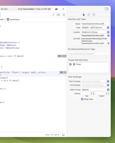
@ViewLoading
- In macOS Ventura 13.3 we introduced a new property wrapper for
NSViewController,@ViewLoading. - Use
@ViewLoadingon properties that are initialized inloadView. If these properties were previously optional, you can remove the optionality and any related checks - A similar property wrapper,
@WindowLoading, is also available for properties onNSWindowController
class ViewController: NSViewController {
    @ViewLoading var datePicker: NSDatePicker
    var date = Date() {
        didSet {
            datePicker.dateValue = date
        }
    }

    override func loadView() {
        super.loadView()
        datePicker = NSDatePicker()
        datePicker.dateValue = date
        view.addSubview(datePicker)
    }
}
 GitHub
 www.linkedin.com