Swift Charts: Raise the bar
 Cihat Gündüz
 laurent b
Description: Dive deep into data visualizations: Learn how Swift Charts and SwiftUI can help your apps represent complex datasets through a wide variety of chart options. We’ll show you how to plot different kinds of data and compose marks to create more elaborate charts. We’ll also take you through Swift Charts’ extensive chart customization API to help you match the style of your charts to your app. To get the most out of this session, we recommend you begin with “Hello Swift Charts” from WWDC22.
Intro
This session is about how to build great data visualizations with Swift Charts,
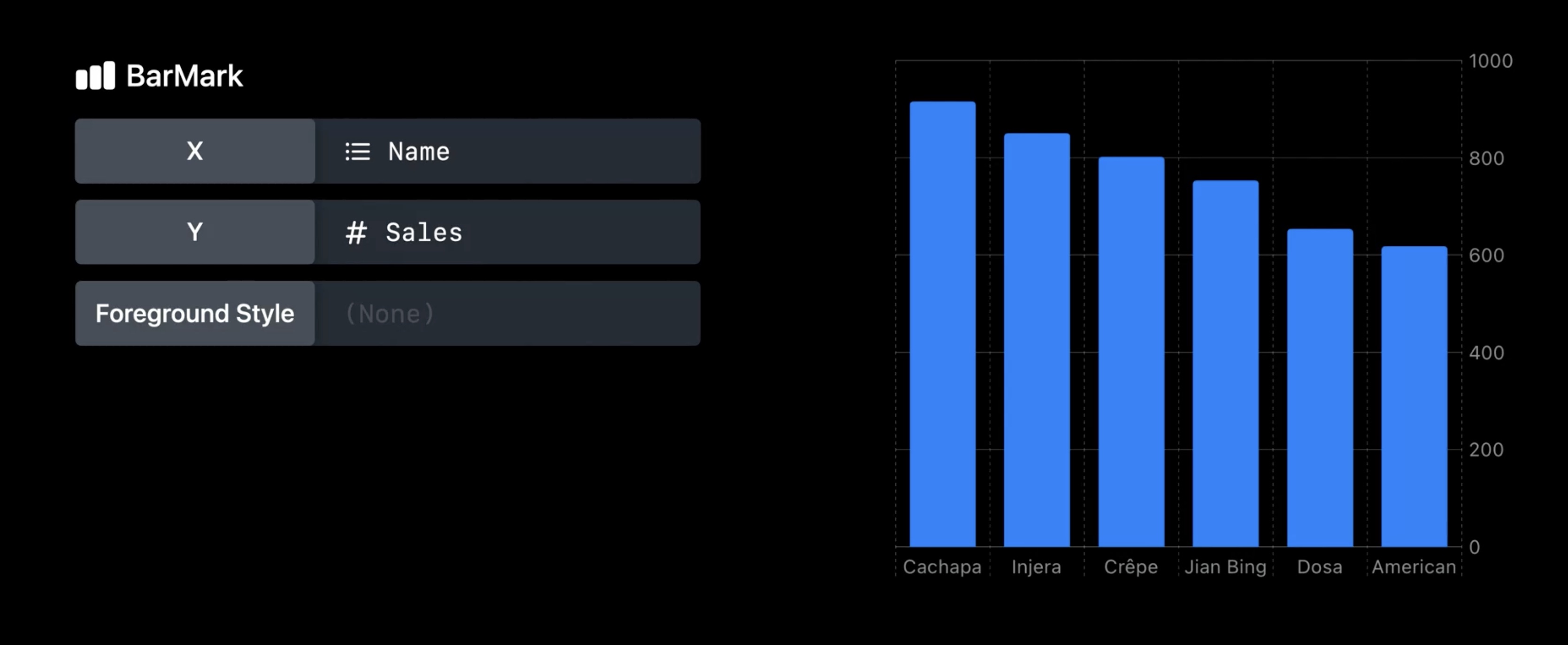
Chart (data, id: .name) {
	BarMark(
		x: .value ("Sales", $0. sales),
		y: .value ("Name", $0. name)
	)
}

Which can be easily customisable.

- declarative syntax, like SwiftUI
- create charts by composition
Some examples of charts on the Apple platform:

- Problem space of chart libraries
- Data Visualization
- Communicate Data
- Accessible
- Localization
- Dark Mode
- Layout
- Dynamic Type
- Device Screen Sizes
- Multi-Platform
- Animation
Marks and composition
- a
Markis a graphical element that represents data

Chartis a SwiftUI view used as the wrapper for charts
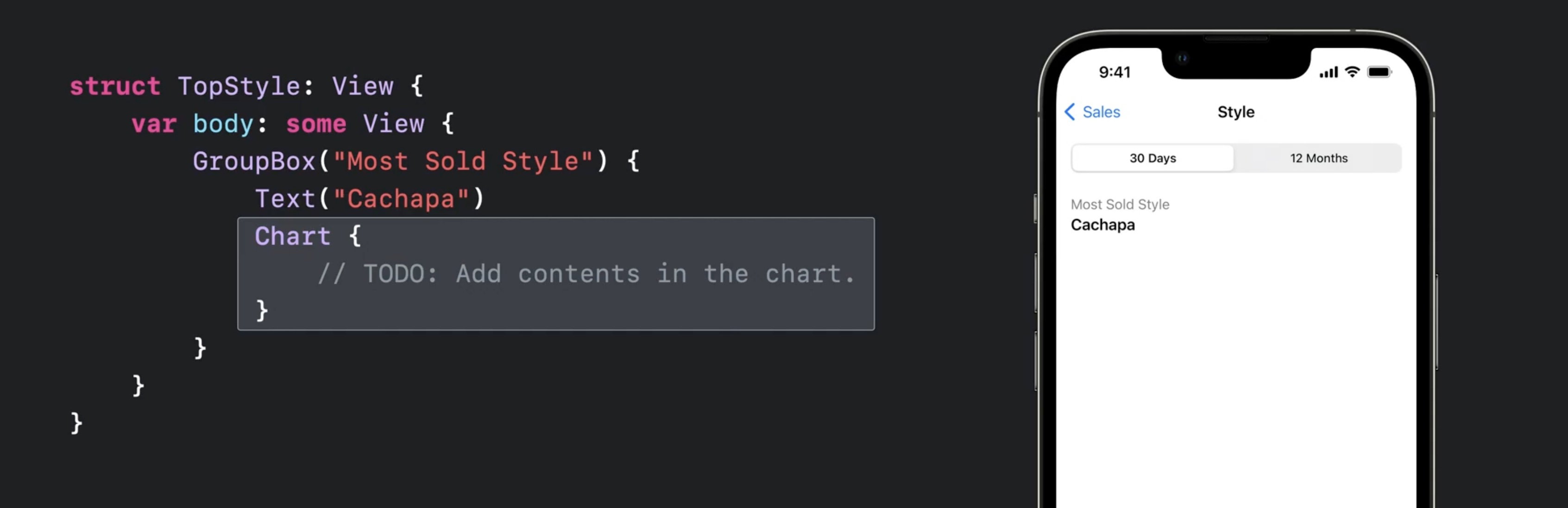
struct TopStyle: View {
	var body: some View {
		GroupBox ("Most Sold Style") {
			Text ("Cachapa")
			Chart {
				// TODO: Add contents in the chart.
			}
		}
	}
}
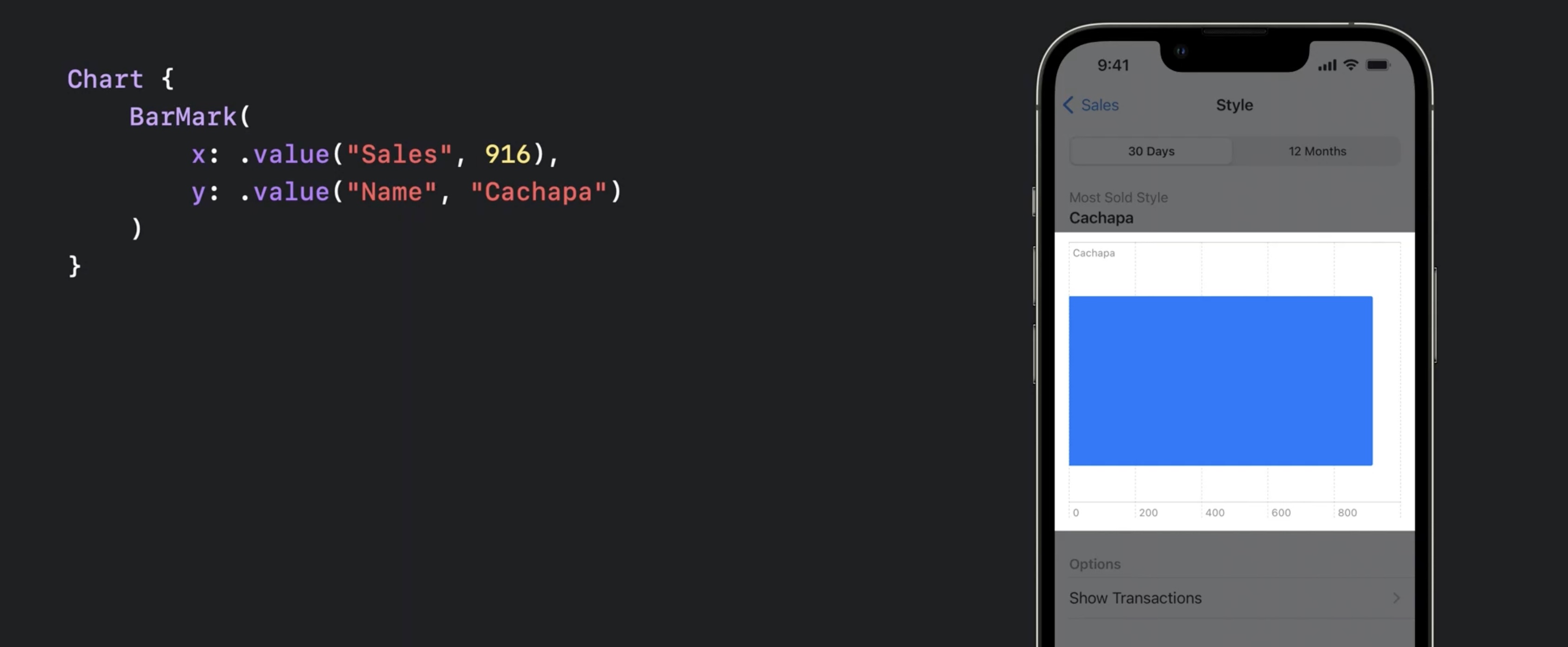
- This is a chart with one BarMark
`swift Chart { BarMark( x: .value("Sales", 916), y: .value ("Name", "Cachapa") ) }`
- Provide multiple
BarMarkviews to show multiple bars .foregroundStylecan be used to specify a color
let data = [
	(name: "Cachapa", sales: 916),
	(name: "Injera", sales: 850),
	(name: "Crêpe", sales: 802),
]

Chart(data, id: \.name) {
	BarMark(
		x: .value ("Sales", $0.sales),
		y: value ("Name", $0. name)
	)
	.foregroundStyle(Color ("barColor"))
}
.accessisibilityLabeland.accessibilityValuecan be used to customize the default VoiceOver value
Chart(data, id: \.name) {
	BarMark(
		x: .value ("Sales", $0.sales),
		y: value ("Name", $0. name)
	)
	.accessibilityLabel($0.name)
	.accessibilityValue("\($0.sales) sold")
}
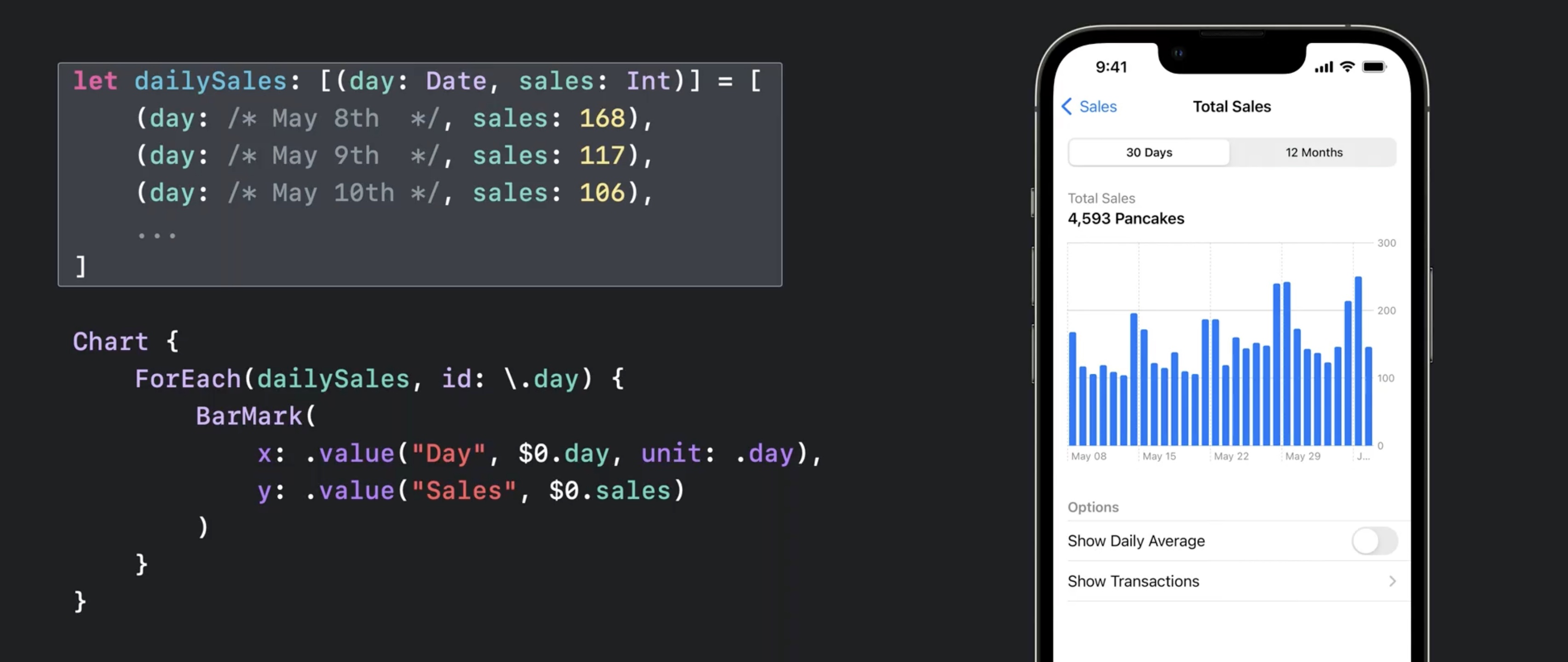
- Data driven, e.g.:
let dailySales: [(day: Date, sales: Int)] = [
  (day: /* May 8th */, sales: 168),
  (day: /* May 9th */, sales: 117),
  (day: /* May 10th */, sales: 106),
  ...
]

Chart {
  ForEach(dailySales, id: \.day) {
    BarMark(
      x: .value("Day", $0.day, unit: .day),
      y: .value("Sales", $0.sales)
    )
  }
}
- switching chart types is easy, e.g. replace
BarChartwithLineChart(orPointChart) as in this example with two series of data.
let cupertinoData: [(weekday: Date, sales: Int)] = [...]
let sfData: [(weekday: Date, sales: Int)] = [...]
let seriesData = [
(city: "Cupertino", data: cupertinoData),
(city: "San Francisco", data: sfData)
]
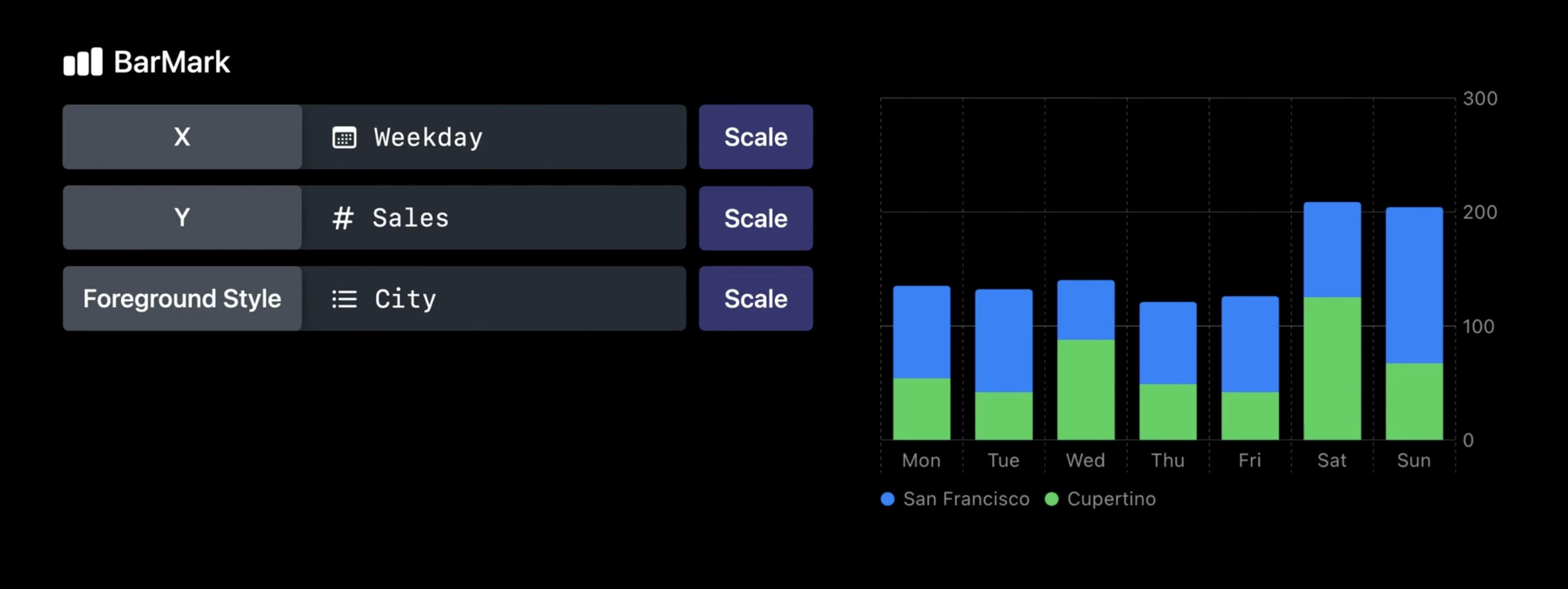
Chart {
ForEach(seriesData, id: I.city) { series in
ForEach(series.data, id: \.month) {
LineMark(
x: .value ("Weekday", $0.weekday, unit: .day),
y: .value("Sales", $0.sales)
)
}
.foregroundStyle(by: value("City", series .city))
.symbol(by: value("City", series.city))
.interpolationMethod(.catmullRom)
}
}
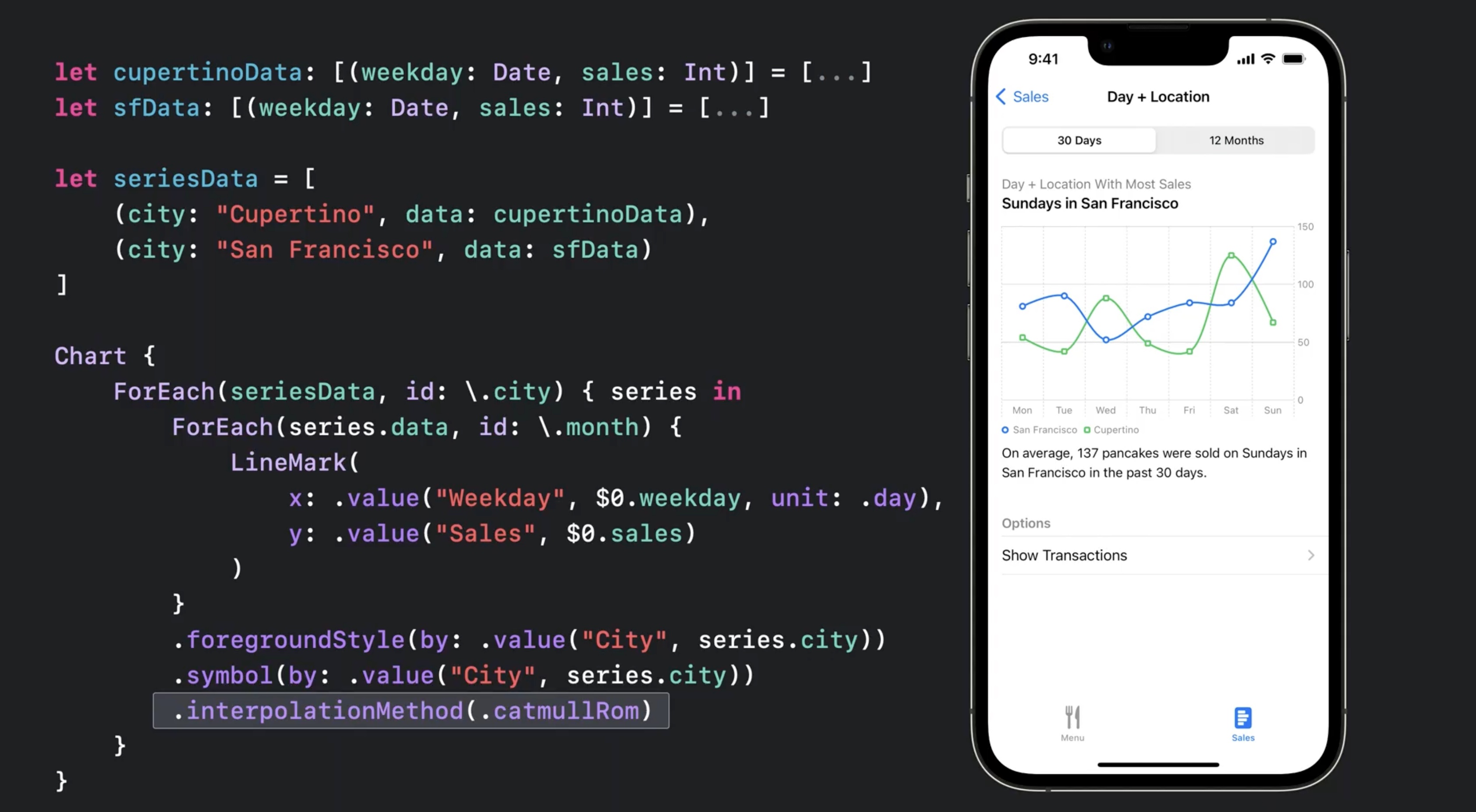
xparameter specifies the x-axis,yparam the y-axis- use
.foregroundStyle(by: .value("City", series.city)for automatic coloring - Use
.symbol(by: .value...)for different shapes and for accessibility, in case the user is color blind - Supports
.interpolationMethod(.catmullRom)for smoothing out the curve - Supports
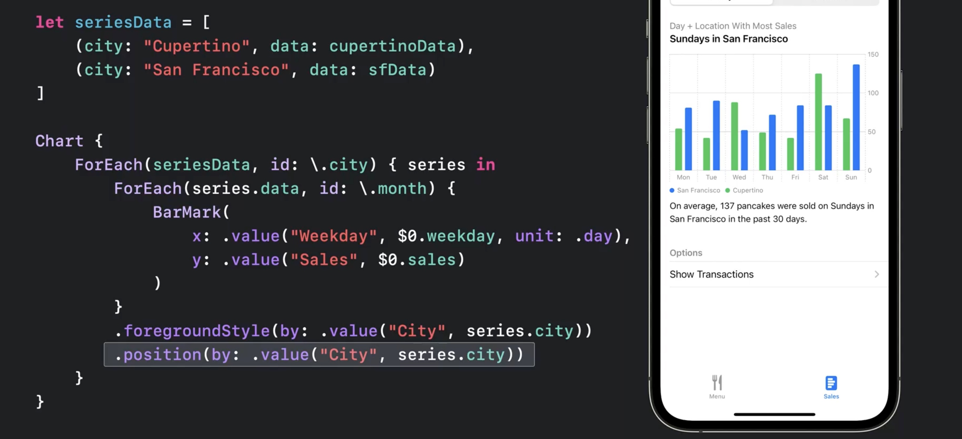
.positionfor grouping
.position (by: .value("City", series.city))
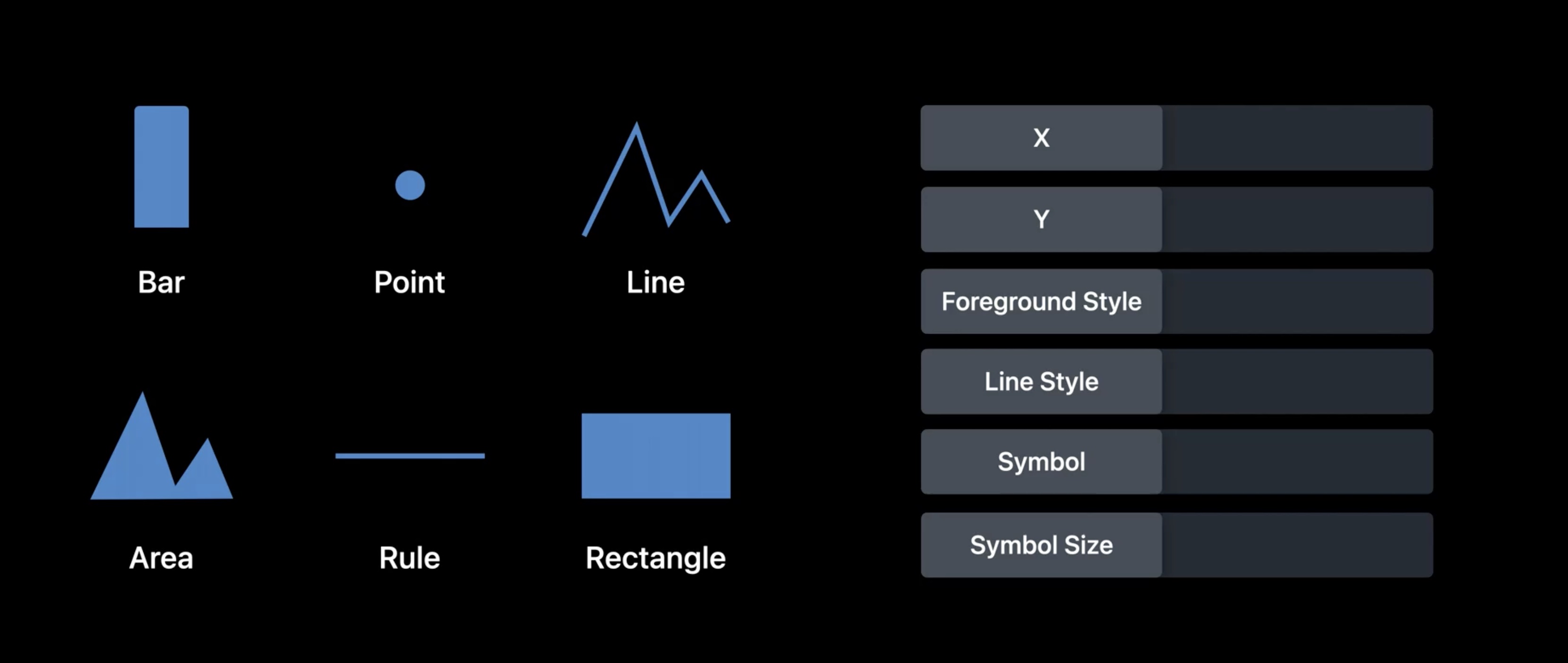
More types of marks
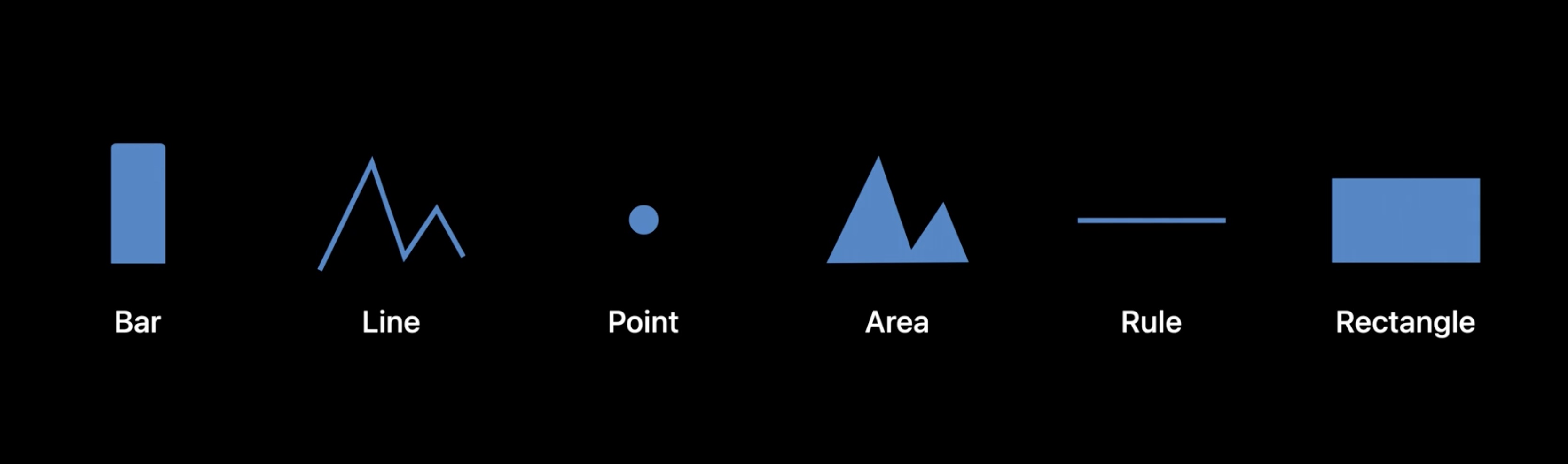
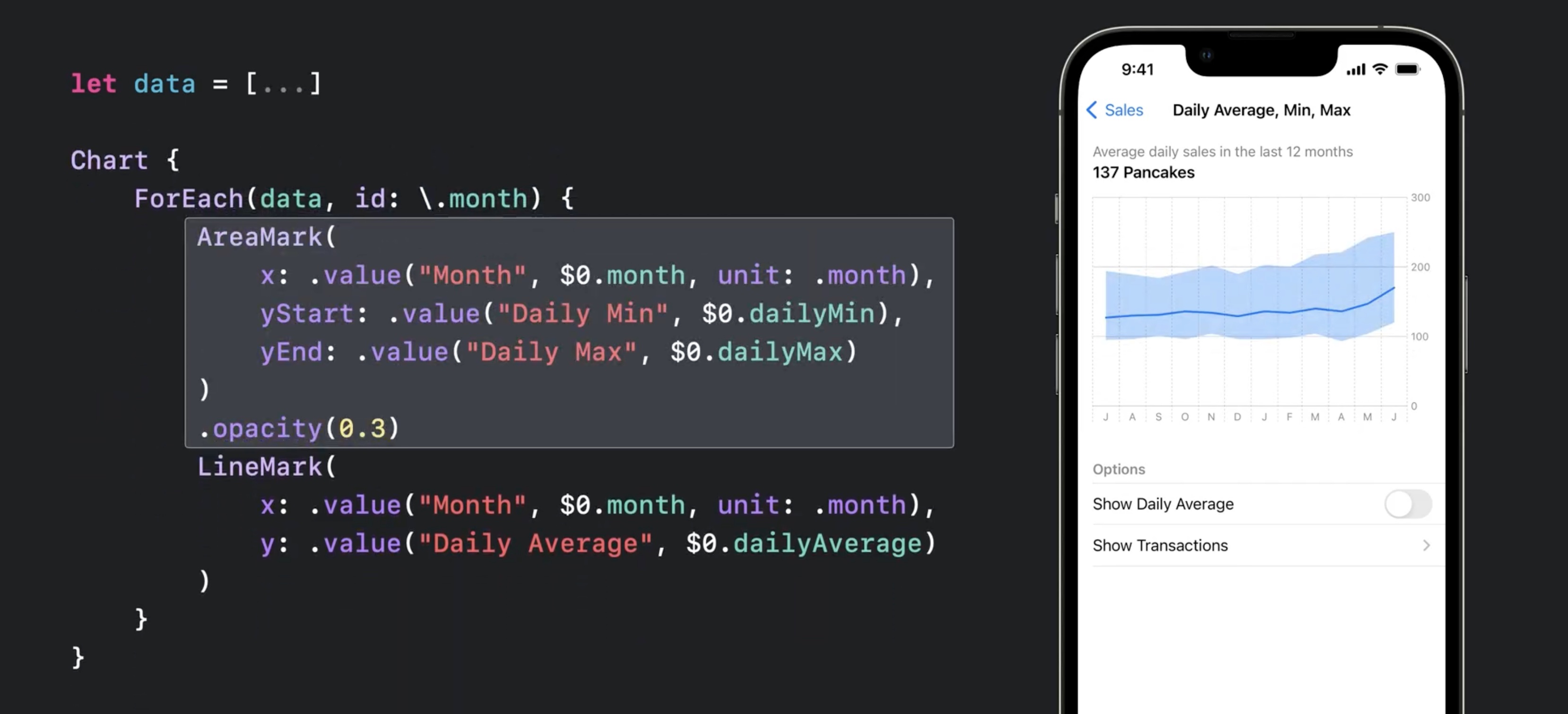
AreaMarkwithx:yStart:yEndto show a range of data
let data = [
	(month: /* Jul, 2021 */,
	dailyAverage: 127,
	dailyMin: 95,
	dailyMax: 194
	),
	...
]

Chart {
	ForEach(data, id: \.month) {
		AreaMark(
			x: .value ("Month", $0.month, unit: .month),
			yStart: .value("Daily Min", $0.dailyMin),
			yEnd: .value("Daily Max", $0.dailyMax)
		)
		.opacity (0.3)
		LineMark(
			x: value("Month", $0.month, unit: .month),
			y: .value ("Daily Average", $0 .dailyAverage)
		)
	}
}
- Also works with
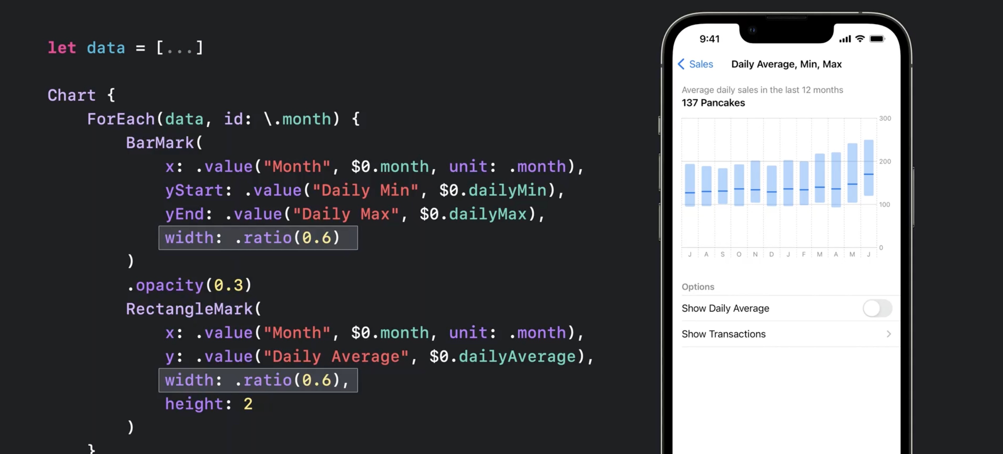
BarMark(to show range of data) RectangleMarkshows distinct marks for mid instead of building a graph inBarMark
let data = [...]

Chart {
	ForEach(data, id: \.month) {
		BarMark(
			x: .value ("Month", $0.month, unit: .month),
			yStart: .value("Daily Min", $0.dailyMin),
			yEnd: .value("Daily Max", $0.dailyMax),
			charts13.jpg
		)
		.opacity (0.3)
		RectangleMark(
			x: value("Month", $0.month, unit: .month),
			y: .value ("Daily Average", $0 .dailyAverage),
			width: .ratio(0.6),
			height: 2
		)
	}
}
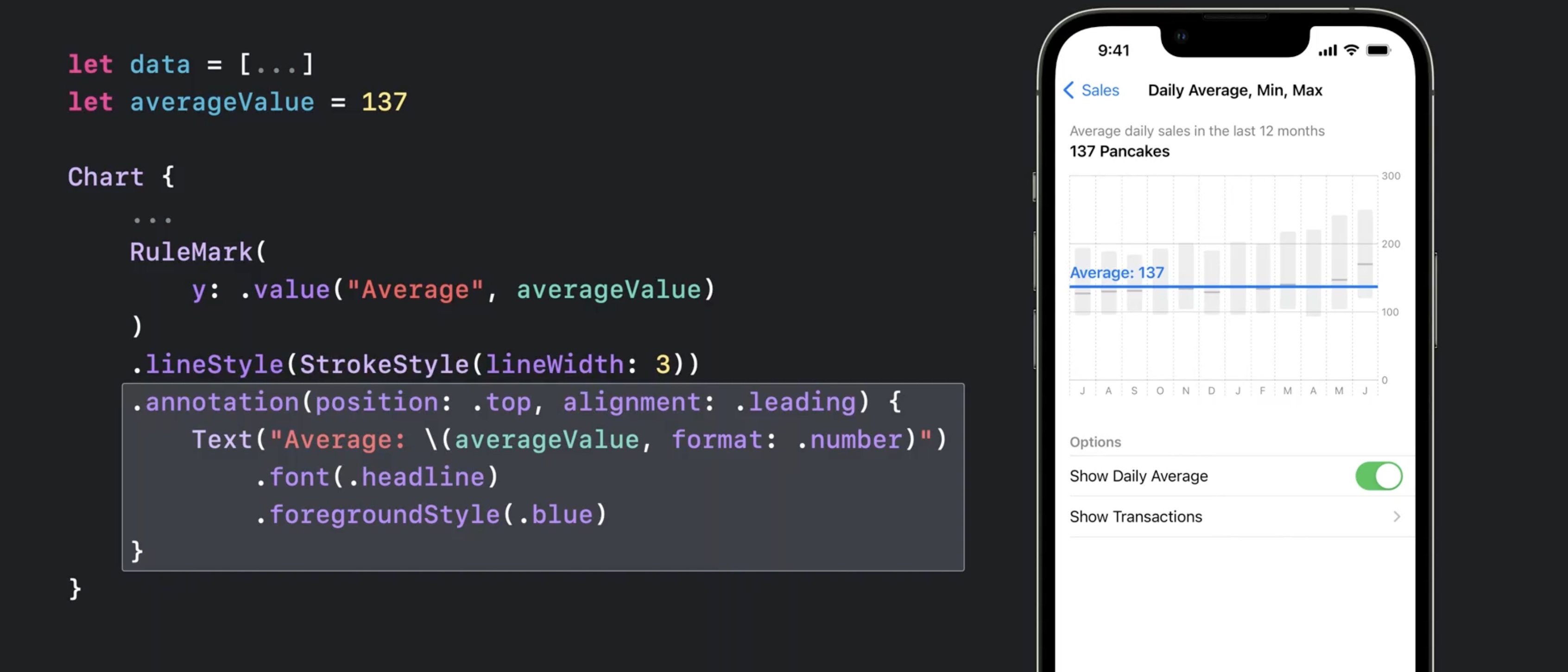
RuleMark(y:)can be used alongside with.annotation(position:)for guiding lines
let data = [...]
let averageValue = 137

Chart {
	ForEach(data, id: \.month) {
		BarMark(...)
		RectangleMark(...)
	}
	.foregroundStyle(.gray.opacity(0.5))

	RuleMark(
		y: .value("Average", averageValue)
	)
	.lineStyle(StrokeStyle(lineWidth: 3))
	.annotation(position: •top, alignment: .leading) {
		Text ("Average: \(averageValue, format: .number)")
			.font(.headline)
			.foregroundStyle(.blue)
	}
}
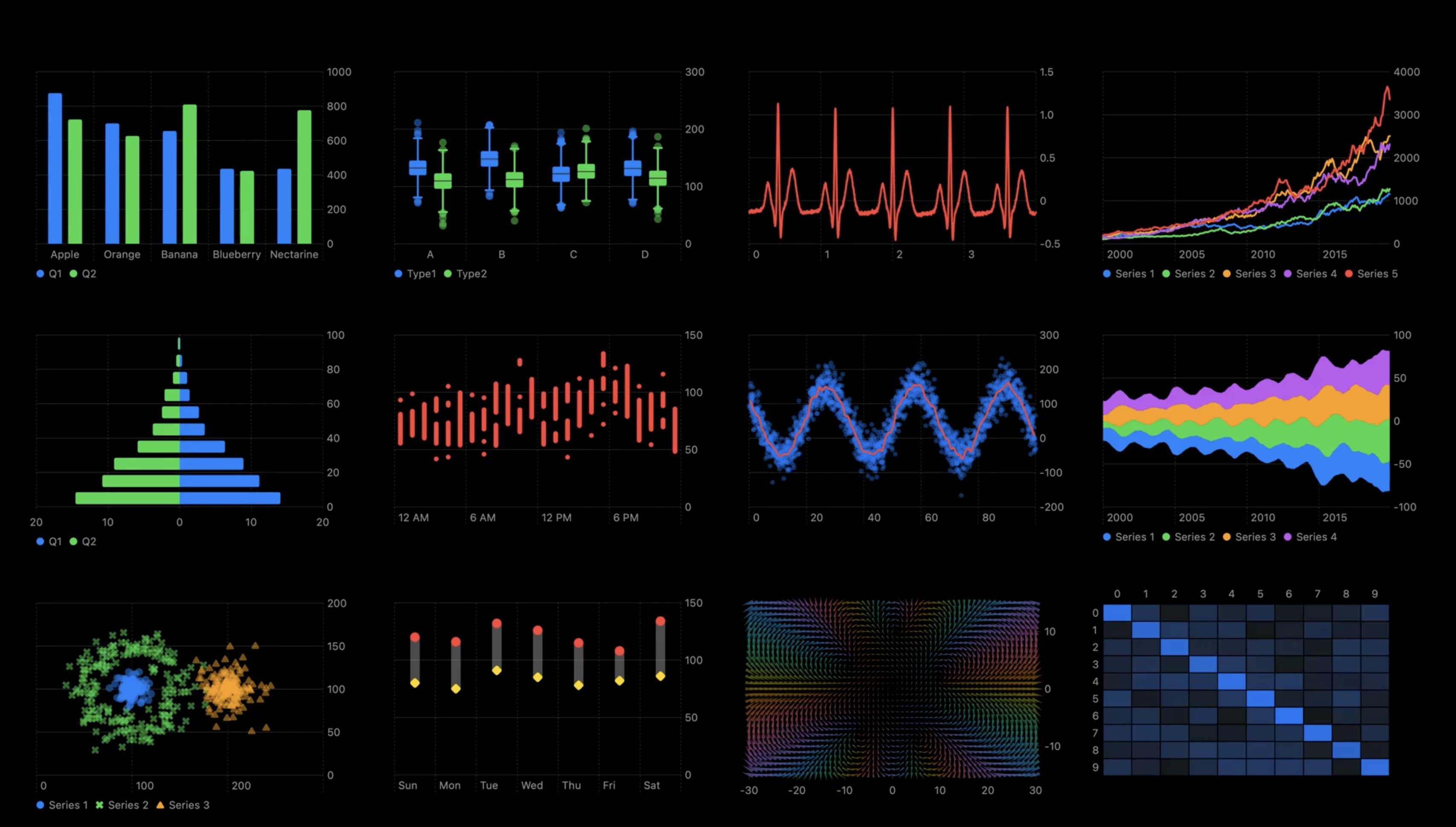
Example of different ways to use and combine these basic marks. In order
- box plot
- multi-series line chart
- population pyramid
- range plot
- stream graph
- multi-series scatter plot
- heat map
- a plot of a vector field
Plotting data with mark properties
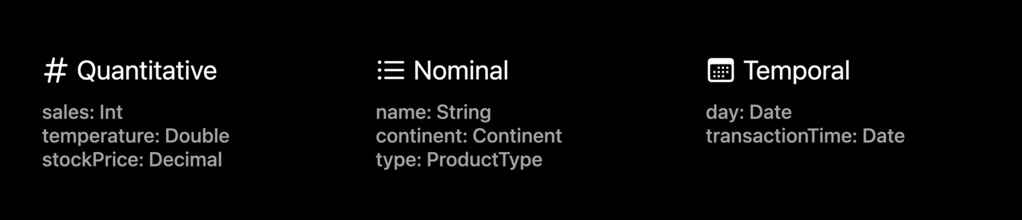
- Data Types
- Quantitative (Int, Double, Decimal)
- Nominal (String, Continent, ProductType)
- Temporal (day: Date, time: Date)
- Quantitative Sales, Nominal Name
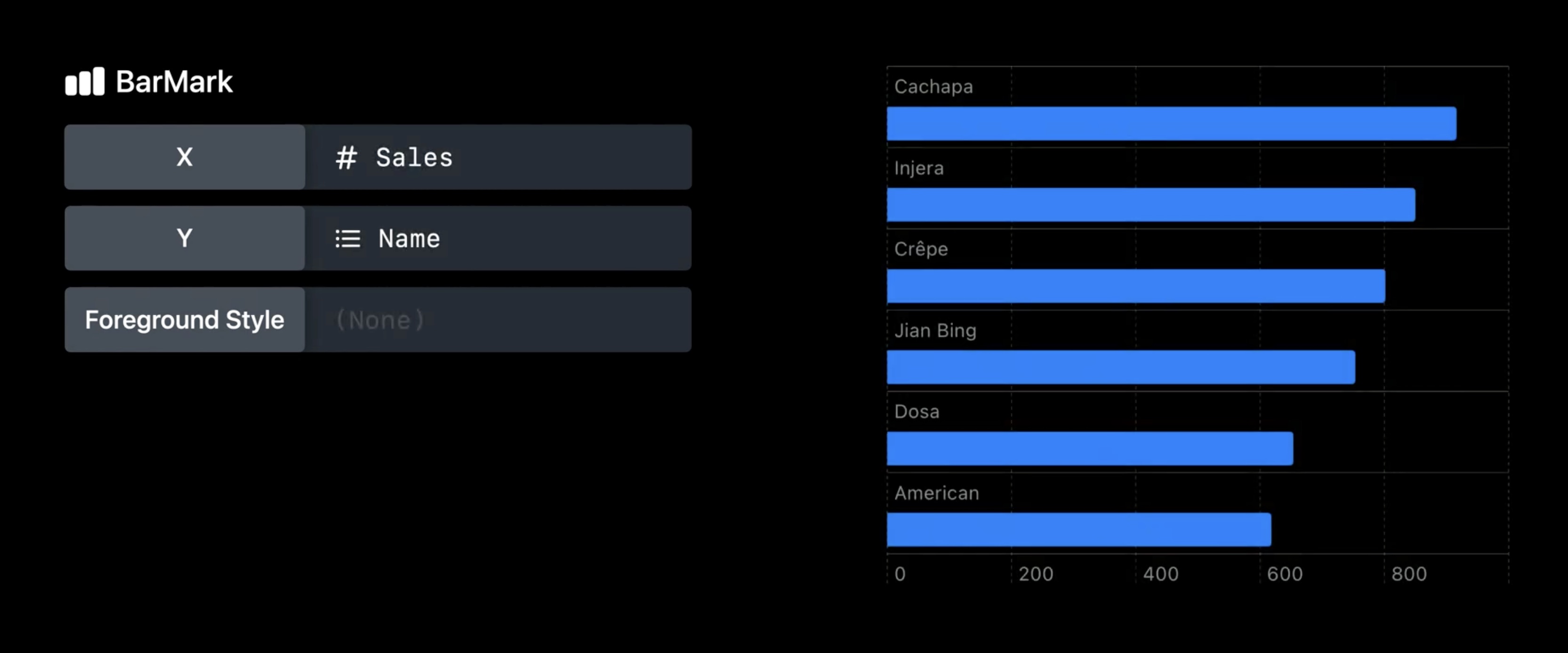
- Orientation of the bar depends on where the nominal data is
- Available data marks and properties:
scaleis available for all data types, e.g.yScale
func yScale(sales: Int) -> CGFloat {
	return CGFloat(sales) * someFactor + someOffset
}
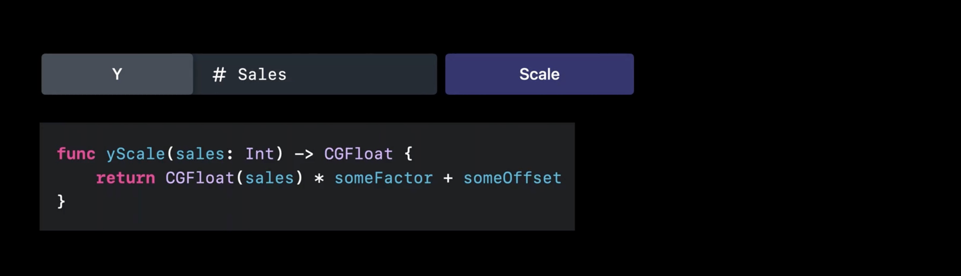
- by default, the lib infers the scales automatically
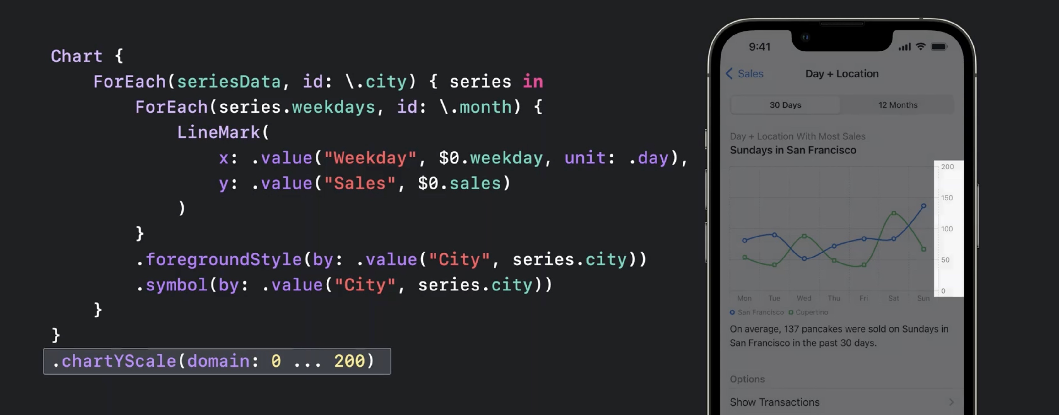
- Use
.chartYScale(domain:)modifier to have fixed range of values on the y axis
Chart {
	ForEach(seriesData, id: \city) { series in
		ForEach(series .weekdays, id: \.month) {
			LineMark(
				x: .value("Weekday", $0.weekday, unit: .day),
				y: value("Sales", $0.sales)
			)
		}
		.foregroundStyle(by: .value("City", series.city))
		.symbol(by: value("City", series .city))
	}
}
.chartYScale(domain: 0 ... 200)
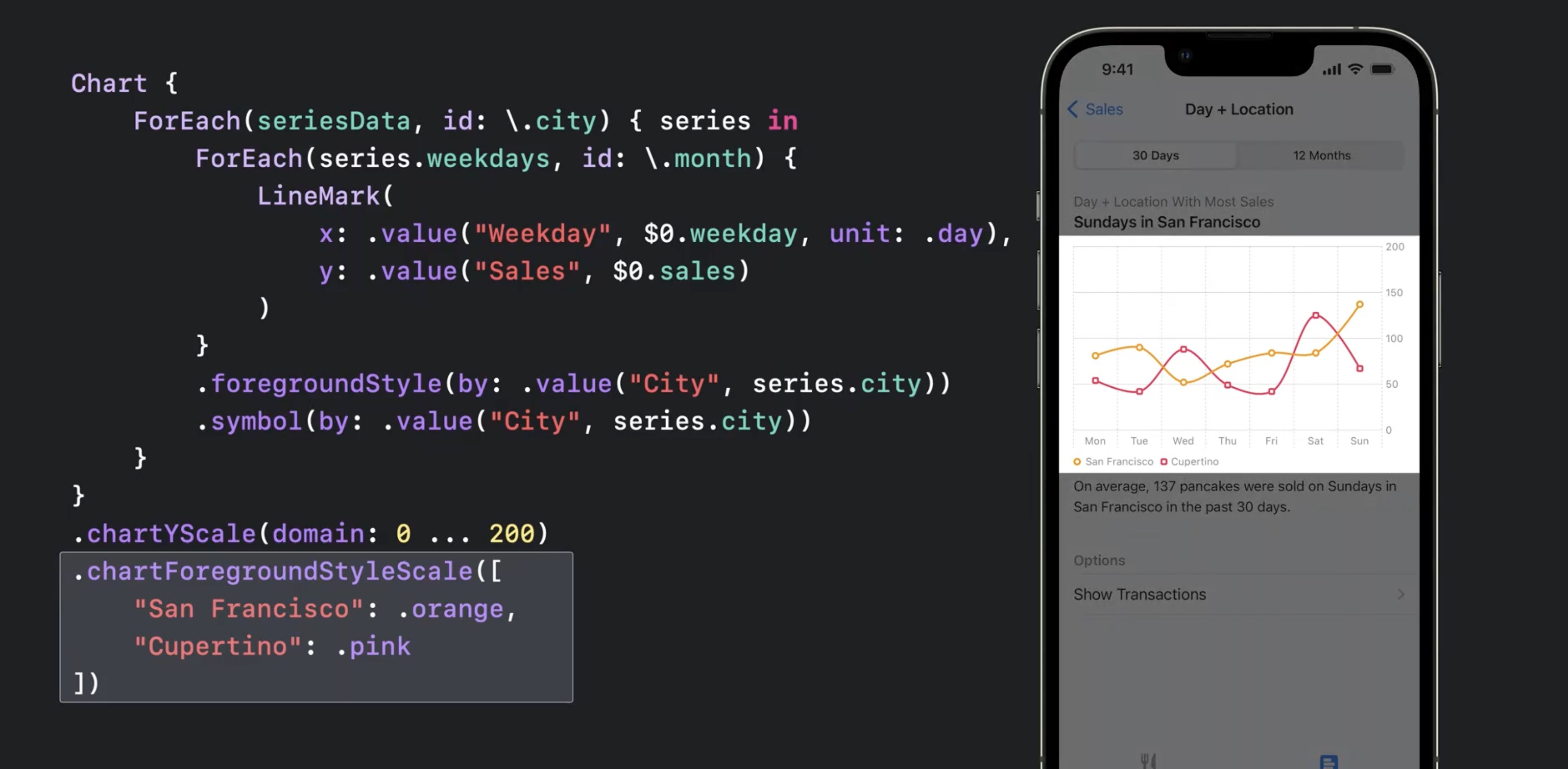
- use the chartForegroundStyleScale modifier to change the colors of the lines on the chart
Chart {
	ForEach(seriesData, id: \city) { series in
		ForEach(series .weekdays, id: \.month) {
			LineMark(
				x: .value("Weekday", $0.weekday, unit: .day),
				y: value("Sales", $0.sales)
			)
		}
		.foregroundStyle(by: .value("City", series.city))
		.symbol(by: value("City", series .city))
	}
}
.chartYScale(domain: 0 ... 200)
.chartForegroundStyleScale([
	"San Francisco" : .orange,
	"Cupertino": .pink
])
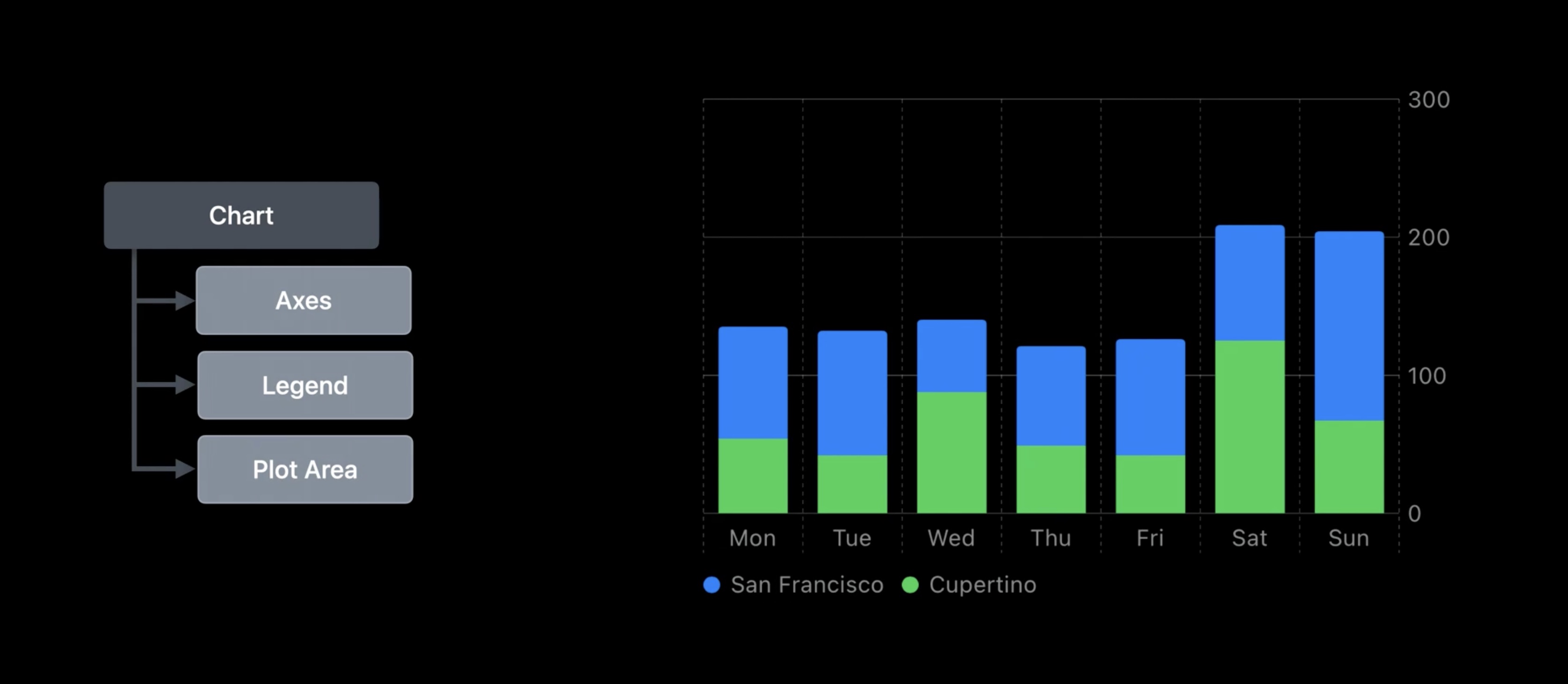
Customizations
- All elements (axes, legends, plot area) are customizable
.chartXAxis {}withAxisMarksinside can be used for custom axis
let data: [(month: Date, sales: Int)] = [...]

Chart(data, id: \.month) {
	BarMark(
		x: .value("Month", $0.month, unit: .month),
		y: .value("Sales", $0.sales)
	)
}
.chartXAxis {
	AxisMarks()  // this defaults to the standard config
}
- Use
AxisGridLine,AxisTickandAxisValueLabelwith marks
let data: [(month: Date, sales: Int)] = [...]
Chart(data, id: \.month) {
BarMark(
x: .value("Month", $0.month, unit: .month),
y: .value("Sales", $0.sales)
)
}
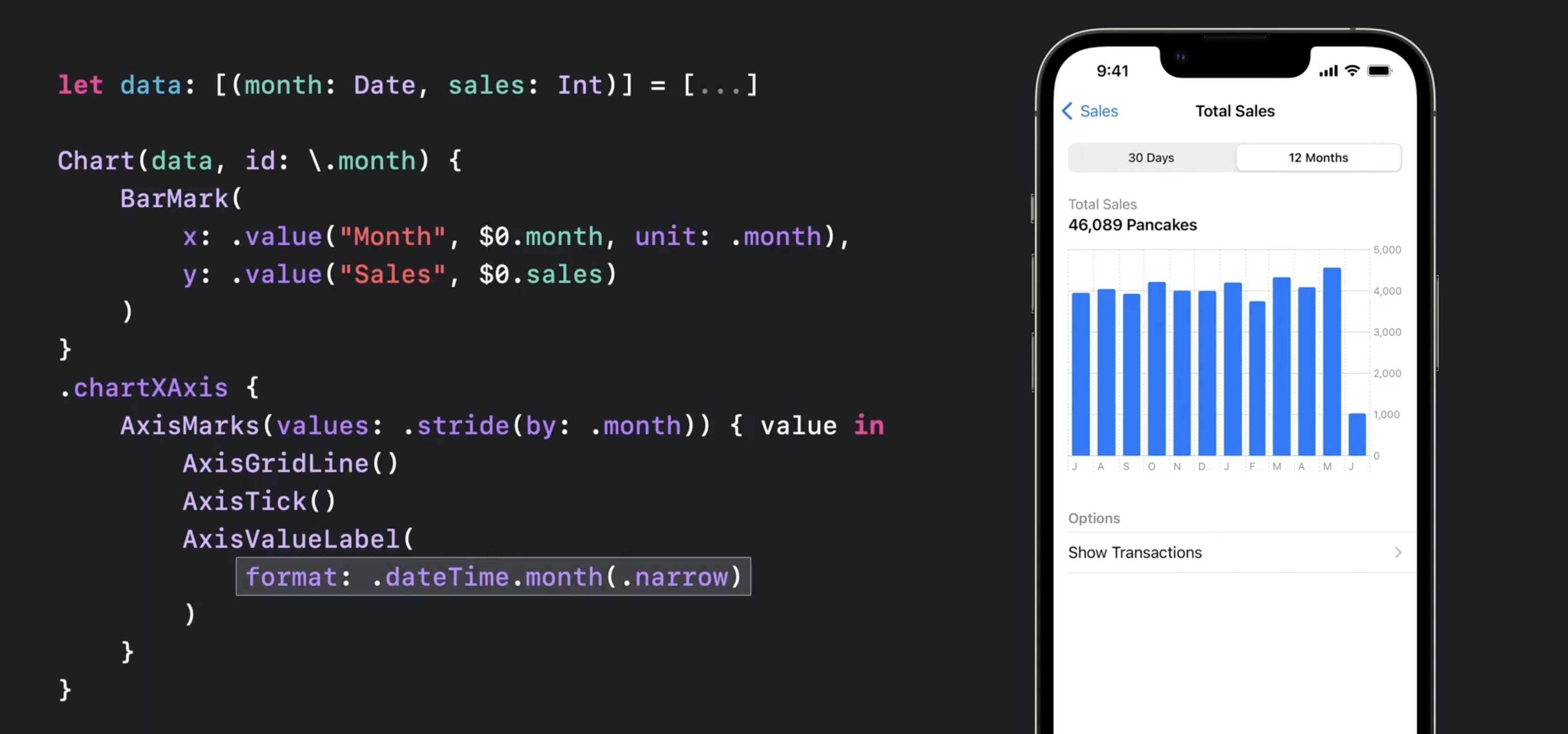
.chartXAxis {
AxisMarks (values: .stride(by: .month)) { value in
AxisGridLine()
AxisTick()
AxisValueLabel(
format: .dateTime.month(.narrow)
)
}
}
- also supports
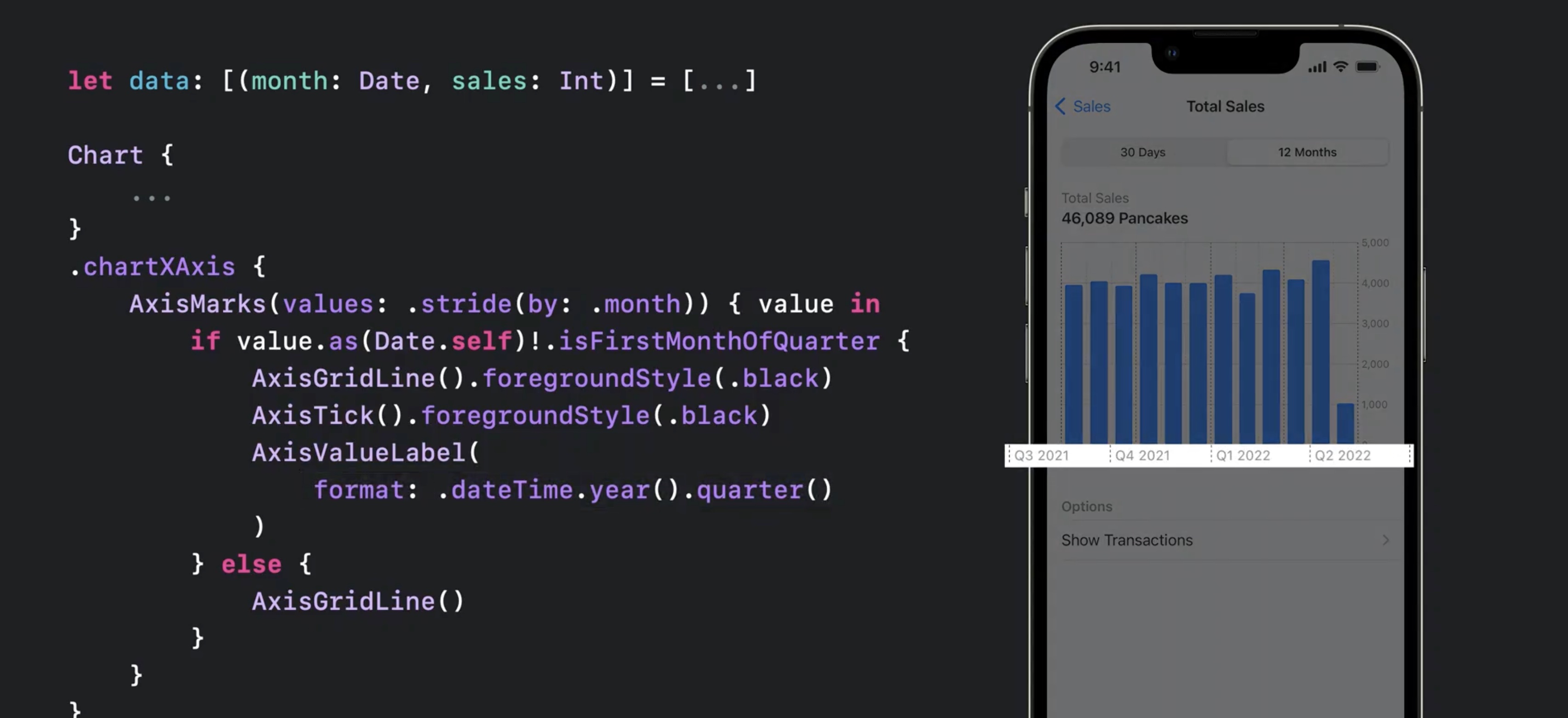
ifkind of conditionals for dynamic axis and showing quarter data
let data: [(month: Date, sales: Int)] = [...]

Chart(data, id: \.month) {
	...
}
.chartXAxis {
	AxisMarks (values: .stride(by: .month)) { value in
		if value.as(Date.self)!.isFirstMonthOfQuarter {
			AxisGridLine().foregroundStyle(.black)
			AxisTick().foregroundStyle(.black)
			AxisValueLabel(
				format: .dateTime.year().quarter()
			)
		} else {
			AxisGridLine ( )
		}
	}
}
AxisMarksaccepts apositionparam, e.g..leadingAxisMarksacceptspresetparam, e.g..extendedto align visually with rest of interface
let data: [(month: Date, sales: Int)] = [...]

Chart(data, id: \.month) {
	...
}
.chartYAxis {
	AxisMarks(preset: .extended, position: .leading)
- hide axis via
.chartXAxis(.hidden)for example
Chart {
	...
}
.chartXAxis(.hidden)
.chartYAxis (.hidden)
- hide legend via
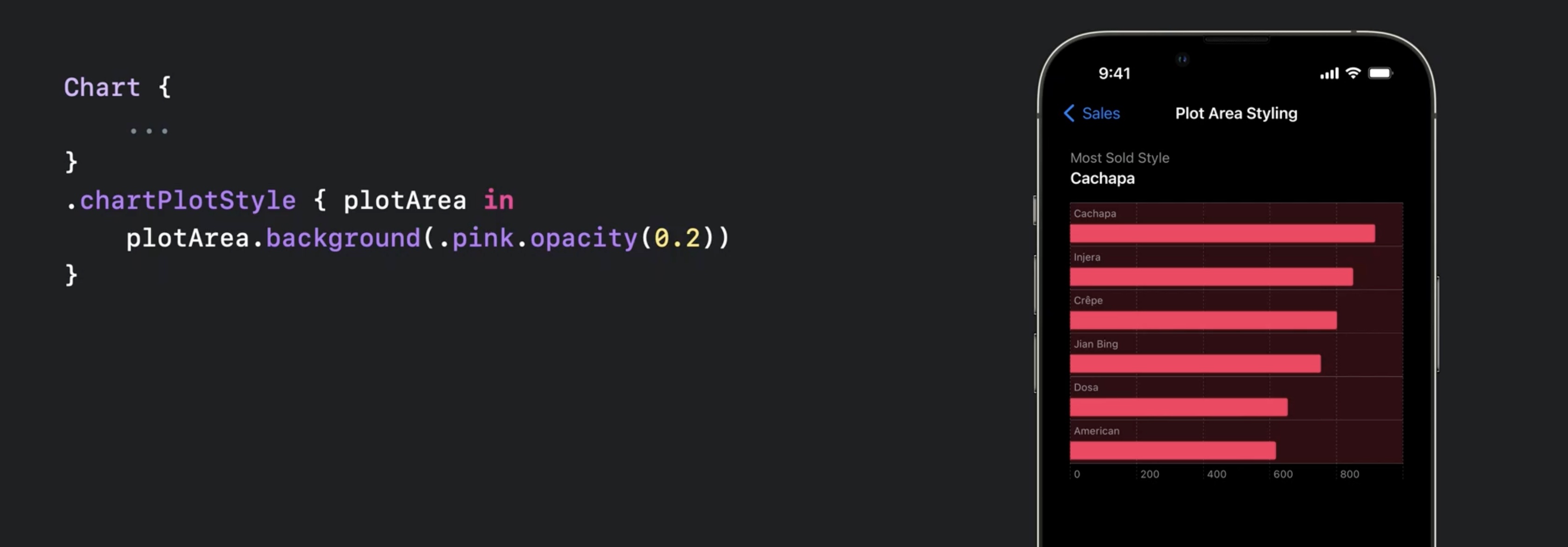
.chartLegend(.hidden) .chartPlotStyle {}to customize plot area ... } .chartPlotStyle { plotArea in plotArea.background(.pink.opacity(0.2)) }`- e.g.,
plotArea.frame(height: 60 * numberOfCategories) - or
plotArea.background(.pink.opacity(0.2)), any modifiers for views available`swift Chart {
- e.g.,
ChartProxycan be used to access theposition(forX:)orvalue(atX:)
let proxy: ChartProxy

proxy.position(forX: 123.0) // get the X position for value 123.0.
proxy.value(atX: 100) // get the data value at X position 100pt.
- allows to coordinate other views with chart, e.g. select an interval in the chart with a slider
.chartOverlaymodifier provides aChartProxyin the content
Chart {
	...
}
.chartOverlay { proxy in
	// Define the overlay view as a function
	// of the chart proxy.
}
.chartBackground { proxy in
	// Define the background view as a function
	// of the chart proxy.
}
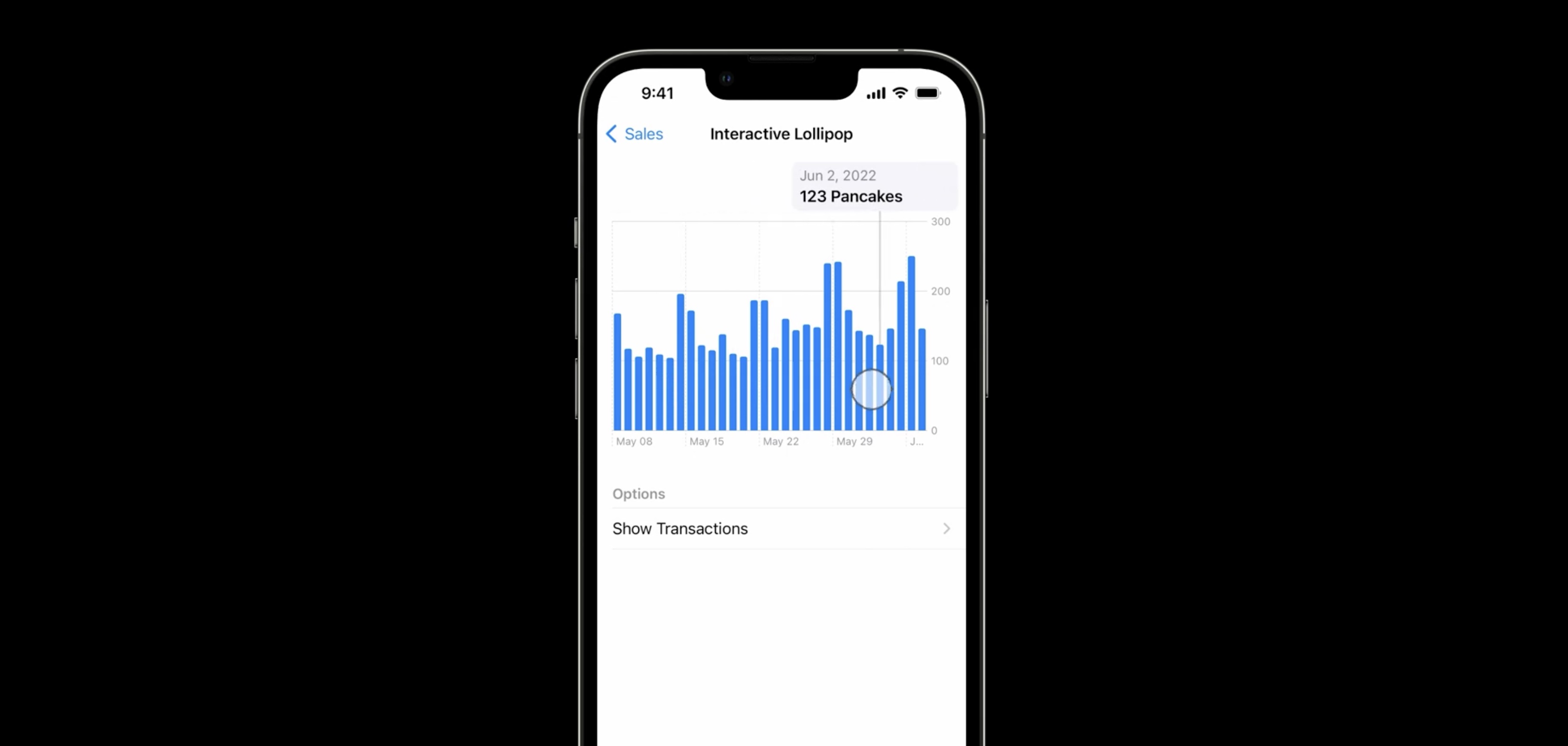
- example
struct InteractiveBrushingChart: View {
  @State var range: (Date, Date)? = nil

  var body: some View {
    Chart { ... }
    .chartOverlay { proxy in
      GeometryReader { nthGeoItem in
        Rectangle().fill(.clear).contentShape(Rectangle())
          .gesture(DragGesture()
            .onChanged { value in
              // Find the x-coordinates in the chart’s plot area.
              let xStart = value.startLocation.x - nthGeoItem[proxy.plotAreaFrame].origin.x
              let xCurrent = value.location.x - nthGeoItem[proxy.plotAreaFrame].origin.x
              // Find the date values at the x-coordinates.
              if let dateStart: Date = proxy.value(atX: xStart),
                 let dateCurrent: Date = proxy.value(atX: xCurrent) {
                range = (dateStart, dateCurrent)
              }
            }
            .onEnded { _ in range = nil } // Clear the state on gesture end.
          )
      }
    }
  }

  // ...
}
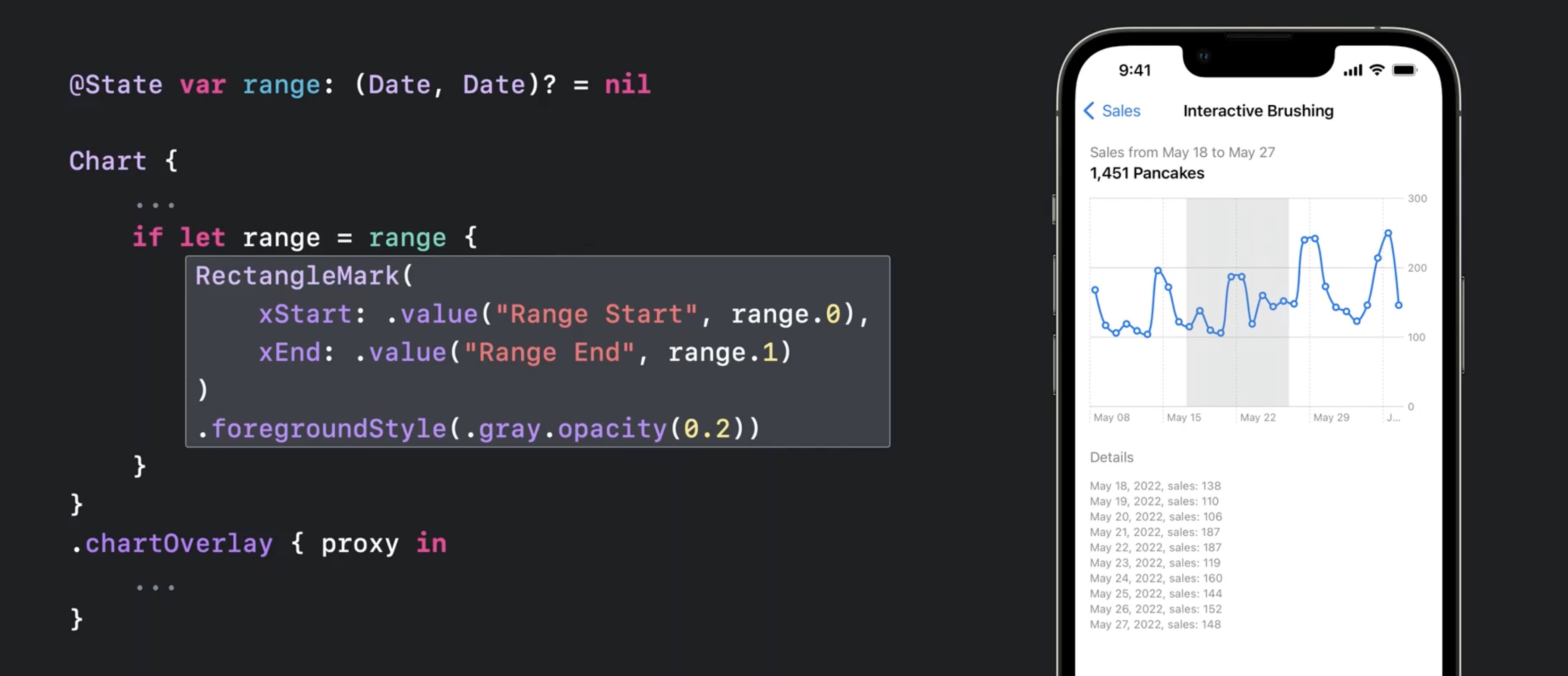
the code will look like this
@State var range: (Date, Date)? = nil

Chart {
...
	if let range = range {
		RectangleMark(
			xStart: .value("Range Start", range.0),
			xEnd: .value("Range End", range.1)
		)
		.foregroundStyle(.gray.opacity(0.2))
	}
}
.chartOverlay { proxy in
   ...
}
- the proxy allows to store data in state and drive the chart rendering with that data (e.g. for a hover and show data effect)
Resources
Creating a chart using Swift Charts
Have a question? Ask with tag wwdc2022-10137
Search the forums for tag wwdc2022-10137
Swift Charts
Visualizing your app’s data
Tech Talks
What's new for enterprise developers
Related Videos
Build a productivity app for Apple Watch - WWDC22
Design an effective chart - WWDC22
Design app experiences with charts - WWDC22
Hello Swift Charts - WWDC22
What's new in SwiftUI - WWDC22
WWDC22 Day 1 recap - WWDC22
 Twitter
 GitHub
 fline.dev