Hello Swift Charts
 Cihat Gündüz
 laurent b
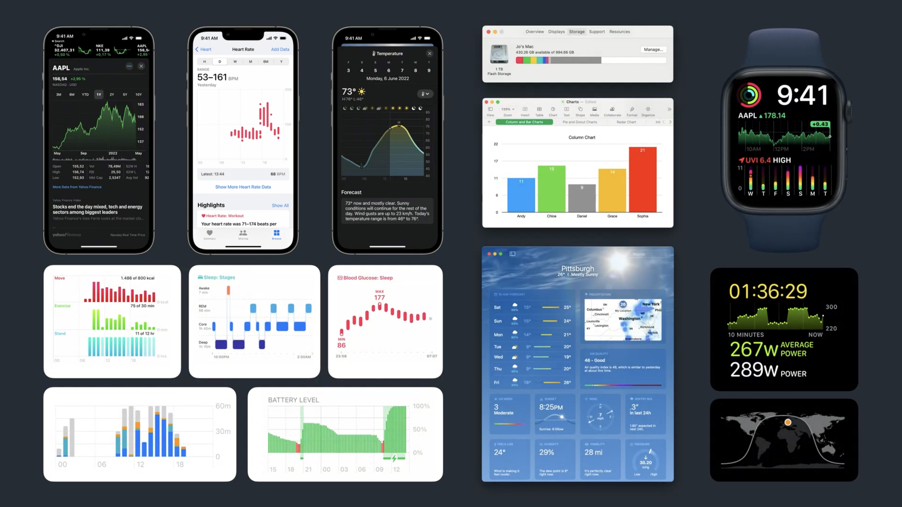
Description: Say hello to Swift Charts — a flexible framework that helps you create charts entirely in SwiftUI that look and feel right at home on all Apple platforms. Discover how you can use compositional syntax to make informative, delightful, and accessible charts with less code. We’ll share the building blocks for making visualizations with Swift Charts, and explore how you can change your charts’ design with a simple modifier. We’ll also take you through the latest updates to Xcode Previews to help you chart a path toward an engaging experience.
There is a new framework: Swift Charts. Swift Charts is a flexible framework for making Apple-designed charts.
- Declarative, Compositional, like SwiftUI
- requires
import Chartsto use
Introducing the sample app about a pop-up pancake food truck sales.
[truck1]: ../../../images/notes/wwdc22/10136/truck1.jpg
The truck serves an international variety of sweet and savory pancakes like cachapa, injera, crêpe, jian bing, dosa, or American pancakes.

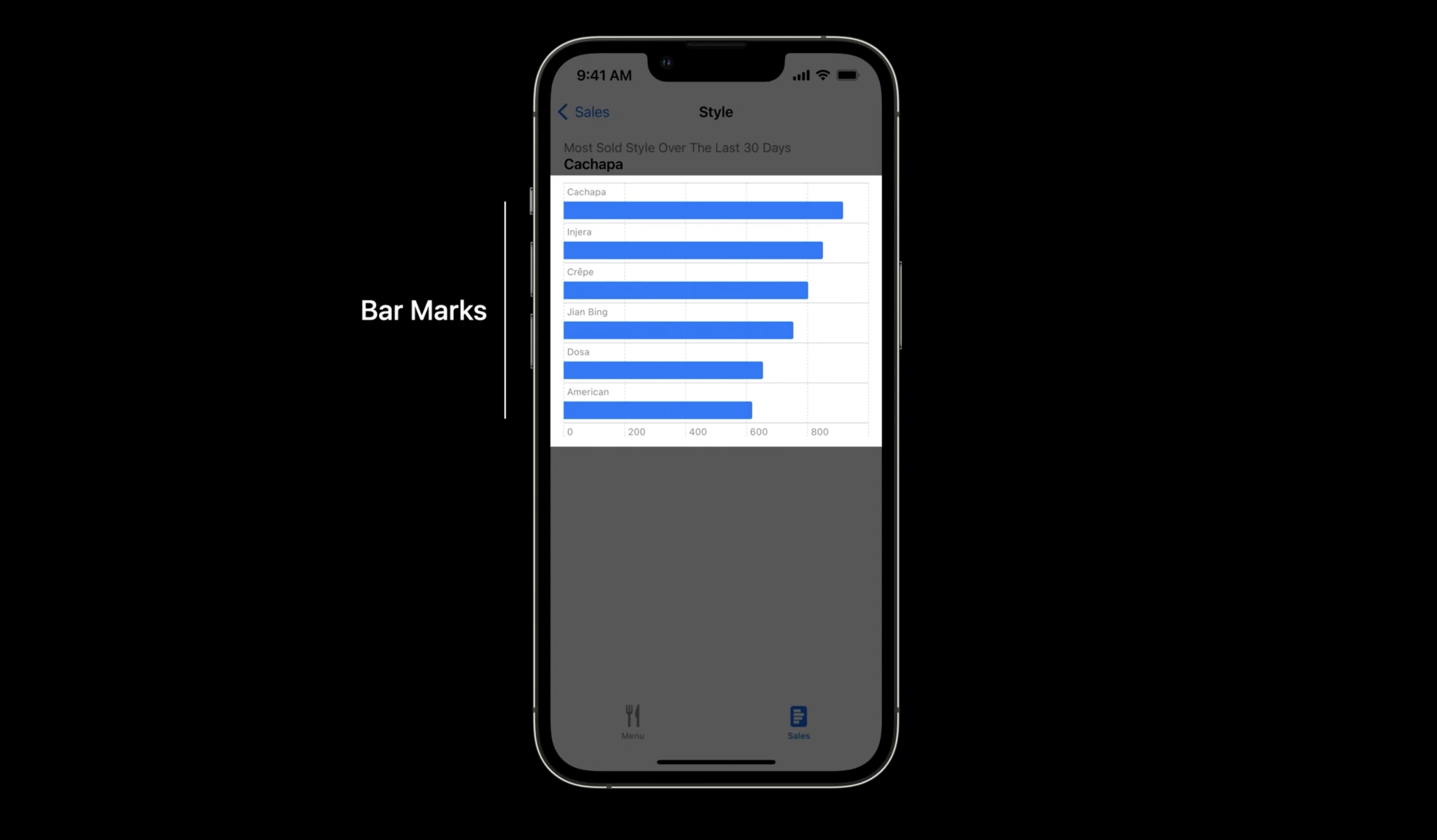
The food truck served more than 4500 pancakes across these styles in the last 30 days. Cachapa were the most popular and the app already shows the most important information in the title.
We add a chart to show a detailed breakdown for the six pancakes.
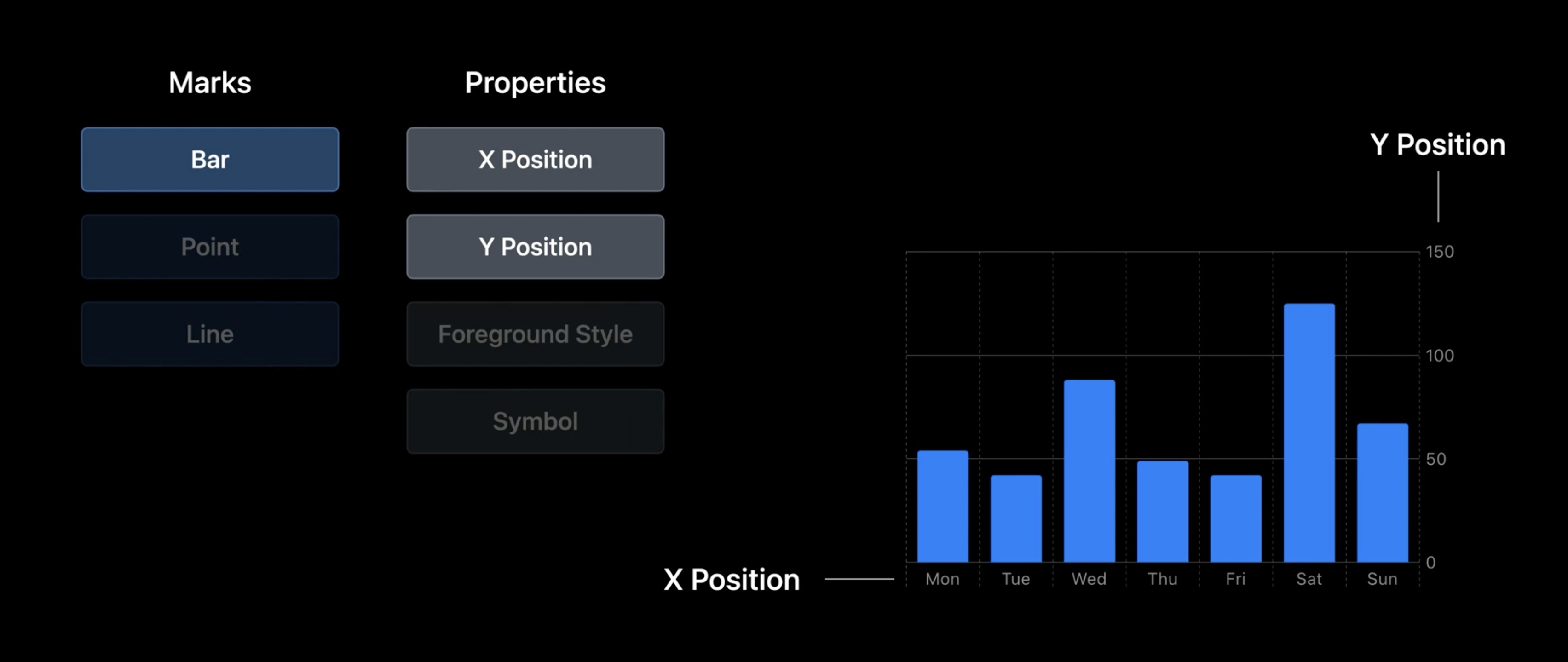
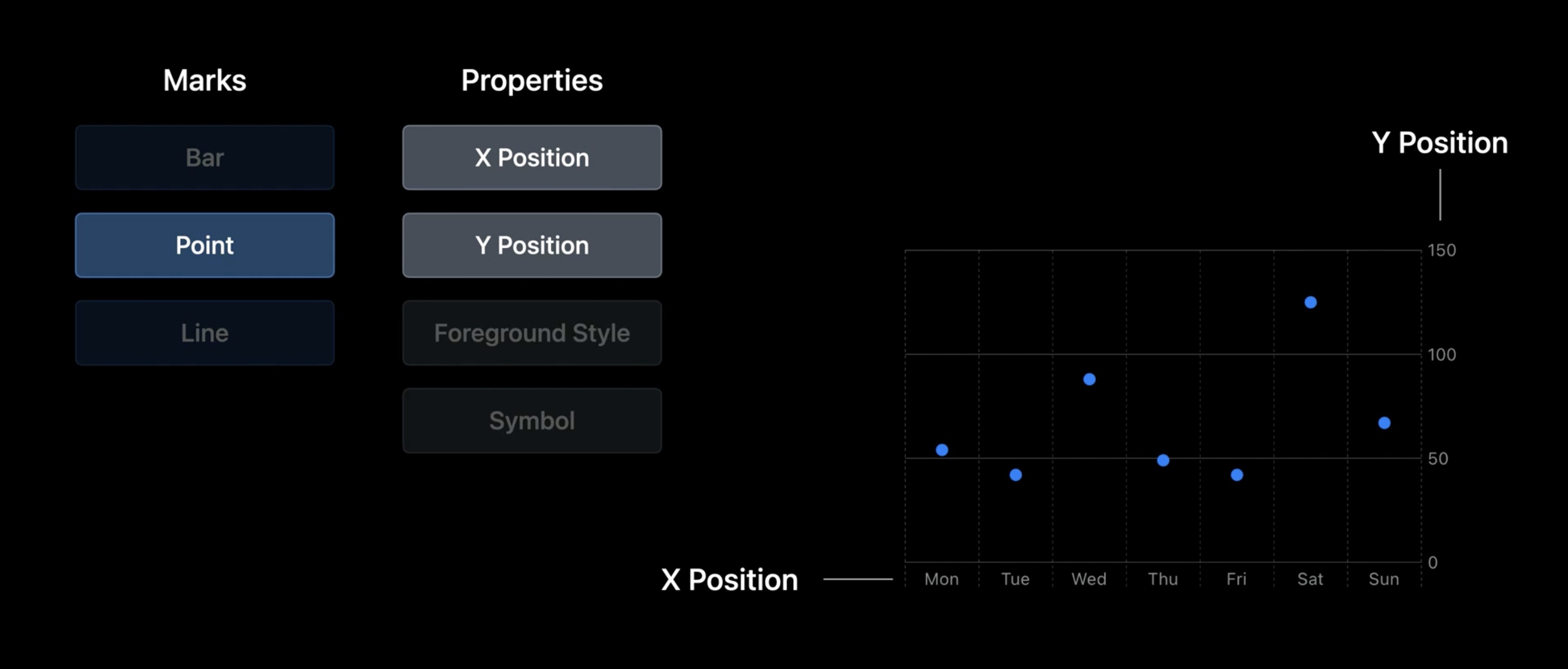
In Swift Charts, we build charts by composition. The main components of a bar chart are the bars, which are visual elements for each item in your data. Swift Charts calls these visual elements "marks."
Chart
Chartis the main outside wrapperBarMarkwithxandypositions and.valuedata- first argument of value is description, second the value
In Xcode we start with adding a chart. To make a bar, we add a BarMark inside the Chart. To show a bar for the number of cachapas, we have to set the name and the sales.
We set the x-position of the bar to be derived from the value of the name of pancake -- in this case "Cachapa." The first argument to the .value factory method is the description of the value, and the second is the value itself.
import Charts
import SwiftUI

struct StylesDetailsChart: View {
	var body: some View {
		Chart {
			BarMark(
				x: .value("Name", "Cachapa")
				y: .value("Sales", 916)
			BarMark(
				x: .value("Name", "Injera"),
				y: .value("Sales", 850)
			)
		}
	}
}
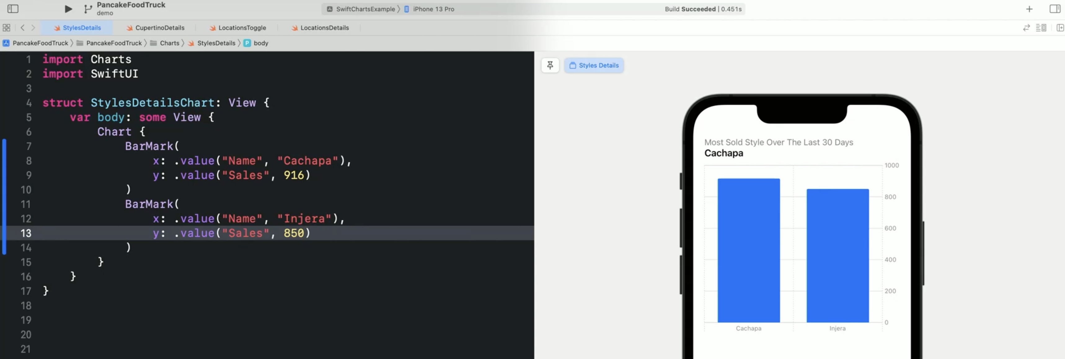
The height of each bar described by the y attribute should be set by the number of cachapas sold, which were 916. To indicate that we're not setting the position or height of the bar directly, we use .value. Swift Charts automatically creates not only the bar but also a label for the bars on the x-axis and a y-axis that shows what the length of a bar means. Let's add a second bar for injera, of which the truck sold 850.
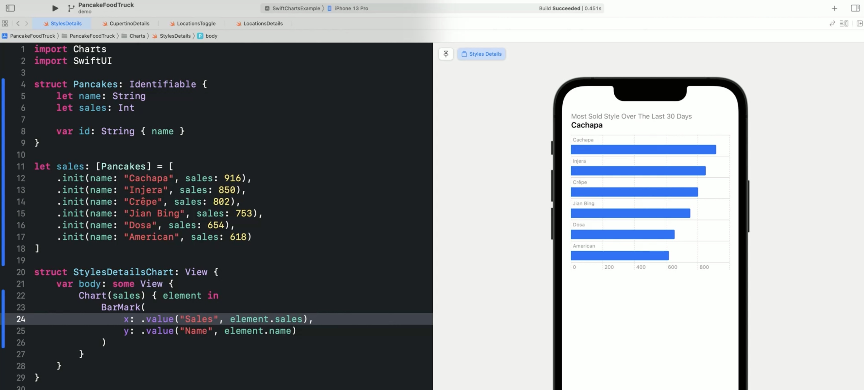
We usually want to create a chart driven by a collection such as an array of structs.
struct Pancakes: Identifiable {
	var name: String
	var sales: Int

	var id: String { name }
}
It has a name -- which is a string -- and how many pancakes the truck sold -- which is an int. Because we want to use it to be repeated, we make it identifiable and define an ID-computed property that returns the name. Now we can create our data set as an array of pancakes. We could load this from an external data source but here we'll define it in the code. Besides cachapa and injera, we also add crêpe. We can make the bar chart data driven with ForEach.
let sales: [Pancakes] = [
	.init (name: "Cachapa", sales: 916),
	.init (name: "Injera", sales: 850),
	.init (name: "Crêpk", sales: 802)
]
And all we need to do now is to repeat the BarMark with a ForEach.
Chart {
	ForEach(sales) { element in
		BarMark(
			x: .value("Name", element.name),
			y: .value("Sales", element.sales)
		)
	}
}
If ForEach is the only content in the chart, we can also put the data directly into the chart initializer.
Chart(sales) { element in
	BarMark(
		x: .value("Name", element.name),
		y: .value("Sales", element.sales)
	)
}
We can now add the remaining three entries for the jian bing, dosa, and american pancakes.
let sales: [Pancakes] = [
	.init (name: "Cachapa", sales: 916),
	.init (name: "Injera", sales: 850),
	.init (name: "Crêpk", sales: 802),
	.init (name: "Jian Bing", sales: 753),
	.init (name: "Dosa", sales: 654),
	.init (name: "American", sales: 618)
]
The labels are becoming now too close to each other. By swapping x and y, we transpose the chart and give the labels for each bar more space.
Chart(sales) { element in
	BarMark(
		x: .value("Name", element.name),
		y: .value("Sales", element.sales)
	)
}
The Swift Charts framework automatically chooses an appropriate axis style.
- make data types
Identifiableto use inCharts - supports
ForEachforIdentifiabledata collections - Implicit
forEachvia aChartinitializer taking a data collection - Charts chooses an appropriate visualization automatically
- Adapts to dynamic type, device sizes, orientations, dark mode and supports accessibility automatically
Swift Charts exposes the data in a visualization to VoiceOver When we navigate the chart in VoiceOver, it speaks the name and number of pancakes sold. Like, VoiceOver: Cachapa, 916. Injera, 850. Crêpes, etc.
And the chart supports the Audio Graphs feature Apple presented in 2021, including the sonifications. VoiceOver: Describe chart. Chart Details. Play Audio Graph. Complete.
Adding now two locations to the truck, Cupertino and San Francisco. where to park on different days of the week?
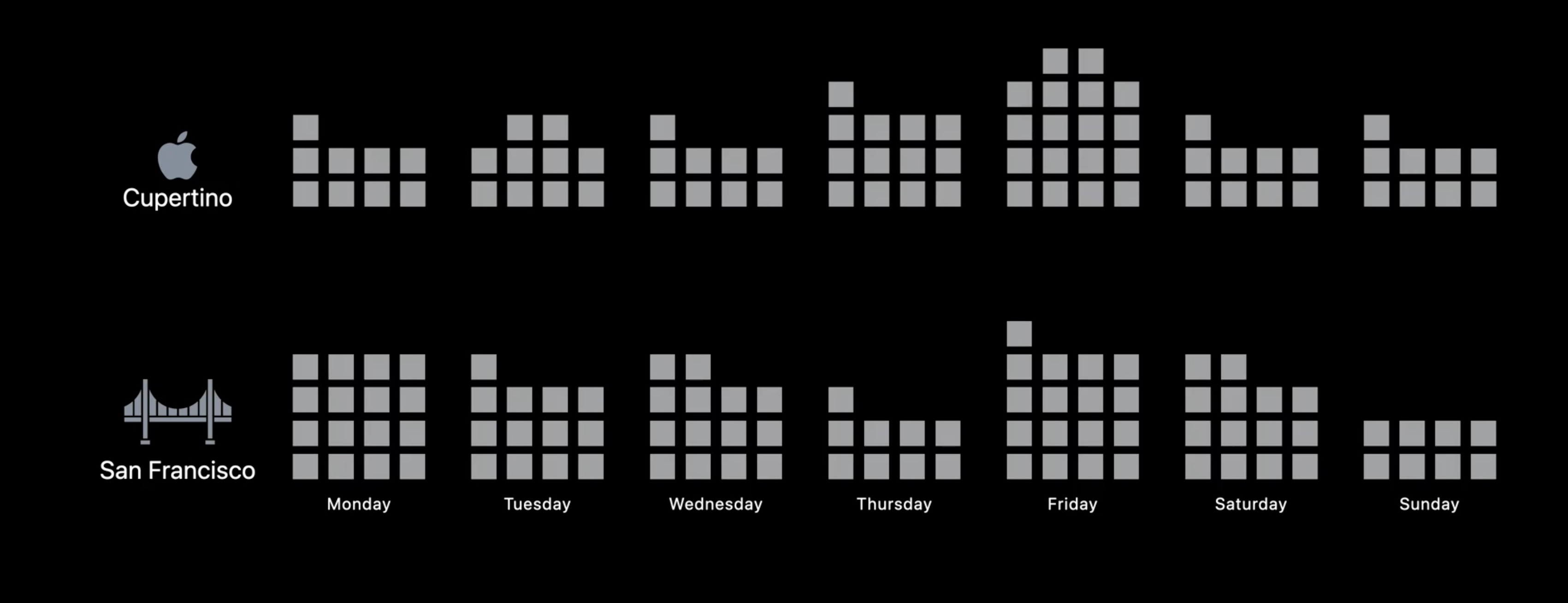
To answer this question, let's visualize the data as a time series for our two cities. We will start by making a bar graph for Cupertino. Then, we will add the data for San Francisco and add a picker. And finally, we will combine the data into one multiseries line chart.
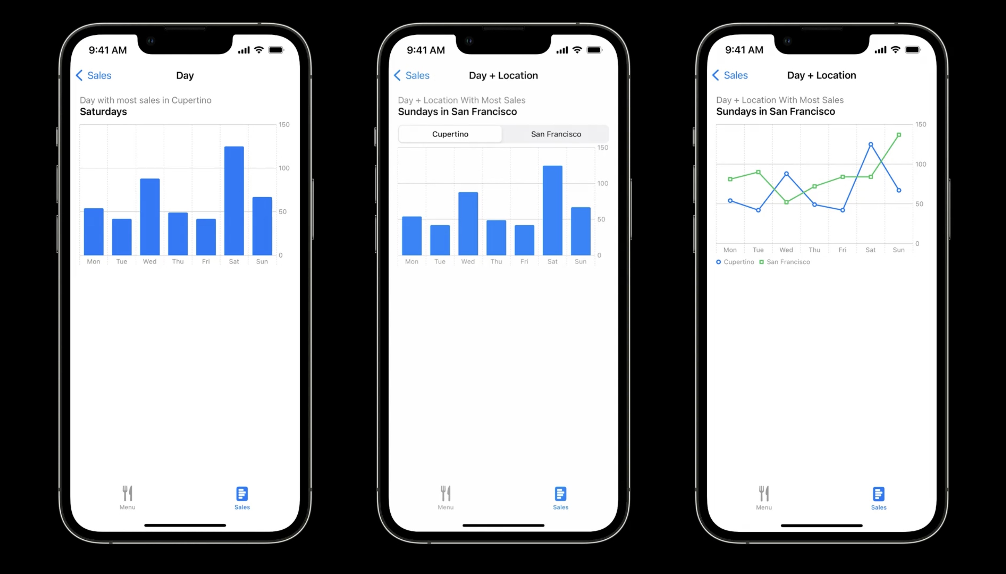
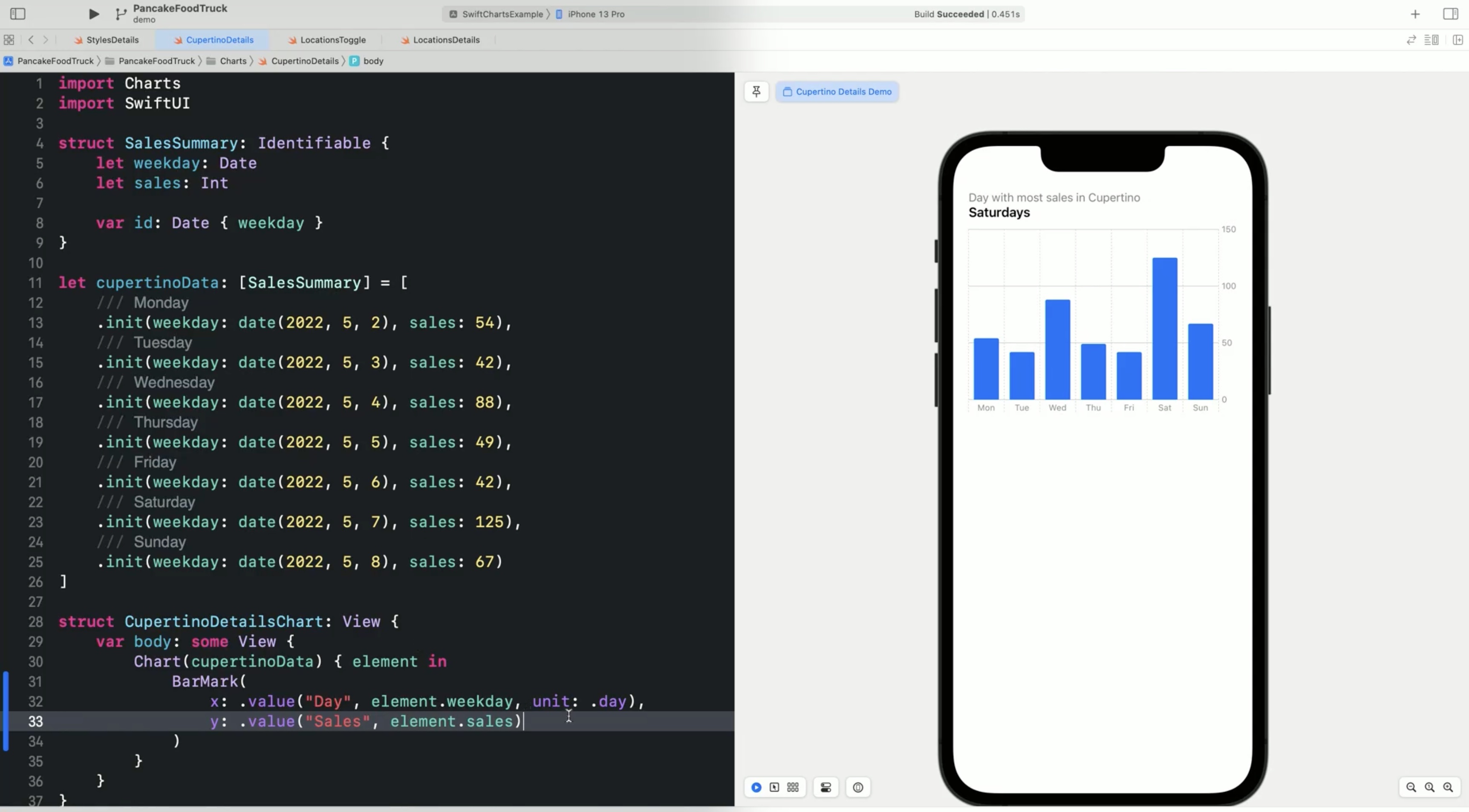
Let's start with the bar chart showing the average number of pancakes sold per day of the week. The sales data has the weekday stored as a date and how many pancakes the truck sold as an integer. The data for Cupertino is in a variable, cupertinoData.
struct SalesSummary: Identifiable {
	let weekday: Date
	let sales: Int

	var id: Date { weekday }
}

// Need this to get the date from the data
func date(_ year: Int, _ month: Int, _ day: Int = 1) -> Date {
	let day = Calendar.current.date(from: DateComponents(year: year, month: month, day: day)) ?? Date()
	return Calendar.current.component(.weekday, from: day)

}

let cupertinoData: [SalesSummary] = [
	// Monday
	.init(weekday: date (2022, 5, 2), sales: 54),
	// Tuesday
	.init(weekday: date (2022, 5, 3), sales: 42),
	// Wednesday
	.init(weekday: date (2022, 5, 4), sales: 88),
	// Thursday
	.init(weekday: date (2022, 5, 5), sales: 49),
	// Friday
	.init(weekday: date (2022, 5, 6), sales: 42),
	// Saturday
	.init(weekday: date (2022, 5, 7), sales: 125),
	// Sunday
	.init(weekday: date (2022, 5, 8), sales: 67)
]

struct CupertinoDetailsChart: View {
	var body: some View {
		Chart(cupertinoData) { element in
			BarMark(
				x: . value("Day", element.weekday, unit: .day),
				y: .value("Sales", element.sales)
			)
		}
		// this was not in the video but there is no other way to get the weekdays showing in the x axis... added by the note taker!
		.chartXAxis {
			AxisMarks(values: .stride(by: .day)) { _ in
				AxisGridLine()
				AxisValueLabel(format: .dateTime.weekday(.abbreviated), centered: true)
			}
		}
	}
}
For the second iteration, let's add the data for San Francisco. The sales data for San Francisco is in the sfData variable.
let sfData: [SalesSummary] = [
	.init (weekday: date (2022, 5, 2), sales: 81),
	.init(weekday: date (2022, 5, 3), sales: 90),
	.init (weekday: date (2022, 5, 4), sales: 52),
	.init (weekday: date (2022, 5, 5), sales: 72),
	.init (weekday: date (2022, 5, 6), sales: 84),
	.init (weekday: date (2022, 5, 7), sales: 84),
	.init (weekday: date (2022, 5, 8), sales: 137)
]
We want to toggle between the two cities and see the bar chart for each city. We start with adding a state variable, city. And then we add a SwiftUI picker for the city to the View. To toggle between the sales summaries for the two cities via the city variable, we add a switch statement for the data variable.
// need this too
enum City {
	case cupertino
	case sanFrancisco
}

struct LocationsToggleChart: View {
	@State var city: City = .cupertino
	var data: [SalesSummary] {
		switch city {
		case .cupertino:
			return cupertinoData
		case .sanFrancisco:
			return sfData
		}
	}

	var body: some View {
		VStack {
			Picker("City", selection: $city.animation(.easeInOut)) {
				Text("Cupertino").tag(City.cupertino)
				Text("San Francisco").tag(City.sanFrancisco)
			}
			.pickerStyle(.segmented)

			Chart(data) { element in
				BarMark(
					x: .value("Day", element .weekday, unit: .day),
					y: .value("Sales", element. sales)
				)
			}
			.chartXAxis { ... } // see above
		}
	}
}
Swift Charts works with SwiftUI animations, so if we specify that the transition should be animated with easeInOut, the bars animate as we toggle between the two cities and also only shows one location at a time.
Working with series
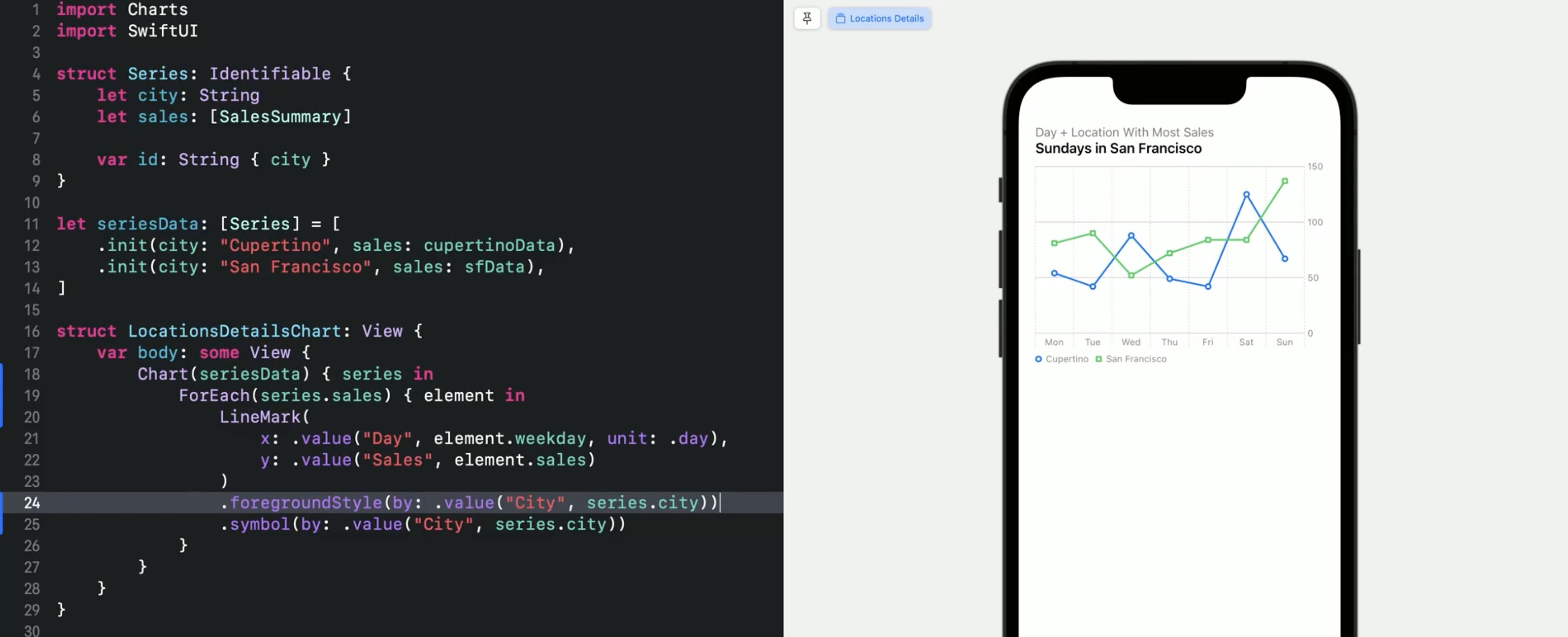
Lets show both series in a line chart. The data for Cupertino and San Francisco is in an array of series. Series structs have the city and sales data.
struct Series: Identifiable {
	let city: String
	let sales: [SalesSummary]
	var id: String { city }
}

let seriesData: [Series] = [
	.init (city: "Cupertino", sales: cupertinoData),
	.init(city: "San Francisco", sales: sfData),
]
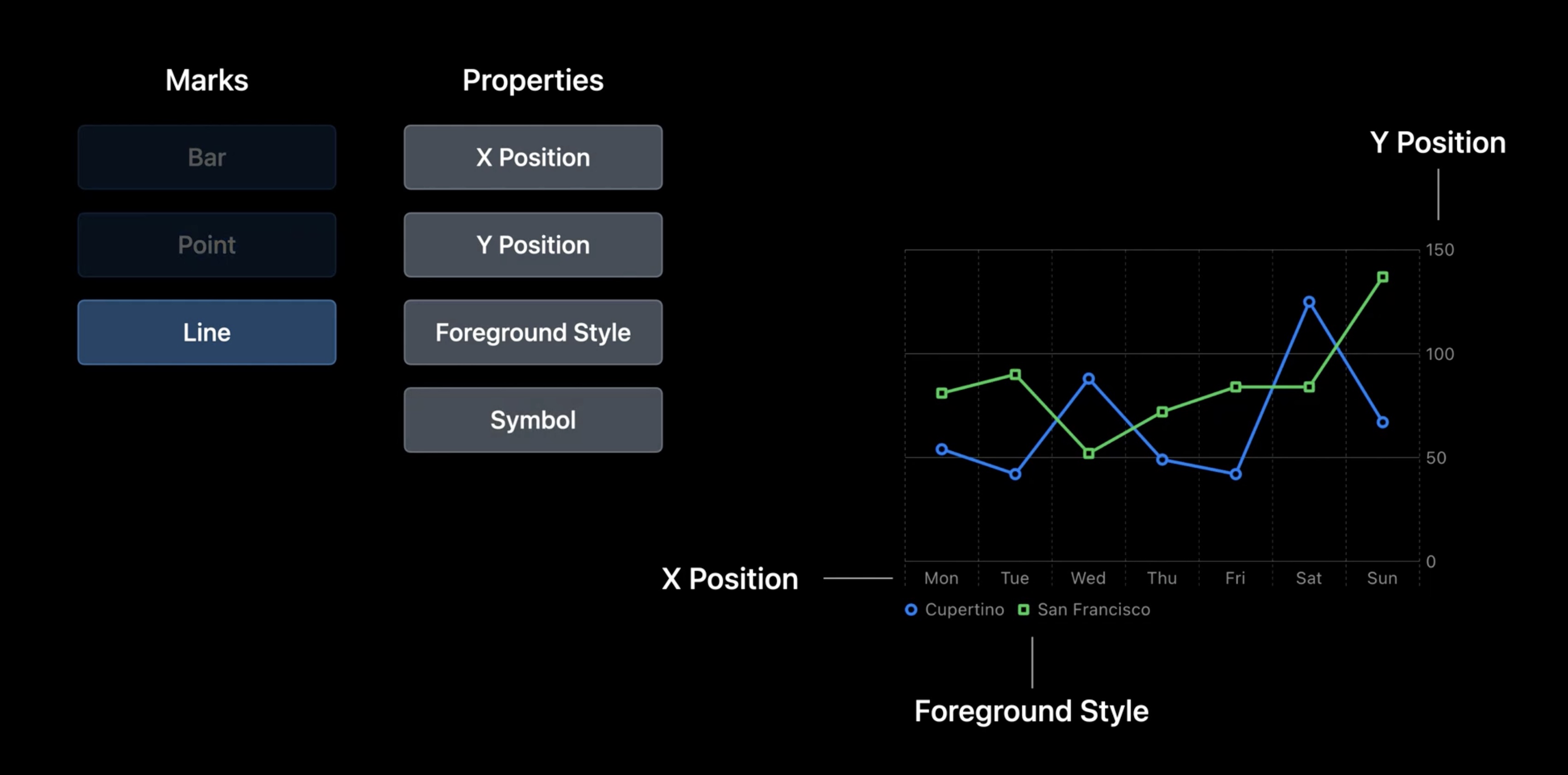
To distinguish the data for the two cities, the color of the bars will be derived from the city. For this, the foregroundStyle is set from the city in the series.
To show what city a color represents, Swift Charts creates a legend below the chart.
Chart(seriesData) { series in
	ForEach(series.sales) { element in
		BarMark(
			x: .value("Day", element.weekday, unit: .day),
			y: .value("Sales", element.sales)
		)
		.foregroundStyle(by: .value("City", series.city))
	}
}
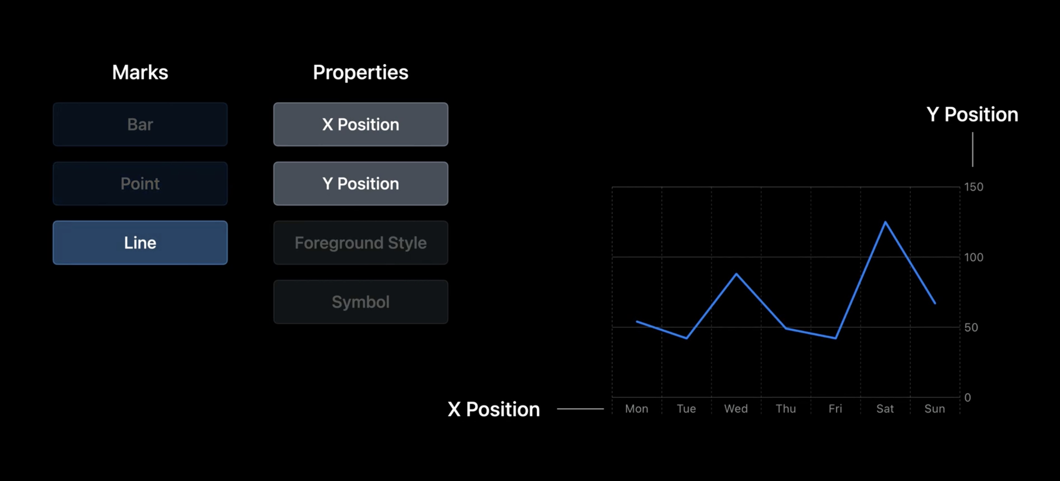
Swift Charts automatically chooses a color for San Francisco, and it shows the bars for both cities in the chart. Charts show data for a particular context and a visualization may need to change as data or questions change.
Change the mark type from a BarMark to a PointMark to display the pancakes sold as points, or to a LineMark to show the data as a line chart.
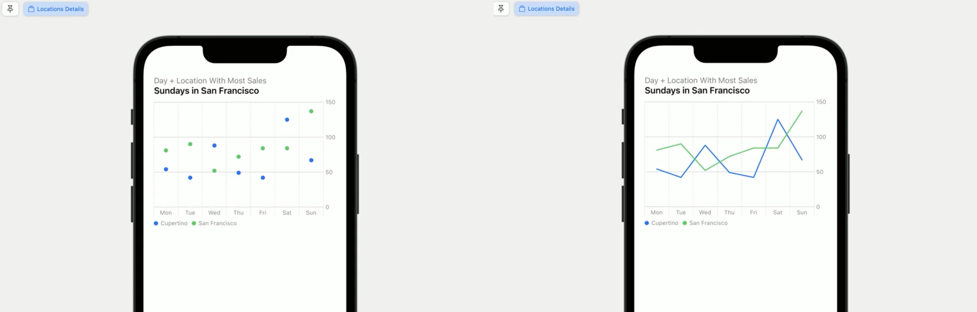
A line chart is a good fit for the sales data since it can compare the two cities in each day of the week. Charts can combine multiple marks. For example, adding a PointMark. To make the series differentiable without color, we set the symbol to be derived from the city.
Chart(seriesData) { series in
	ForEach(series.sales) { element in
		BarMark(
			x: .value("Day", element.weekday, unit: .day),
			y: .value("Sales", element.sales)
		)
		.foregroundStyle(by: .value("City", series.city))

		PointMark(
			x: .value("Day", element.weekday, unit: .day),
			y: .value("Sales", element.sales)
		)
		.foregroundStyle(by: .value("City", series.city))
		.symbol(by: .value("City", series.city))
	}
}
Now each point indicates the city by its color and symbol.
Swift Charts has a shorthand for this.The style of the points adapts to the line.
Chart(seriesData) { series in
	ForEach(series.sales) { element in
		BarMark(
			x: .value("Day", element.weekday, unit: .day),
			y: .value("Sales", element.sales)
		)
		.foregroundStyle(by: .value("City", series.city))
		.symbol(by: .value("City", series.city))
	}
}
Features
- When navigation charts in VoiceOver speaks the description + value
- Supports AudioGraph feature from 2021, too (peep sounds)
- .value also accepts a
unitfor types likeDate, e.g..day - Supports SwiftUI animations (e.g. animate between different data collections but same bar chart view)
- Use
.foregroundStyle(by:to group data by color → auto-generated legend for the colors - Easy to change from
BarMarktoPointMarkorLineMark(great for prototyping charts!) - Also
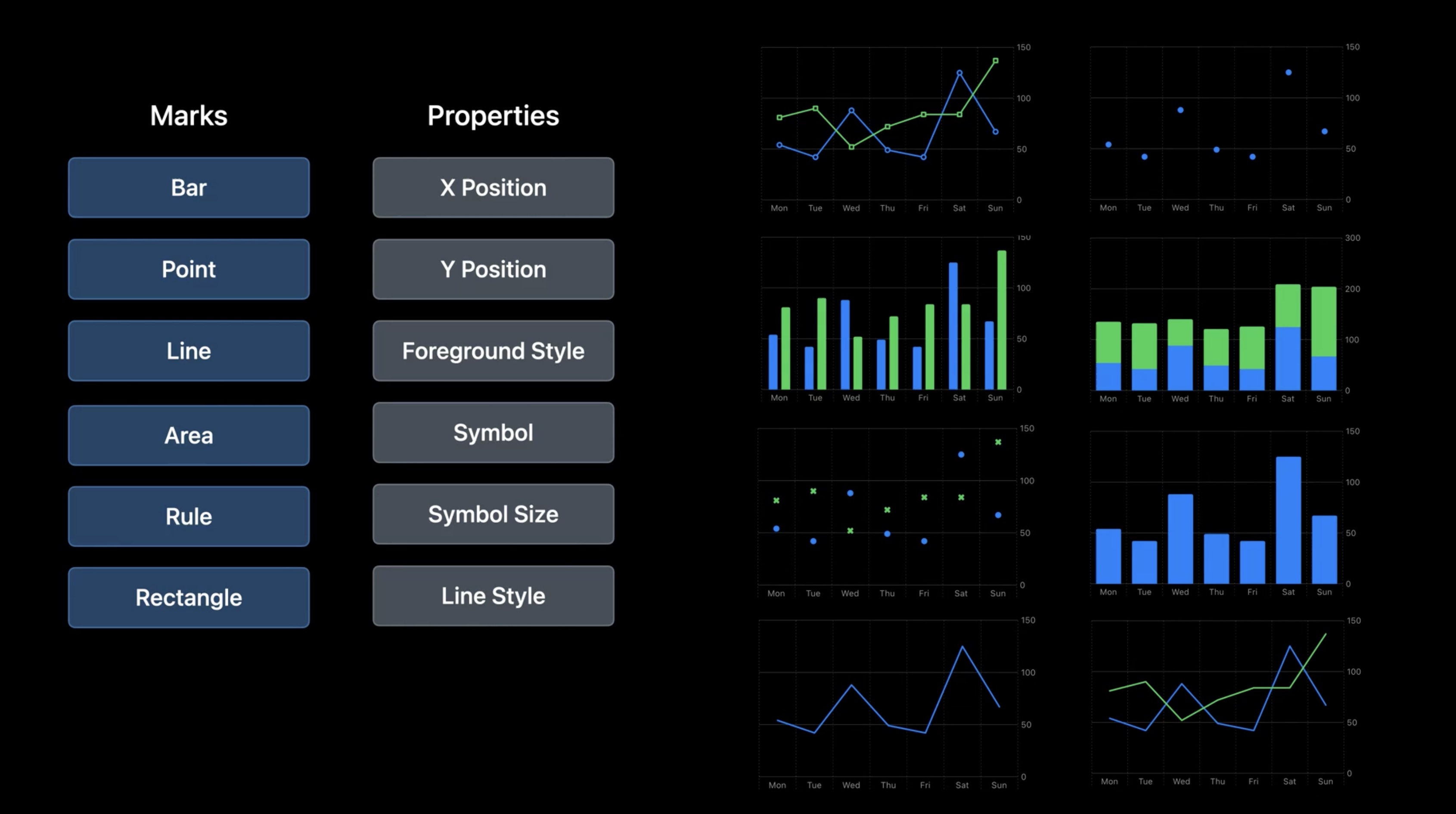
.symbol(by:a value available to use square/circle instead of color to differentiate data form each other - Marks: Bar, Point, Line
- Mark Properties: X Position, Y Position, Foreground Style, Symbol
- More Marks available:
Area,Rule,Rectangle - More Mark Properties available:
Symbol Size,Line Style - Support for:
- Dark Mode
- Device Screen Sizes
- Dynamic Type
- Voice Over
- Audio Graphs
- High-Contrast
- Localization
- Multi-Platform
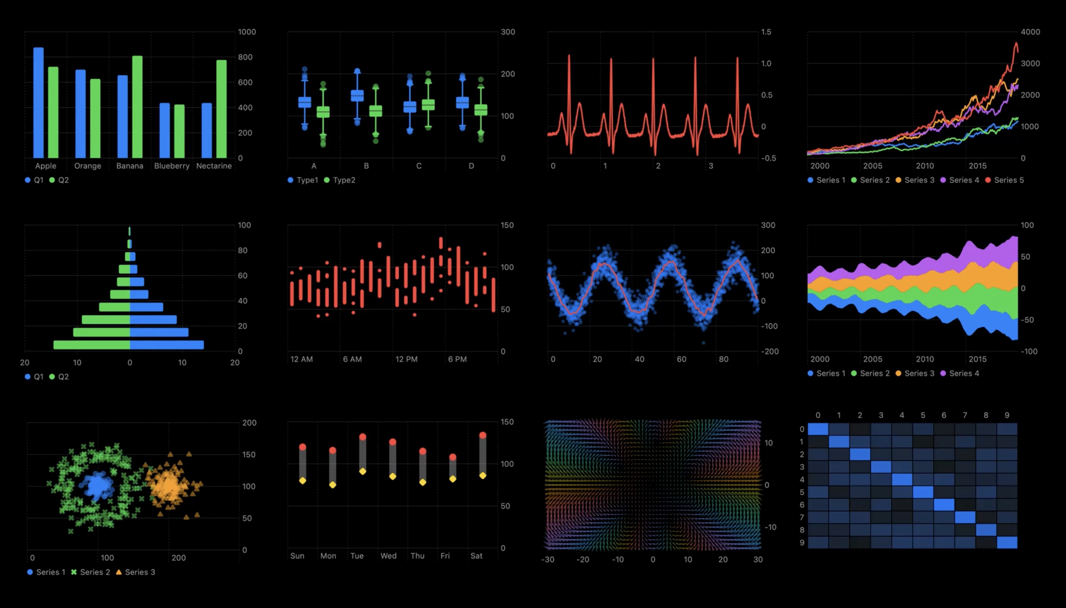
Wrap up - Charts Cheat sheet
BarMark with x and y properties:
With points:
With lines:
Showing multiple series:
Even more options:
till advanced!
Support for:

Resources
Creating a chart using Swift Charts
Have a question? Ask with tag wwdc2022-10136
Search the forums for tag wwdc2022-10136
Swift Charts
Visualizing your app’s data
## Related Videos
Tech Talks
What's new for enterprise developers - WWDC22
### Sessions Build a productivity app for Apple Watch - WWDC22
Design an effective chart - WWDC22
Design app experiences with charts - WWDC22
Swift Charts: Raise the bar - WWDC22
Use SwiftUI with UIKit - WWDC22
What's new in SwiftUI - WWDC22
 Twitter
 GitHub
 fline.dev