SF Symbols 2
 Federico Zanetello
Description: SF Symbols make it easy to adopt high-quality, Apple-designed symbols created to look great with San Francisco, the system font for all Apple platforms. Discover how you can use SF Symbols in AppKit, UIKit, and SwiftUI. Learn how to work with SF Symbols in common design tools and how to use them in code. And we’ll walk you through the latest updates, including additions to the repertoire, alignment improvements, changes with right-to-left localization, and multicolor symbols. This session focuses on the latest features in SF Symbols 2. While not required, we recommend watching "Introducing SF Symbols" from WWDC19. If you’re planning to incorporate symbol assets into SwiftUI, you may also benefit from watching “Building Custom Views with SwiftUI."
The basics
- Symbols are designed to work next to text from any SF family
- When symbols appear next to text they are vertically centered with a cap height
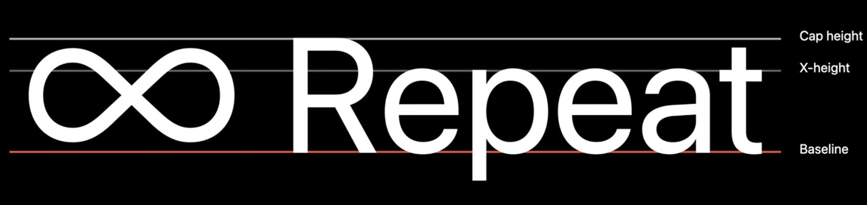
- The text baseline is used as a flexible guide, sometimes symbols are lower or higher than the baseline: this is intended and it's meant to optically balance the shape of the symbol with the text
- Things to keep in mind when designing new symbols:
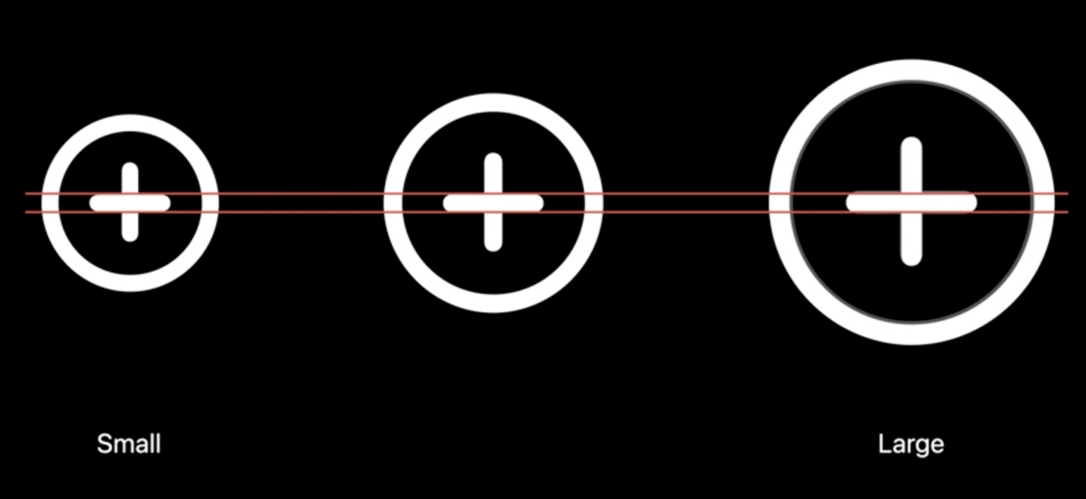
- symbols come in three dimensions, small medium (default) large
- all sizes align vertically
- small symbols are ~20% smaller than the medium, large symbols are ~30% bigger than the medium symbol
- small symbols look lighter and large symbols look bolder than others sizes, but actually there are some weight compensations which allow the symbols to maintain the same stroke thickness, making the symbols look weight matched not only between the scales but also with text.
Usage tips
- SF Symbol are supported on macOS starting from Big Sur
- When using the SF Symbols app, we can copy the name of a symbol via
⇧+⌘+C. - To change the scale of a symbol while maintaining the same point size we need to set the
UIImage'sSymbolConfiguration:
var playImageView: UIImageView = ...
let buttonConfig = UIImage.SymbolConfiguration(textStyle: .headline, scale: .small)
playImageView.preferredSymbolConfiguration = buttonConfig
playImageView.image = UIImage(systemName: "play.fill")
In SwiftUI:
Image(systemName: "shuffle")
    .font(.headline)
    .imageScale(.small)
- Use SwiftUI's
Labelto make sure the symbol and text are always in sync:
Label("Sharing location", systemImage: "location.fill")
- With iOS 14 Images can also be added directly in
Text:
let glyph = Image(systemName: "location.[fill")
return Text("\(glyph) Sharing location")]
- Some symbols have been renamed: when selecting a symbol in the SF Symbols app, you can see what name you should use based on your target
- use the baseline alignment when laying symbols next to text
- use vertical alignment guides to make the symbols and text grow harmoniously when text gets resized
What's new
New symbol categories:
- devices
- transportation
- game controllers
- human features
In the SF Symbol 2 app we can create our own collections:
Symbols are now automatically localized (you can see the localization when selecting a symbol in the SF Symbols app):

Colors
- Last year all symbols were a mono color glyph, from this year we have new colored symbol variants
- These variants will still respect the set tint color, but some part might have a different color
- All these colors adapt with system appearances
To use the multicolor variant, set the isTemplate property to false:
if let folder = NSImage(
    systemSymbolName: "folder.badge.plus", accessibilityDescription: "add folder") {
    folder.isTemplate = true
}
In SwiftUI:
Image(systemName: "pencil.tip.crop.circle.badge.plus")
    .renderingMode(.original)
 GitHub
 zntfdr.dev