Designed for iPad
 Sarthak Khillon
Description: Discover the building blocks for designing a great iPad app: Learn how to minimize use of modal interfaces and leverage the new sidebar to increase efficiency by streamlining navigation and facilitating powerful drag and drop interactions. See how to take advantage of iPad’s versatile interaction opportunities by supporting multitouch, pencil, keyboard, and trackpad. And create adaptive layouts that respond to all size classes and orientation to support a great multitasking experience. These techniques will not only improve your iPad app — they’ll make it easier to create a Mac Catalyst app that truly feels right at home on macOS.
Overview
We currently have a variety of form factors when designing our apps.
Mac:
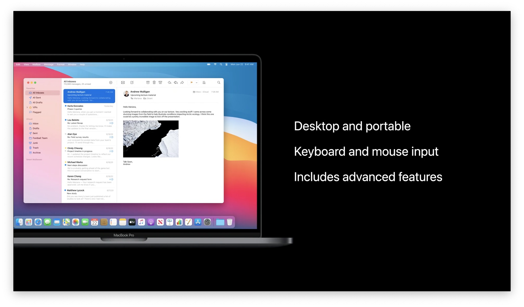
iPhone:
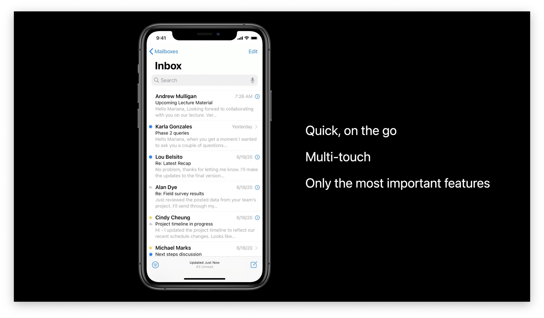
But you shouldn't build something "halfway" between iPhone and Mac for iPad just because its size is also "in the middle". You should use what's unique to iPad.
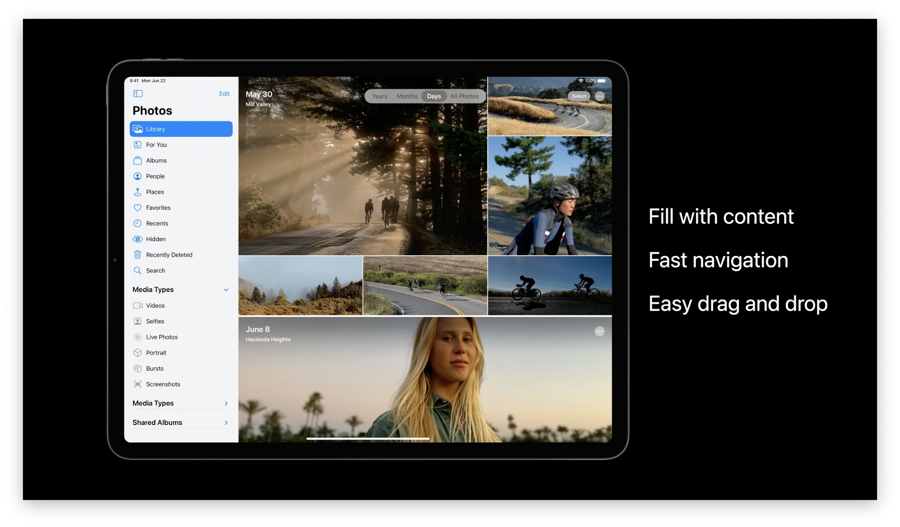
Layout your app for iPad
Your first step when designing an iPad app should be to use all the screen real estate you have.
Flatten Navigation
First, flatten your navigation. Avoid big, full screen transitions in favor of updating parts of the screen. Jump to the 3 minute mark for an example using the Photos app with the Sidebar.
Show More Content
You have a bigger screen, so you can show more stuff. Essentially, make your content more dense because the iPad is big enough to where stuff is still readable.
Apple examples:
- More icons on the home screen.
- 3x more files visible at a time in the Files app.
Stay in Context
In iPhone apps, you need to focus on a specific thing because you have limited space. On the iPad, you have room to show more than one thing at a time.
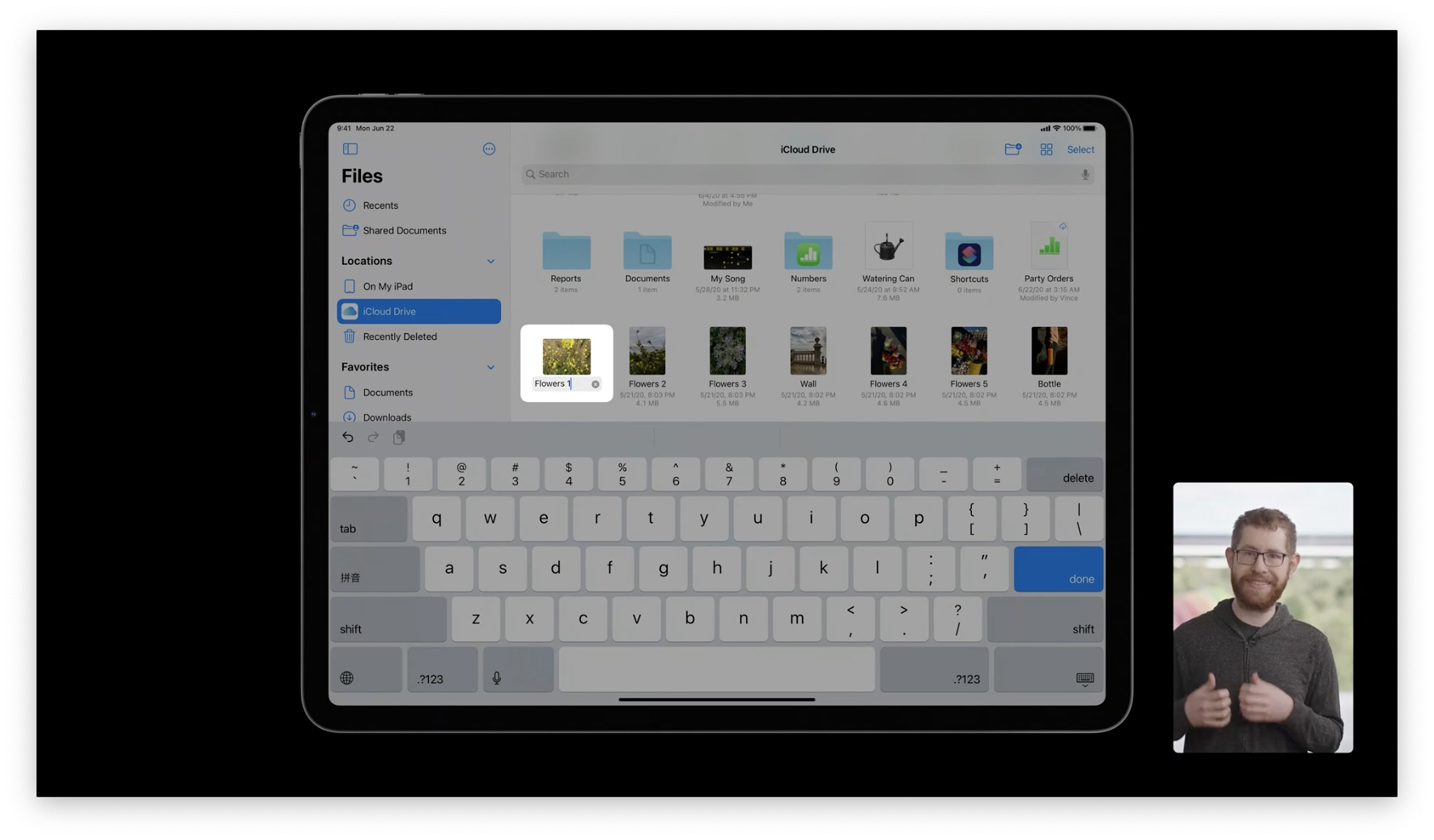
Below is how files were renamed in the iPadOS 13 Files app. You have no context about surrounding files--what if you want the file names to follow a similar pattern? You'd have to exit renaming, remember, and then start renaming again.
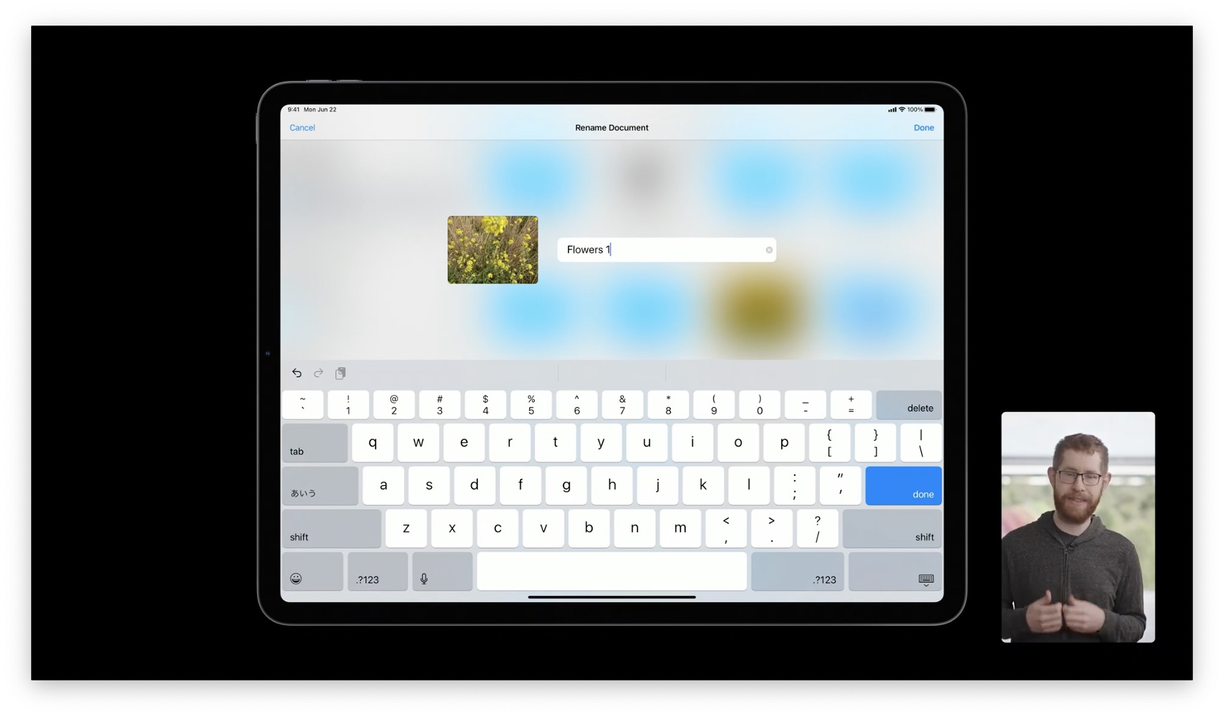
Renaming a file in iPadOS 14 happens inline, so you can use surrounding information as a reference.
General Advice: Wherever you have an overlay or you're blocking out part of the screen, see if you can remove that to give more context.
Popovers
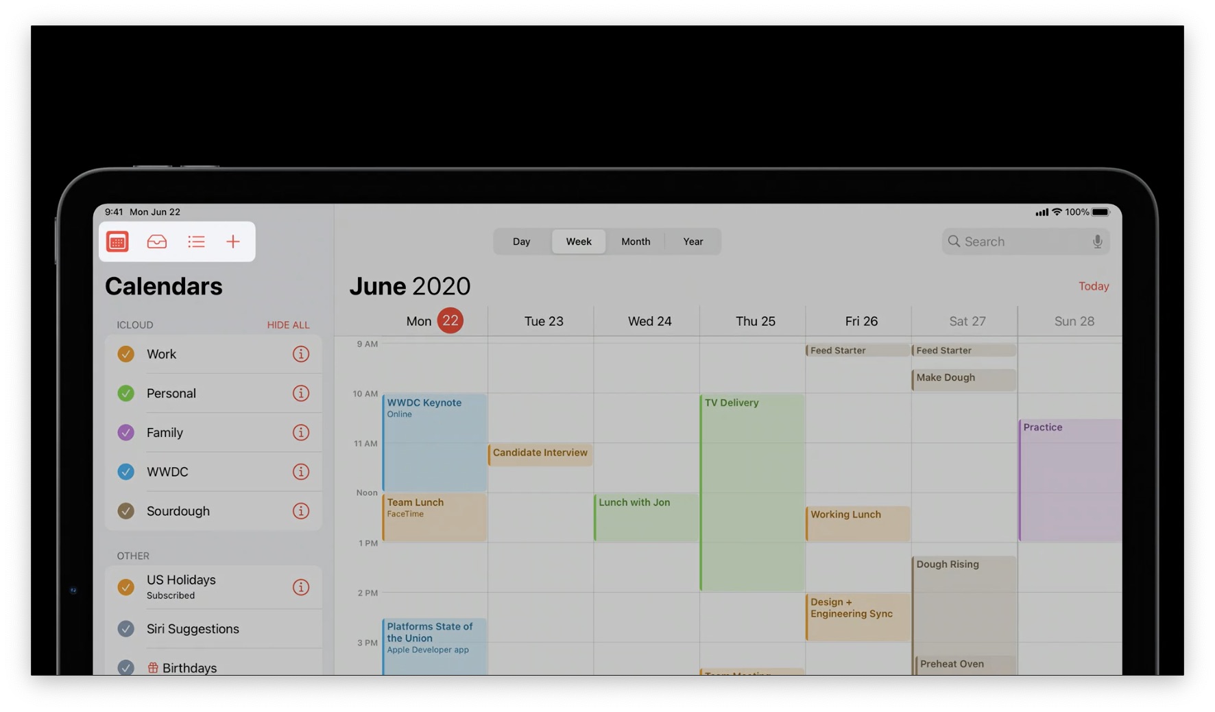
Popovers are a handy tool to provide more context while still doing something useful. In the Calendar app, the arrow on the popover gives you information about what you're editing, and you can still see every other event:
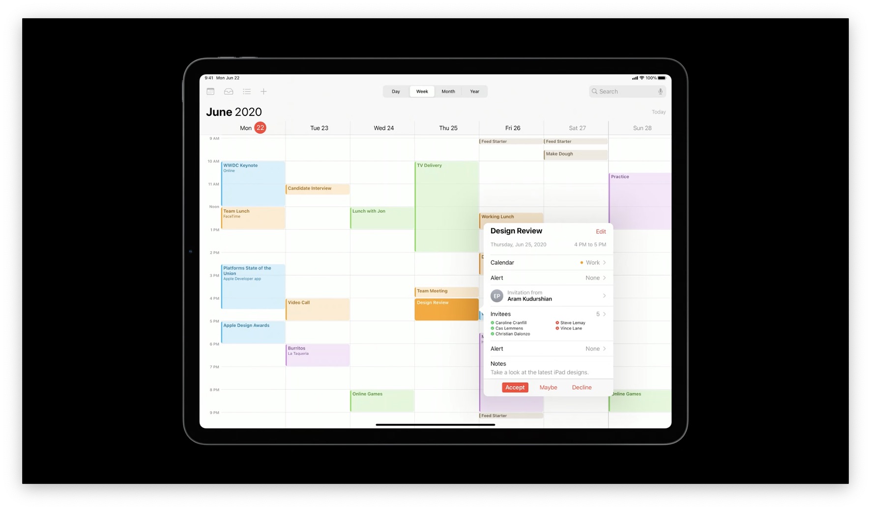
But look at this popover from Calendar in iPadOS 13. It just has an arrow that points to a button called "Calendars", and it provides no useful context.
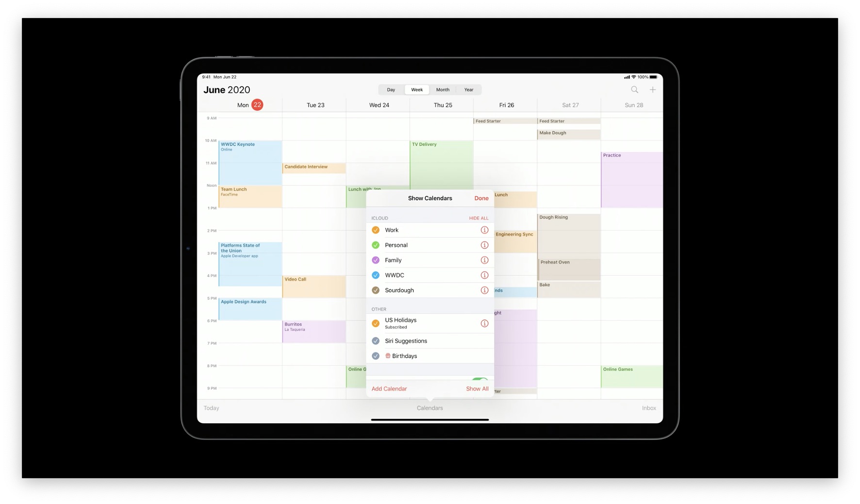
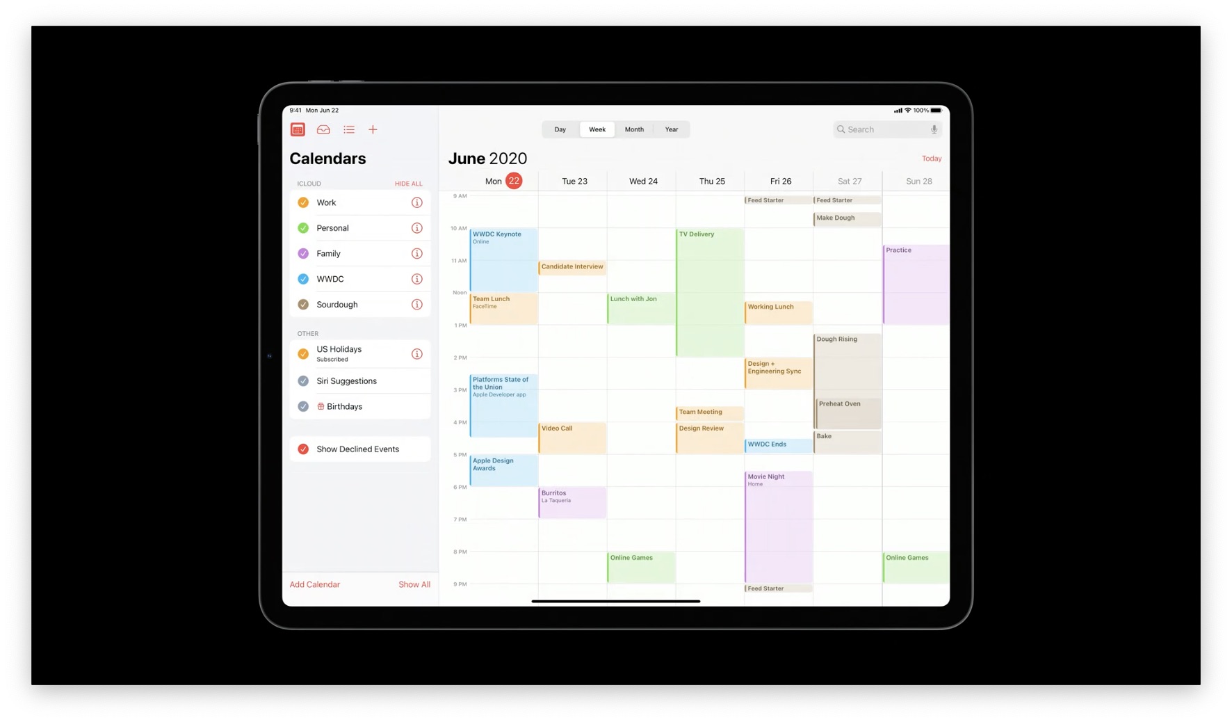
In iPadOS 14, this information was moved to a Sidebar so you could see more information at once.
General Advice: See if you have any modal sheets/popovers, and evaluate if they are more useful than Sidebars. This is also great advice if you're thinking of porting your app to macOS using Catalyst, because macOS devices are even bigger and you should minimize content-obscuring overlays.
Creating Immersive Experiences
Some of the most magical experiences happen when the device itself seems to become "content", such as:
- Turning pages in books
- Watching videos
- Sketching with the Apple Pencil in Notes
- Editing a single photo in the Photos app
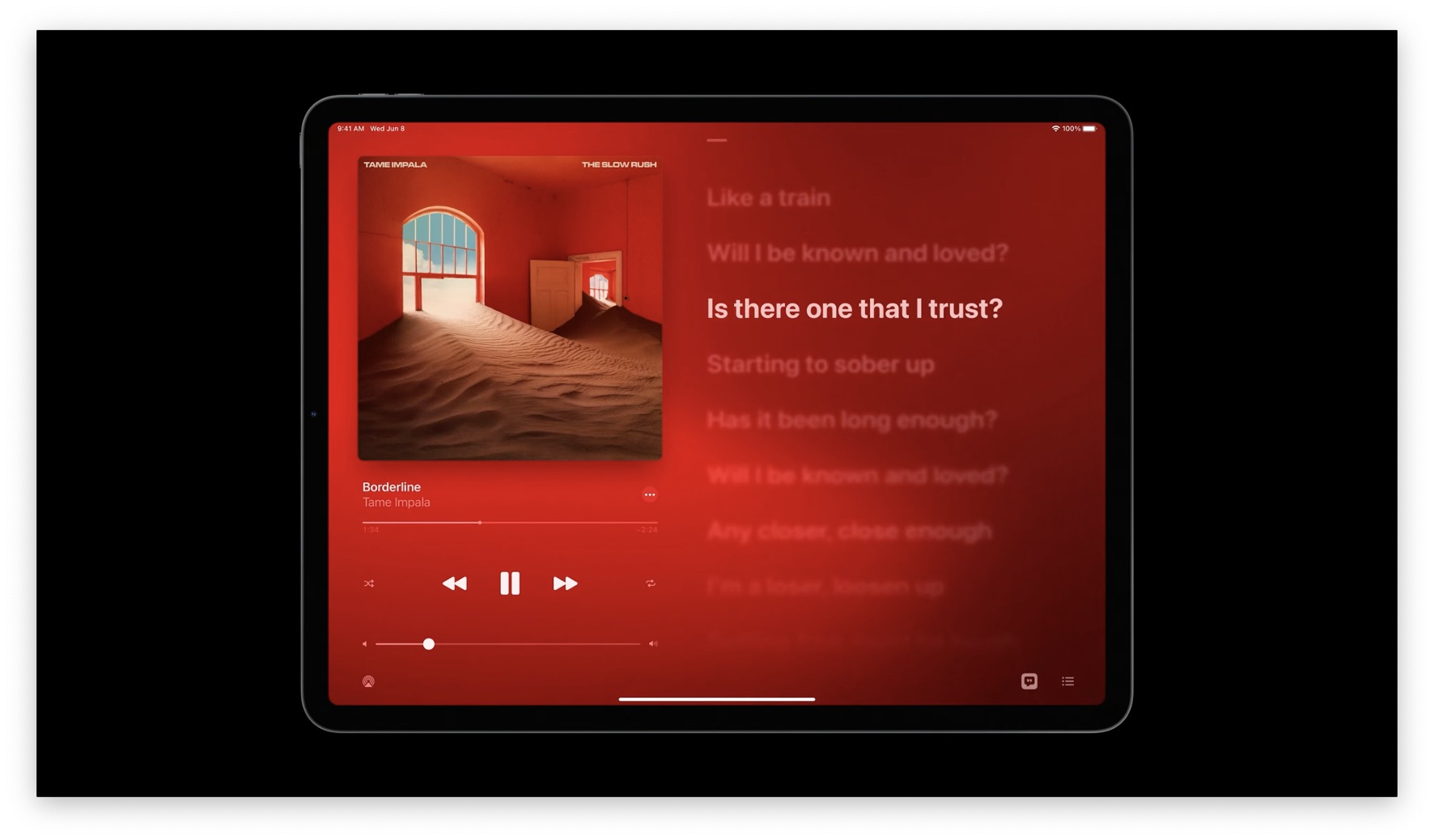
Here's an example from the Music app, where the lyrics are nice and big, since the audio doesn't really need screen space:
Supporting iPad Inputs
Of course, the iPad is a touch-first device. We have keyboards, Pencil, and trackpads. Great apps should use each input type for what it does best.
Multitouch
Your iPad apps should always prioritize touch inputs before anything else, like a keyboard.
Adopt system features
Make sure to add keyboard shortcuts for all the common actions in your app. These are always appreciated, as long as they're not required (otherwise, you're violating the "design for touch first" principle).
This also translates well if you're porting your iPad app to macOS using Catalyst, since all the keyboard shortcuts work the same way.
Trackpad
The trackpad is supported automatically if you use system controls, but you can also extend the pointer to any custom controls/interactions (see 11:30 in the video). For more information, see Designing for the iPadOS Pointer.
Pencil
Make sure to support Scribble, which, like trackpad support, you get automatically when using system controls. If you have custom controls, make sure Scribble is supported in them, too.
Combine multiple inputs
This is something you can only do on the iPad, which can make for some great interactions.
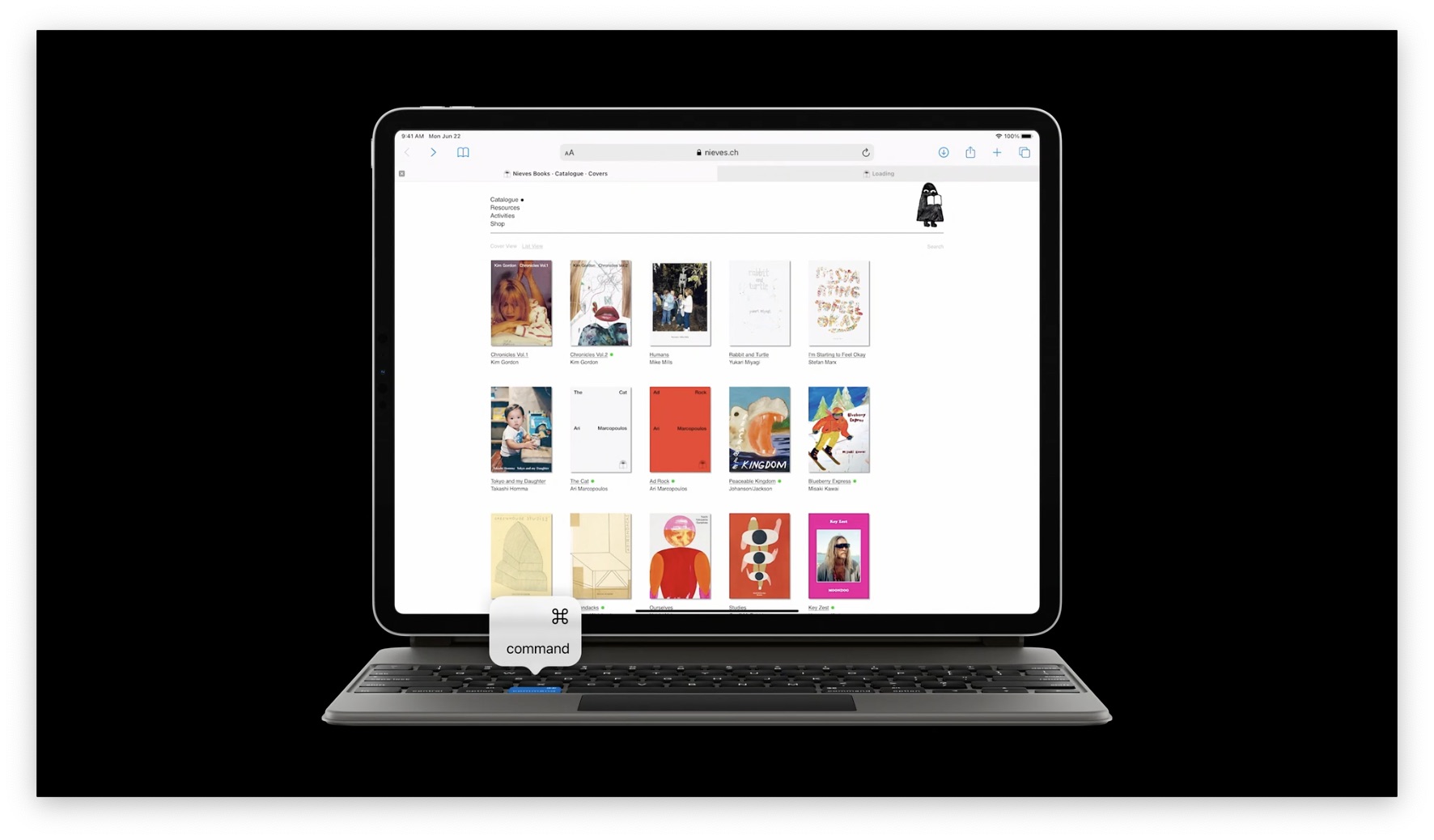
One example is holding down CMD on a keyboard and tapping on a link to open it in a new tab.
In your app, consider combining modifier keys (CMD/Option/CTRL) with touch and trackpad for even more functionality. You can replicate common behaviors like holding down option and tapping something to make a copy.
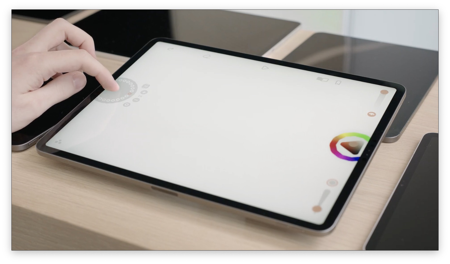
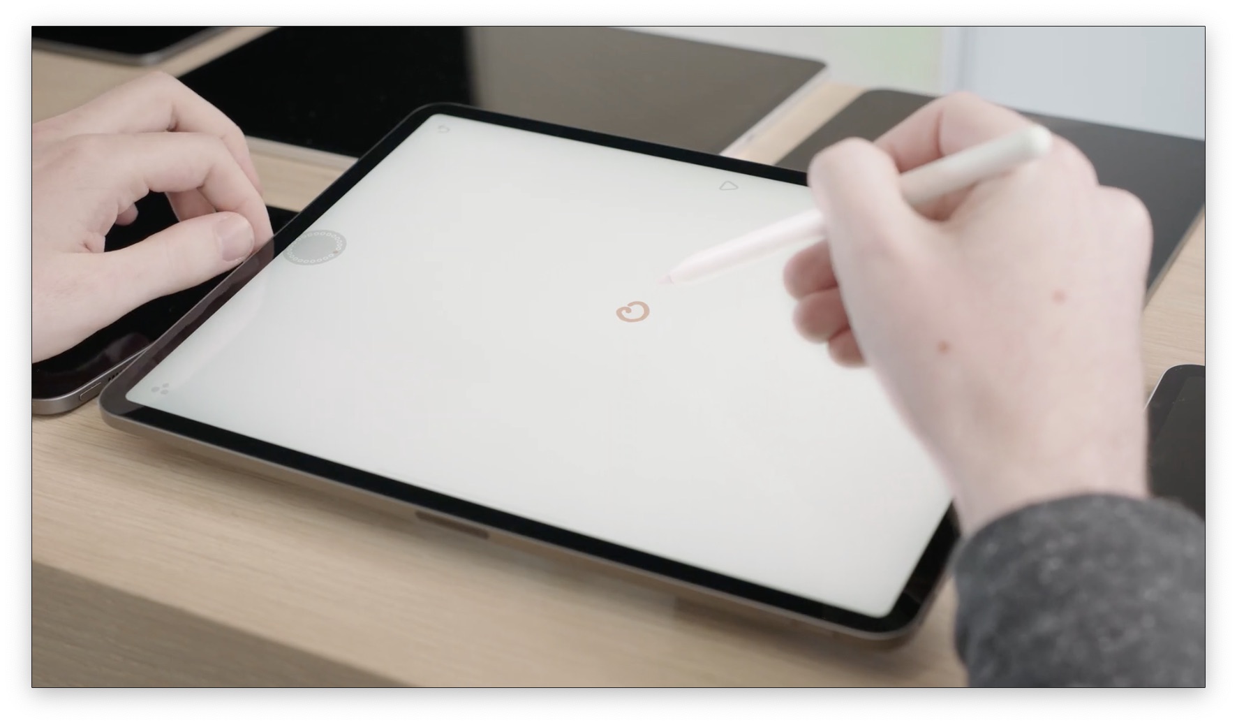
Another great combination is Pencil and touch. They use Looom, an animation app, as an example.
You can touch a dial on the left to select which frame you're drawing the animation for.
You can then draw the frame with your pencil:
To see this in action, jump to 13:30 in the video.
Always stay responsive
Staying responsive helps your app stay fast. No matter what's going on screen (animation/transitions/processing), your app should always accept input.
In the iPadOS 14 Files app, you can sort by different conditions (Name, Date, Size, etc) and then choose a different sort condition while the changes are animating. Users should not have to wait, because then the app is not as fast as they can think about using it.
See 14:15 for this philosophy in action.
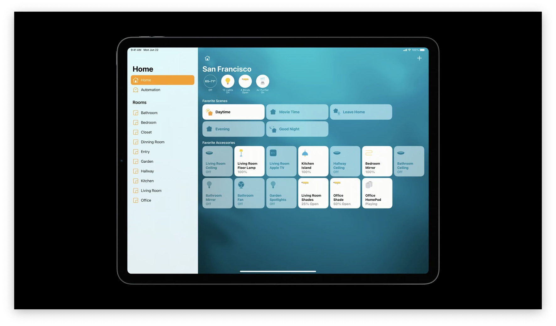
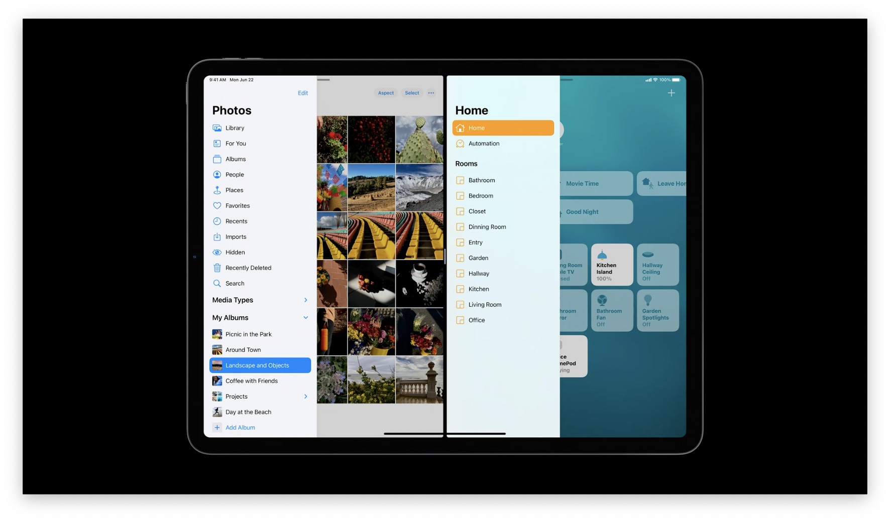
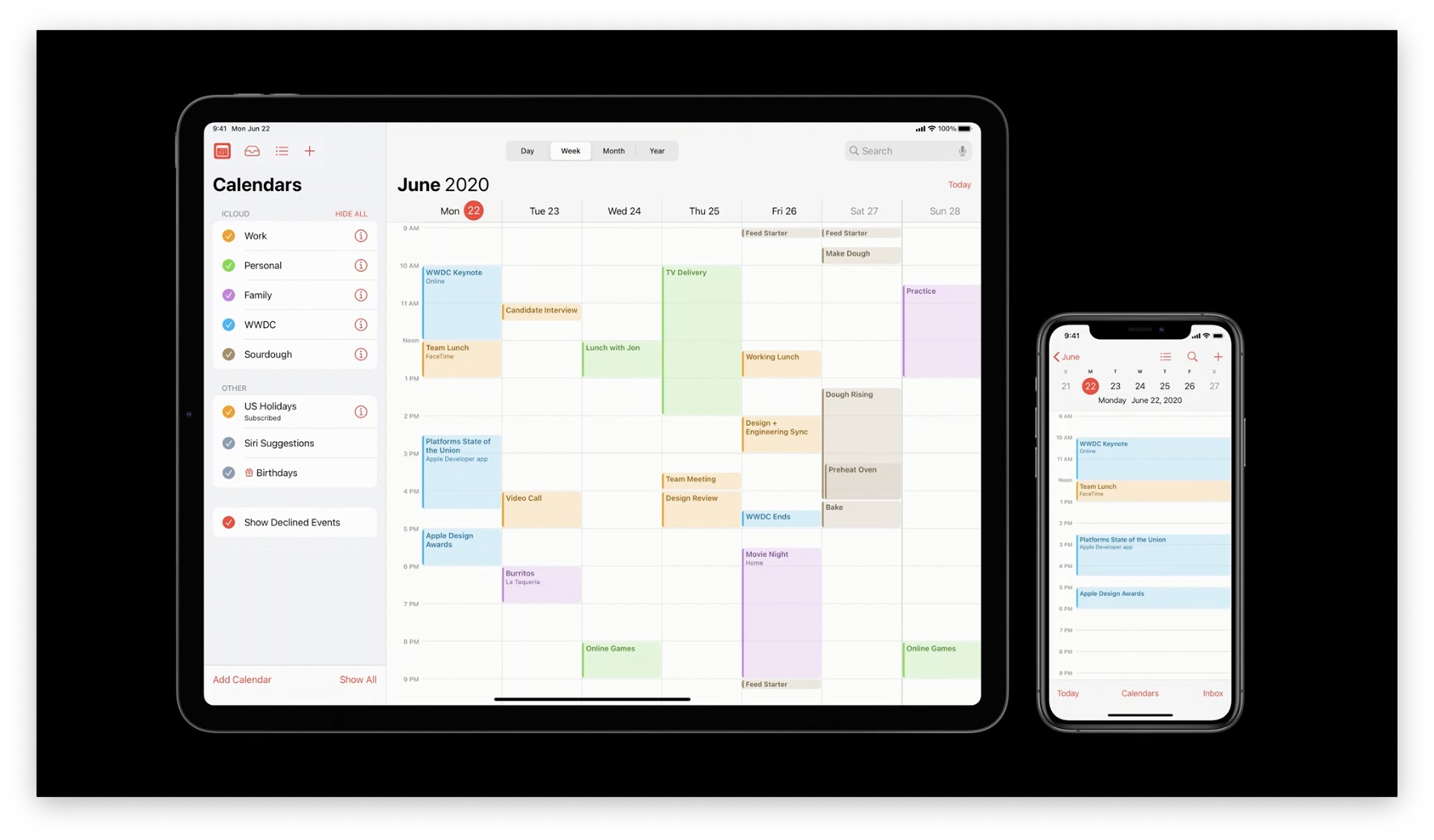
Sidebars
The Home app in iPadOS 13 has a Tab Bar with a lot of horizontal space.
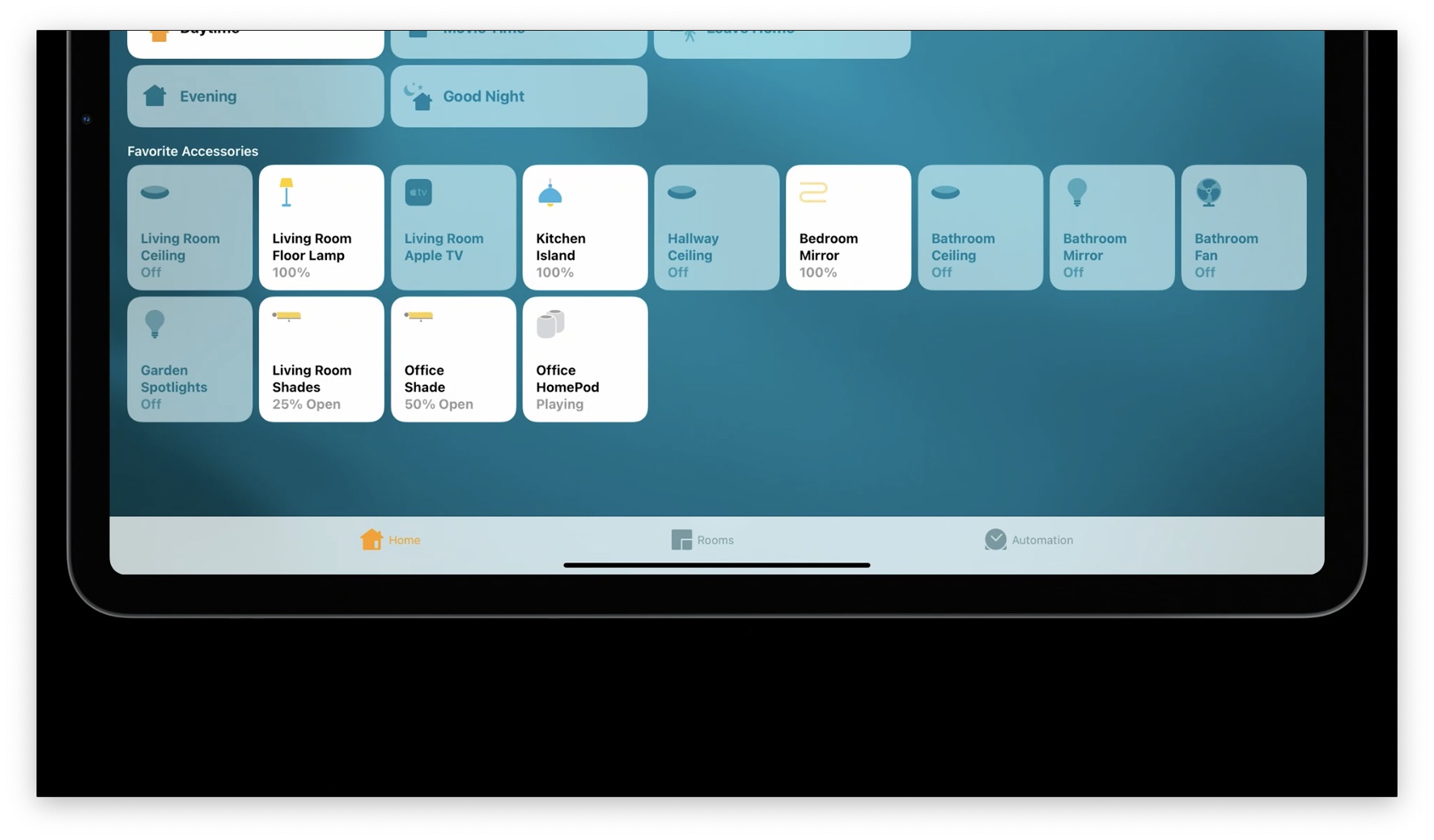
This has been moved to a Sidebar in iPadOS 14 to use space more efficiently.
This part is better shown in video, so jump to the 16 minute mark. They continue with more examples in Music, Files, and Photos.
What about Portrait Mode/Multitasking?
Sidebars are automatically hidden, but you can either swipe them in from the left or tap the sidebar button in the top left corner to show them.
Also in the iPadOS 14 Mail app, 3-column layouts are now available on all iPad sizes instead of just iPad Pro. Jump to the 19 minute mark to see how this works in various form factors.
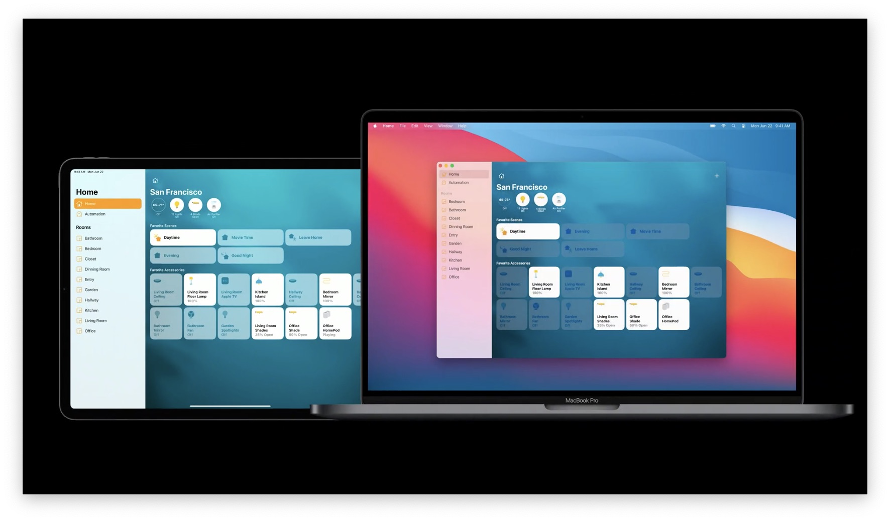
iPadOS <> macOS
Sidebars work the same way on macOS, so this is a great way to design your app for Catalyst as well.
Sidebar Summary
Sidebars are useful because:
- App layouts are optimized for iPad
- Modal and non-modal editing
- Drag and drop
- Collapsable sections
- Overlay presentation
- Fluid swipe gestures
- 3-column layout
Here's how Sidebars are used in Apple's iPadOS 14 apps: 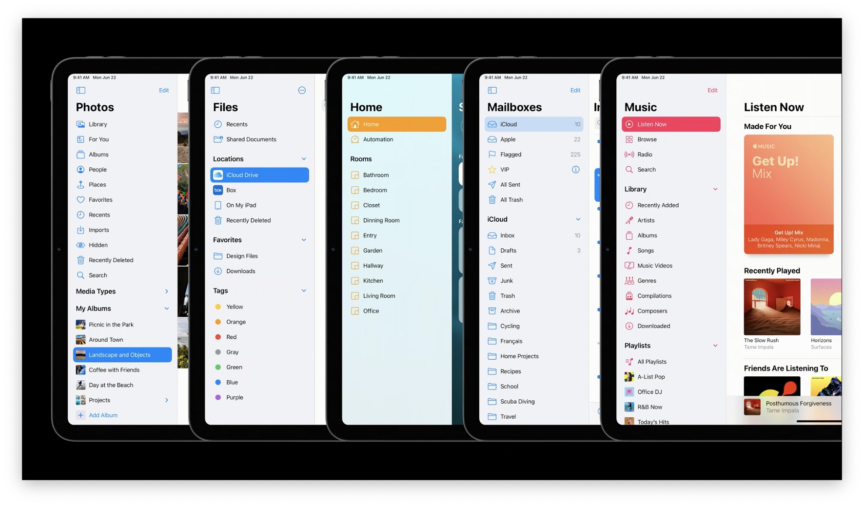
Adding a Sidebar to your app
Sidebar works really well with 2 styles of app navigation: Flat, and Hierarchical:
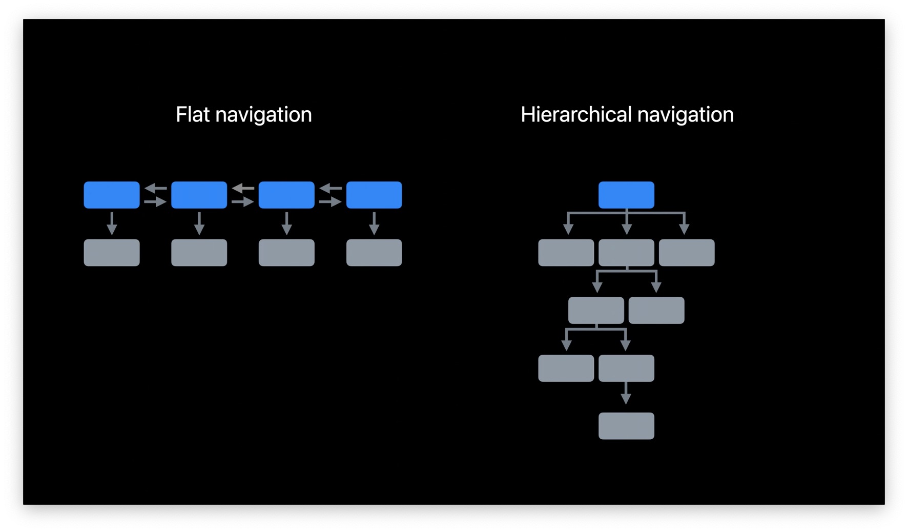
Unless your app is something immersive like a game, it can likely be simplified into one of these two categories.
Flat Navigation
This way, the majority of your app content in different "sections" can be seen by just choosing a different row in the Sidebar. It's okay if one or two sections have more depth.
This navigation style is common in apps like Maps or Photos.
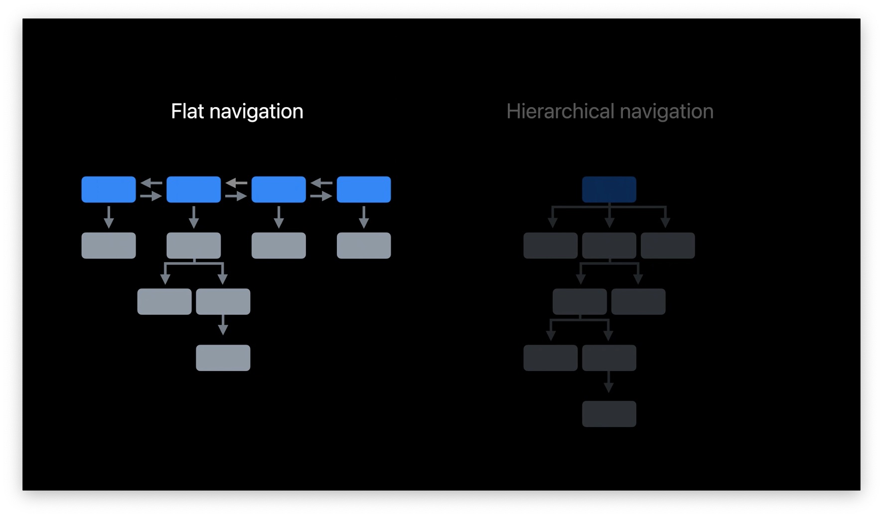
Hierarchical Navigation
These are apps traditionally made with Tab Bars, which have a lot of depth for different sections. These are apps like Mail.
Converting a Tab Bar to Sidebar
Tab Bars are familiar and provide easy-to-understand structure for your app.
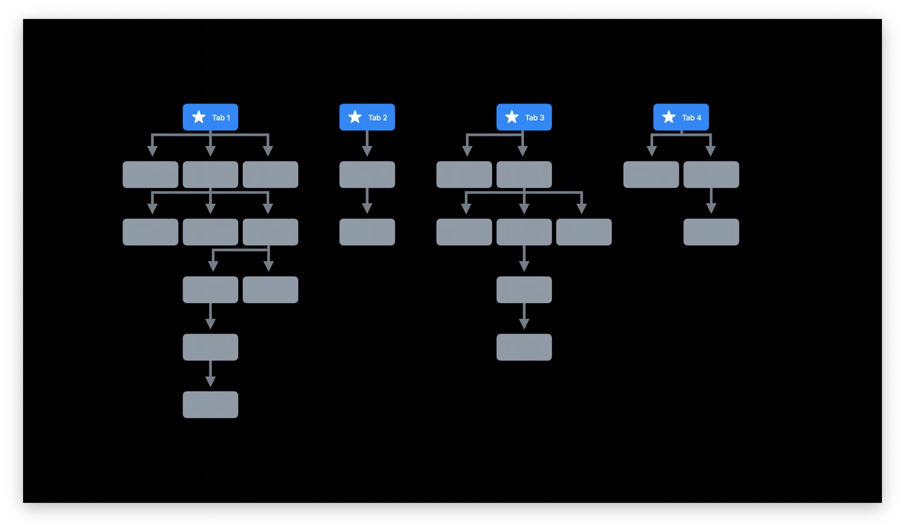
A great way to transition is to put each Tab as a top-level menu item in your Sidebar:
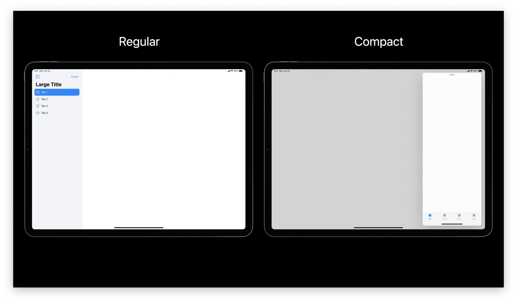
Don't get rid of your Tab Bar! It's useful in compact-width layouts and iPhone:
What else can you put in the Sidebar? Longer lists of content work well, especially if that content is user-generated like photo album names. Put these items below your primary navigation in a collapsible header.
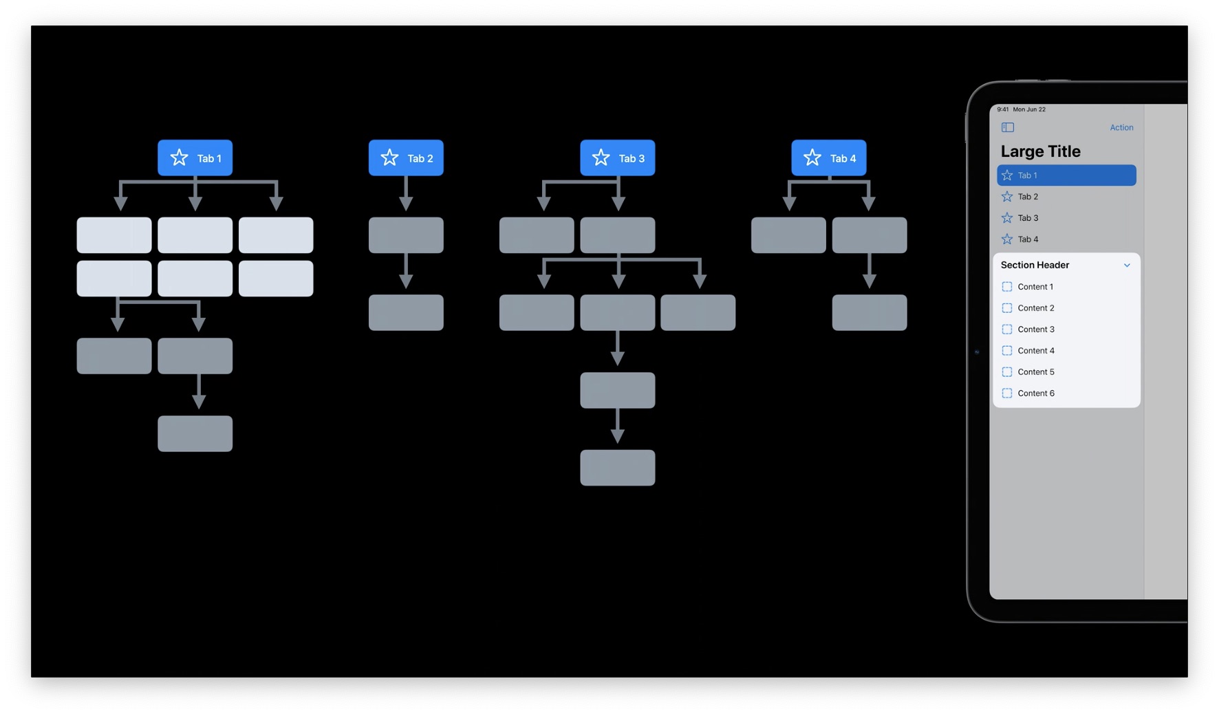
It's okay if there are 2 ways to get to the same content! Think of the Sidebar as shortcuts to really important content.
Resist the urge to put your entire app in the Sidebar! If the user has to scroll and collapse a lot, the Sidebar is no longer a quick jumping off point.
If your content is user-configurable, make the last row an "Add" button. This lets people create content inline.
The Sidebar should not show deeply nested content. Use the primary area of your app to handle that navigation.
Quick Tips for Sidebar
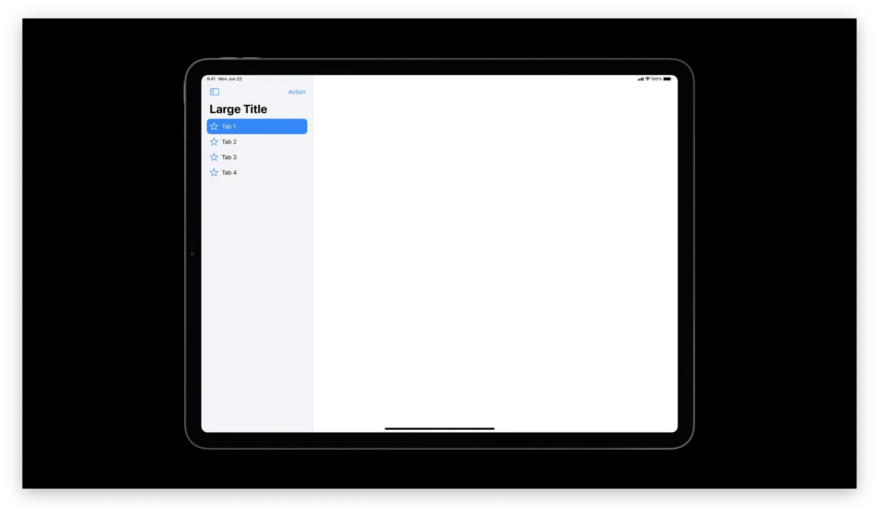
❌ Don't use Sidebars in compact form factors, like iPhone. Prefer a Tab Bar.
❌ Don't mix Sidebars and Tab Bars in the same view, because they do the same thing.
❌ Don't surface your entire app in the Sidebar.
✅ Keep primary navigation at the top.
✅ Convert sidebars to Tab Bars in compact width layouts.
✅ Use outlined glyphs (keep filled-in glyphs for Tab Bars)
✅ Include user's most important content.
✅ Support edit mode.
✅ Support drag-and-drop.
Toolbars
Similar to Tab Bars, the Toolbar in iPadOS 13's Calendar app is wasting a lot of space.
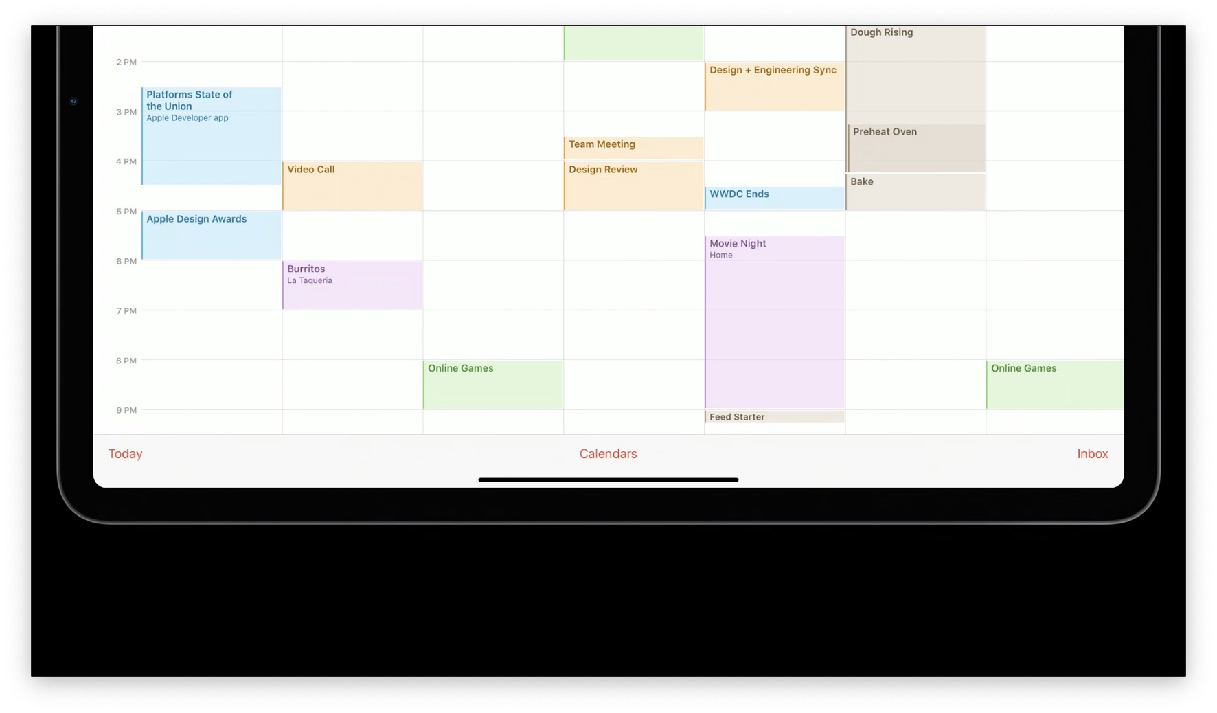
In iPadOS 14, these items have been moved to the top, where they use space more efficiently.
However, make sure to keep them at the bottom in compact-width form factors:
Quick Tips for Toolbars
✅ Place Toolbars at the top in iPadOS if there are aren't many items (usually < 3).
✅ In compact-width, move Toolbars to the bottom.
Recap
Making a great iPad app doesn't come for free. You need to design specifically for iPad.
- Flatten navigation to fill the display. Give the user additional context wherever you can.
- Support inputs like touch, Pencil, keyboard, and trackpad. Use them together in creative ways.
- Use Sidebars for fast navigation instead of Tab Bars.
- Place actions into the top navigation bar rather than Toolbars at the bottom to make better use of the iPad display.
To learn more, refer to:
- Design with iOS Pickers, Menus, and Actions to learn more about iOS/iPadOS 14 controls. These also work well with Catalyst.
- Build for iPad will show you how to use all of this in your code.
 Twitter
 GitHub
 www.linkedin.com