Accessibility in SwiftUI
 Federico Zanetello
Description: Making your app accessible is critical, but just as important is designing a fantastic accessibility experience. Learn what makes a great experience and how to make your app understandable, navigable, and interactable. SwiftUI builds accessibility into your app for you! Discover how much you get with no extra adoption, like accessible images and controls. Identify where you can add supplemental accessibility information with the new SwiftUI Accessibility API, which gives you the tools to add information to elements such as labels, values, and hints.
Make sure the app accessibility is:
- Understandable: Labels
- Interactable: Actions
- Navigable: Ordering and Grouping
Accessibility notifications
E.g. after pressing the equal button = on a calculator app, we can fire an accessibility notification telling Siri that the result value has changed.
Making Buttons More Accessible
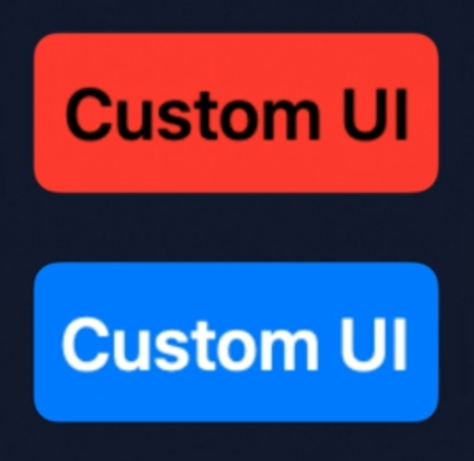
// With SwiftUI, you can easily customize button drawing

struct CustomButtonStyle: ButtonStyle {
	func body(configuration: Button<Label>, isPressed: Bool) -> some View  {
		configuration.label
		  .font(size: 18)
      .foregroundColor(isPressed ? .black : .white)
      .padding(8)
      .background(
        RoundedRectangle(cornerRadius: 5)
        .fill(isPressed ? Color.red : Color.blue)
      )
	}
}
var body: some View {
	Button(action: {}) { Text("Custom UI") }
	  .buttonStyle(CustomButtonStyle())
}
Making Images More Accessible
- Images can be created with an optional
labelparameter, this parameter will be used by voiceover and the likes.
- If an image is not part of the core experience we can initialize it with the
decorativeparameter, this way it will be ignored by the accessibility system features.
 GitHub
 zntfdr.dev